
TL;DR: Here’s the quick verdict on white background vs lifestyle product photos: it’s not either/or. White background photos win as your main image and on category grids, where speed and clarity matter. Lifestyle product photography wins in ads, social, and the rest of your gallery, where context sells. Mid-market Shopify stores convert best using both, in a deliberate order.
If you run a mid-market Shopify store, you’ve probably had this exact discussion with yourself or your team: should the main product shot be a clean photo on white (or grey), or a styled photo of someone actually using the product? The white background vs lifestyle product photos debate gets framed like you have to pick a side, and picking wrong feels expensive. So people stall, or they go all-in on one style and quietly leave money on the table.
We’ve spent years around ecommerce product images, and I’ll save you the suspense: the stores that convert best don’t choose. They use both, on purpose, in specific spots. The trick isn’t picking a winner. It’s knowing which photo belongs in which slot, and why.
Let me walk you through what the data says and how to set up your own collection so each style does the job it’s actually there to do.
Which actually helps you sell more, white background or lifestyle photos?
Neither wins outright. White background photos drive faster decisions as the main image, while lifestyle product photography lifts engagement deeper in the gallery and in ads. BigCommerce found that product pages pairing lifestyle imagery with standard shots convert up to 20% higher than pages using white background images alone.
The reason this question has no clear winner is that the two styles aren’t really competing. They do different jobs at different moments. When you stack them in the right order, each one sets up the next, and that’s where the lift comes from.
- A white background shot answers “what exactly am I buying?” in half a second.
- A lifestyle shot answers “will this fit my life?” or “how can this be styled?” a beat later.
It helps to think about which product photos convert better in context rather than in the abstract. Aggregated A/B test data across DTC brands shows lifestyle-versus-white tests on top SKUs typically produce 10 to 30% lifts, and one brand reported lifestyle winning by 18% on mobile across 20 products.
That doesn’t mean lifestyle always wins. It means that adding the right lifestyle shot to a page that only had white shots usually moves the needle, because you were missing half the story.
White background photos still do the heavy lifting
White background product photography earns its keep because it removes friction. There’s nothing in the frame to distract from the product, so shoppers see the true color, shape, and material in a fraction of a second. That clarity builds trust, and trust is what gets someone from “interesting” to “add to cart.” If you want the fundamentals nailed down first, our product photography basics guide is a solid starting point.
White shots also keep your store looking tidy. When every hero image sits on the same clean backdrop, your category grid can be scanned easily, and nothing looks out of place. That consistency matters more than people think. Consistent imagery across a store has been linked to conversion gains of at least 10%, and 54% of shoppers say they’ve abandoned a purchase because product content felt inconsistent. For a mid-market catalog with dozens,hundreds or even thousands of SKUs, a uniform white hero shot is the easiest way to look professional at scale.
There’s a budget angle too. White background shots are faster and cheaper to produce than full lifestyle scenes, since you don’t need models, locations, or styling. That makes them the practical default for your main image, with professional product photos setting the quality bar even when you’re shooting at volume.
What lifestyle photos do that a white background can’t
Lifestyle product photography shows the scale, real-world use, and context, so shoppers can picture using the product in their own lives. That emotional connection is what lifts conversions in ads, social feeds, and on the product page, where the image fills the screen, and feeling drives the click.
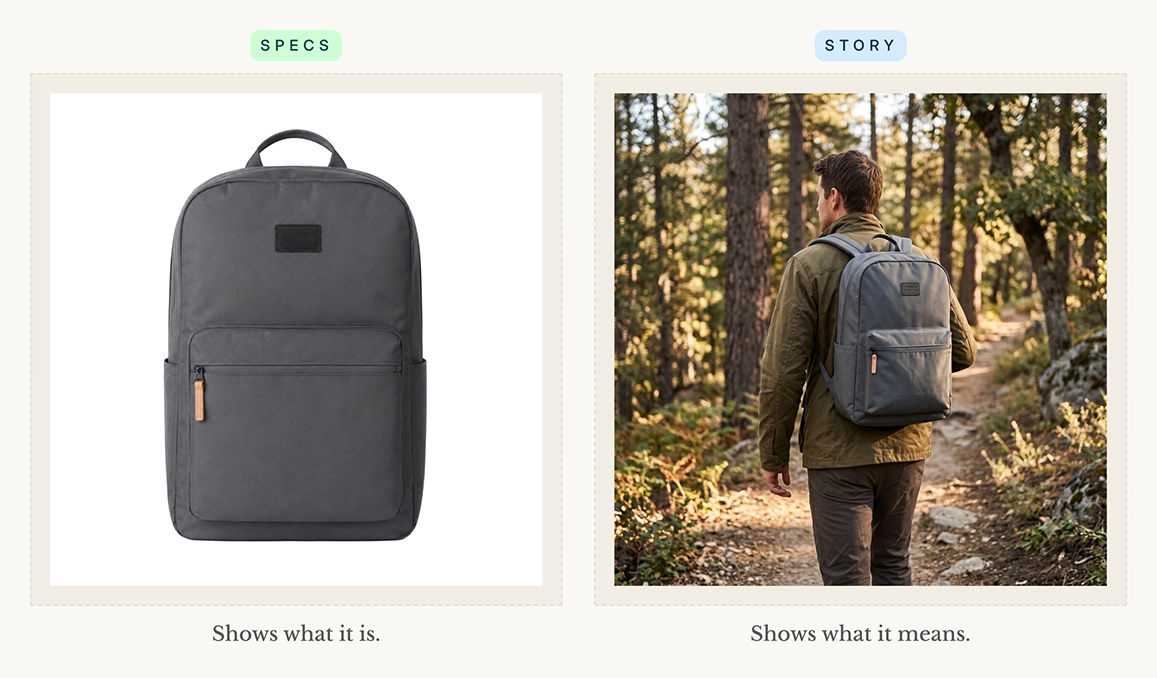
A white-background photo tells you what a backpack is. A lifestyle photo tells you what owning one feels like: it shows the bag on someone’s shoulders on a trail, so you know if it’s the right size, how it sits, and whether it matches the version of yourself you’re shopping for. That’s the gap lifestyle fills — it turns specs into a story. For products tied to a feeling or a lifestyle, like apparel, home goods, wellness, or outdoor gear, that story is often the whole sale.
This matters most on mobile, where in-context shots tend to win because the image takes up the entire viewport and the emotional read dominates. The majority of your web traffic comes from a mobile, so the photo that performs in a thumb-stopping feed is doing real work. There’s also a quieter benefit: showing real scale and use cuts down on surprises. Around 22% of products get returned because they look different in person, and good context and detail shots are one of the cheapest ways to reduce returns.
Does Shopify or Amazon require a white background?
Shopify doesn’t require white backgrounds. You have complete control of your theme and gallery. But marketplaces like Amazon and Walmart mandate a pure white hero image. So if you sell on both, shoot white to stay compliant and add lifestyle shots to the gallery and on your own storefront.
A lot of merchants get tripped up –Because Amazon makes a white hero image non-negotiable, people assume it’s a universal rule and apply it everywhere, including their own Shopify store, where they have full freedom. You don’t have to. Your storefront is the one place you can lead with whatever converts best for your brand. If marketplace selling is part of your mix, our guide to photographing products for Amazon covers the spec side.
Here’s how the background rules actually shake out across the major platforms:
- Shopify store: No requirements. You control the theme and gallery, so you can lead with whatever converts best for your brand.
- Amazon: Main image must be a pure white background (RGB 255, 255, 255), with the product filling about 85% of the frame and no text, logos, or props. Minimum 1,000px on the longest side; 2,000px+ enables zoom.
- Walmart: Primary image also requires a pure white background (RGB 255, 255, 255) and the same ~85% fill rule. Gallery images after the first can use other clean backgrounds.
- eBay: No strict white-background mandate, but a clean white or light background is recommended. Minimum 500px on the longest side; 1,600px+ unlocks zoom. No added borders or text.
- Etsy: No background requirements at all. You get full creative freedom, and lifestyle shots often work well even as the first thumbnail.
The smart move is to shoot once and deploy by channel. Capture a clean white hero that satisfies every marketplace, then build a small set of lifestyle and detailed product photos for wherever they’re allowed. If you’re juggling several platforms, it’s worth knowing the exact marketplace image requirements up front so you’re not reshooting later.
Your product gallery playbook: What goes where
Here’s the part that turns the lifestyle vs white background question into an actual plan. Instead of choosing a style, you match each style to where it works best along the buyer’s journey, along the buyer’s path. Think of it as matching the photo to the funnel stage and the surface it shows up on.
- Main / hero image: White background product photos. Clean, compliant, and instantly readable on every device and marketplace.
- Category grid: White or a consistent on-model style photo. Uniformity helps shoppers scan and compare without visual noise.
- Product detail page gallery (images 2 to 8): Lifestyle, in-use, detail close-ups, and ideally a scale reference. This is where context does the selling (and reduces returns!).
- Ads and social feeds: Use lifestyle photos. Emotional, scroll-stopping, and built to earn the click at the awareness stage.
- Email and retargeting: A mix of imagery. Lead with the lifestyle shot to re-spark interest, support with the clean product shot.
Lifestyle photos get shoppers interested. White background photography gives them the clarity and trust to buy.
Get this sequence right, and you’re not just adding pretty pictures, you’re converting more traffic into sales by giving each shopper the exact image their decision needs at that step.
How many product images should I have?
Aim for five to eight images per product. One white background as your hero image, two to three alternate angles, at least one lifestyle or in-use image, and a detailed close-up. Catchlab’s study of 2.3 million listings found that product pages with more than five images convert about 50% higher than single-image ones.
More images help, but only up to a point and only if each one adds something. The same Catchlab research found that lifestyle context images, detail close-ups, and scale references drove real engagement, while redundant angles of the same view did basically nothing. So don’t pad your gallery with five near-identical white images.
Make your photos look good without blowing your budget
The honest objection to using both white background and lifestyle photos is cost: traditional product photography can run $300 to $500 per product, which adds up fast across a big catalog. You don’t need a full studio shoot for every SKU though. Start with the products that earn it, then use the tips below to keep the rest affordable.
Prioritize lifestyle shots for your bestsellers
Not every product needs lifestyle photos. Include them in the product listings that sell the most, so the investment pays for itself.
Batch your shoots to spread the cost
Setup and teardown eat up the most time in any shoot, not the shutter clicks. Photograph a whole category in one sitting so you only build the lighting and scene once. A few practical product photography hacks go a long way here: group similar products, knock out all your white shots first, then switch over to your lifestyle setups in one block.
Reuse and repurpose your lifestyle scenes
One good lifestyle setup can serve a dozen products. Style a kitchen counter or a desk scene once, then rotate related items through it instead of building a new set each time. That same shot can also feed your ads, social, and email, so you’re getting several placements out of a single session rather than paying per image per channel.
Standardize your white photos for fast editing
Consistency saves money on the back end, not just the front. Lock in the same lighting, distance, and camera settings for every white-background shot so editing stays quick and uniform. When every hero looks the same, your category grid stays clean, and your editor isn’t fixing each photo from scratch.
Lean on tools before booking a studio
That’s also where a tool can save you hours. If shooting clean, retail-ready product images is the bottleneck, an app that turns your raw photos into polished, store-ready shots lets you build that white-plus-lifestyle mix without booking a studio for every product.
The bottom line
Stop treating white background vs lifestyle product photos as a fork in the road. The mid-market stores that win use product-only photos where clarity and trust matter (your hero image, your category grid, your marketplace listings) and lifestyle photos where context and emotion matter (your gallery, your ads, your social). The two styles aren’t competing for the same job. White background product photos earn trust, while lifestyle photos create desire. Using both in the right places is what grows sales.
If your bottleneck is producing those clean, consistent product photos in the first place, Pixc: AI Image Editing app turns your raw images into polished, store-ready photos so you can produce both styles of images without the cost of a studio. Get your images right, put each one in its proper order, and let the data do the rest.