Want to know a secret to gaining a competitive advantage in the eCommerce world?
That secret is improving your website’s usability.
eCommerce website usability is really just the quality of a user’s experience when they interact with an online store’s website. There are three web design tips to consider when you evaluate the usability of your web design: speed, responsiveness and overall user experience. Let’s take a look at all three.
1. Speed
No one likes to wait — eager online shoppers in particular. Websites need to load instantly to please internet surfers of the digital age. If your site is not up and ready to go in just a few seconds, you will lose traffic like crazy.
Check these stats out:
- 40% of people will abandon a webpage if it takes more than three seconds to load.
- Mobile site bounce rate spikes to 100% when a page takes four seconds or more to load. It jumps to 150% if a page takes eight seconds or more to load.

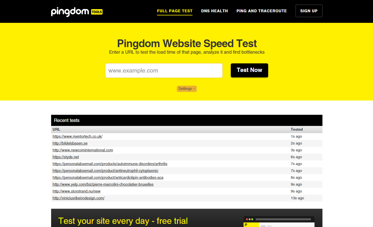
Most eCommerce websites could improve improve their loading times. A typical eCommerce website takes 6.5 seconds to load, while the average user expects a load time of about two seconds. Test your site’s speed (with a tool like Pingdom) and see where you rank. If you find your site has a four-second loading time or more, start taking steps toward decreasing this time as much as possible.
You can speed up your website by looking into its structure. If you’re using an eCommerce platform like Bigcommerce, Shopify or Volusion, you needn’t worry about this.
However, if you’ve custom-built your website, take advantage of CSS coding whenever possible to avoid including images with excessive load times or other items on page that drag down your site’s speed. Speak with your developer and make sure you eliminate or reduce excessive code, combine style sheets and use software that streamlines coding. Keep your site lean by reducing or limiting scripts and elements on-page.
Furthermore, deliver this coding information to your system in a digestible manner through compression. All that information listed on your website (everything from the About page to product listings) comes with a substantial amount of code. Compressing information could reduce download times up to 70% and decrease the bandwidth of your page.

You can also improve your eCommerce website usability by optimising your product photos. No surprises here: larger images take longer to load. Images between 1000 and 1600 pixels on the longest side are the perfect size if you’ve got a zoom function installed, and if you’ve taken your product images on a quality digital camera, the images are likely to be much larger. Re-size all of your images before you upload them and you’re sure to see a difference.
When it comes to format of your images, use JPG whenever possible. PNG is another viable option but may not always be supported. If you have any questions about image formats, feel free to shoot us an email and we’ll be happy to help you out!
2. Responsiveness
According to Mobile Joomla, ‘Visitors who have a slow browsing experience are significantly less likely to return to the site’. Don’t let this happen to you!
Nearly half of all internet use occurs on mobile devices like tablets or smartphones. Presenting customers with a distorted website makes you look unprofessional and will make your traffic run screaming in the other direction.
A sharp, fully functional and correctly displayed mobile website is an absolute must for the success of your eCommerce business. You can achieve this by creative a mobile version of your website or implementing responsive web design.
A site designed with responsive web design means the website will readjust itself to different screen sizes.
Responsive web design is preferred to creating a separate mobile site, as the latter will cost you more money and make it harder for search engines to rank you well due to multiple domains. We recently wrote a post on responsive web design if you want to learn a bit more about it.
3. Overall user experience
Visitors to your eCommerce store want to easily cruise through your website and get from one place to the next with ease. They are not looking for an off-road extreme adventure where obstacles lie behind each and every corner. Your website needs to be simple and easy to navigate.
Create organised menu categories and subcategories for your site, like Moo and The Iconic have done.
(By the way, all external links (including those to your social media profiles) should open in new tabs. You don’t want to redirect visitors away from your site!)
Consider also using breadcrumb navigation, which is a great way to improve your customers’ user experience. It guides your customer through the purchasing process by showing them which step they’re at and how many more steps they have to go.
This will limit the number of people who abandon their carts halfway due to boredom or uncertainty. It will also make it easy for your customers to go back to previous steps and make changes rather than having to start all over again.
eCommerce website usability: Make it a priority!
Start optimising your site as early as possible to create a user-centered site. Implementing a clean and efficient website will create an inviting environment that makes internet surfers hang out a little longer. Maybe they’ll even hang around long enough to make a purchase from your store.
Below is a list of usability tests that will show you what’s working and what isn’t.
- Surveys or interviews
- Wireframe navigation testing
- First-click testing
- Usability testing
- Card sort testing
Let us know if you have usability tips in the comments below, or tweet us @pixcphotos!


