
Have you ever opened a website on your phone that just looked… wrong?
Perhaps it didn’t fill the screen or maybe it was cut off. What did you do? Chances are you bounced right off that site and made a note to check the site again later on your computer (but let’s be honest, you probably didn’t!).
The world of mobile device internet usage is exploding and taking over. You can’t afford to be caught sleeping now — you have to keep up on your game. No one is going to trust you or consider your site professional if it loads incorrectly, items are missing or it simply provides a poor presentation.
Mobile eCommerce is big — and only getting bigger
If you want your eCommerce business to grow and thrive, you have to make sure your site can also be viewed on a mobile phone. Take a look at these figures from Smart Insights and see for yourself just how huge the mobile eCommerce (or mCommerce) world really is:
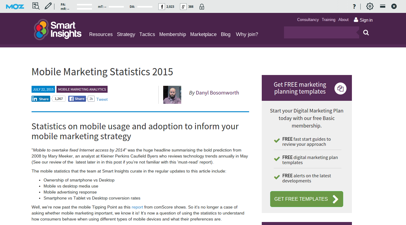
- More than 20 percent of Google searches are now being performed on some sort of mobile device.
- In 2012 over half of all local searches were done on a mobile device.
- 25 percent of internet users only access the internet via a mobile device in the United States.
- 25.85 percent of all emails are opened on mobile phones, with another 10.16 percent opened on tablets.
- In 2014 mobile Internet usage is expected to overtake desktop usage.
- Out of the 4 billion mobile phones in the world, 1.08 billion are smartphones and 3.05 are SMS-enabled.
How do you keep up? Well, the best way of making your eCommerce store mobile-friendly is to use and understand the importance of responsive web design.
What is responsive web design?
Simply stated, a site designed with responsive web design means that your website has been programmed to automatically resize and adjust to fit to the screen of the device used to open the page, whether it’s a computer, tablet, smartphone or portable device. The result is a consistent website that looks the same no matter what type of device the user is on.
Have a look at the screenshots below from Salt, an eCommerce surfing apparel store, and see how the home page design adjusts depending on the size of the screen it’s viewed on.

Also, have a look at Appelles homepage and look at how the product page changes too depending on the device. The amount of dark beige space on the sides disappears as we move to mobile devices. The product images get smaller and more of them are shown on one page.
The only alternative to responsive web design if you want an efficient mobile version of the site is to create an entirely different website. Building multiple sites will involve extra startup and maintenance work, which will only cost you more money in time.
Do it for Google!
Google left everyone in suspense waiting on their recommendation for the best mobile SEO practices. Finally, in June 2012, Google made their position on responsive design clear in an article titled Google Finally Takes A Clear Stance On Mobile SEO Practices:
Google recommends you go with a responsive design when possible, otherwise you can use device-specific HTML but Google asks you to take certain steps to communicate when you are using device-specific HTML.
So, if you find responsive web design boring or unnecessary for any reason, at least do it for Google’s sake. Your eCommerce store is more likely to appear further up the search results if your website has a responsive design. Why does Google prefer responsive web design? It saves them work.
Think about it. When you create two webpages, each page will have a completely different URL and completely different HTML. For Google, this means they have to index two separate sites with all the same content. When the website is set up acknowledging the importance of responsive web design, all platforms will have the same URL and the same content, which is easier for Google indexing.
Do it for social media!
When you have two separate domains, one for desktop and one for mobile, problems will arise when people use social media platforms to share links to your site. Where it gets confusing is when someone shares a link off their mobile device and a friend opens that link on a desktop, the page will load incorrectly as it attempts to display the incorrect design, or vice versa.

Stick with SEO best practices by keeping your website mobile-friendly with responsive design and one URL that will open correctly. Your site will look correct no matter which device your viewer uses.
How do I get a responsive web design?
Switching to a mobile-responsive site is not as scary as it sounds. Some people get freaked out by the idea of responsive web design due to fears of increased cost or exceeding budget.
Google has stated a preference of using responsive web design as the mobile configuration.
The truth is using a mobile-responsive site will cost less in the long run. Sure, the initial website setup may cost a little more to hire the experts to make your site responsive. However, it will pay off in the long run.
With the recent trend in mobile usage, nearly all programmers and developers will be familiar with responsive web design and should have no problem revamping your website to make it work for you. If you are building a new website, be sure this is something discussed with your web developer in the early stages.
eCommerce platforms are even getting in on the fun and offering platforms with incorporated functions to create a responsive site. If you have not settled on a specific platform, this is something to look into when starting or revamping your website. A number of platforms like Bigcommerce and Shopify now offer themes that make it easy to create a beautiful, responsive eCommerce website from the ground up.
The importance of responsive web design is paramount!
Are you keeping up with the times? If not, it’s probably time to play catch-up. The internet forecast for the upcoming decade shows the takeover of mobile devices will not be slowing down anytime soon. If your plan is to grow your eCommerce business, the sooner you implement responsive design, the better off you will be.