A digital storefront without high-quality product photos is one that most shoppers aren’t going to risk buying from. If you want to make the best impression possible on prospective customers, you need to give them as accurate an idea of what you’re selling a possible. Here’s how.
I’m sure you’ve heard the saying before – a picture is worth a thousand words. That applies tenfold to the ecommerce space. You’re probably aware of this to some extent.
But do you know exactly how important product imagery is?
- Visual appearance is a key decision driver for 93 percent of consumers. (Kissmetrics/Neil Patel)
- 67 percent of users say images are very important in their purchasing decisions. (CrowdRiff).
- 85 percent of web users feel that visual information is more trustworthy than text (The Intent Labs/BusinessWire)
In short, without high-quality product photos, you might as well close up shop. Yet simply taking a few cute snapshots of what you’re selling isn’t necessarily enough, either. Images for your storefront need to be created with intent.
They need to give the shopper context. They need to be informative. And they need to entice and intrigue.
Here’s what you must bear in mind when creating product photos to help ensure that yours achieve that and more.
A primer on the types of product photos you need
Before we really dive into things, I’d like to take a moment to describe the three different ‘types’ of product photos you’re likely to need to use on your ecommerce store.
Standard product photos are exactly what they say they are. They’re photos of a product that gives shoppers a solid idea of how it looks. They put the product front-and-center with a neutral background, usually white, or sometimes grey.
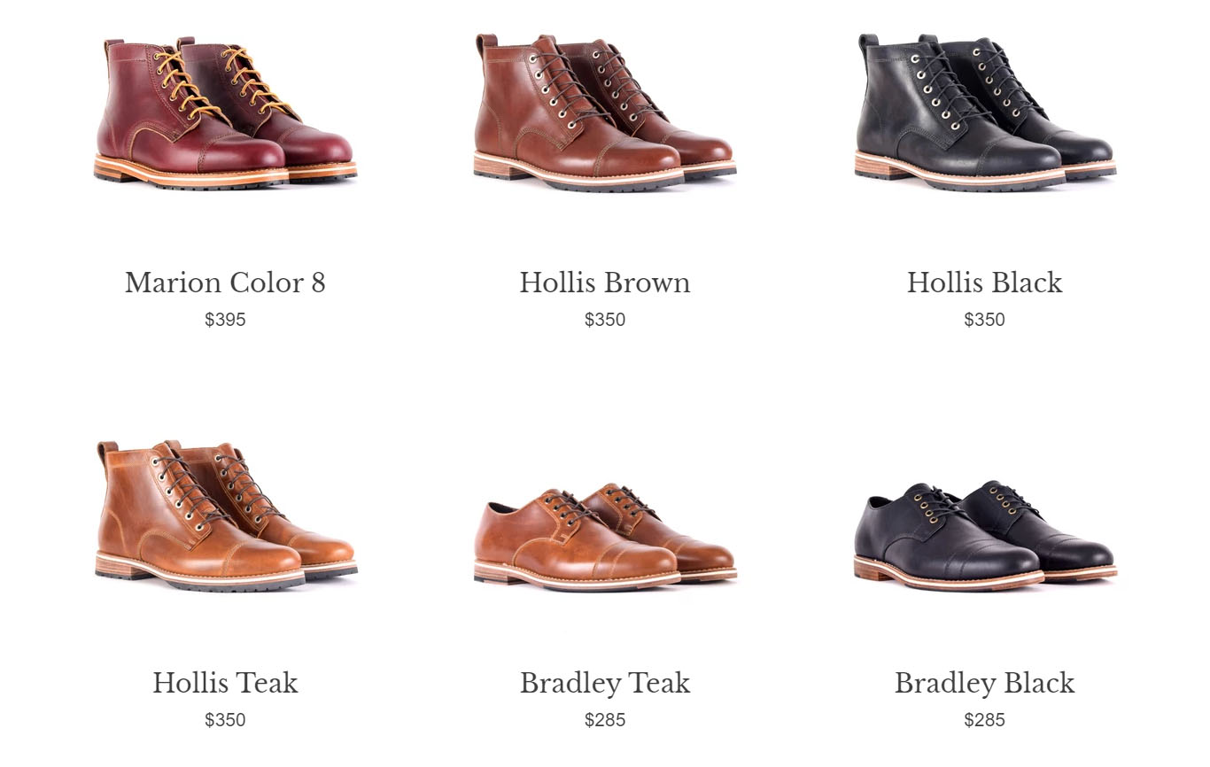
HELM boots’ product shots clearly shows what their shoes look like
Information photos are a little more interesting. They’re a picture of your product with a few bullet points describing the product’s features or unique selling points. Let’s say you’re selling a blender. In that case, you might include details on different speeds, attachments, and materials. You could also include a photo with product specifications under this umbrella.
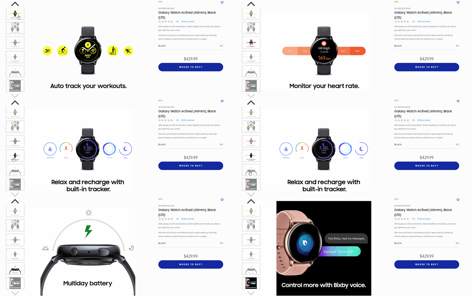
Samsung uses information photos to show the product’s features
Lifestyle photos (aka contextual shots) show the product in action. They’re created with your target audience in mind, and the background and surroundings usually consist of imagery that would resonate with your customers. If, for example, you’re selling hydration packs for cyclists, lifestyle photos of the product might show a cyclist wearing the pack as they bike along a mountain trail.
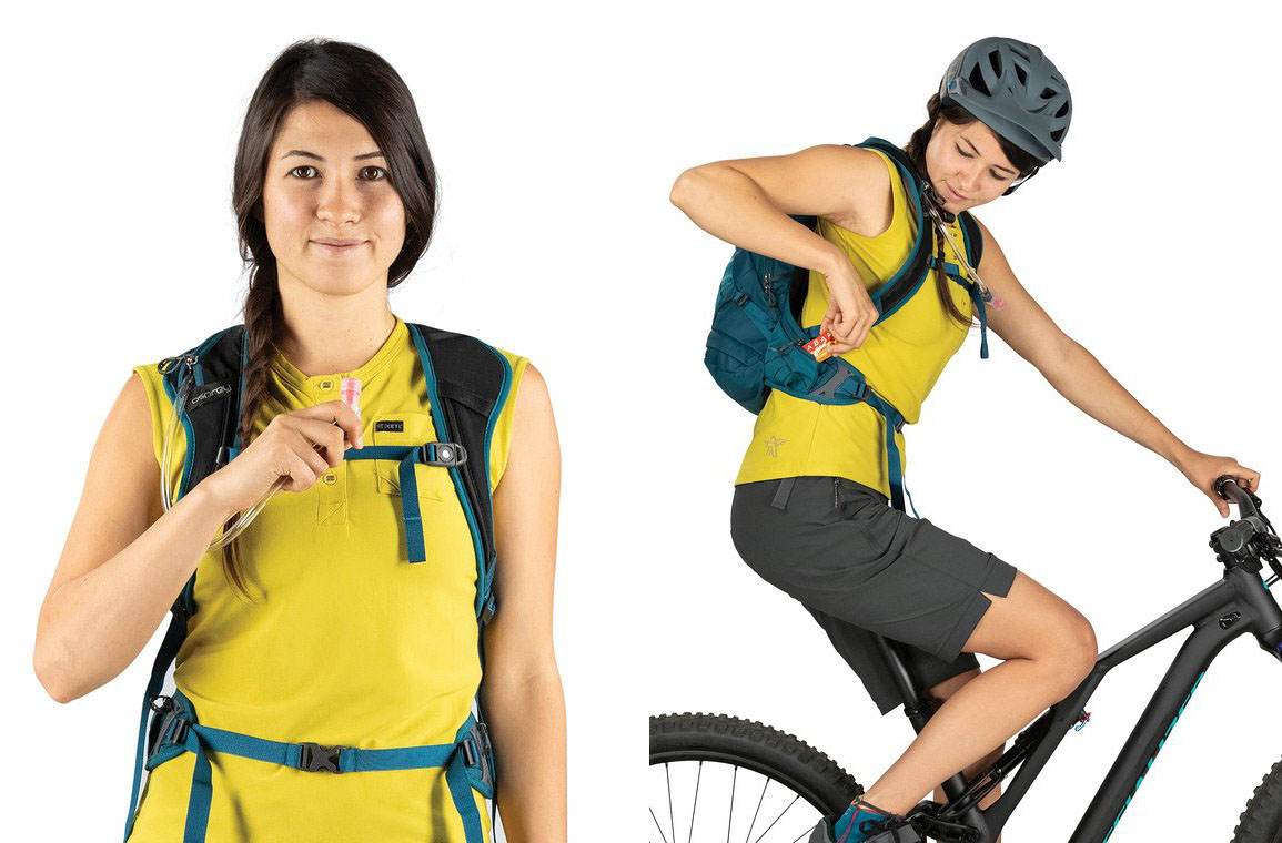
Here’s how Osprey incorporates lifestyle shots to their product pages.
With that out of the way, let’s dive into the qualities that make the photos described above really shine.
Proper lighting, proper lenses
Product photos are all about putting your brand’s best foot forward while being as authentic as possible. With that in mind, there are two huge blunders you can make here. The first is using improper lighting.
Too much light, and you’ll be dealing with a whole lot of glare. Too little, and no one will be able to make out the finer details of your products. Your best bet here is probably to go to a studio with a specialized area for taking these kinds of photos.
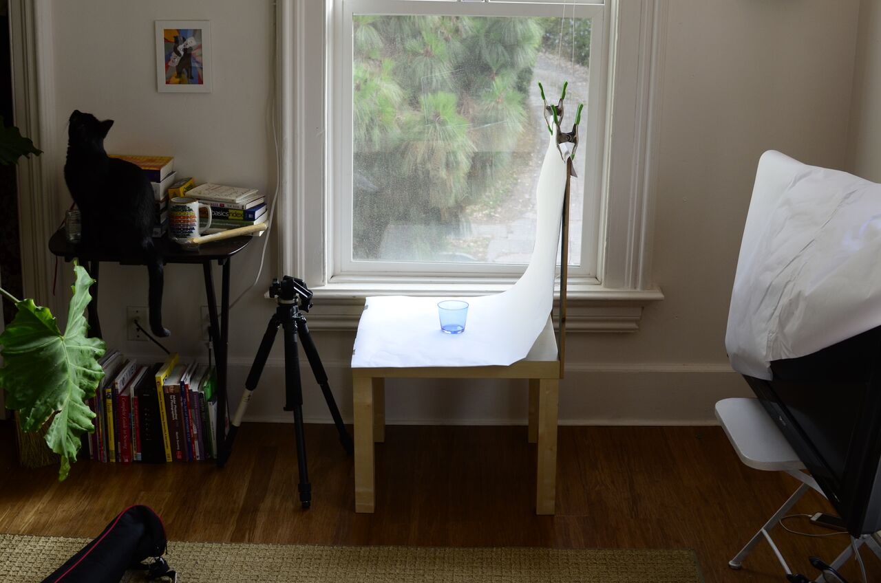
However, if that’s not an option, you can set up a photography area so that it faces a window, allowing you to take advantage of the sunlight.
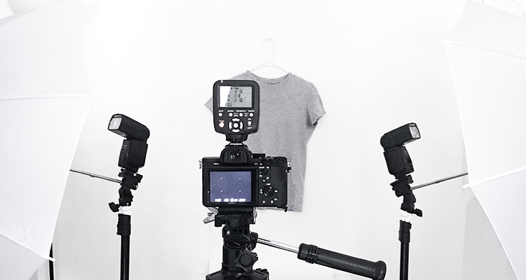
You might also consider a basement or windowless room if you want to make use of artificial light, with light sources from at least three different angles to minimize shadows.
Note that for the above, I’m mostly talking about standard product photos. Lifestyle photos will require a bit more finesse. You’re going to want to think about everything from how and where your product is going to be used as well as the time of day.
Early in the morning or later in the day if there’s a bit of cloud cover is usually best – the light is a lot softer, and you’ll be dealing with a whole lot less glare. Pixc has a decent guide on the basics of setting up a home studio, while this blog from Light Stalking can help you perfect the use of artificial lighting in your product photos.
The second big mistake involves using the wrong kind of camera lens.
If you don’t have access to a professional-level camera, a smartphone can work. Especially if you’ve got a higher-end device, you can take photos that rival professional DSLRs. At the same time, a real camera is always a better bet – mostly because of the wide array of high-quality lenses you’ll have access to.
If you’re unsure of where to start, photography blog Photo Workout has some good suggestions for lenses, while Pixc has published a comprehensive camera buyer’s guide (which includes some detail on lenses).
Quality and Consistency
Another too common mistake I see novice retailers make, especially on marketplaces like Etsy, is taking photos that are too “busy.” Their photos have a hundred different things going on at once, so much so that it’s impossible to tell where the product actually comes into the picture. Don’t do this.
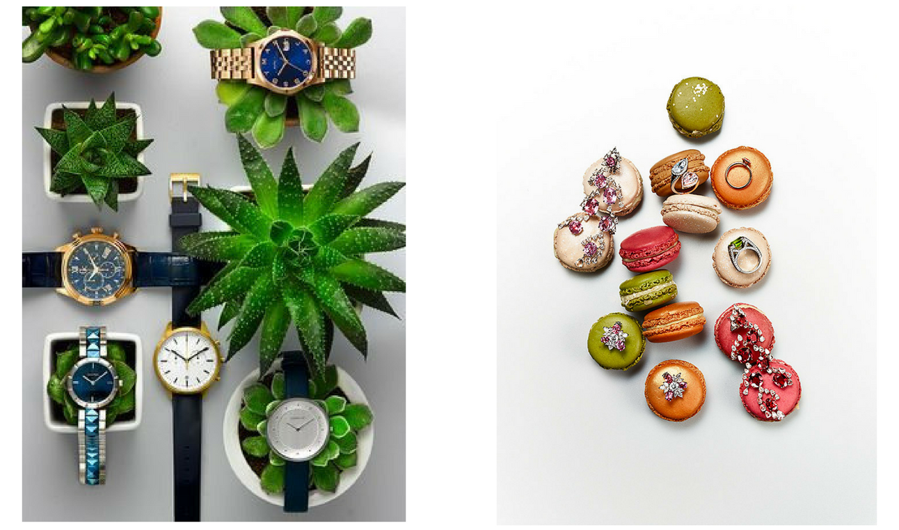
The photos above made it difficult to focus on the actual jewelry products
Whether you’re taking lifestyle photos or standard product photos, your product must always be the focus. People aren’t here to marvel at your photography skills, even if they are impressive. They want to see what you’re selling, even in your lifestyle photos.
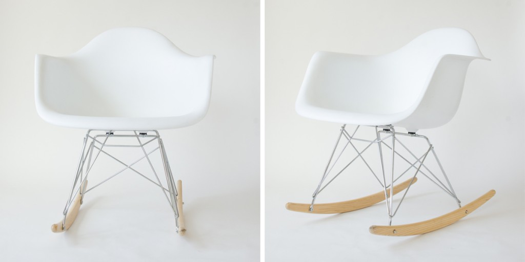
Keep product photos simple and crisp, capturing each item from multiple angles against a neutral background. Go over each product with a fine-toothed comb before taking any pictures to ensure there aren’t any imperfections such as scratches, smudges, or dents. The idea here is to paint a complete picture of your product, capturing it from every angle and in every context.
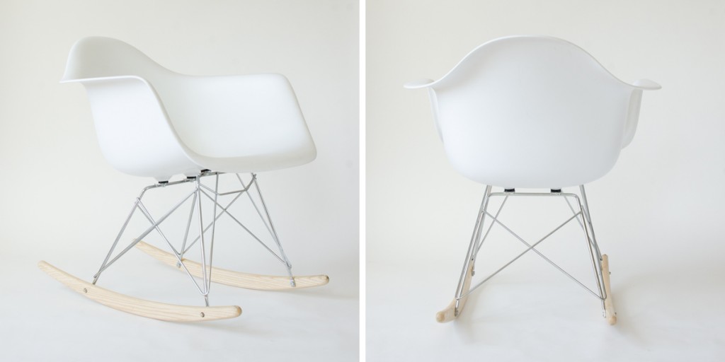
When you’re taking photos, remember also that more is better. Maybe your thumb is covering the lens in one of your shots, or you caught the model mid-sneeze. The more photos you capture, the easier it’ll be to discard duds later on in the post editing process.
Finally, consistency is key. Each product on your storefront should have roughly the same quantity of images, and these images should all be of similar quality. That will likely involve jumping into photoshop and touching things up, removing small imperfections like shadows and dim backgrounds, or of course you can send it to Pixc.
Just make sure you avoid touching them up too heavily. Too much photoshop magic and you run the risk of being inauthentic. That’s something you want to avoid.
Optimize your photos
Last but not least, I’d like to wrap things up by talking about optimization. Even high-quality product photos can be counterproductive if they aren’t properly optimized. It doesn’t matter how good or descriptive a photoset is if the page it’s hosted on takes too long to load.
Higher load times mean more people will get frustrated and abandon your store. That means a ton of lost sales. Moreover, Google openly acknowledges that page speed is a ranking factor in search, so it could potentially hurt your position on the SERP.
But how fast is fast enough? For eCommerce, the average among the top 100 sites hovers around 3 seconds. Anything lower than that, and you’re probably fine.
In order to avoid that, your first step is to reduce the resolution of your images. A lot of DSLR cameras tend to capture photos at downright ridiculous resolutions (at least where the web is concerned). I’d advise square photos with a height and width of around 1000 pixels, though the specific requirements vary by marketplace.
Beyond that, there are a few other small tweaks you can make to quality. Adobe Photoshop, for instance, has a “save for web” option, while GIMP allows you to tweak the quality of a photo when you save. You should also save JPEGs where possible, as PNG images tend to be a bit larger.
Sizing aside, each photo should be named as descriptively as possible. Don’t just use the generic naming conventions applied by your camera. Consider instead what people would search for to find your product, and work that in.
This also applies to your alt text. Follow the same conventions you would for your filename, describing the product as succinctly as possible without resorting to keyword stuffing. Let’s wrap this section up with an example.
Let’s say your product listing is a red ten-pound kettlebell. Your product photos could be named as follows.
- brandname-kettlebell-red-10lbs-front.jpeg
- brandname-kettlebell-red-10lbs-side.jpg
- brandname-kettlebell-red-10lbs-wide,jpg
You get the idea. Alt text, meanwhile, would be something like the below.
Brandname red ten-pound Kettlebell front view.
Conclusion
They say a picture is worth a thousand words. Where eCommerce is concerned, it’s worth a whole lot more than that. It can be the difference between a successful sale and a bounce.
By populating your storefront with high-quality, engaging, and informative photos, you’ll help give your potential customers a more complete, comprehensive idea of who your brand is, what you offer, and why they should buy from you. And by properly optimizing those images, you’ll ensure they can actually see them before they grow impatient and shop elsewhere.
Author Bio
Terry Cane is the COO at SEOHost.net, a reliable and supportive SEO hosting partner.


