People love visuals and react to them positively. This is particularly true when shopping online. In fact, 75% of the online shoppers state that product photos have an impact on purchase decisions and 22% of them return an item if it does not correspond to the photo.
Visual content is the actual representation of your product and your primary goal is to sell your product.
Since product photos are the first thing shoppers see when visiting your store, you have to make sure your visual content is appealing and engaging.
I have included five top ecommerce stores that use stunning product photography.
I hope to inspire you and give you some ideas for store redesign this year.
Modcloth
One of the golden rules for ecommerce content creation is to make your visual elements correspond to your brand identity and message.
Modcloth represents this idea perfectly.
As the brand states, “Since day one, we’ve championed values of female empowerment and inclusivity. We’re dedicated to serving our community of amazing women by celebrating their stories and offering a full range of sizes. Because everyone deserves to fit right in”.
Modcloth supports this statement with the following:
- Hiring many different models to represent different body shapes and how the clothes fit on each
- Using a background color to emphasize the color and style of each piece of clothing
- Using bright colors and unusual settings to display their top selling products.
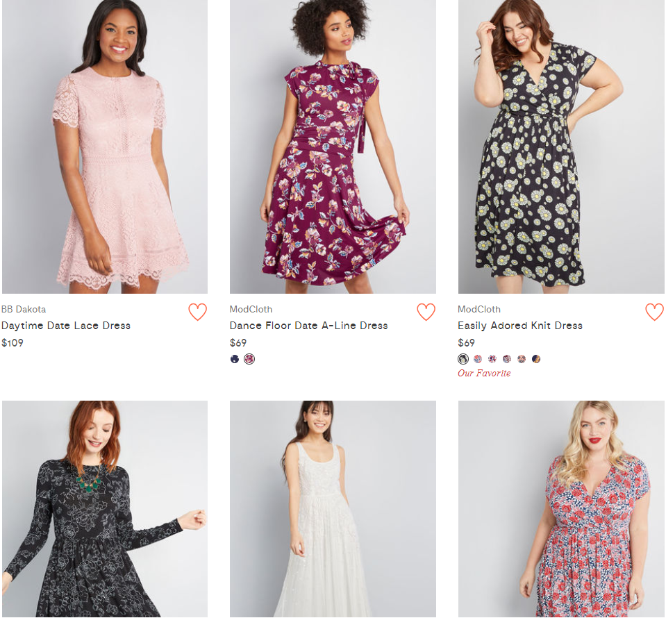
Modcloth uses a consistent style for their product images.
The Modcloth brand plays it smart by stressing the uniqueness of each product with the help of playful smiling models and corresponding shooting environment.
Warby Parker
Photographing glasses is somewhat similar to photographing jewelry – glasses are shiny and intricate.
Shoppers are specifically looking at the frame shape and color, so product photos have to emphasize the details well
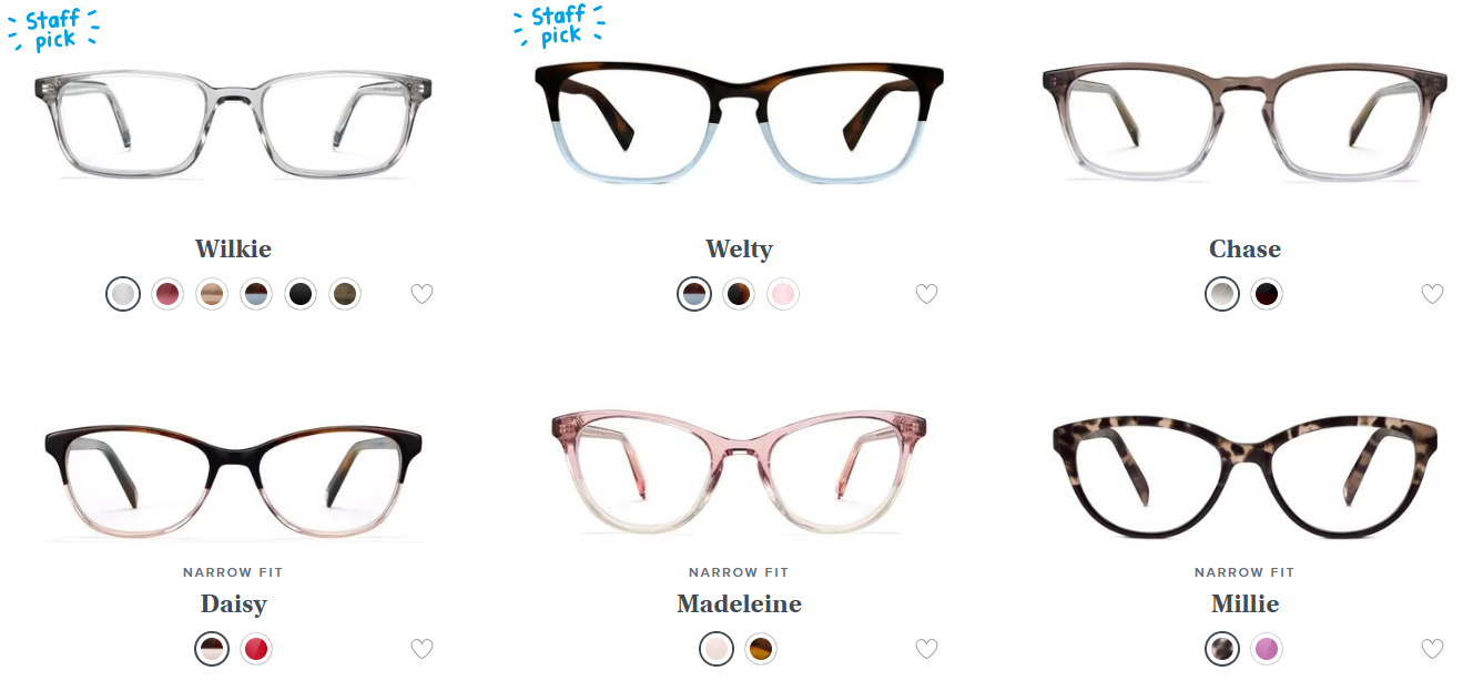
Warby Parker displays all their glasses on a clean white background.
Warby Parker does a good job of displaying its products. All the glasses are on a white background, which helps shoppers easily compare the frame colors and shapes.
The overall site design has a white background too which makes the whole visual experience smooth and appealing.
Moschino
Since Moschino positions itself as provoking and daring, the brand uses an unusual approach towards product photography.
All the products are displayed on either a white or grey background, which, without a doubt, places additional emphasis on the bright product colors.
Another interesting thing is: Moschino does not show the faces of the models in the product catalog.
Initially, the products are displayed alone but upon hovering the image, it will change to a photo of a model, wearing the product – but with no face shown!
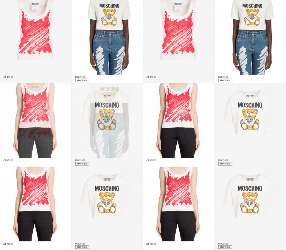
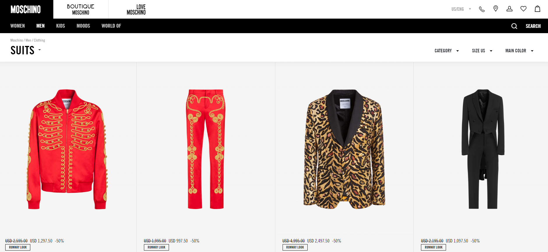
Moschino displays all its products on a white background.
My best guess is that the brand does not want to distract the user with a certain person but instead, aims to show how the product looks on a person and lets the shoppers imagine themselves in place of the model.
Barx Sox
All photographers know one common truth about the art of photography: a lot depends on lightning and how wisely you use it.
You can check the biggest tips on how to work with the different light types here, but for now, have a look at Barx Sox website.
Barx Sox offers dog-themed fun socks and the brand seems super casual and fun.
If you look at the product photos on its homepage, the brand used natural light and surroundings (aka street photography) to display the brand’s nature in the best manner.
Barx Sox is a really good example of being casual and fun yet stylish.
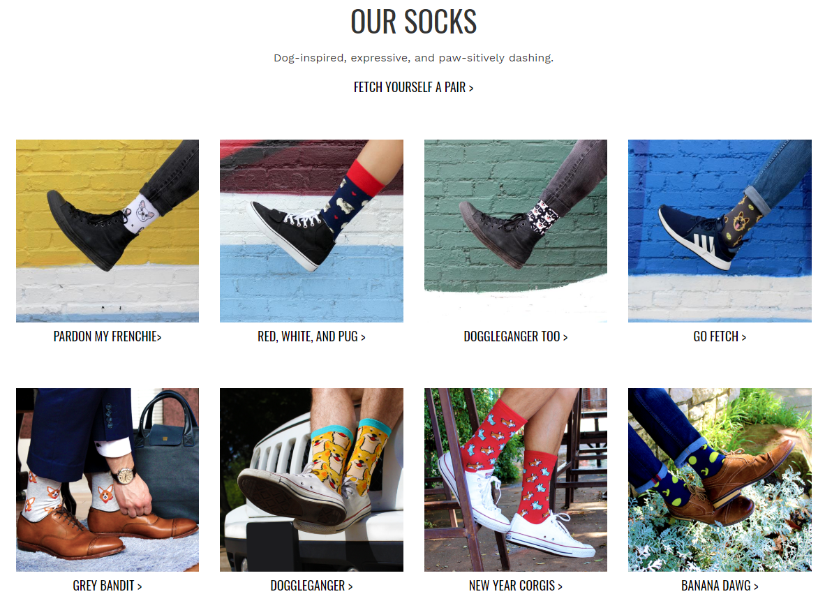
Barx Sox’s product catalog
Other awesome tips to steal from Barx Sox:
- Photo of socks with various footwear and clothes to showcase product ubiquity
- Showing the photos of a “naked” product and a packaged version
- Placing real dogs in the photos.
Fenty Beauty
The beauty products by Rihanna won the hearts of thousands of shoppers and their visuals correspond to its brand identity.
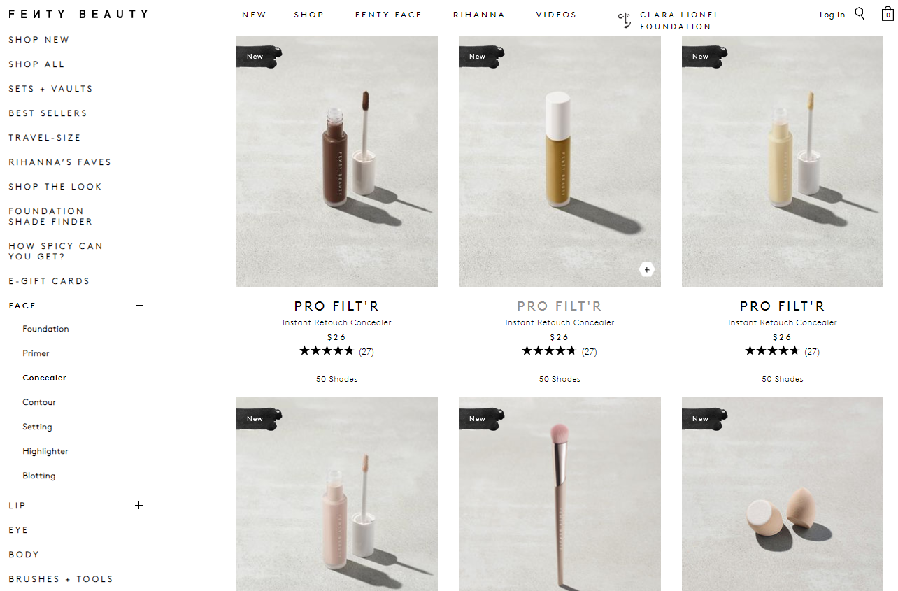
Fenty Beauty product page
In addition to the overall warm and pastel colors, Fenty also has a signature way of displaying its products. They are all photographed outdoors, in what seems to be natural bright light.
All products stand on concrete pavement and cast a shadow. What’s also interesting is that they have set up the light so the light direction is the same for all the products (check out the shadow!).
How to rock product photography for your ecommerce store
Photos of your products serve as your brand trademark and an introduction to your store. Think of it the same as of brick-and-mortar stores.
When a shopper enters a physical store, they are attracted to the product that grabbed their attention first. The same works for online stores.
The shopper will look at your products first and then, based on their first impression they will decide which ones they would like to examine further by clicking through to the product page.
So, your task is to display your products in the best manner and show off the best features straight away.
When planning your product photo shoot, it is important really think how you would like to showcase your products on the website.
And one of the biggest questions to keep in mind is how do you take product photos in a way that they correspond to your brand’s identity?
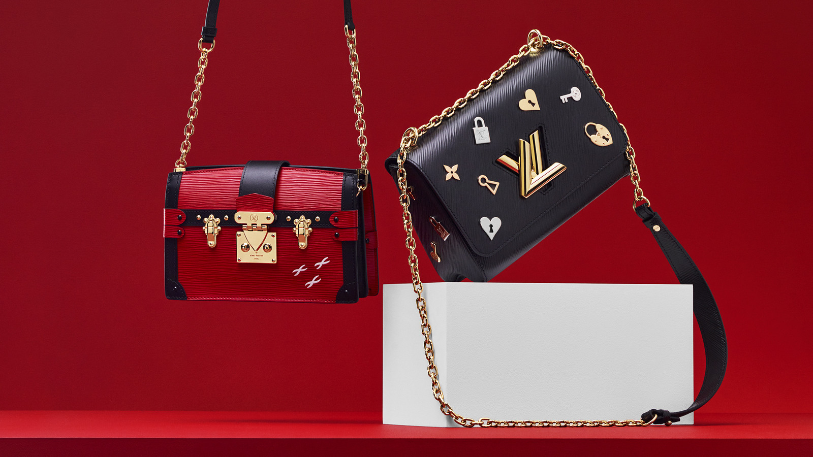
Louis Vuitton’s example of imagery that supports their brand identity
Consistency is one of the core factors that form the general impression of a brand and encourage consumers to discover your products and (ideally!) buy them.
So before choosing where and how you will shoot your products, outline the following:
- How would you like your products and brand to be perceived?
- What are the main colors of your website? Which color would suit it the best?
Tip: Take some test photos and conduct an A/B test to see what kind of background and color palette gets a better conversion rate.
After you come up with a clear vision of how you want your products to be represented, you can start thinking about your lighting, background, hiring models and any angles that you would like to include to show off the products’ features.
For more information and detailed steps on how to achieve the perfect product photo, take a look at our complete product photography guide.
Product content is crucial to succeed
88% of the shoppers claim that detailed product content is crucial for their purchasing decision and ecommerce product photos are a vital part of product representation.
Experiment with your product photos, and don’t forget about post photo editing and you’ll be amazed to see your conversions grow as soon as you refresh the look of your online store.
Author Bio
This blog was written by Irina Linnik. She’s a marketing specialist at Onilab – a Magento troubleshooting company. Being a savvy e-commerce observer, Irina always keeps abreast of innovation and cover the latest industry trends. Her goal is to inform the readers in a clear, understandable and enjoyable manner and help them navigate through the vast and ever-changing business environment.


