Not all product page experiences are created equal.
There are a ton product page designs that are sub-par. Shoppers won’t spend more than five seconds browsing.
Then there are high-converting product pages — pages that are so rich in content that most visits turn into a sale.
As a business, you most definitely want to aim for the latter.
This week, we’re deviating from our usual product page teardown and are reviewing two ecommerce stores (Sephora and ASOS) that sell the same brand and product, Dr. Jart.
We dig deep into their product pages because we want to inspire you to optimize your store.
To accurately assess the performance of both brands, we’re following our basis of the critical elements a product page should have.
Let’s begin.
The layout of the collection page
A collection page is the display of your entire product catalog.
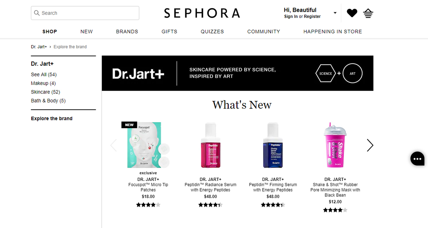
Sephora divided the Dr. Jart collection page into different parts: new arrivals, best sellers, and product lines.
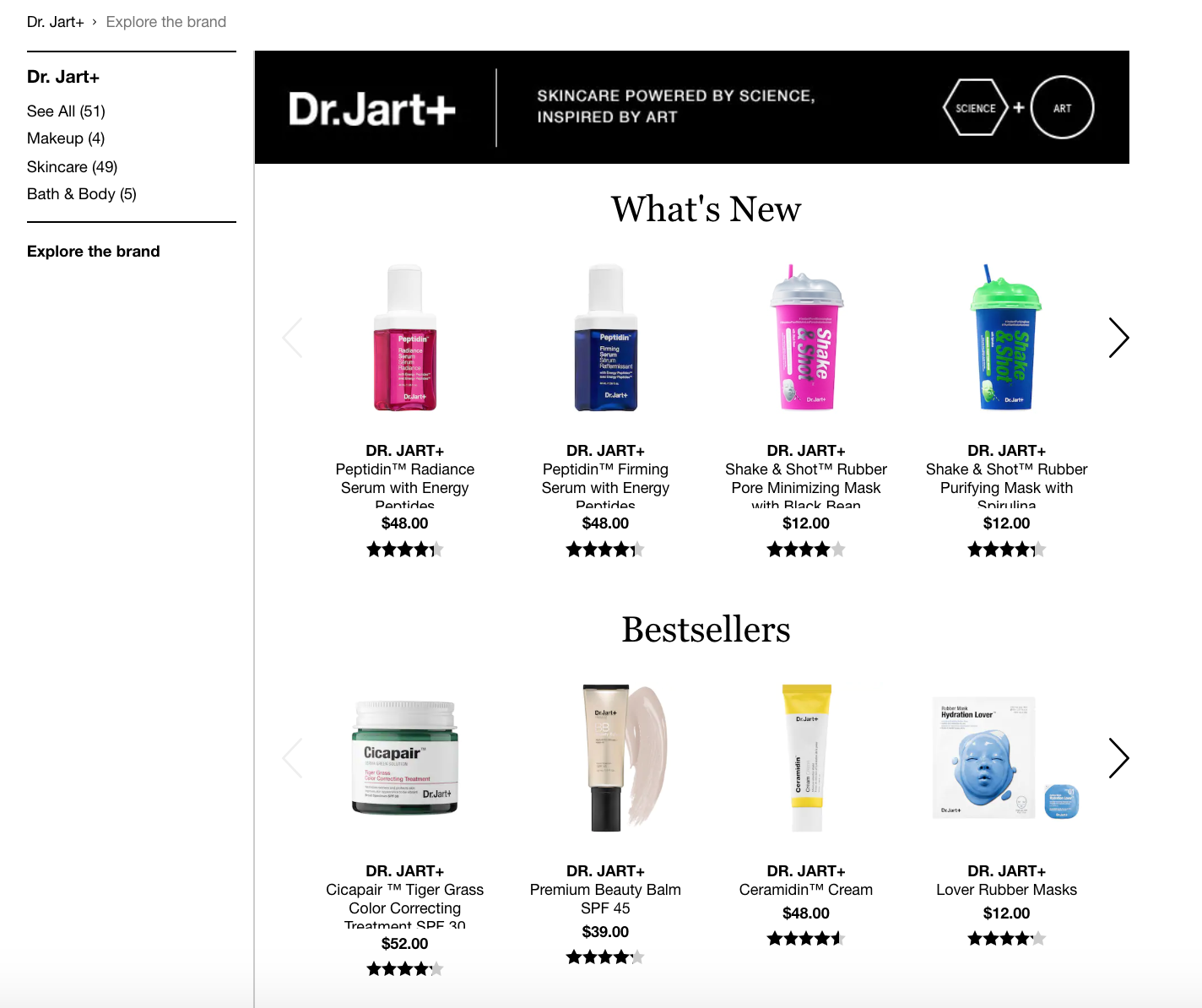
The clear division among the categories helps shoppers find what they need as quickly as possible.
They no longer have to scroll through rows and rows of products to locate the item they want to add to their cart.
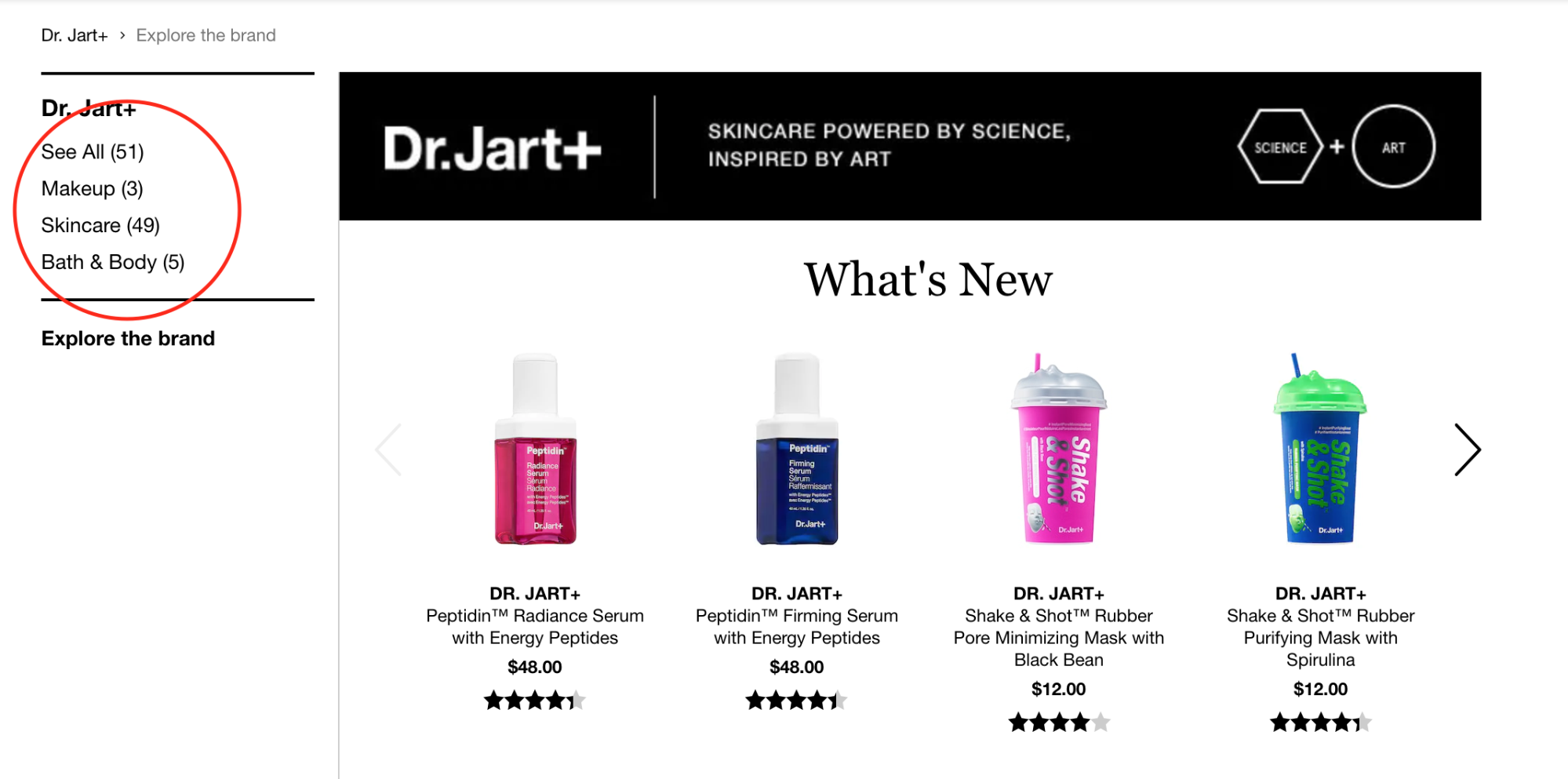
Sephora’s sidebar includes a list of links that break down the products into three distinct sections: Makeup, Skincare, and Bath & Body. The sidebar helps the shopper filter the store’s vast product catalog.
Sephora has added a “Behind the Brand” section on the collection page to give a brief overview as to what Dr. Jart is all about.
ASOS’ Dr. Jart collection page lays out the products in a grid, but not in a way that it looks cluttered.
At first glance, the page looks a tad bit overwhelming given that there are tens of products present, but there’s a filter on top that shoppers can use.
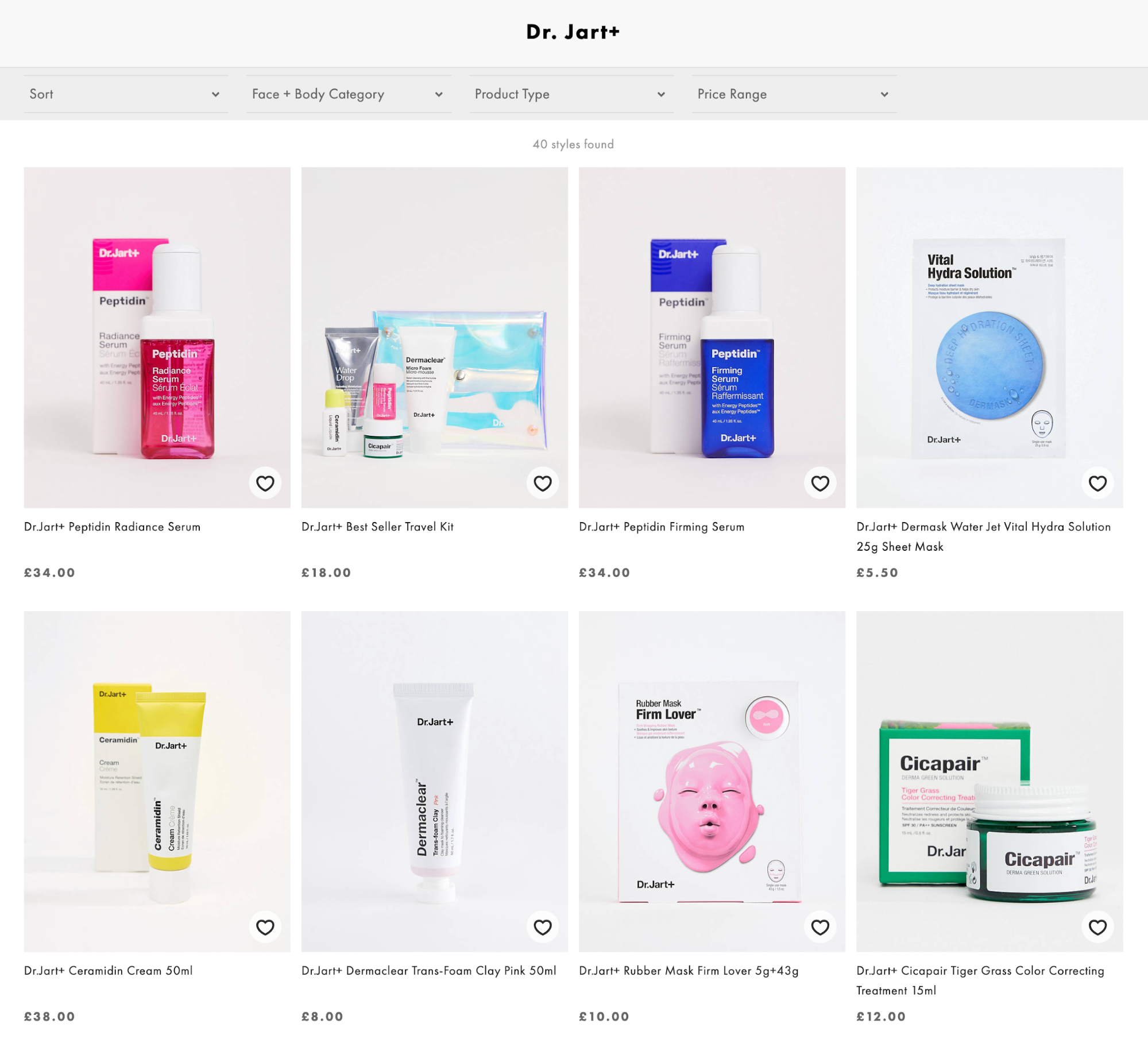
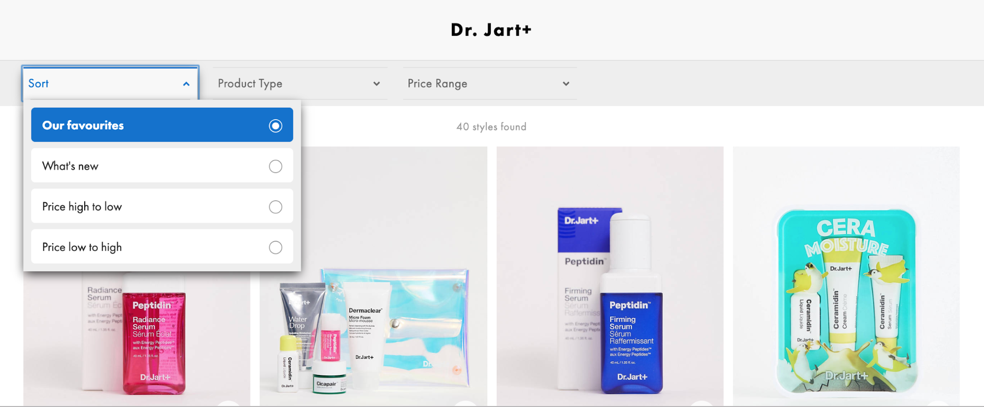
They have a drop-down filter menu that lists categories similar to Sephora’s favorites, new arrivals, and price range.
You should have a filtering option on your store. Just imagine that you’re in a bookstore trying to find a particular title. If the author and subject aren’t organized on the bookshelves, you wouldn’t be able to find the book you’re looking for. You would be forced to look through each row and aisle until you’re tired and give up.
The same goes online. While it’s much easier to browse through products by scrolling up and down, do your potential customers a favor and organize your products.
Product photos and imagery
Time and time again, we’ve repeatedly emphasized the importance of high-quality product photography for your ecommerce store.
Why?
It’s simple: your sales are heavily contingent on your photos since customers use them to make buying decisions.
Considering that these Sephora and ASOS are high traffic retailers, you can only expect that they deliver photos of exceptional quality across all platforms.
Both sites boast professional-looking and consistent imagery, but they differ in terms of presentation and style.
Sephora showcases images taken on a white background, similar to what you would see in a magazine. Displaying images like this provide a uniform look and can eliminate distractions in comparison to lifestyle images.
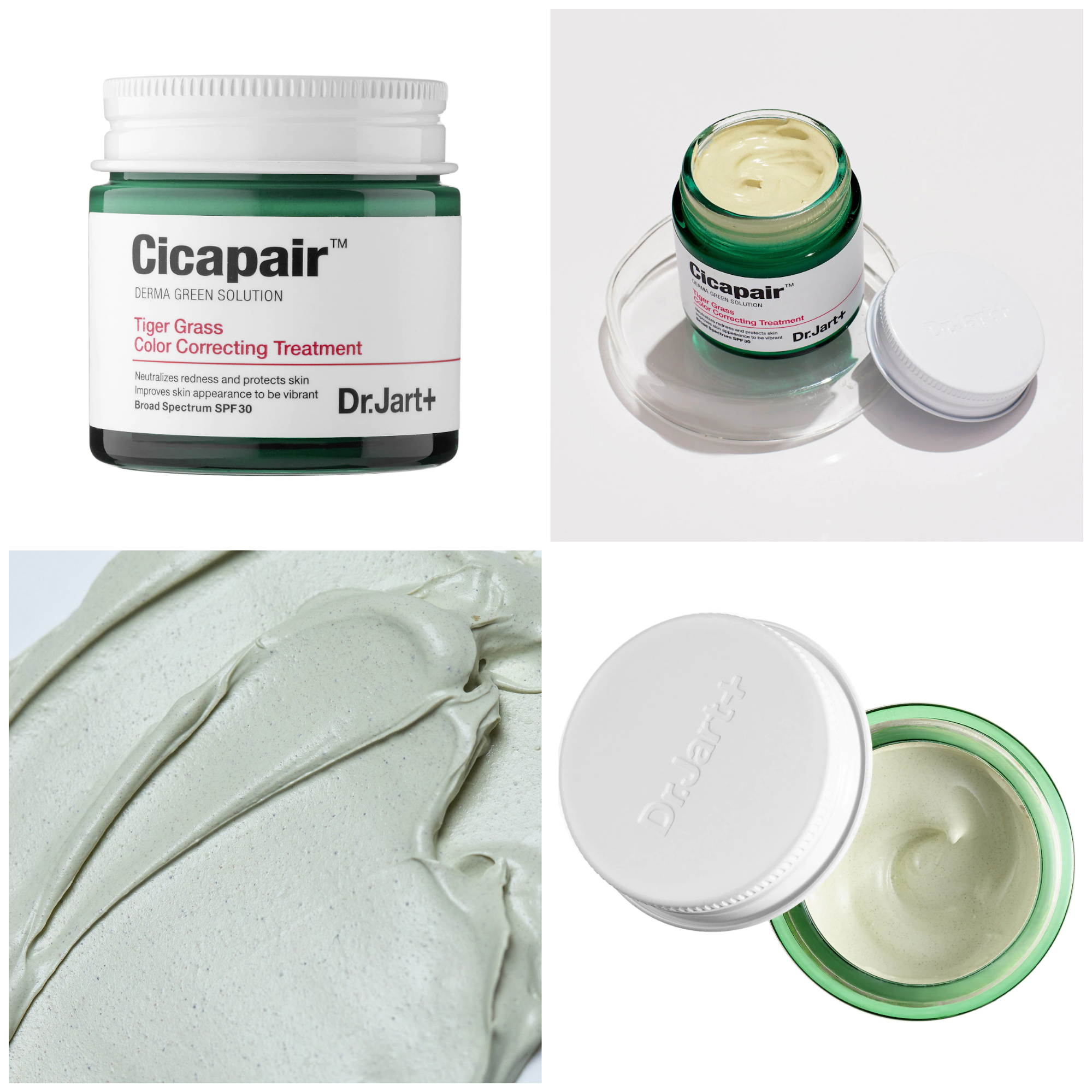
They also include a fair bit of image variety. They include photos from different angles and capture the texture of the product to help shoppers imagine how it would feel if they were to apply it to their skin.
For this particular product, it’s apparent that the cream is a bit on the heavy side when applied it probably feels rich and buttery.
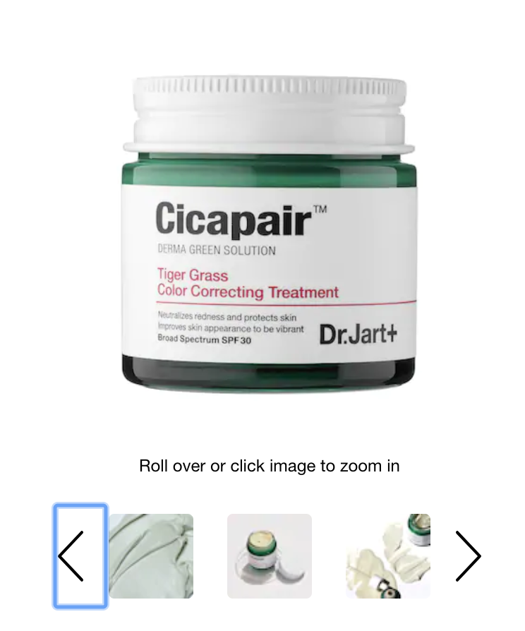
If there’s a downside as to how Sephora showcases their product, it’s that they appear small especially when viewed using a desktop computer. If a shopper wants to scrutinize the image further, there’s an added step of clicking on the photo and zooming in.
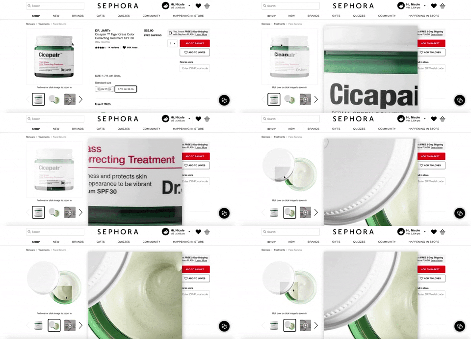
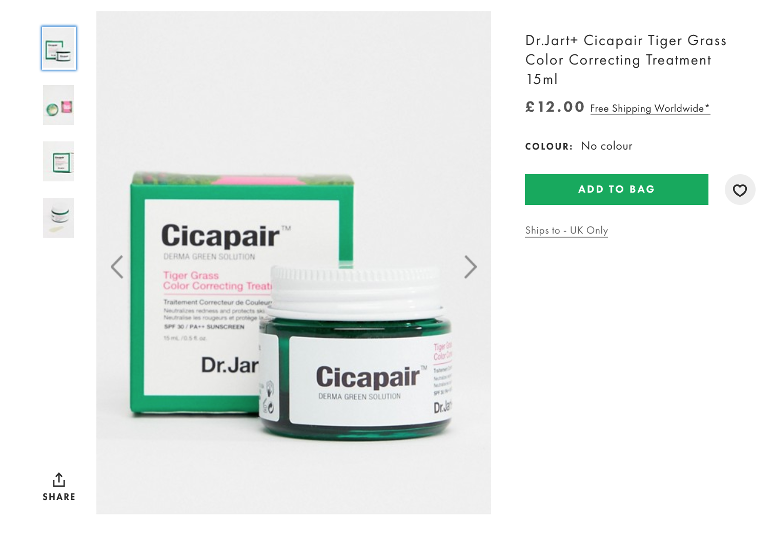
On the other hand, ASOS’ hero image is large enough not to require zooming. However, shoppers can do so if they wanted to.
And as opposed to Sephora’s clean look, ASOS’ product photos still contain the background. Their images look like they were pulled from an Instagram feed. This works for ASOS considering they are targeting a younger demographic.
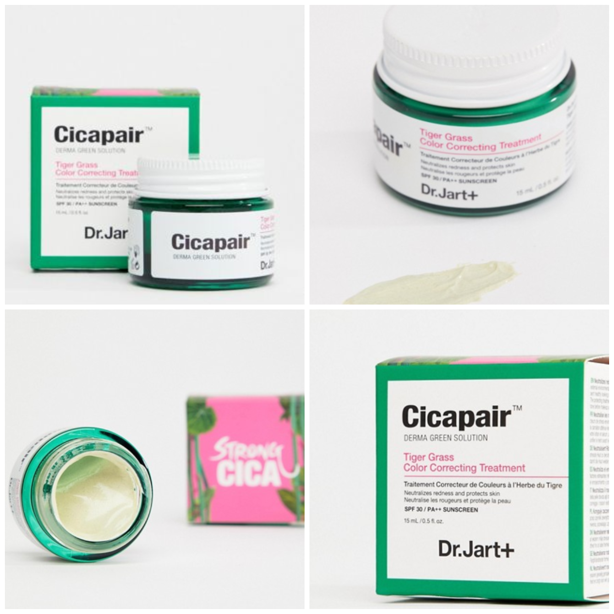
These sites can get away with having opposing ways of presenting their products because they have completely different target audiences.
Sephora is a retailer whose market is higher-income men and women. This explains why their images are cleaner and more professional.
Meanwhile, ASOS’ target market is a younger demographic, which explains why their images look more like lifestyle photos. But even if this is the case, they make sure that everything still seems professional and consistent.
What works for one store may not work for yours. It always helps to look into what appeals to your target audience before you begin shooting your products.
If you have an older market, maybe Sephora’s strategy would work for you. And if your shoppers are mostly young, you can consider adopting ASOS’ approach.
The layout of the product descriptions
Product descriptions can be just as important as your product photos.
They work in conjunction with your imagery to inform shoppers what they need to know about the product. Your product descriptions should communicate the value of the product. The copy should tell a story and elicit emotion from the shopper, so they’ll be compelled to purchase the product.
Sephora’s product descriptions offer more value because they include the item’s purpose, benefits, ingredients, suggested usage, and shipping information.
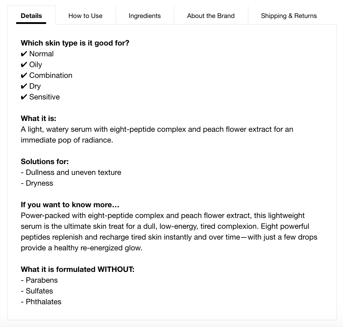
Sephora includes a lot of information. The shopper doesn’t have to do any other research once they hit the product page because they cover skin concerns, ingredients, suggested usage and how to include it in their daily regime.
Meanwhile, ASOS’ approach to product descriptions is relatively brief and concise.
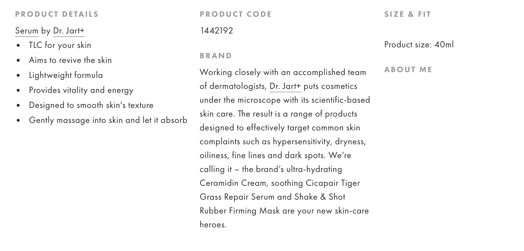
Their product pay includes a ‘Product Details’ section which lists down the features of the product in easy-to-read bullet points. It describes the formula of the item, its main benefits, and suggested usage.
While having a more detailed description is preferable, cutting it into small chunks of text may be more helpful to mobile shoppers, or those who are eager to shop but not necessarily have all the time in the world to read. This type of shopping behavior is more common in millennials, who are ASOS’ primary target audience.
In addition to the brief product details, there’s also a Brand section which describes Dr. Jart as a whole. This helps the shopper who is unfamiliar with the brand know more about it, and hopefully help them make a decision.
When writing product descriptions, you have to know your target market and understand their wants, needs, and frustrations.
Come up with a list of questions they may have.
When you have all the information, structure your product descriptions in a way that relates to them and gets them to make a purchase.
Social proof and customer reviews
There’s a reason why we’re more compelled to purchase products recommended by our friends.
It’s often because of hearing someone else’s experience — especially from people we know and trust — about the product/service helps it have credibility.
Online shopping follows the same principle. Buying a product because of the hype is one thing, but the individual ratings and reviews shoppers post on your site are what helps other shoppers decide whether an item is worth parting with their hard-earned money.
Sephora is exceptionally good at aggregating user ratings and reviews.
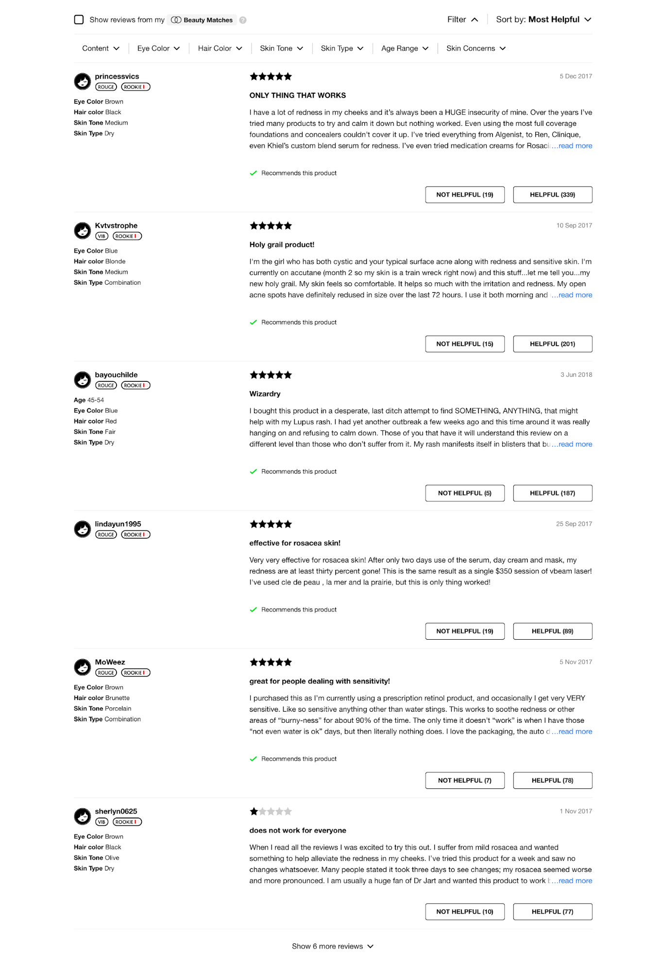
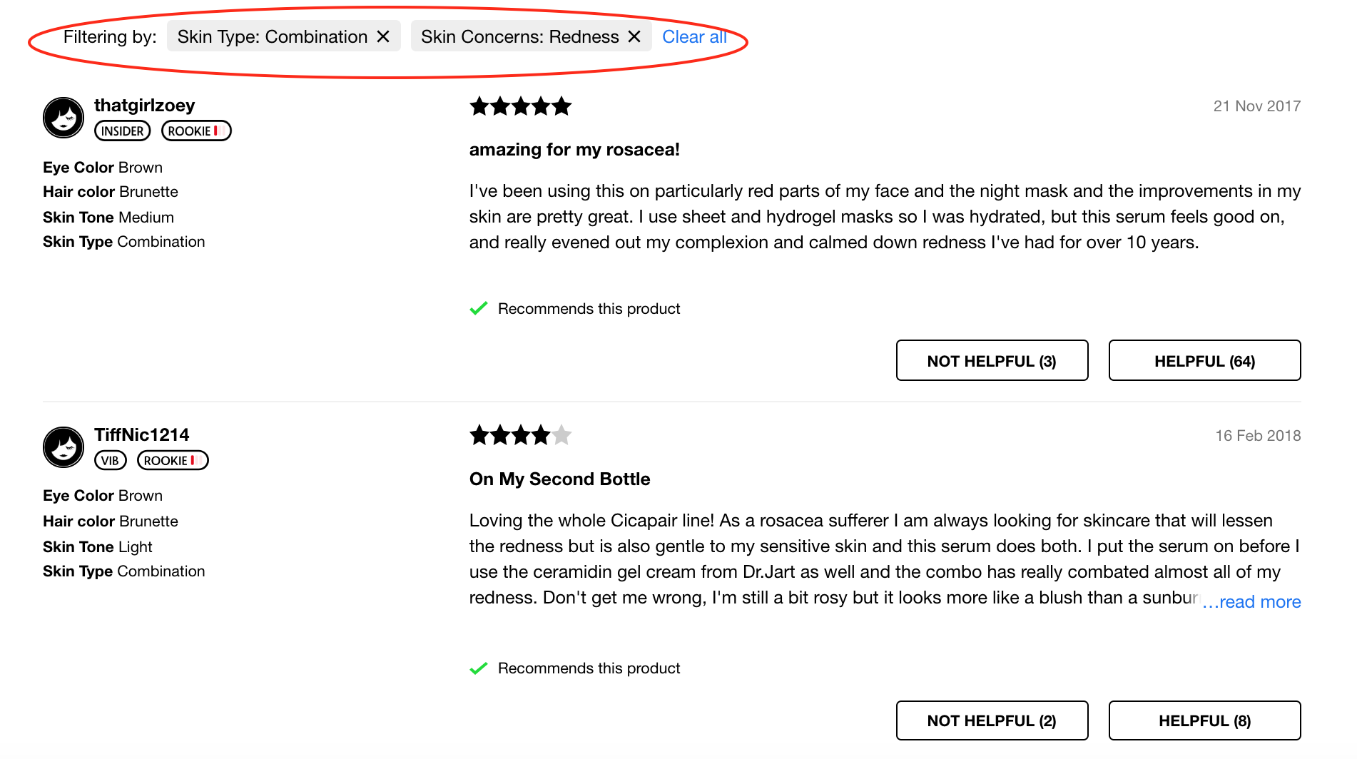
They do not only list every review that comes in, but they also provide a way for shoppers to filter the reviews, so they can read the reviews from shoppers that are of a similar age range, skin type, skin concerns, etc.
Say a shopper exhibits combination skin and suffers from redness, they can filter the reviews to only read those from other customers with the same skin type to better gauge whether a product will be suitable for them or not.
Unfortunately, ASOS does not display product reviews on their site.
Instead, they include user-generated images on their social media platforms.
If a shopper wants to hear about what other people have to say about a particular product, they need to research other channels (YouTube, other websites, blogs, etc.).
We recommend implementing a review system on your store. Customer reviews increase your credibility and majorly impact how other shoppers decide on proceeding with the purchase.
A review is a sales machine in itself. When images and descriptions don’t convince them to hit checkout, there’s a good chance that the reviews will. And reviews can help your SEO (Search Engine Optimization) too!
Upselling and cross-selling on the product page
A product page does not necessarily have to sell only one item. You can squeeze in upsells and cross-sells, too. That way, you can generate more revenue on the same page.
Sephora is aggressive in upselling and cross-selling, but they do so discreetly.
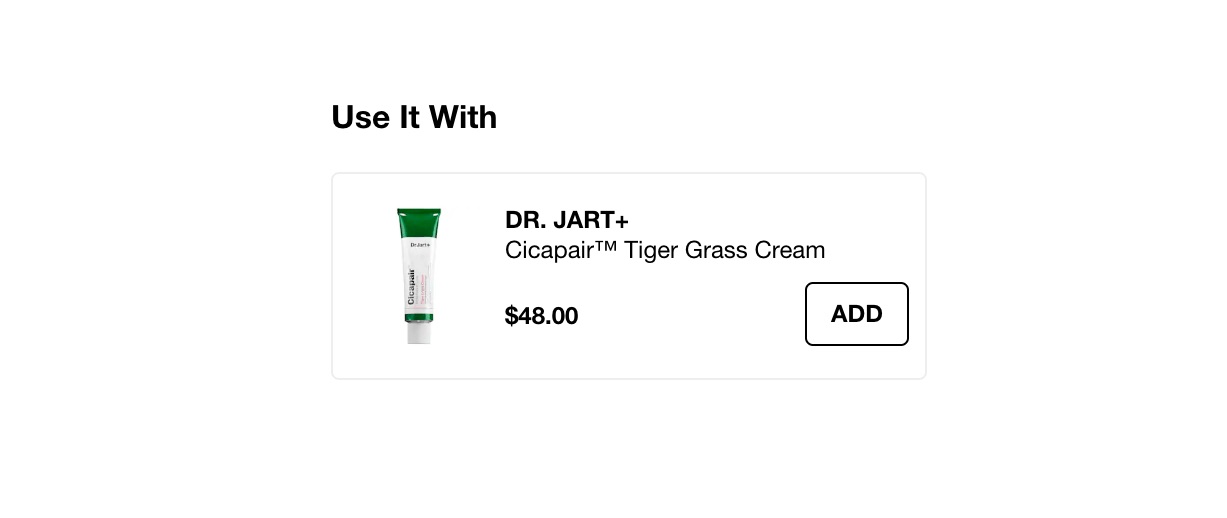
For starters, the page includes a “Use It With” section which contains items that work complementary with the main product. It implies that if the shopper wants the product to be useful, they should purchase products that work in conjunction with it.
The “Similar Products” section contains a list of items that have the same function as the hero product. Users can browse through them on the same page, helping them quickly look for an alternative should they decide that the main product doesn’t work for them.

They also have “You May Also Like,” “Recently Viewed,” and “Related Pages” sections to further push offerings on their site.
The “You May Also Like” section refers to other products that a shopper may consider using along with the main item. This list enhances product discoverability, and could potentially entice shoppers to add more products to their cart as the site has already suggested it to them.
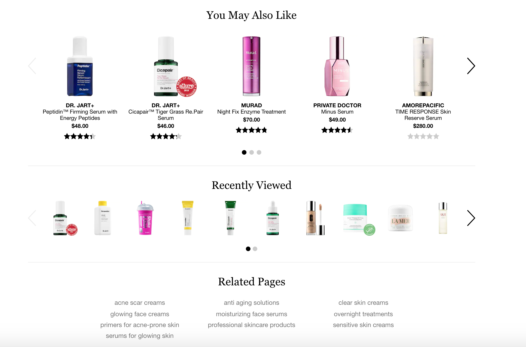
Having the “Recently Viewed” section saves the shopper from having to navigate back to the items they were previously looking at.
As for the “Related Pages” section, it features a list of related product collections that a user may also be on the hunt for. Since the main hero product is of an item that targets tired complexion, the user may also be looking for things that focus other skin-related concerns like acne and dull skin.
Similar to Sephora, ASOS also has “You Might Also Like” and “Recently Viewed” sections to enhance product discoverability and improve the user experience.
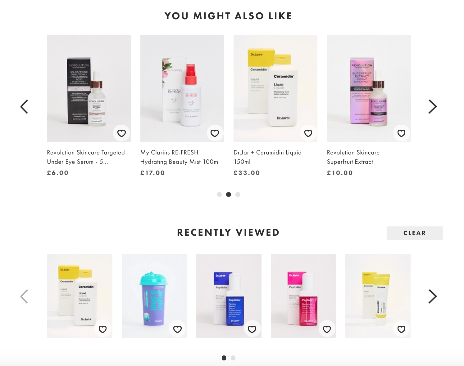
Upselling and cross-selling are optional but by incorporating them in your store you could increase your bottom line.
Luckily, eCommerce platforms like Shopify, BigCommerce, and Volusion have plug-ins and apps that allow you to include these sections on your product page.
Key takeaways from their product page design
Tip 1: Allow shoppers to filter your collection pages for easier navigation.
Tip 2: Make sure that your product descriptions are easy-to-read and scannable.
Tip 3: Include upsells and cross-sells sections to boost your store’s revenue.
Tip 4: Customer reviews are your friend.

