Some ecommerce store owners spend thousands on creating a beautiful website but overlook the importance of good product images.
They’ll do well to take to heart a big secret: the quality of your product images has the power to heavily boost online sales.
Why are images so important?
Humans are visual creatures, and we are instinctively drawn towards images over text because we can absorb and process their meaning with less effort. In fact, most of the information transmitted to the brain is visual.

Think about the power of amazing images in an offline context. Food magazines make our stomachs grumble, fashion catalogs make us rethink our entire wardrobes, and travel advertisements always seem to convince us that we’re in desperate need of a holiday.
If we apply that to the digital world, images have the same power and can boost online sales. Think of increasing your online sales as a two-step process.
Firstly, you want to reduce your bounce rate – the percentage of visitors to your website who navigate away after only viewing one page.
Secondly, you want to improve your conversion rates, which in this context refers to the percentage of visitors who actually buy your products. If you impress people with how you visualize your product online, they will be more inclined to browse your website and even make a purchase.
So how do you visualize your product online? I’ve narrowed it down to four important things to consider when choosing a product image: context, authenticity, background, and size (or CABS if you like acronyms).
1. Context
Yes, a picture is worth a thousand words, but only if it’s the right picture. Don’t use unrelated images on your website. There needs to be a reason behind every photo you upload. ‘It’s a cool photo’ is not a good reason. Remember that your product image focuses on the product – hence the term ‘product image’.
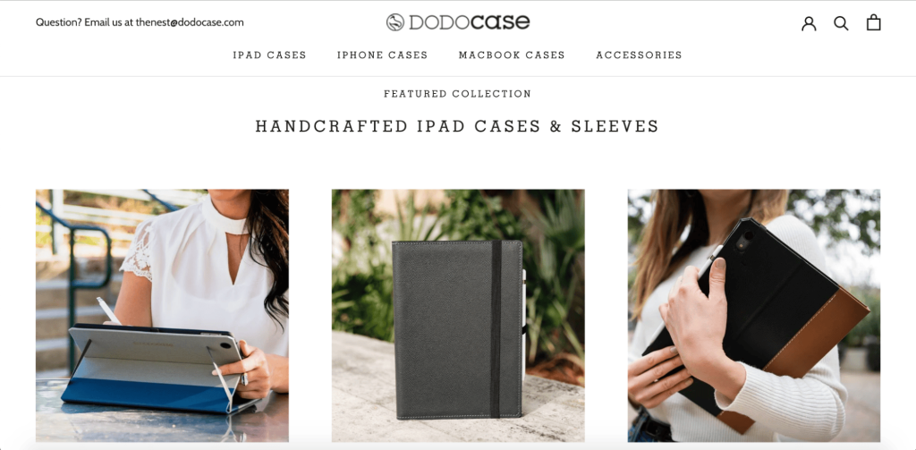
You want visitors to know exactly what you are selling. Ask yourself, does this photo directly relate to the product I’m selling? Does it highlight the main features of the product?
2. Authenticity
While online shopping has many advantages, you don’t have the experience of physically touching and seeing the product in real life.
Obviously, you can’t replicate reality online, but you should aim to represent your products as authentically as possible so that customers know exactly what they’re buying. You can compensate for the lack of physical experience by using good photographs. This may sound like a no-brainer, but don’t use cartoons or drawings for advertising your product.
Product images that rotate 360 degrees are effective but expensive because you have to hire someone to make them for you. That becomes costly when you’re selling multiple products.
Every product has a ‘hero image’ — the image representing the product, whether it’s the only photo available or the first of a series. Why not take three to five photos of a product from different angles, or close-ups of certain features, and upload them as part of a series behind your awesome hero photo? This will enhance your visitor’s viewing experience compared to using only one photo.
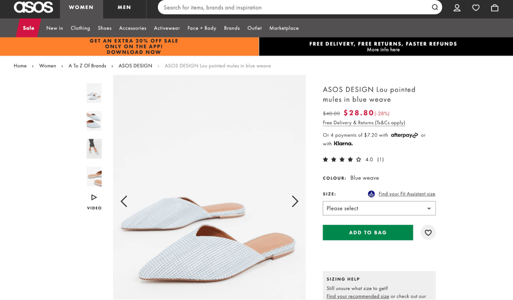
Check out the screenshots of ASOS’s product images for a shoe. The hero images are of the shoes by themselves, but you can also zoom in, view photos of the shoes from different angles, and see photos of what the shoes look like when worn.
Further, photographing the product on a human or a mannequin is a great idea if you’re selling clothing or footwear. It makes it easier for the customer to visualize what the clothing looks like when worn, compared to using flat lays.
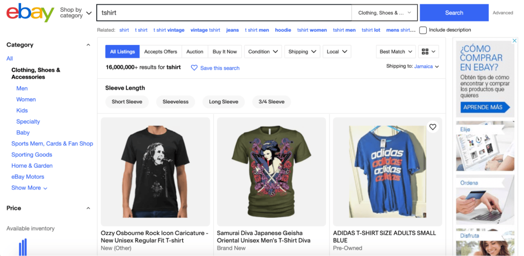
A side note if you’re selling used items: use your own photos! Don’t download stock photos or Flickr images or upload dodgy screenshots from the original product catalog.
If you’re selling a previously used item, upload a photo of the product in its current state. Of course, it won’t look as shiny and new as the original, but at least people will know exactly what they’re buying.
Think about when you’re shopping for a T-shirt on eBay, and a catalog photo is accompanied by the description ‘Used: An item that has been used previously. The item may have some signs of cosmetic wear, but is fully operational and functions as intended’.
It’s tough to feel comfortable bidding on that shirt because the potential buyer can’t see the ‘signs of cosmetic wear in the photograph.
3. Background
The rule of product image backgrounds is that the background should not conflict with or distract the viewer from the product.
Be careful when using a background because it can influence a buyer’s overall impression of a product. For example, imagine an advertisement for a smartphone on a cluttered desk. Amongst a mess of pens, scrunched-up paper, and used coffee mugs, the smartphone won’t be associated with an organized lifestyle despite the product’s capabilities.
If you can’t create the perfect background image, minimize your backgrounds to something simple. No background or a simple monochromatic background can be just as effective for any kind of product.
For innovative, simple-to-use technology, a plain background enhances the sleek, powerful, and simple qualities of the product. For an artsy, creative ceramic piece, a plain background lets you focus only on the work of art itself.

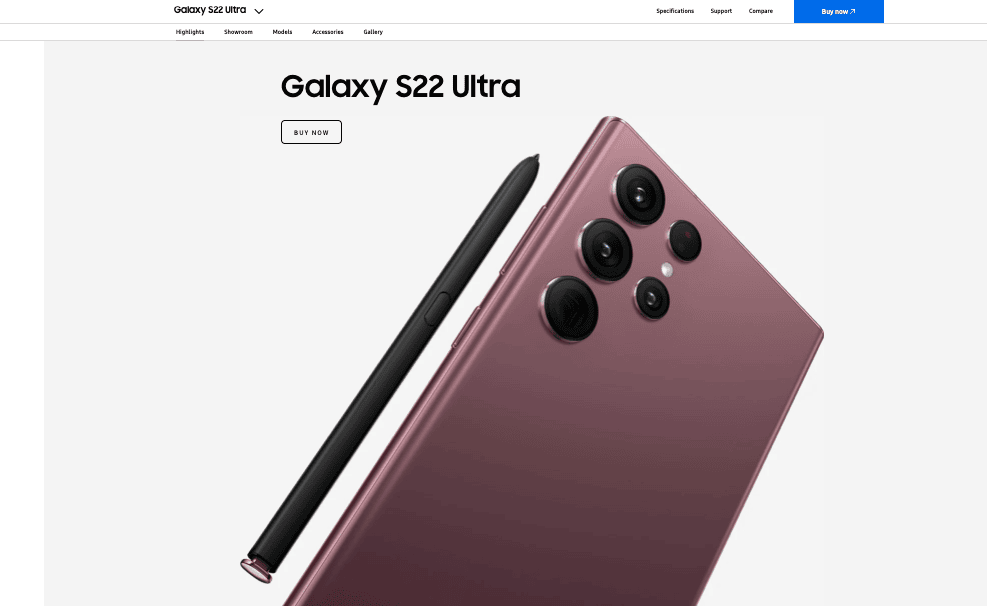
Samsung uses great product images for advertising its Galaxy smartphones and boosting online sales. Their gallery includes photos with neutral backgrounds, drawing attention to the sophisticated design of their devices, as well as photos of the product in use, where the device is always the focal point of the image.
4. Size
Your product only has a few seconds to make a positive impression on visitors, and what good is a photo that leaves your potential customer squinting and zooming into a blur of color because it’s so small?
The size of your images is important.
Use large images if you think a close-up shot of a particular feature is necessary. Present the shots with finer detail in a series after the hero image.
Skinner Auctions tested whether increasing the size of their product images from 250 pixels to 350 pixels wide would increase conversion rates. They found that 63% more of the visitors started the bidding process, and a huge 329% more visitors completed all the forms necessary to make a bid.
Bigger is better. Just remember to ensure that your high-resolution photos are optimized for the web — there is nothing more annoying for an eager online shopper than a product image that takes its sweet time to load.
According to Portent, for every additional second it takes for your website to load, your ecommerce conversion rate decreases by an average of 0.3%.
So go out and make CABS work for you
Think about how much time and/or money you spend on either designing your site, acquiring or making your products, writing blog posts, updating your store’s social media, and advertising.
Putting in a bit of effort to have awesome product images doesn’t seem like that much work now, does it?
Deploy CABS for your online store, and you’ll see amazing results for your business. Try it, and let me know how it works for you!

