
In ecommerce, the key to success is knowing how to boost conversions effectively. It’s not just about drawing traffic to your site. It’s about converting that traffic into loyal customers. Don’t lose sight of your end goal – growing your sales and increasing your repeat customers.
In this blog, we’ll unlock the secrets of conversion rate optimization. We offer you a treasure trove of strategies that go beyond the basics. Whether you’re just starting out or a seasoned online retailer, the following insights will help you transform your online store into a sales conversion powerhouse.
Decoding conversion rates: The ecommerce catalyst
Conversion rates are the silent narrators of your online success story. They’re not just numbers but reflections of customer behavior, satisfaction, and the effectiveness of your marketing efforts.
Imagine this: a slight tweak in your website’s design or a new payment option could increase sales dramatically!
Understanding conversion rate mechanics
Let’s break down the nuts and bolts of conversion rates. You’ve probably heard the term thrown around a lot, but what does it really mean for your ecommerce business?
Essentially, a conversion rate is a clear indicator of your online business performance. It’s calculated by dividing the number of conversions (like sales or sign-ups) by the total number of visitors, then multiplying by 100 to get a percentage.
Say your site had 10,000 visitors last month, and 200 of them made a purchase. This gives you a 2% conversion rate.
Why does this matter? Well, this little number is a powerhouse of insight. It tells you straight up how effective your site is at persuading visitors to take the action you want.
A high conversion rate means your site is a well-oiled machine, efficiently turning visitors into customers. Conversely, a low rate could be a red flag that something’s not clicking with your audience, whether it’s your product offerings, website design, or customer engagement strategies.
By understanding your conversion rate, you’re equipped to make targeted improvements.
The impact of user experience on conversion rates
Now, let’s talk about user experience (UX). Believe it or not, how your website feels and functions can make or break your conversion rates. Ever left a website because it was too clunky or hard to navigate? That’s UX failure right there.
A smooth, user-friendly website can be your secret weapon in turning visitors into customers. We’re talking about everything from the layout and loading speed to how easy it is for customers to find what they’re looking for.
Good UX is about creating a seamless, enjoyable online shopping experience. And guess what? When customers enjoy browsing your site, they’re more likely to stick around and buy something.
Leveraging analytics for conversion insights
Data – it can be overwhelming, but it’s gold when it comes to boosting your conversion rates. Here’s where we get into the meat of leveraging analytics for actionable insights.
Analytics tools are like a high-powered microscope for your website, showing you who’s visiting, how they’re navigating, and where you might be losing them. You need to know how to interpret this data to make smart changes.
Think of it as detective work. You’re looking for clues in your website data to solve the mystery of why visitors might not be converting. This isn’t just about tracking numbers. It’s about turning those numbers into strategies that drive real results.
Proven strategies to boost your ecommerce CRO
In the world of ecommerce, there’s no one-size-fits-all solution if you want to boost your conversions. It depends on the current status of your online store and how things are currently set up. Fortunately, we’re here to guide you through a mix of tried-and-tested tactics and some out-of-the-box ideas that could be your golden ticket.
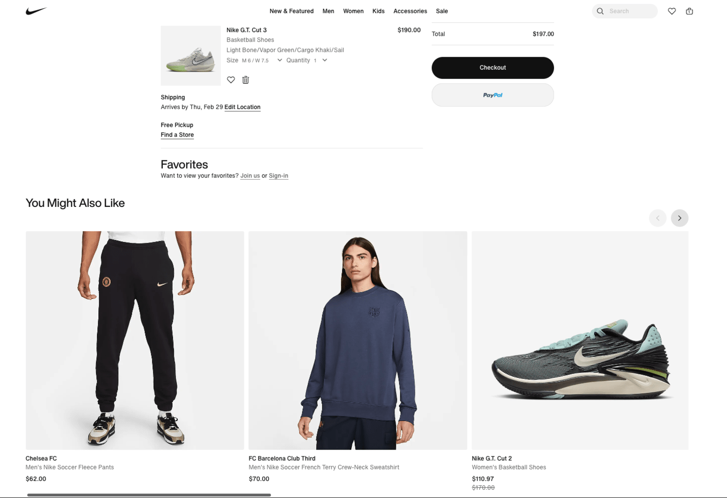
Streamlining the checkout process
Alright, let’s talk shop – specifically, the checkout process. It’s like the final lap in a race. You want to make it smooth and hurdle-free. Make it complicated and that’s a surefire way to see those carts abandoned.
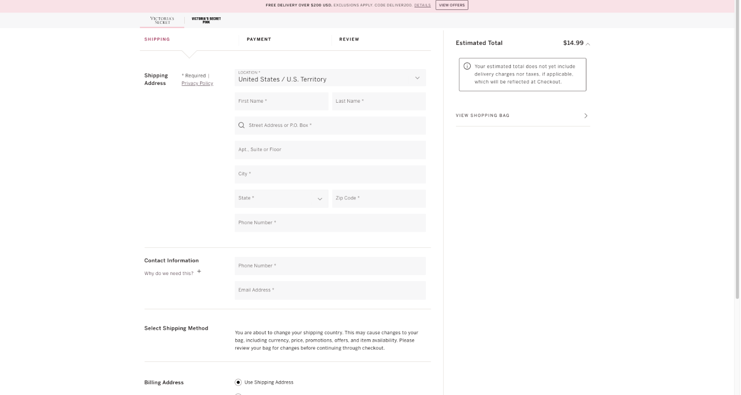
When it comes to the checkout process, focus on simplicity and accessibility. Here are three things you can work on:
- Design with Clarity – Here’s the deal – your checkout page should be as clean as a whistle. Think minimal text, clear instructions, and no visual chaos. It’s all about guiding your customers through with ease. Keep it simple, clear, and fast.
- Auto-fill Magic – Who doesn’t love a bit of convenience? Auto-fill for your returning shoppers is like rolling out the red carpet. It speeds things up and shows you care about their time.
- Error Handling – Have you ever hit a snag at checkout and received a cryptic error message? It’s frustrating, right? Your site should flag errors and help you fix them quickly. It’s about keeping that checkout journey smooth and stress-free.
Mobile Optimization: Crafting a mobile-first experience
We live in a mobile-first world. Making your online store mobile-friendly is non-negotiable. In fact, Google has long emphasized mobile-first indexing, and if you don’t keep up, your conversions will definitely suffer.
Here are some actionable steps to enhance your site for mobile users:
- Responsive Design: Ensure your website adapts seamlessly to different screen sizes. Use responsive design techniques, and don’t forget to test your site on various smartphones and tablets to identify and fix any issues.
- Simplified Navigation: Mobile users must quickly find what they’re looking for. Streamline your navigation by using a simple, intuitive menu. Implement a sticky header at the top of the screen, providing easy access to essential links without needing to scroll back up.
- Touch-Friendly Design: Ensure buttons and links are large enough to be easily tapped with a finger. Avoid small text and ensure there’s enough spacing between clickable elements to prevent accidental taps.
And don’t forget about keeping your mobile SEO sharp; it’s all about staying current and ensuring your site is playing well with local searches and loading at lightning speed. Regular updates? They’re your best friend in the digital world.
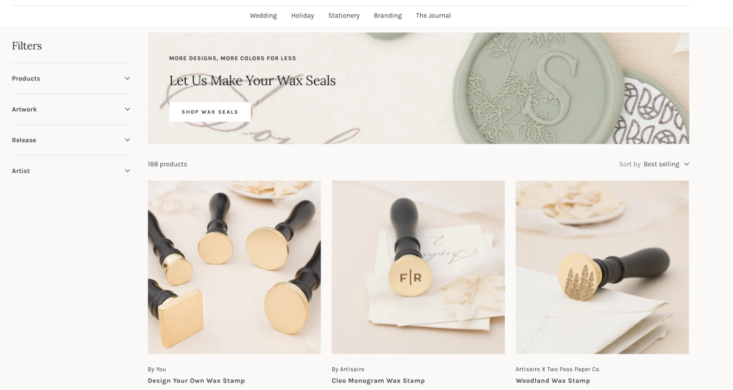
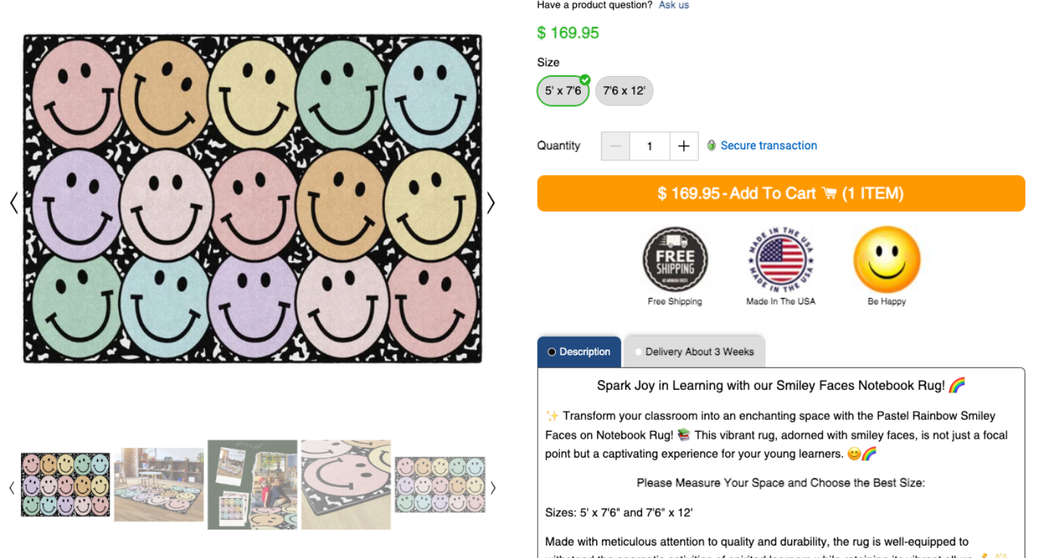
Elevating product visualization
Think about it, great pictures and videos are like the secret sauce of your online store. They do more than just make things look pretty. They’re about getting your customers to hit that ‘buy’ button. Using top-notch visuals, you’re not just showing off your product; you’re telling its story.
- Highlighting Benefits with Realism – When you’re showing off the best bits of your products, nothing beats real, crisp photos. It’s like giving your customers a sneak peek into how awesome the product is in real life. They get to see the product doing its thing, making it way easier to picture it in their own lives.
- Downplaying Negatives with Unreality – Do you have a few not-so-great points you don’t want to make a big deal about? Here’s where a little creativity with graphics or cartoons can really shine. This way, you’re focusing on the fun parts, giving your customers a feel-good vibe about what they’re buying.
Remember, the key is to understand what aspect of your product you want to emphasize and choose your visual approach accordingly. Whether it’s the rugged durability of outdoor gear or the soothing effect of skincare products, your visuals should tell the story you want your customers to remember.
Crafting compelling product descriptions
Your product descriptions are your secret sales force. They do more than describe; they persuade. It’s all about highlighting benefits and tapping into customer emotions to nudge them toward that purchase.
Adding non-face emojis, as highlighted in a study, can make your ads and product descriptions more likable. These emojis should complement your words, enhancing phrases without replacing them.
Moderation is crucial; overusing emojis might overwhelm readers. It’s also important to match emojis with your brand’s voice, ensuring they align with your overall brand style and messaging.
Expanding payment flexibility
Integrating a variety of payment methods, including digital wallets, is vital in today’s ecommerce landscape. As digital wallets gain popularity, they offer a secure, fast, and user-friendly payment option, particularly appealing to mobile shoppers.
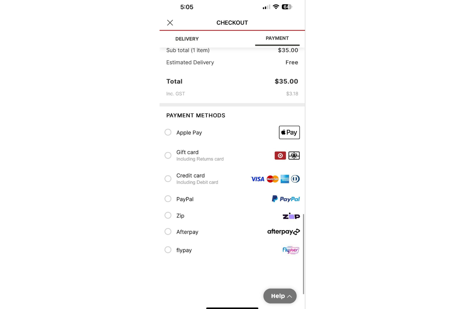
When selecting payment options, it’s important to consider your customer demographics to ensure you’re offering the methods most relevant to them. Also, maintaining a high level of security is crucial in building trust with your customers.
Implementing these various payment methods should be done in a way that keeps the checkout process streamlined and straightforward, avoiding any added complexity that could deter potential buyers.
The goal is to make the payment process as seamless as possible, enhancing the overall customer experience and potentially reducing cart abandonment rates.
Harnessing the power of social proof
There’s this cool study that sheds light on how influencers can really connect with their audience. It turns out that when they bring their friends or family into the picture, literally, it adds this genuine, trusty vibe to their posts.

Reviews and testimonials are powerful tool in building trust and swaying purchasing decisions. They act like a friend’s recommendation, giving your products a seal of approval from those who’ve tried them.
Here’s a pro tip: keeping things short and sweet in the captions, throwing in a bunch of pics, and sharing stuff on weekends makes it even better. It’s all about making things personal and real – that’s what gets people hooked and believing in what they’re seeing.
Enhancing customer support with live chat
Live chat support is not just about answering questions quickly. It’s about making your customers feel heard in real-time. Imagine the difference it makes when someone’s there to help right when you need it.
Let’s give those chatbots a real purpose. Start by creating a smooth handoff from chatbot to human support. When things get too complex for the bot, have a system that seamlessly transfers the conversation to a real person.
Don’t forget about training your human support team to be not just efficient but also genuinely caring and personal. It’s all about striking that perfect balance between quick, automated responses and the warmth of human interaction.
Mastering A/B testing
A/B testing is like your ecommerce compass, guiding you to what really resonates with your audience. It’s all about comparing two versions of a web page or a product listing to see which performs better. Think of it as a real-world experiment where your customers decide the winner.
Try jazzing up those CTAs and layouts on your website. Picture this: you strip down your homepage to the essentials, really spotlighting that one killer call to action. It’s like decluttering your closet – you highlight the gems. This could be a game-changer for guiding your visitors right where you want them.
Now, let’s experiment with your website layout. Imagine shuffling your top-notch products to the front and center of your category pages. It’s like putting your best foot forward – these crowd-pleasers get the attention they deserve, and boom, you might see your sales climb.
And when it comes to product pages, think Goldilocks – not too much info, not too little, just right. That sweet spot could be the ticket to keeping your customers hooked and hitting that buy button.
Just remember, it’s all about testing and tuning into what your visitors are vibing with. No fear, just fun with A/B testing – you might stumble on something that really clicks with your crowd!
Strategic use of pop-ups
Let’s get real about pop-ups. They can be annoying, sure, but if you use them wisely, they’re like hidden gems for boosting engagement.
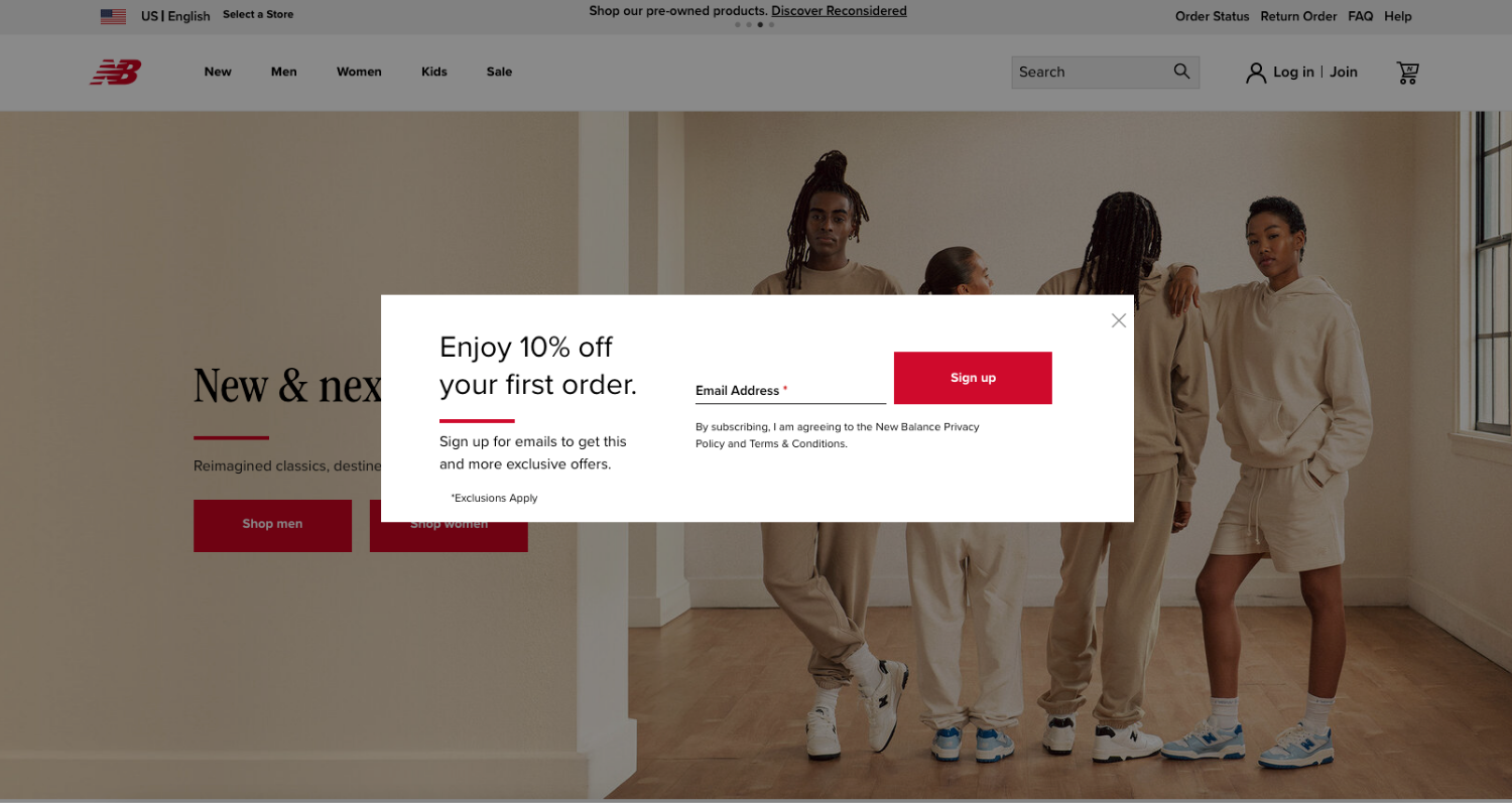
Timing is everything – pop those pop-ups at just the right moment in the user’s journey. Maybe when they’ve spent a good amount of time on a page or as they’re about to leave.
Here’s the kicker: make sure they’re actually offering something valuable. Think exclusive discounts, insider tips, or even a bit of insider info. It’s all about giving your visitors a reason to click and not just close.
Personalizing the user experience
Personalization is more than a trendy concept. It’s about truly understanding what your customers want. Your goal is to figure exactly what it is your target buyers ‘want’.
Think of it as giving a personal touch to their shopping experience. By highlighting items they’ve recently checked out or suggesting products based on their preferences, you’re showing them you pay attention.
And when it comes to email campaigns, tailoring them based on user activity can really make your customers feel special. It’s all about crafting that unique experience that says, “Hey, we know what you like!”
Streamlining online forms
You know those long, tedious forms that make you want to give up halfway through? They can be a real roadblock for your customers. The trick is to keep them short and sweet. Wherever you can cut down on the number of fields. Fewer fields mean fewer obstacles between your customers and that ‘submit’ button.
And here’s a nifty idea – use smart forms that change based on what your customer is doing. It’s like having a form that reads your customers’ mind, showing them only what they need to see. That’s how you make filling out forms feel like a breeze, not a chore.
Attractive shipping and return policies
Who doesn’t love free shipping and hassle-free returns? They’re like the cherry on top of a great shopping experience. Make sure your free shipping thresholds are front and center – it’s a major draw for customers.
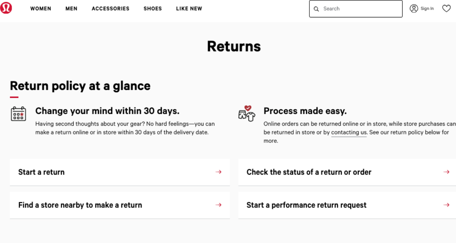
When it comes to returns, clarity is key. You want your policies to be as easy to digest as your favorite snack. Keep them simple, straightforward, and customer-friendly. That way, shoppers feel more confident and relaxed about buying from you.
Capitalizing on exit-intent technology
Exit-intent tech is like your website’s friendly goodbye wave, offering something cool just as customers are about to leave. Think about it – what if you could grab their attention with a last-minute deal or a special offer? That’s what compelling exit-intent offers do.
And hey, these pop-ups can be a great way to grow your email list, too. Imagine catching those almost-gone visitors with an irresistible sign-up offer. It’s a win-win: they get a good deal, and you get to keep the conversation going.
Boosting revenue with upselling and cross-selling techniques
Imagine you’re in the driver’s seat for boosting sales. Upselling and cross-selling? They’re your navigators. Picture suggesting perfect pairings to customers – like a camera with a stylish case. And here’s where it gets even better: use apps to bundle these products.
It’s like creating a gourmet meal deal but in your online store. This way, you’re not just selling products; you’re curating experiences. And who doesn’t love a good package deal? It’s all about making shopping irresistible and fun.
Crafting a conversion-driven ecommerce strategy
Let’s keep our eyes on the prize: boosting those ecommerce conversions. It’s all about smart personalization and leveraging social proof to its full extent.
By creating a shopping experience that feels tailored and trusted, you’re setting the stage for a stellar year in ecommerce. So, put these strategies into play and turn those casual browsers into loyal customers!
Share on social: