
Did you know that 56% of all global ecommerce sales come from mobile devices? With the growing number of consumers using smartphones and tablets for purchases, having a mobile-friendly website is no longer a choice – it’s an essential requirement.
A mobile-friendly ecommerce store enhances user experience and boosts search engine rankings, conversion rates, and customer satisfaction. Our blog presents the top 10 mobile-friendliness tests to put your worries to rest.
Why have a mobile-friendly ecommerce website?
A mobile-friendly site ensures your business can reach and engage with many potential customers browsing and buying using a mobile device.
Part of this is providing a good user experience with a quick load time, easy navigation, and clear images. It must be a similar (if not better) experience than the main site.
This positive user experience leads to increased engagement, longer site visits, and higher conversion rates, ultimately contributing to the success of your ecommerce business.
A mobile-friendly site also offers significant SEO benefits. Search engines prioritize mobile-friendly websites in their rankings, considering the growing preference for mobile browsing.
A mobile-friendly site can improve your website’s visibility, attract organic traffic, and enhance your online reputation. Mobile responsiveness = competitive advantage.
By investing in a mobile-friendly website, you future-proof your store and ensure your business stays relevant and accessible as mobile technology evolves.
What makes a website mobile-friendly?
Creating a mobile-friendly website means optimizing the design, layout, and functionality to ensure it works on mobile devices. It isn’t just about making the main website look smaller. Several factors are taken into account when it comes to making a website mobile-friendly:
- Responsive design – A responsive design automatically adjusts the website’s layout and content to fit different screen sizes and resolutions. This ensures the website looks and functions well on smartphones, tablets, and other mobile devices.
- Mobile-friendly navigation – The navigation menu should be easy to use on touchscreens, with well-spaced links and easily tappable buttons. A clear and concise menu structure enhances user experience and helps users find what they need quickly.
- Readable text and font size – text size should be easy to read without zooming on the page. It needs to be readable with contrast between the background to make it easier to read.
- Optimized images and media – Images and files should be sized and compressed to reduce load times without sacrificing quality. This means faster page loading and a smoother user experience on mobile devices. Optimizing images is easy if you have the right tools to help.
- Fast page load speed – Mobile users expect quick access to information, so ensure your mobile site’s loading quickly.
- Mobile-friendly forms – If your website requires users to fill out forms, ensure they are mobile-friendly and easy to complete on touchscreens.
- Skip Flash and pop-ups – Avoid using Flash and minimize the use of pop-ups to create a seamless mobile experience. It doesn’t work on most mobile devices, and pop-ups can be tricky to shut down.
- Thumb-friendly design – Add buttons and links so users can easily tap them with their thumbs for one-handed navigation.
- Mobile payment options – offer mobile-friendly payment options, such as mobile wallets and one-click checkout, to create a seamless purchasing journey.
Testing your website regularly can ensure that your ecommerce site is mobile-friendly and works for your customers to make the purchase process easy. You can keep your website optimized and updated once you know how mobile-friendly they are.
The best mobile-friendliness tests for your website
If you don’t know where to start when it comes to testing your website to check how mobile-friendly it is, there are a ton of test tools you can use to make it a breeze. Here are the best mobile-friendliness tests for your website:
1. Mobile-Friendly Test by Google
Google’s Mobile-Friendly Test is a quick and easy way to determine whether your website is optimized for mobile devices. Enter your website URL, and the tool will analyze your site’s mobile-friendliness, providing a pass-or-fail result and a preview of how your site appears on mobile devices.
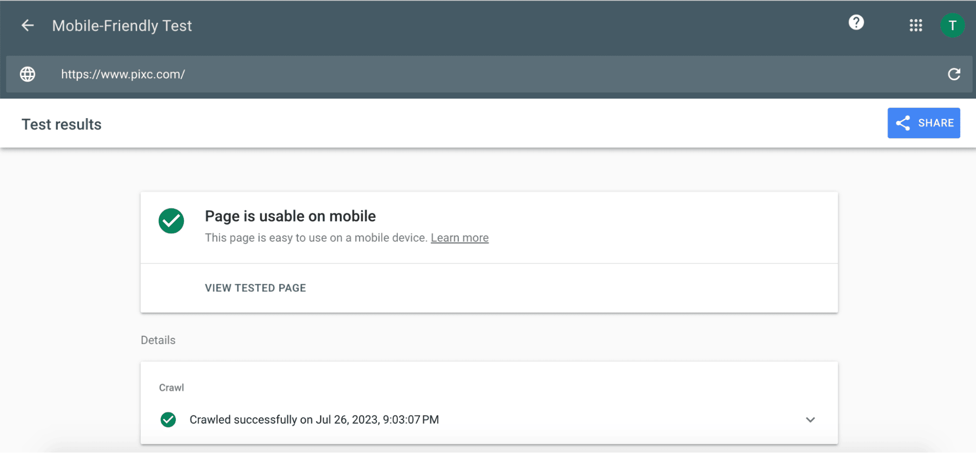
Run the test regularly to check any mobile-friendliness issues and address them promptly. Make the necessary adjustments to improve your site’s mobile performance.
2. Mobile speed test
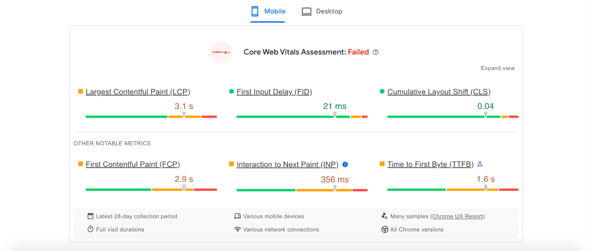
Mobile users expect fast-loading websites. The Mobile Speed Test measures your website’s loading time on mobile devices and provides insights into areas for improvement. PageSpeed Insights is another tool that can be used to check mobile site speed.
Following this, you can optimize images, minimize redirects, and use compression techniques to improve your website’s loading speed on mobile devices.
3. Cross-browser and cross-device compatibility testing
Test your ecommerce store on different browsers and devices to ensure consistent functionality and appearance across different platforms.
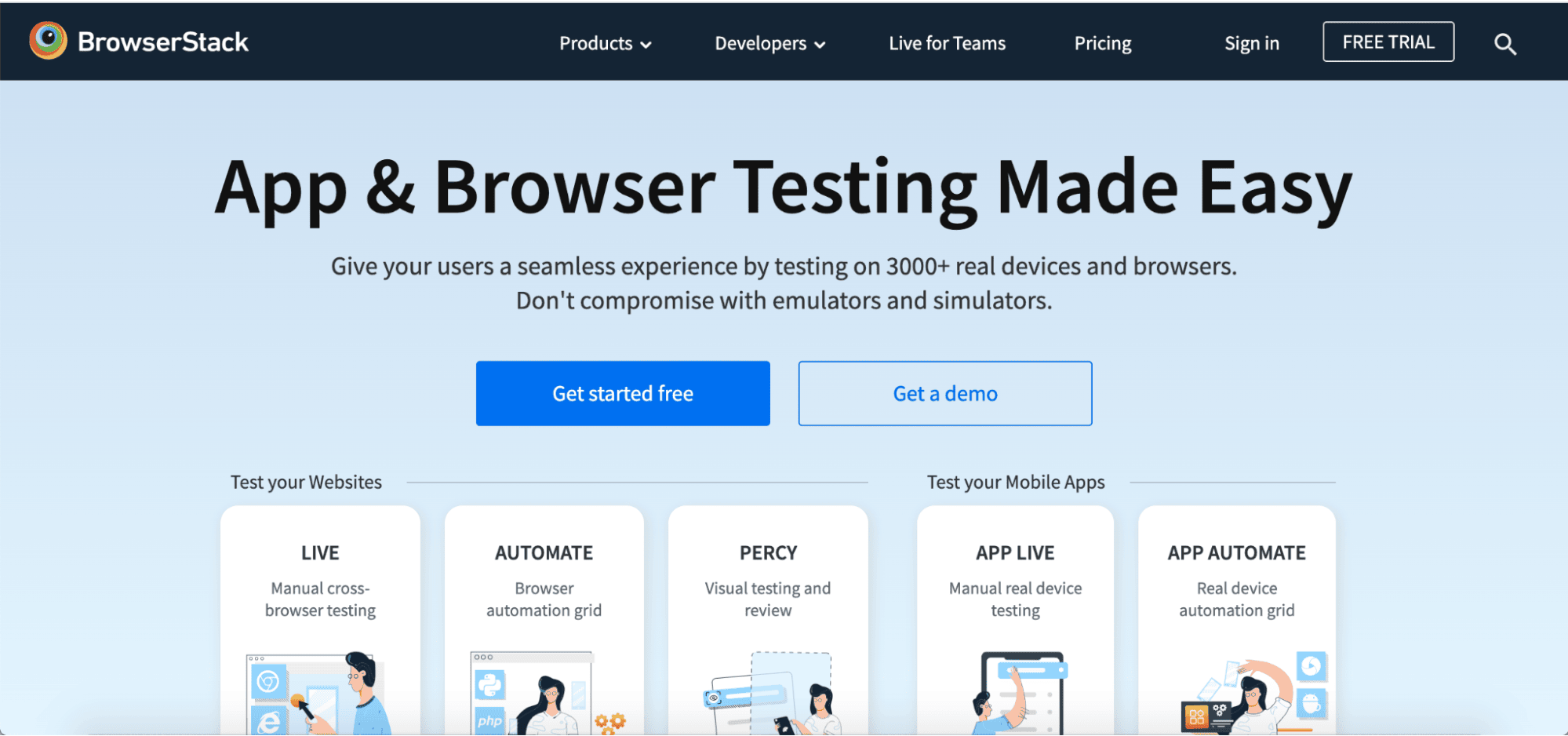
Use browser testing tools to verify that your website works seamlessly on popular browsers like Chrome, Firefox, Safari, and Edge. Similarly, test your website on different devices, including smartphones, tablets, and various screen sizes. BrowserStack, LambdaTest, or MobileTest.me can help you to test your website across different mobile devices and browsers.
4. Touchscreen usability test
Since mobile users navigate websites using touchscreens, all elements must be easily tappable and responsive.
Test buttons, links, and other interactive elements on your ecommerce store to ensure they’re well-spaced and easily accessible on touchscreens. Run through this manually and ensure it all works as it should.
5. WebPage Test
WebPage Test runs through your website and gives simple summaries and actionable tips on improving your website, including making it more mobile-friendly. It goes into more detail if you want to pass the info on to your web development team or if you’re more technically minded.
6. TestMySite.io
TestMySite.io is a comprehensive mobile test tool that assesses your website’s mobile speed and performance. Essentially, it provides an overall score and detailed recommendations to optimize your site for mobile users.
7. Mobile-Friendly Test – Bing
Like Google Search Console, Bing Webmaster Tools offers a Mobile Friendliness Test to evaluate your website’s mobile performance. It works similarly to Google’s tool but helps evaluate it from the point of view of a different search engine and ads tool to ensure your website’s working as hard as it can for you.
8. SiteChecker
SiteChecker isn’t just for mobile-friendliness and gives you information about how your whole site works. You’ll get mobile friendliness recommendations for your desktop and mobile sites, social media, coding, and linking, plus information on how to fix it, why it’s important, and how to fix it.
Mobile friendliness is absolutely essential
Mobile friendliness is no longer an option; it’s a must-have for any ecommerce store. So many people now make their purchases using a mobile device; you need a site that will work properly on mobile.
By regularly testing and optimizing your website for mobile users, you can make the site better for your customers, generate more sales, and improve user experience across the board.
Making your website mobile-friendly doesn’t need to be complicated – test your website using these tools and then pass the info on to whoever manages your website.