
Humans are naturally drawn to great visuals. 90% of information transmitted to the brain is visual, and we process images 60,000 times faster than we process text.
With the eCommerce industry on the rise, you’re going to need great visuals to stand out amongst your competitors and increase your sales. Here are five key eCommerce design tips to keep you on the right track.
1. Create your logo design
The logo you choose for your brand will contribute greatly to your brand’s identity. It needs to be distinct and easily recognisable, and it must match the general vibe of your brand. Pick a colour to the exact hex swatch and stick with it, and use a combination of fonts or graphics that are unique to you.
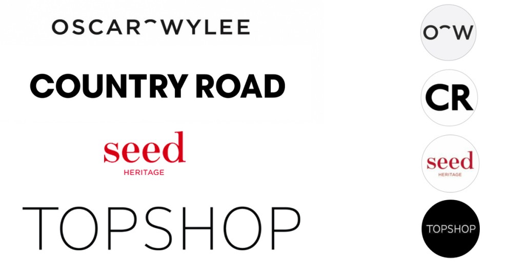
If used effectively, your social media platforms can be a great place for gaining brand exposure, creating a brand personality and driving traffic to your eCommerce store. This is why the best kind of logo is one that’s easy to recognise when displayed as a small social media thumbnail, even on a smartphone. You could use your entire logo like Seed and Topshop have done. Or you could deconstruct your logo and use only a few recognisable elements (like Oscar Wylee and Country Road).
If graphic design isn’t your thing, don’t stress. Try outsourcing your logo design to freelancers on Fiverr, 99designs, DesignCrowd, Freelancer or any other crowdsourcing platform. Alternatively, you can hire a graphic designer locally or work with a creative agency, but outsourcing is a lot more affordable.
2. Pick your colour scheme carefully
Another crucial aspect of your brand identity is your eCommerce store’s colour scheme. Different colours can trigger certain feelings, emotions, thoughts and memories; we all associate different colours with different things.
We also associate colours with certain brands, and in the end, you want people to associate the colour you choose with your brand. A new visitor to your store will immediately register the colour scheme, while a returning customer will know they’ve come to the right place when they recognise the colours. Like with your logo, you should pick one or two hex swatches and stick with them.
For this reason, it’s important to give your brand’s colour a bit of thought. Think about the brand personality you’re trying to achieve and the type of atmosphere you want your store to project. If you’re going for sophistication and elegance, plain dark colours or white work best. If you’re after a brand that’s fun and exciting, go for something bright. Check out how the website of Mr. Porter, for example, contrasts with the website of Sportsgirl.


3. Optimise your product images
Nothing compares to being able to see and touch a product in real life before you decide to buy it, so you need to help your website visitors clearly visualise your products. You do this by including high-quality product images, which should be clear, simple, consistent and big. Why? Because, according to Jeff Bullas, ‘67% of consumers say the quality of a product image is very important in selecting and purchasing a product’.
The background of each product photo shouldn’t distract the viewer from, or conflict with, the product. A white background works best because it draws attention to a product, is free from distraction and works with any website or platform design. It’s also a lot easier to see a product on white on a smaller screen, like a smartphone or mini tablet.
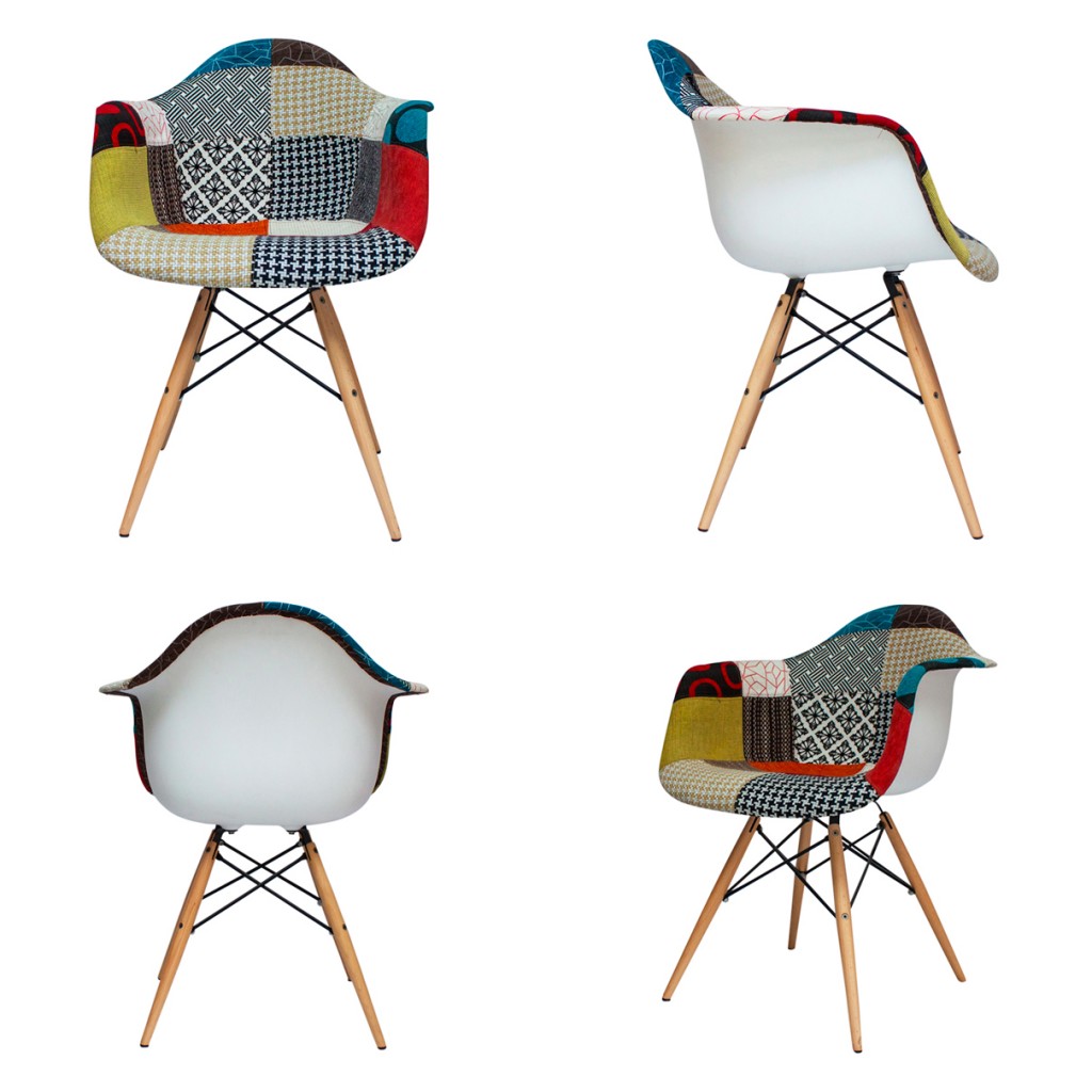
It’s always a good idea to provide multiple photos of your product. Take photos from a number of angles and close-ups of special features or textures. Remember that if you appear confident in what you’re selling, customers will be confident in what they’re buying.
Your images should all be the same size, and each product should take up the same amount of canvas space (ideally 80-90%). There’s no point in having great product images if they don’t look good together! Inconsistent product images will affect the overall appearance of your website and make it look less professional.
Finally, the bigger your product images, the better. It’s important to understand that the image you upload to your eCommerce store is the ‘base image’, and this photo is then resized to the various templates you have on your site. A zoom function is a great way to improve your customer’s shopping experience, but the trick is that when a customer ‘zooms’, they actually view the image at the original base image size.
Many eCommerce store owners make the mistake of cropping images to the largest template on their site (usually the one on the individual product listing page) and uploading this as the base image. For an effective zoom function, the base image needs to be larger than the largest template on your site (see how Kate Spade uses the zoom function effectively below).
The best size for a base image is 1600px on the longest side — perfect for a zoom function and also the optimal size for viewing on mobiles and tablets. Mobile commerce is growing at three times the speed of online retail as a whole, so optimising your store for this customer segment is critical for success.


4. Create amazing in-context product photos
In-context product photos are great to visually convey the ‘vibe’ of your eCommerce store, showcase your products in a realistic (and desirable) context and sometimes feature the target customer or environment for your product.
If you’re on a budget, you don’t need to complement all of your product images with in-context photos. But it is worth hiring a photographer for a day or taking the time to organise your own photo shoot so you have a few in-context shots to display around your eCommerce store. This helps you include more visuals than just product images. You can also use these shots as cover photos for your social media platforms or across other promotional content.
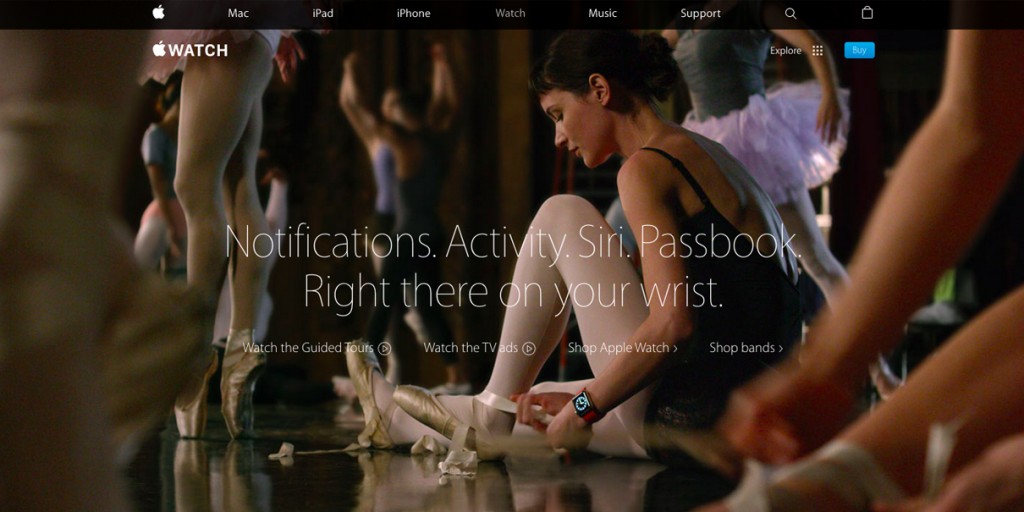
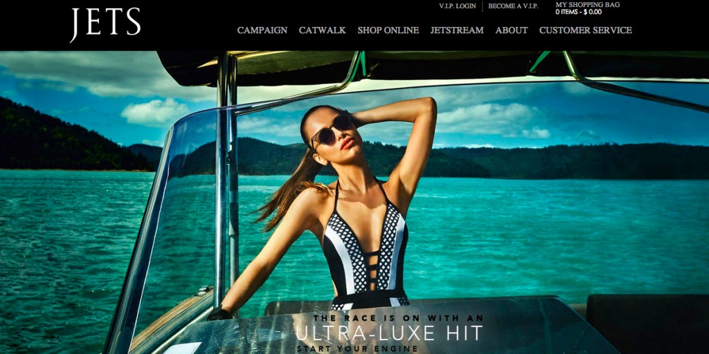
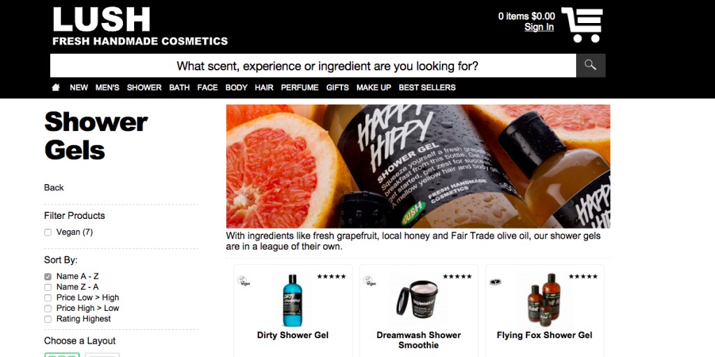
See what Apple, JETS, and LUSH have done with in-context photos below.
5. Don’t forget basic design principles when creating great visuals!
Even if you nail your logo design, colour choice and imagery, that won’t do you much good if you completely disregard some simple design principles. The basic principles of good design come from an understanding of what we naturally like and do not like to look at, and how the brain reacts to visual elements.
When it comes to webpage design, less is definitely more; a cluttered and disorganised website can be overwhelming. Start by leaving sufficient spacing between elements on a page and don’t use more than two or three different font styles. It’s a good idea to make hyperlinks one colour and unclickable text another colour.
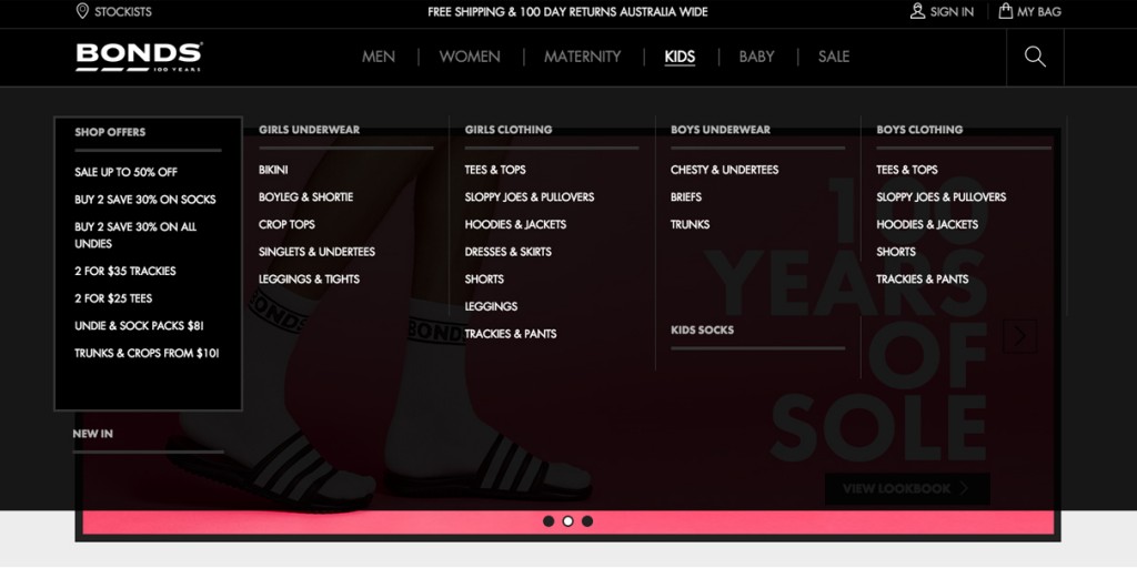
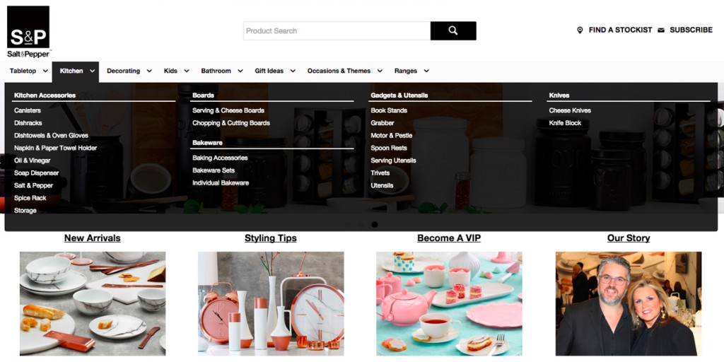
You’ll need some kind of visual hierarchy to the overall design of each page. Fitts’ Law suggests we’re naturally drawn to bigger things first, so make any important elements (particularly any call-to-action buttons) larger than other elements. Categorising your product menu in a logical way will make it easier for customers to find what they’re looking for. Bonds and Salt & Pepper, for example, have done a great job at categorising their huge range of products.
The most important thing to remember is a big part of running an eCommerce store (or any business) is figuring out what works and what doesn’t. Great visuals are no exception, so don’t be afraid of changing it up and trying new things.
Apply these eCommerce design tips to your online store!
Your customers will feel more comfortable shopping at an online store that looks great, and you’re more likely to increase your sales with better visuals. So, get started revamping your site’s look!