So you’ve spent hours researching top-selling online products, developed your strategy, and built your online store. But the sales just won’t come.
You’re not alone! Many new ecommerce store owners struggle to generate sales at first because, as with anything you learn to do, there is a learning curve involved.
This current run of what seems like bad luck probably frustrates you to the point where you feel like bashing the computer screen. Stop! Slow down, take a breath and review these ten ecommerce pitfalls to avoid.
You never know — one small change could increase your online sales.
1. Your website is too complicated
Keep things simple! We are a ‘when we want it, we get it’ type of society. Nothing will drive customers away faster than unnecessary logins, excessive or complicated forms, and other obstacles that stand in the way of finding products quickly. These are big ecommerce pitfalls that will surely steer your traffic away from your site.

Your website’s user interface should be simple — the shorter, the better. Easy-to-use drop-down menus and a step-by-step buying process will really improve your customer’s online shopping experience.
You want a domain name that’s easy to remember. Keep it short and sweet. Nothing confuses customers or pushes them away faster than a long, drawn out, and complicated URL. Go for a name with a pleasant ring to it that is still short and preferably one word (Amazon).
2. You’re spamming too much
Spam, spam, spam — don’t we all love spam? NOPE.
You may think that constantly filling your customers’ inboxes with emails multiple times daily to increase brand awareness is a good idea. But, those emails are likely to be deleted without being opened, or the email host will send it straight to Junk. Sending tons of emails can also make you look a little desperate, which will undervalue your business.
Here is a great quote from an article written by Paul Graham:
It’s easy to buy lists of millions of email addresses. You might think that sending emails to a million people would be a good way to promote your site. Such email is called spam, and it is a big mistake.
An introductory email series can be effective for some businesses, but once the series is over, try limiting your emails to once a week or so.
3. Your website is too slow
Don’t overload your site with more content than it can handle. Our society loves instant gratification. To enter a website that doesn’t load immediately makes the average user backup and move on.
In fact, according to a study done by Portent, “A site that loads in 1 second has an ecommerce conversion rate 2.5x higher than a site that loads in 5 seconds.”
Don’t let this happen to you!
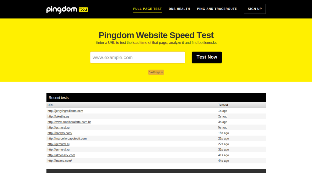
You can check your website speed with a tool like Pingdom. After you do, make sure you take appropriate steps to shave down your site’s loading time if necessary.
4. You’re trying to sell too much
It may seem like offering the widest selection of products and services is the way to go. But narrowing it down to sell fewer items to a more targeted group of customers can help you build a strong brand and market your online store more effectively.
For instance, if you choose to sell art supplies, you will have to compete with all other online general art stores, as opposed to if you choose only to sell acrylic paints and brushes. Less is more.
5. No ‘call(s) to action’
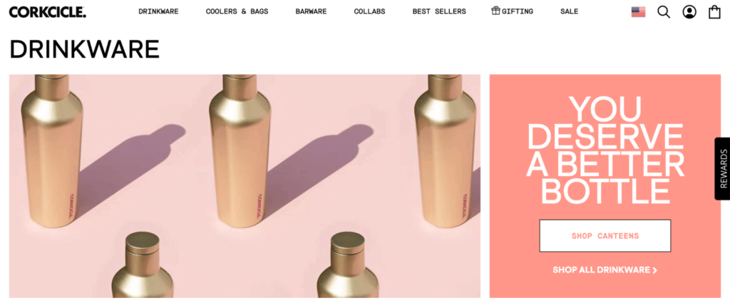
Customers need to know what they are supposed to do when they come to your site. Develop a strong and effective call to action (CTA) for each and every page that prompts your customers to do what you want them to do.
You need to be clear on your CTA, whether it’s downloading something, purchasing an item, signing up for a mailing list, or liking your social media pages.
Make your CTAs obvious too! For example, keep them in buttons, place them near the top of your pages or make them stand out with different colors or typefaces.


HeyDay (a skincare line) and Greek Sandals (a handmade sandal boutique) are two examples of ecommerce businesses with completely different but effective CTAs. Both inform the reader what action to take right off the bat.
6. Your prices are too high
One of the reasons people turn to online shopping is the chance of finding better prices online. Don’t sell items for typical retail store prices because you are not a typical retail store.
The cost of selling goods online is significantly lower than the cost of running a store, so you can make just as much of a profit even if you sell your items for a lower price.
7. You’re not drawing enough attention to your site
One of those incredibly important ecommerce pitfalls to avoid at all costs is not drawing enough attention to your site. It doesn’t matter if you’re selling pure diamonds for one dollar if nobody knows your site exists!
Invest a decent amount of time and money into ecommerce marketing in the form of ad campaigns, social media management, content marketing, and other effective promotional campaigns.
This can be as simple as creating an online presence via social media platforms. If you’re a bit stumped on how to do this, read our posts on how to use Facebook, Instagram, and Pinterest for business:
- 5 Customer-Focused Tips to Use Facebook for Ecommerce
- How to Leverage Instagram for Your Business
- How to Use Pinterest for Business the Right Way
8. There isn’t enough information on your site
Although I’ve talked about the importance of being simple and specific, your product descriptions must be well-written and detailed enough to give your customers a good idea of what they’re potentially buying.
If you’re not good with words, find a freelancer to write your copy and create product descriptions for you when your new products come in.
You should also have specific pages listing your policies, procedures and/or FAQs. Include information regarding your operating hours, estimated delivery dates and times, shipping, returns, promotions, and anything else you think may be of interest to your customers. This will help you cut down on pointless customer service inquiries.
9. Bad visuals
In the real world, it takes about seven seconds for a shopper to develop his first impression when they walk into a store.
In the ecommerce world, this period of time can be as quick as half a second and can make the difference between a sale and the loss of a potential customer.
Consumers often choose between businesses and their competitors based on their first impressions of each.

The key to a great first impression is a visually appealing website. If you’re using an ecommerce platform like Bigcommerce, Shopify, Volusion, etc., there are so many great templates out there that are really easy to use and change up a bit to suit your store’s style.
Even if you’re more advanced and you’re building a site off WordPress or something similar, you can still find customizable templates that will help get you started.
Stick to a strict color scheme — don’t try to incorporate every color of the rainbow. I also wouldn’t use more than two font styles, whether it’s the same font in regular/bold/italics or two different typefaces.
10. Dodgy product images
Think about the last time you entered a retail shop to make a purchase.
Perhaps you were buying a pair of jeans. Most likely, you tried them on first, made sure they were comfortable, saw the front, back, and all the details, and could feel the material to assess quality; you effectively tested the item before making the purchase.
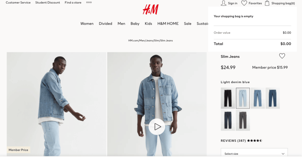
When it comes to ecommerce, it’s an entirely different experience to walking into a store and choosing your product. Since customers will not be able to see in person the products you sell, it’s absolutely vital to provide high-quality images.
Unprofessional, pixelated, or sloppy pictures are a sure way to drive people right off your site. It’s simple: Dodgy pictures make your business look dodgy.
It’s not hard to produce great images either. However, when you think about the amount of time and effort you’ve put into creating, marketing, and operating your online store, dedicating some time to creating impressive, conversion-focused product images is definitely worth it.
If you want to know more about how to take awesome product images, sign up to our mailing list or check out the rest of our blog (the latter of which is full of tips and tricks for product photography).
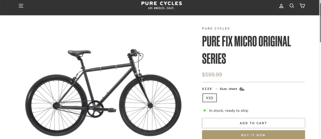
Even if you sell a service, that’s no excuse to have crappy visuals. Create some easy-to-understand graphs, infographics and charts — they can be effective for online service-based companies, especially when presenting statistics about the results of the service.
Conclusion
Now that you know which ecommerce pitfalls to avoid, it’s time to make your website thrive.
The internet is strewn with all the online stores that didn’t make it. Many of them fell into one (or several) of these ecommerce pitfalls.
But not you! With your new knowledge, you can avoid the pitfalls.

