Whether we realize it or not, a brand’s color palette affects us psychologically to trigger certain feelings, thoughts, and emotions.
The color you choose as your brand’s color palette will influence how people perceive your brand. A carefully selected color scheme will help you create and build a brand identity around your ecommerce store.
Choosing your color palette
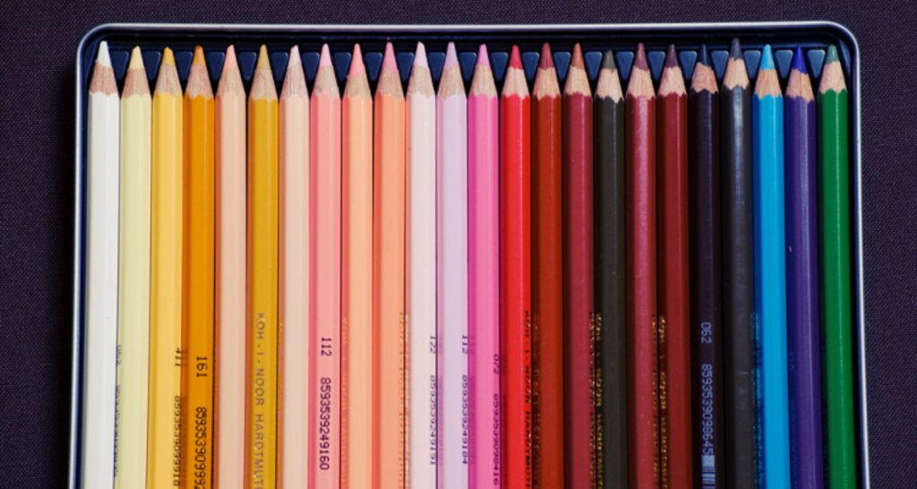
To ensure consistency, choose your brand color palette to the exact hex swatch.
A hex swatch is a code version of your color that is presented as a unique six-digit number and letter code corresponding to an exact color. For example, solid black starts as #000000 and pure white is #ffffff. Then there’s everything else in between.
A cool color picking tool is Hailpixel. Move your cursor around the page and see how the code changes with the color.
So how do you know which color or color scheme is right for your brand palette? It’s a big decision, so in this blog, we help you narrow down your choices by telling you a bit about what each primary and secondary color is often associated with.
Yellow
Yellow represents happiness, optimism, joy, and intellect likely because of the connection with a sunny, bright day.
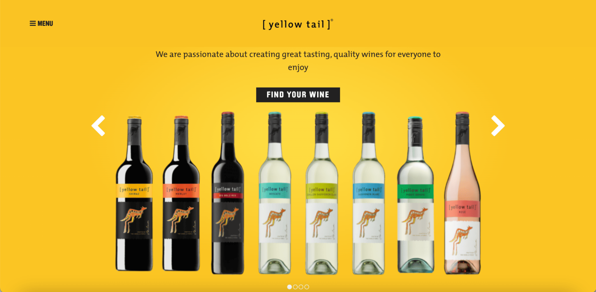
Yellow Tail, a wine company, uses yellow not only to match the name of the brand but also to match its brand philosophy about ‘the pleasure you get from the great taste of the wine’ and how enjoying wine with your friends, family, neighbors and ‘with your goldfish Goldie’ is the most important thing.

Yellow can also represent ‘cautionary’ or ‘industrial’ in cases like tools and equipment brands such as Caterpillar and STANLEY Tools.
Blue
More so than with any other color, the brands associated with blue will greatly depend on the type of blue. Light blue is often associated with health, tranquility, and softness.
Dark blue can position your brand as having knowledge, power, and integrity. For that reason, many corporate entities, especially software, finance, governments, and banks, use blue in their brand palette.

For example, Intel, LinkedIn, and Bank of America use these ‘warm’ blues to convey professionalism and loyalty.
Red
Think for a moment about some brands that use red in their brand color palette.
Readily, Coca-Cola may come to mind. Plus others like Target, Marvel, YouTube, and Netflix.

Red is an intense color associated with passion, danger, desire, and power. Coca-Cola is the perfect example of red’s positive connotation. The brand evokes pure excitement to live and enjoy life.
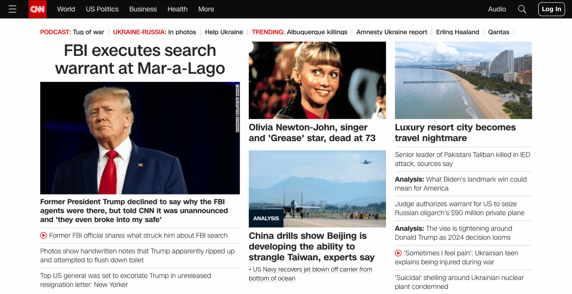
On the other hand, red can also suggest danger, express caution, or the need to be alert, for example, CNN.
Red is often used in the food, media, and tech industries. It is, however, a great contrasting color that ecommerce businesses can use to highlight important calls to action, sales, and news.
Green
For most people, the word ‘green’ is used to describe eco-friendly, organic, and environmental products.
The color itself is the color of freshness, harmony, growth, and nature, making it an excellent choice to build a brand identity for any organic/eco/green company.
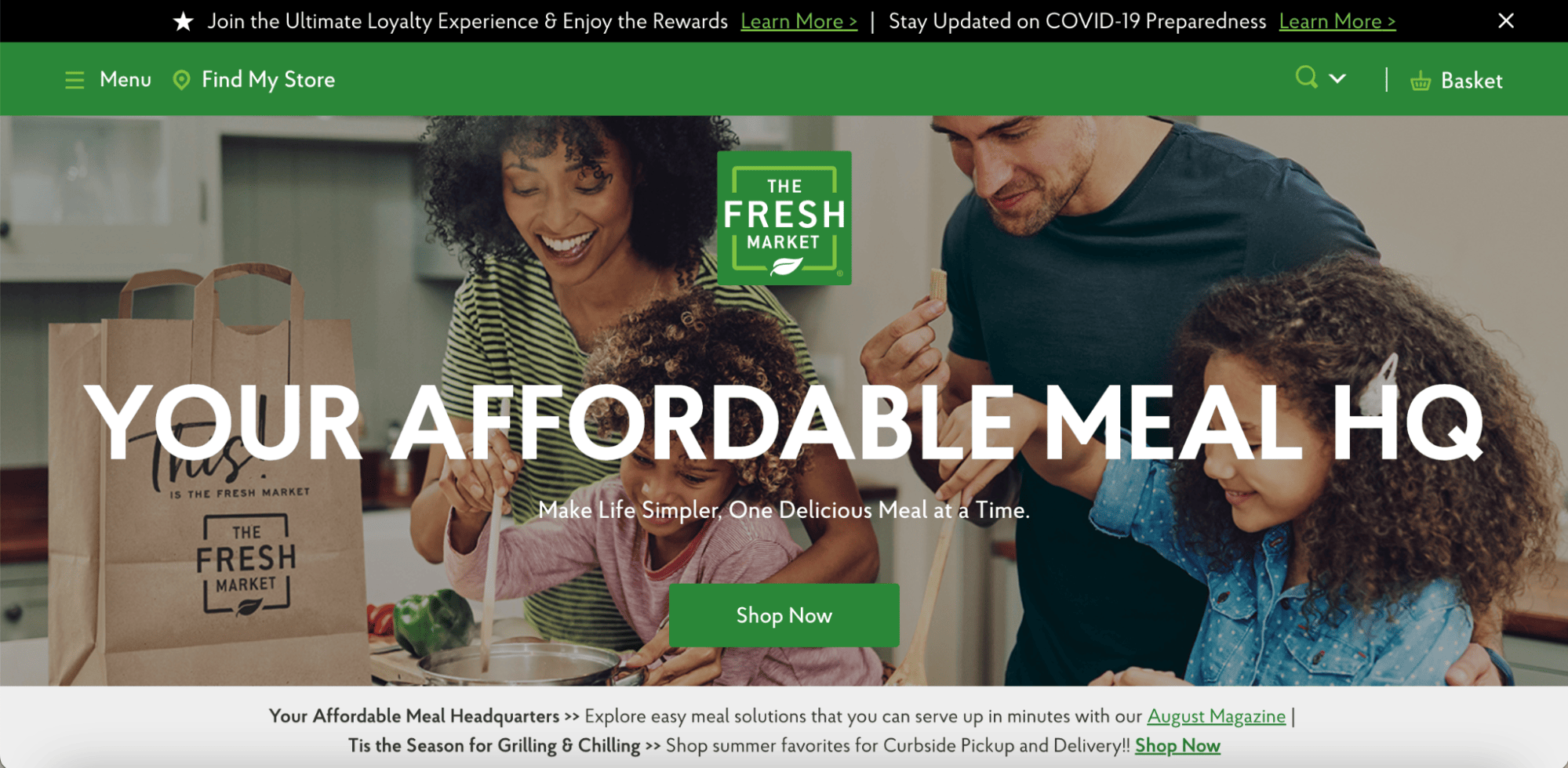
The Fresh Market sells fresh produce and meat, while John Deere sells sustainable farming equipment. Both brands use shades of green to suggest they are environmentally friendly.
Green is also sometimes associated with money and makes a great choice for finance-related businesses and services.
Purple
Purple represents magic, luxury, imagination, and compassion. Purple is perfect for your brand color palette if you sell high-end products like jewelry or have a spiritualistic aura.
No other color symbolizes riches and royalty the way purple does. The reason is that in ancient times the color purple was expensive to produce so only the wealthy could afford to own items in purple.
Purple is also closely associated with women and children, so think carefully if you want to use it for your brand that markets male products.
Orange
Bright and bold, orange is becoming a must-have color for many website color schemes — and for a good reason. Orange can be used to create an inviting brand identity that is warm, determined, enthusiastic, and creative.
It is also the color of modern thinking, making it an excellent choice for innovative products or modern design.
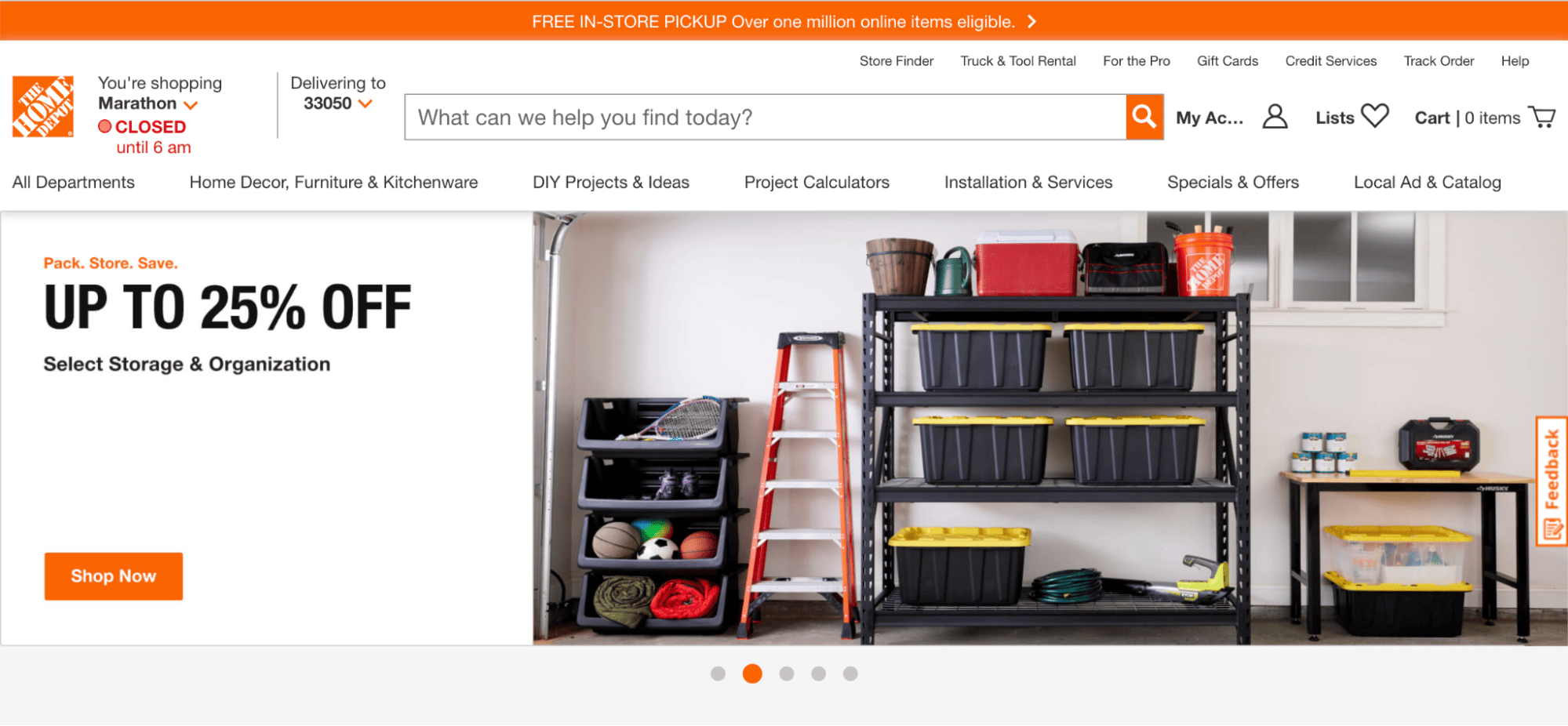
For example, Home Depot is a home improvement company that leverages orange in its brand palette. The color and what they stand invigorate and evoke energy to get a job done and done well.
Etsy, an ecommerce platform known for its selection of creative, handmade, and vintage items from unique sellers, uses a dark orange as its brand color.
Brown
Brown is sometimes thought to be one of the most boring colors. In fact, it’s one of the least favorite colors for both males and females.
However, brown is an earth tone that symbolizes home and stability. It is genuine, reliable, down-to-earth, and a fantastic color for brands that are either outdoorsy or natural.

UPS, a popular brand that’s identified by the brown and gold logo uses the color from its trucks to uniforms. It suggests reliability and sustainability.
If you want to position your brand as rugged or maybe one that should be highly respected, brown is an ideal color in your brand palette.
Pink
Pink represents flirtatiousness, friendship, femininity, and love. Pink is often used when the target customers are women — it can be risky to use pink for gender-neutral products because it may cause avoidance by men.
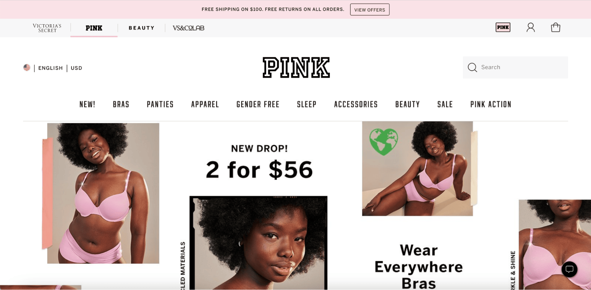
PINK by Victoria’s Secret and Peter Alexander are fashion retailers that use pink as the main color in their brand palette, and both primarily target women.
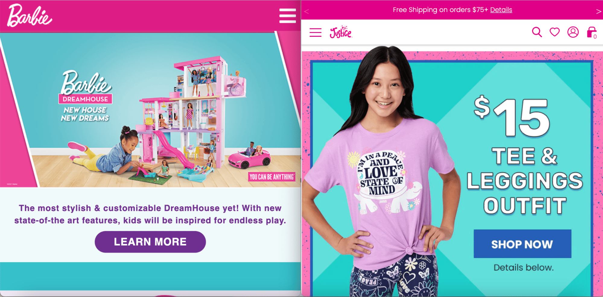
Pink is also traditionally used for girls’ products. When toys and clothing are pink, it is usually connected to little girls.
If women and little girls make up your ideal customer, then pink is a great way to grab their attention.
Black and white
Black and white, despite being shades, also have color personalities. Black is the color of death, elegance, morbidity, and sophistication. White, on the other hand, represents purity, simplicity, perfection, and cleanliness.
Regarding brand identity and color schemes, black and white can also be neutral; many ecommerce stores use black and white for their logos because they don’t clash with other colors.
In addition, you’ll find these brands are likely to use black and white versions of the same logo depending on the background color because they’re easily inverted.
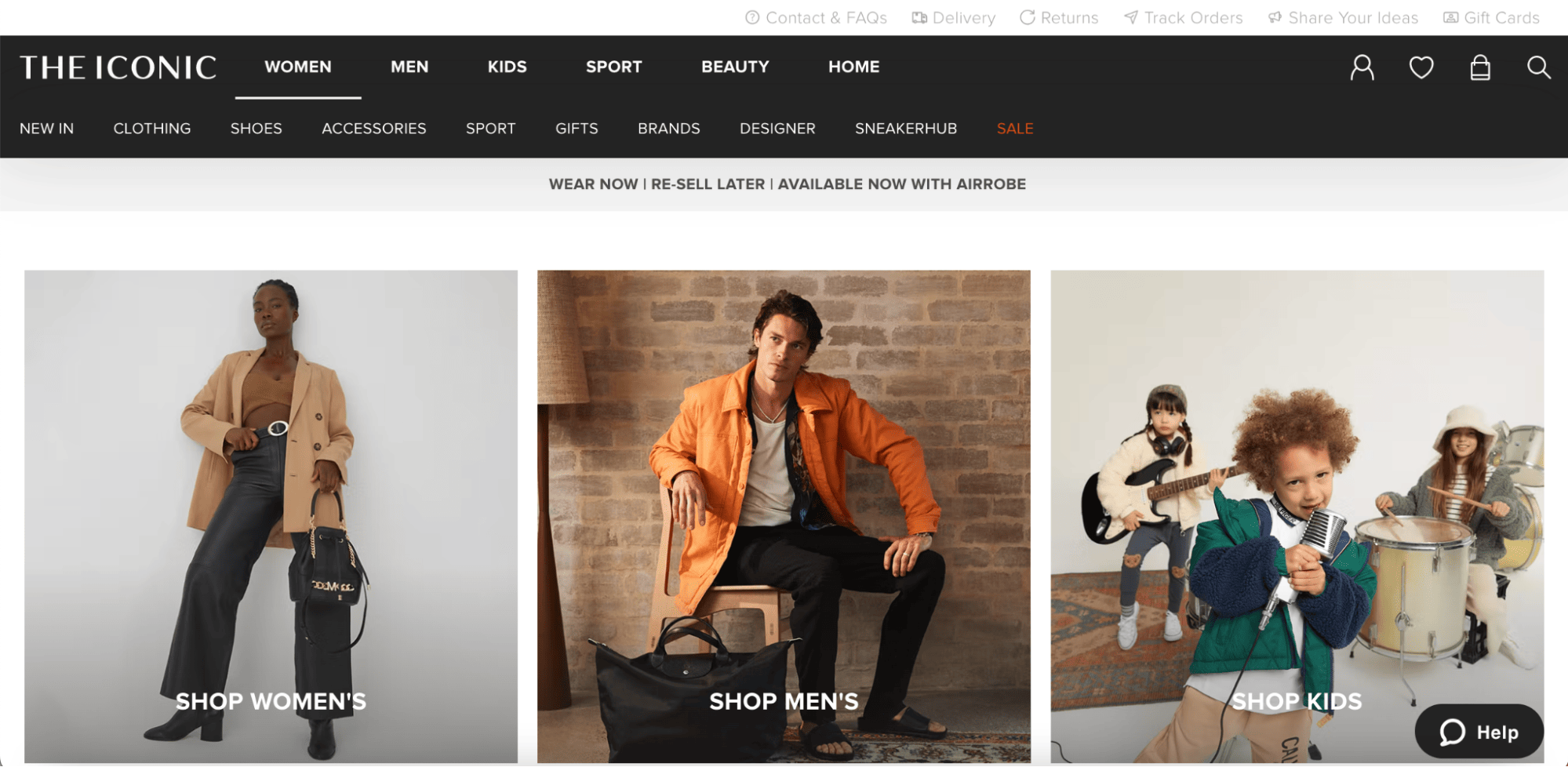
Online fashion stores will likely use black/white because the shades are simple and versatile and will look great when paired with any campaign. Topshop, The Iconic, and Boohoo all use black/white for their logos.
Using different colors together
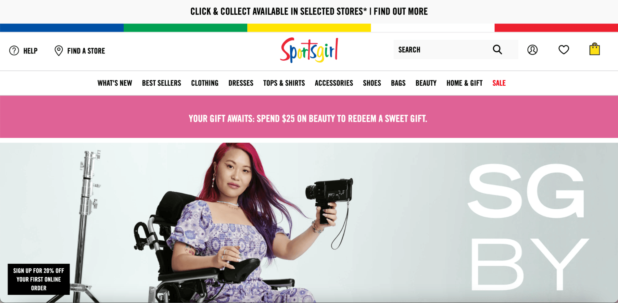
You can also use multiple colors, but in this case, each color used won’t be as powerful in conveying a certain vibe as when used alone. The most important thing to consider when using multiple colors is not so much color psychology but how aesthetically appealing the set of colors is.
For example, Classifieds and community website Gumtree, women’s fashion retailer Sportsgirl and auction and shopping website eBay all use various colors.
Stick to a brand color palette of no more than three or four colors; the more colors you add, the more likely there’s a color clash.
Take advantage of the many free online color scheme programs that will use the colors of your choice and show you which ones go together best. You’ll be able to create an appealing and effective color scheme for your ecommerce business. Try Adobe Color CC.
So, what are you waiting for? Take advantage of the rainbow and select a brand palette that will help build your ecommerce website best!