If you’re wondering, “What is visual merchandising?” and believe it is solely relevant to brick-and-mortar retail, reconsider. It’s a powerful strategy for ecommerce and can be a total game-changer for your ecommerce business.
Let’s explore the visual merchandising strategies of ecommerce that can turn casual browsers into loyal customers. From perfecting product images to placing compelling buttons, we’ll show you how to make every click count.
What is visual merchandising in ecommerce?
Ecommerce visual marketing is the art of presenting your products online in a way that instantly engages and persuades potential customers. It’s about using images, videos, and design elements strategically to showcase your products at their best.
Instead of walking into a retail store and seeing displays, in online shopping, these visuals play the role that a physical storefront would, attracting visitors and guiding them through your virtual aisles.
Think of it as the spotlight on your products. It’s not just about displaying them; it’s about making them shine. High-quality images, well-crafted layouts, and thoughtful design choices combine to grab attention and create a browsing experience that captivates your target audience.
Visual marketing aims to create a visually appealing journey that is easy to navigate, making it easier for them to understand, appreciate, and ultimately choose your products.
The benefits of ecommerce visual merchandising
You might think you have a website, social channels, and newsletter – surely that’s enough, right? Well, maybe not. A website is a great start, but implementing ecommerce visual marketing takes it to the next level.
Your customers will have a better user experience on your site if you use visual merchandising. It encourages engagement, time spent on site, browsing, and adding to their cart.
Visual merchandising in ecommerce also supports increased conversions by allowing your customers to make purchasing decisions more quickly. Visual merchandising gives them all the info they need to make their choices.
Visual merchandising also supports brand storytelling. It takes around 7 seconds for people to get an impression of what you and your business are about, and telling your story through your website and storefront helps potential customers to decide. You can create a brand image that resonates with your audience through carefully curated imagery and design. This again supports brand recognition and loyalty.
Enhancing sales opportunities is achievable with visual merchandising as well. You can increase the average order value by leveraging upselling and cross-selling techniques, such as strategically featuring related or complementary products on sales pages. This principle also applies to tailoring seasonal promotions or special offers, constituting a crucial aspect of visual merchandising.
Good ecommerce visual merchandising also gives you a competitive edge, making you stand out from your competitors (in a good way). This is again part of creating a strong, recognizable brand that your customers want to stay loyal to.
Effective ecommerce visual merchandising isn’t just about making things look pretty; it’s a powerful tool that drives customer engagement, boosts conversions, and helps build a strong, recognizable brand identity.
Strategies for successful visual merchandising
So, having answered the question, “What is visual merchandising?”, here are some strategies to help you with it, how it works, and how to implement it across your ecommerce channels.
High-quality product images
One of the first steps to nailing your visual merchandising is using high-quality images that showcase your products clearly and from every angle. You need to represent your products accurately and show off the details. Grainy camera phone photos shot in a dimly lit room won’t cut it.
You must keep it consistent and create a style and background for your brand. It’s also essential to keep any imagery consistently sized. Your customers are seeing slick imagery across the internet all day long. Make yours count – and let our resizing and AI-powered editing tools help you.
Visual Hierarchy
The where and how of your images matter, too. Organizing your site so that best-selling, new, or creative products sit front and center is important. If customers come to your site for this, make it easy to find.
The use of colors, contrast, and whitespace also matters. Use all three visual tactics strategically to enhance your brand and support readability. Ensure your website stands out with Pixc’s Vis Merch Pro app, which optimizes your product visuals for maximum appeal.
Top Tip: Don’t forget to check how this looks on different devices, browsers, and operating systems.
Storytelling and Context
This one depends on your brand, products, and where it fits into your customer’s lives. Showing products in real-life situations and scenarios can help your customers “buy into” your brand story and see where your product fits into their lives.
User-generated content – or content that at least looks like user-generated content – and testimonials are good ways to do this. Customers want to feel that your product solves their problem, and showing it in a “real” setting is one of the quickest ways.
Interactive Elements
Interestingly, 78% of marketers say video content drives sales. It, therefore, makes sense to provide interactive elements as part of your ecommerce visual marketing strategy, especially if your products look great or there’s a ton of detail in them that they know about.
This could be 360-degree views, demo videos, or augmented reality (AR) so that they can visualize products in their space. It aligns with a storytelling approach that allows customers to envision how your product integrates into their lives.
Personalization and Recommendation
With Artificial Intelligence (AI) and Machine Learning (ML), you can provide users with personalized recommendations and shopping experiences, increasing engagement and conversion rates.
You can create product bundles, suggest complementary products, or use tools like recommendation engines that use algorithms to show related items based on browsing or purchase history.
Mobile Optimization
Ensure your visuals and layout adapt seamlessly to different devices, are displayed correctly, and have fast loading times – this improves user experience and engagement. Our photo resizing and editing tools can help you do all the above quickly and accurately.
Check out how imagery appears on different mobile devices, and ensure that your website works just as well on a mobile device as a desktop—according to Statista’s Market Insights, mobile ecommerce sales reached $2.2 trillion in 2023, making up 60 percent of all ecommerce sales worldwide.
Clear Call-to-Actions (CTAs)
Do you want your customers to do or feel something that leads to a sale? Look at your Call-to-Actions – what they say, how they look, use of color, and where they are on site.
You might be surprised what a difference changing it up can make. You want them to stand out, be compelling, and drive action.
A/B testing can be useful in this setting to work out what resonates best with your customers. Your analytics help you to be clear on this.
Trust Signals
Trust is even more important in ecommerce, where a customer can’t see or physically touch the product. You need to provide information to build their trust and expectations.
Referred to as trust signals, display reviews, ratings, testimonials, and security badges prominently on your site. This way, people can easily see what they can expect and learn from others’ experiences with your products.
Consistent Branding
We’ve already mentioned the importance of building a solid brand. Keeping it consistent is also an important part of that element.
Although you might talk differently on different platforms, your brand must have a common thread. This helps your brand to feel cohesive and recognizable.
Use fonts, imagery, and a consistent visual style that aligns with your brand’s identity. This helps to support trust, loyalty, and people’s opinions of your brand.
Challenges and how to overcome them
Some common challenges and pitfalls in ecommerce visual merchandising can create hurdles for your brand.
- Maintaining coherence across various devices and platforms is important. Ensuring that images, layouts, and interactive elements are optimized for desktops, tablets, and mobiles needs attention. Inconsistent visuals can lead to a disjointed user experience, impacting engagement and conversions negatively.
- Handling a large volume of images, videos, or media assets while ensuring consistency and accuracy poses challenges and can be expensive. It’s important to spend time getting images right and keeping them organized.
- Striking a balance between visually appealing elements and website performance is essential. Heavy image files or excessive use of animations can slow down page loading times, impacting user experience and search engine rankings.
- Maintaining high-quality, brand-aligned visuals is essential. Poor-quality or inconsistent images can lead to mistrust, while a lack of coherent branding might confuse customers, impacting their perception of the store’s professionalism and offerings.
- Neglecting accessibility features in visual content can exclude potential customers. Images without alternative text or videos lacking captions may alienate individuals with disabilities, leading to a lack of inclusivity and potential loss of customers. Pixc: Auto Alt Text has you covered on this one.
Ecommerce Visual Merchandising: Case Studies
Sometimes, understanding requires a “visual” perspective. Here are some ecommerce brands doing a fantastic job at visual merchandising.

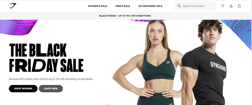
Sportswear retailer Gymshark started as a solely online retailer. The brand uses user-generated content on its site and strong imagery and copywriting to support its sales and marketing strategy.
They also use branding, white space, and CTAs incredibly well – they’re all cohesive across each channel and build a brand that resonates with its target audience.
Beauty Bay

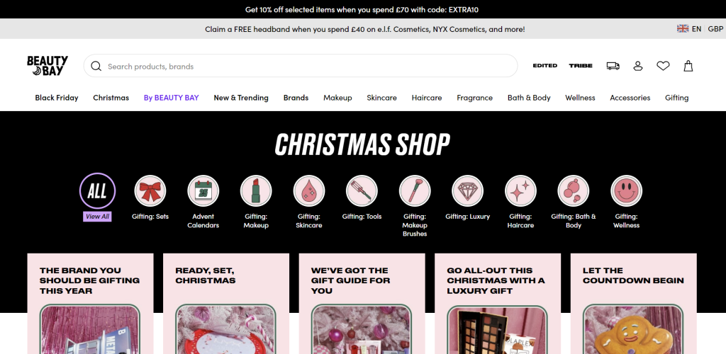
Online beauty retailer Beauty Bay utilizes promotions, CTAs, and seasonal shopping across its entire site.
The brand continually creates stories that show it understands its target audience well and then incentivizes it through copy and promotions with clear CTAs.
Beauty Bay also has clear branding that isn’t busy or over the top across its site, along with great imagery.
Envelopes.com
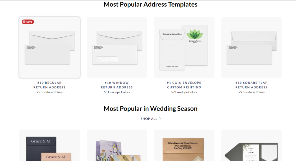
Envelopes.com does precisely what you’d expect – sell envelopes.

The brand highlights seasonal trends and promotions on its homepage. It also clearly showcases its best-selling products, making it easy for visitors to find popular choices quickly. This improves the user experience by reducing the need for extensive scrolling and browsing, especially since many people are likely interested in the most popular styles.
Wrap-Up
Getting to grips with ecommerce visual merchandising doesn’t have to be difficult – especially if you put user experience at the heart of your website build.
Knowing what motivates them, what they want, and how to create branding and visual assets that resonate with that audience is non-negotiable.
You can curate the perfect social feed, ad campaign, or SEO strategy, but what if customers get to your site and have a poor experience? They’ll click away to another of the millions of websites that did get it right. Focus on creating something visually appealing that works well and drives your customer to take action.


