When it comes to ecommerce, high-quality product photography is key to increasing your sales. Product images help convey your products’ value and functionality, without seeing or trying it out in real life. It shows your potential buyers that you are selling it top-notch and worth their hard-earned money.
Unfortunately, not all have the resources to hire a professional photographer to produce retail-ready photos for their online stores. And since we, at Pixc, are on a mission to help you succeed and scale without a lot of additional resources, we have put together this Ultimate DIY product photography guide.
Our ultimate guide we’ll give you our top tips on how to choose the best camera, create the right setup and edit your photos to give them that professional, retail-ready touch that your customers expect.
Contents
What equipment to use for every situation
Setting up your equipment and taking your photos
Product photo post-processing
Optimizing your images for your website
What You’ll Need
We put together this jam-packed section to make it easy for you to decide on the right materials and equipment you’ll need based on a variety of factors (i.e. budget, location, types of products, etc.)
List of products to shoot
A lot of ecommerce store owners overlook this step, but an organized shoot can make all the difference.
Create a list or spreadsheet of products you need to shoot and the photos you need of each product (e.g. different angles, close-ups). This will ensure you don’t miss anything and have to set everything up again.
You should also group similarly sized products together so you can spend as little time as possible adjusting the studio setup.
Photographer’s Toolbox
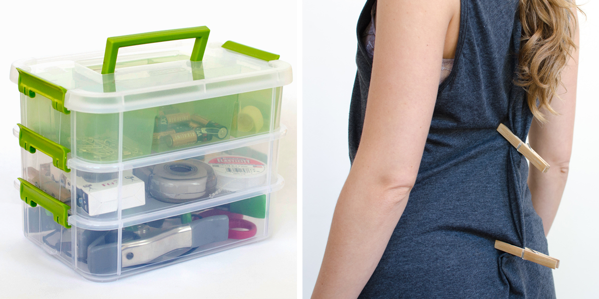
I also recommend putting a ‘Photographer’s Toolbox’ together. It’s better to be over prepared than under prepared.
Your toolbox should contain the following:
- Tape for keeping things in place (clear and double-sided tape works best)
- Pencil and paper in case you need to scribble notes or plan a setup
- Clamps to hold equipment in place (like your sweep or a reflector)
- Fishing line to hold up smaller products, particularly jewelry
- Pocket scissors to cut the fishing line or any loose fabric threads
- Glue dots for keeping smaller products in place
- Non-damaging hooks if you want to photograph clothing on hangers, or towels/sheets in a hanging position
- Spare batteries or a charger for when your camera decides to die in the middle of a shoot
If you’re shooting clothing, here are a couple of other things you might want to have on hand:
- Clothespins/pegs to make the clothing fit perfectly — you can pin clothes from the back to make the front look better
- Safety pins for smaller adjustments, like pinning collars in place
- An iron — creases always seem to magically appear, don’t they?
- Coat hangers to keep your products nice and neat while they’re not being photographed
Camera
Here’s a quick checklist to see if your camera is suitable for your product photography shoot:
- High megapixel count to ensure that you produce high-quality and zoomable photos. A megapixel of 12 and up is ideal.
- Manual mode so you can adjust the settings depending on the type of product you shoot. It allows you to tinker with the ISO, shutter speed, aperture, and white balance.
- Auto-focus is useful when you want to save time. While it’s not advisable to use it every time you conduct a photography session, it could come in handy when the situation calls for it.
- Good color quality to produce accurate images. Not all cameras display color the same way. You need to find one that will depict the color of your product correctly so you won’t have to spend so much time with editing later on.
- Low light capability to adapt to your setting. When you don’t have access to natural light, your camera should still be able to perform well in low light conditions. Opt for a model that produces the least noise at high ISO levels.
DSLR vs Mobile
You don’t necessarily need a state-of-the-art camera for DIY product photography. You can use anything from a smartphone to a point-and-shoot to a DSLR. The latest smartphone models will definitely produce high-resolution images suitable for an ecommerce store. So before you splurge on a great camera, try your hand at product photography with what you have first.
If budget and ease of use are main factors for you, then go for a smartphone. They are so much easier to use and you don’t have to toggle with complicated settings. On top of that, there are a lot of free mobile apps that can help you with your shoot.
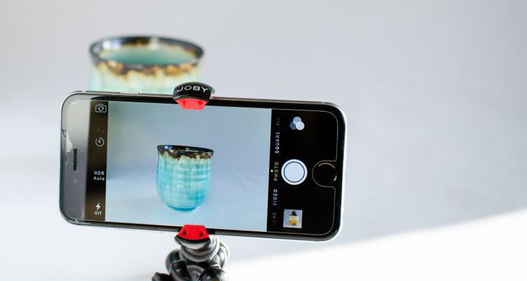
Smartphones also provide you with an all-in-one product photography solution. You can take photos, edit them straight from your phone, and even directly publish them on your website.
If you prefer using a smartphone, make sure you have the right photography setup and equipment. Because smartphones can’t provide you with the manual settings that DSLRs do, your setup is a big factor in taking high-quality photos.
Now if manual control and customization is your main priority, you are better off investing in a DSLR camera.
With a DSLR, you are free to manipulate and control all the settings to get your desired photo. They have tons of bells and whistles you can tinker with to capture your preferred shots.
DSLR cameras are also a good option if you’re looking for dedicated product photography equipment. If you’re planning on doing DIY product photography for a while, then it might be best to invest in one.
Ultimately, it doesn’t matter whether you use a smartphone or DSLR as long as the camera you are going to use has the basic requirements for a product shoot. You will have to prioritize the lighting, background, and post-processing to produce stunning ecommerce imagery.
Table and Sweep
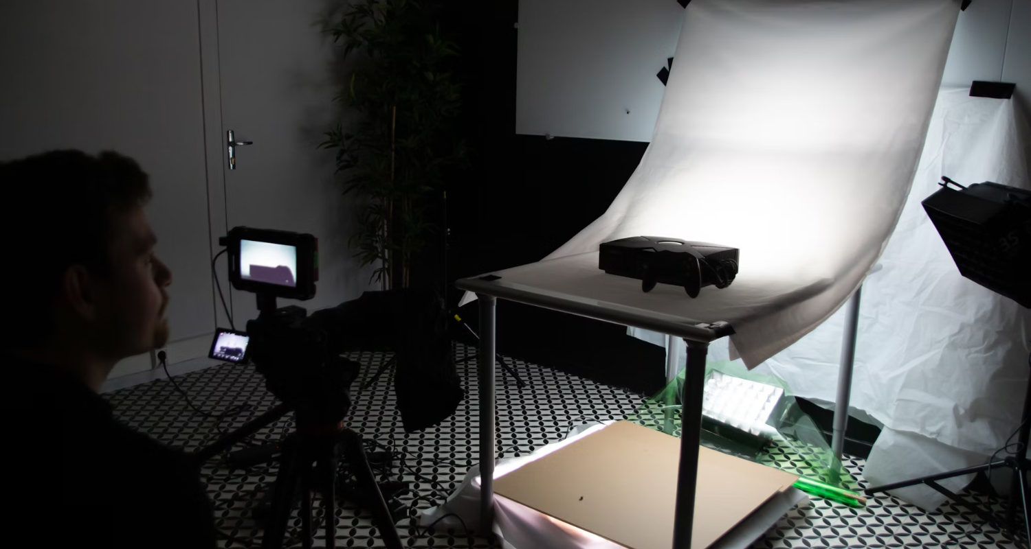
For best results, you want to shoot your products against a ‘sweep’, which is a white backdrop that seamlessly transitions from the vertical to the horizontal surface.
Choosing the right sweep and table depends on the size of the products you’ll shoot, as well as your set budget. Here are some options for you depending on what is suitable for your product shoot.
DIY Tabletop Photography Setup
If you’re shooting small products, I recommend building your own DIY shooting table. It’s an all-in-one sweep solution for smaller products and will give you a lot of flexibility and control when it comes to your light sources. To create a makeshift, you would need the following equipment:
- Small table
- 2 pieces of scrap wood (about 2 feet tall)
- Spring clamps
- White paper (large enough to cover the table and scrap wood)
Steps on how to set up your DIY photography tabletop is available here. You can also replace the small table and scrap woods with a wooden chair. Just make sure your white paper is long enough to cover the back of the chair.
Professional photography tabletop setup
If you have the budget for it, consider buying a professional shooting table. LimoStudio, Fovitec, AW, and Foto & Tech have portable shooting tables with sweeps ranging from $50 to $110 on Amazon. These are great if you’re selling accessories, crockery, shoes, etc.
Large sweep for larger products
When photographing larger products, you will need a bigger sweep, larger than the product itself. Ideally, you want the sweep to fill the entire shot frame when you look through the camera lens.
If you’re after something more sturdy and professional, you can always purchase a white sweep from a photography store. The benefit of buying one is that sweeps usually come with a stand. You can easily set up your studio anywhere provided there is enough room.
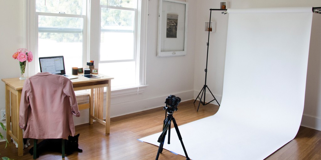
If your budget is tight and you’re shooting large products, you’ll need to improvise. I’ve thrown a white sheet over an old DVD rack before — you gotta do what you gotta do!
Location
The most important part of DIY product photography is choosing where you want to conduct your shoot.
If you don’t want to fork out money for a studio and artificial lighting equipment, pick a location that allows for as much natural light as possible. It can be a corner of your home, a spare room, or even a garage. Just as long as the spot gets lots of natural light, it’s a suitable location for product photography.
Tripod
Using a tripod is key to consistent and crystal-clear photos. While you can always use your hand when shooting, it usually ends up resulting in blurry images and out of focus images.
Mactrem, AmazonBasics, and Dolica all sell tripods on Amazon for under $60. If you’re after a smartphone mount, check out Fotopro.
If you don’t want to buy or rent a tripod, you can place your camera on a hard and stable surface to keep it in a fixed position.
Light sources
There are many ways to skin a cat, but for product photography, you only have two choices for light sources: natural lighting or artificial lighting.
You will have to choose wisely because it can potentially make or break your entire shoot. The decision mostly hinges on 1) current season/timing of the shoot 2) budget and 3) location of the shoot.
Natural lighting (advisable for DIY product photography)
If you want to lower your spending as much as possible, natural lighting is a better option. The key is to use the sun as an indirect light source, so you need to set up your studio near a window.
However, the main downside of using natural lighting is the unexpected colors and contrasts in your shoots that are caused by season, time of day, and also weather.
You can still solve these issues by buying a foam board or a reflector to give you what photographers call “fill light”. Using a foam board or a reflector allows you to manipulate and evenly distribute the shadows when using natural lighting. And, even if you opt for artificial lighting, a reflector or foam board can be handy.
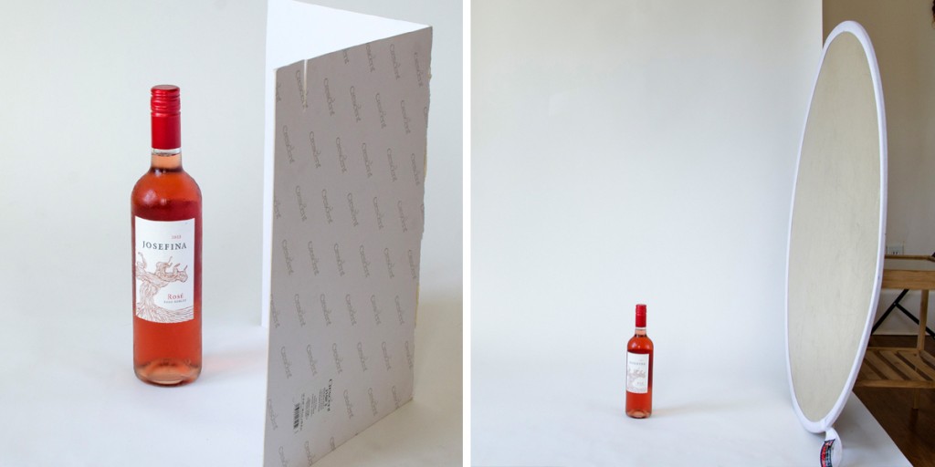
In the two photos below, the photo on the right was taken with a reflector; the shadows are distributed evenly.
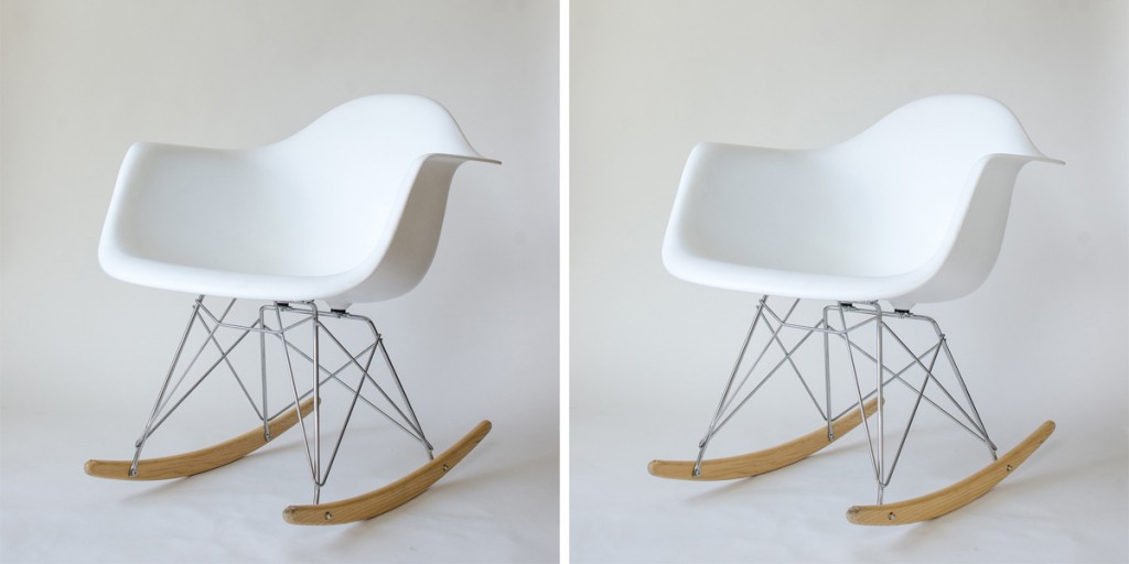
Foam boards are a lot cheaper than reflectors. You can get a pack of 10 for less than $20. Basic reflectors will set you back $30, while larger ones typically cost upwards of $50.
Artificial lighting
If budget is not a factor and you’re looking for more flexibility during a shoot, your other option is to use artificial lighting.
Unless you’re setting up a permanent studio and want to invest in professional lighting, I would not recommend using artificial light sources. They’re very fiddly and you need to know what you’re doing if you want them to work correctly. It involves a lot of trial and error, but once you figure out the right combination of lighting and camera settings that work best for your products, it can go smooth sailing from there.
Artificial lighting works best for people who can’t shoot during the day. When shooting with artificial lighting, it doesn’t matter what time of day you shoot since you’re going to be replicating natural lighting with your tools.
If you still want to use artificial lighting but have limited funds, you can use everyday light bulbs. Go for 15-watt fluorescent bulbs and 60-watt incandescent bulbs. Note that incandescent bulbs are less energy-efficient and also much warmer than fluorescent bulbs, so you may need to play around with some custom white balance settings.
Use adjustable desk lamps or grab some clamp lights and spring clamps from your local hardware store.
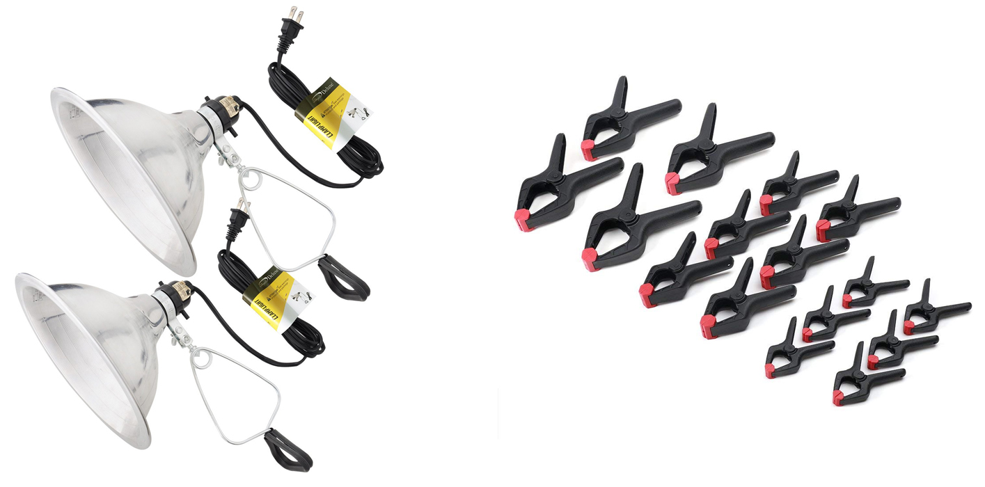
If you want to upgrade to better-quality studio lights, I highly recommend you buy a lighting kit. You’ll find lots of different kit options online — Amazon has a range of studio lighting kits, as does Digital Camera Warehouse.
Back to top
Shooting product photos
Now that you have your materials ready, it’s time to keep everything organized and in check to facilitate a fuss-free shoot.
Prepare products to shoot
To conduct a seamless photo shoot, you have to be organized. You don’t want the products you’re going to take photos of strewn all over the place. This will only disrupt your workflow and may result in you having a hard time keeping track of the hundreds (or even thousands) of product photos you take.
Make sure your products are ready to be photographed. Clean, polish, iron and dust before you shoot, not while you shoot.
A helpful tip is placing all the products in one corner of the room and assigning time blocks as to when you’re going to shoot them.
Setting up your photography tabletop and sweep
Just like how it’s important to set the table prior to eating a meal, arranging your photography tabletop and sweep is crucial for ensuring a smooth and seamless shoot.
Shooting on a white background will help you reduce the amount of photo editing you will need to do later on. A white sweep will reflect white light onto your product, giving you a well-lit product photo that needs few or no brightness and contrast adjustments, while a black backdrop will have the opposite effect.
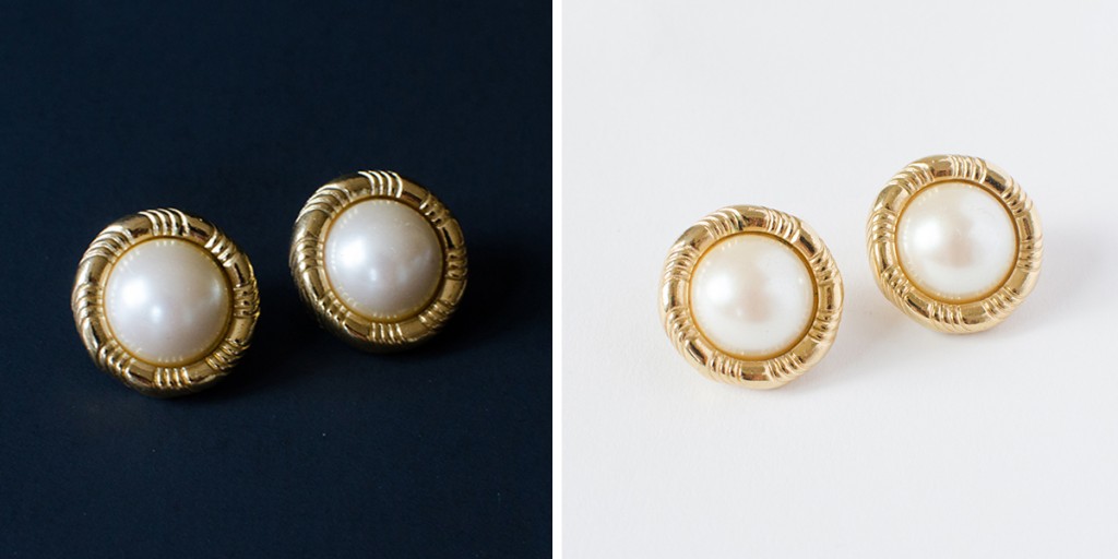
The sweep will also ensure your camera’s white balance calibration is as accurate as possible. Put simply, the light sources that we come into contact with every day are not pure white. They all have color temperatures, measured in Kelvin, and our brains can adjust to different light temperatures and process colors for us.
For example, a white piece of paper will look a little yellow under warm light and slightly blue in the shade, but in both lighting environments we know the paper is still white.
Digital cameras guess what the true colors are based on a white element in the photograph. The sweep will ensure the photograph accurately represents the product’s true color and prevent any color spills.
Now for the makeshift sweep, you would need the materials listed here. To create your DIY tabletop photography setup, nail the bottom of your planks to the back edge of the table and clamp your sweep material to the top of the planks. Let the material ‘sweep’ down to the table surface.
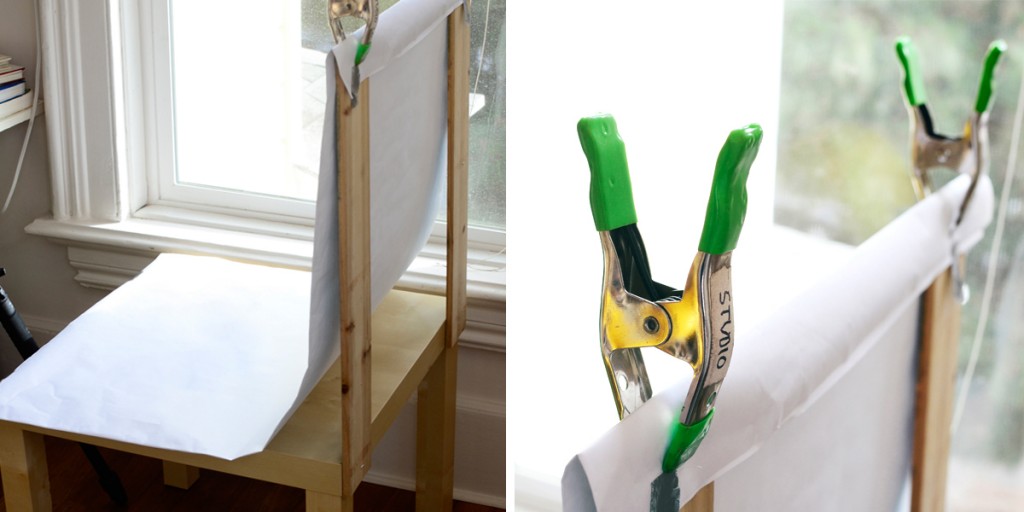
A chair could also work in this scenario. All you will have to do is clamp the sweep to the top of the chair and let it flow down the chair itself.
If you’re shooting larger items, the easiest way to do it is to piece together a few rolls of craft paper, tape them to a wall or pin them to a stand (pictured below), and allow gravity to do the rest.
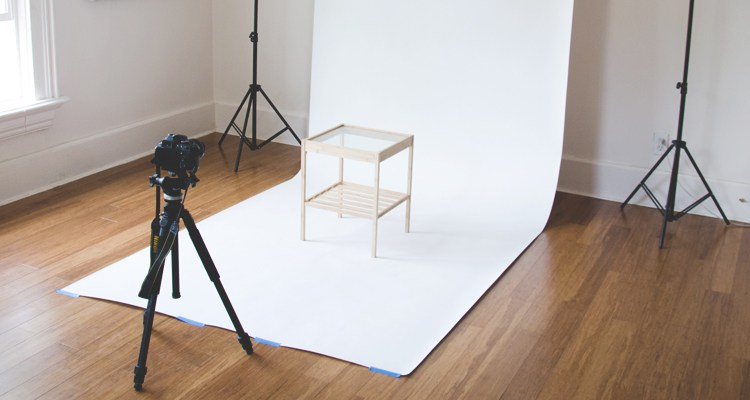
When you purchase a sweep, I suggest getting a support stand too. You just need to set it up with enough space to accommodate your lighting setup.
Setting up your lighting
Setting up the lighting largely depends on the type of lighting you selected.
Natural lighting
If you’re using a tabletop setup, the first thing you want to do is situate your table as close to the window as possible but do so in a way that the sunlight is not directly hitting your set. Ideally, the window you’re going to use should be large enough that it allows for a lot of natural light to enter the room.
Angle the table at about 45 degrees to get just the right amount of light. You don’t want direct sunlight spotlighted on the products and models because it will result in subpar photos with lots of shadows which will be a lot hard to edit afterward.
If you find the natural light is too intense (depending on the time of your shoot and season), you can diffuse it by covering the window with a white sheet or taping white paper over the window pane. Any sheet of a different color will affect the color of the light, which will ultimately affect the final product image.
You can also use a foam board to either bounce light back onto the subject or absorb light. White foam boards brighten the overall lighting of your products, while black foam boards help lessen the harshness of the lighting in situations where the sun is shining perhaps a little too bright.
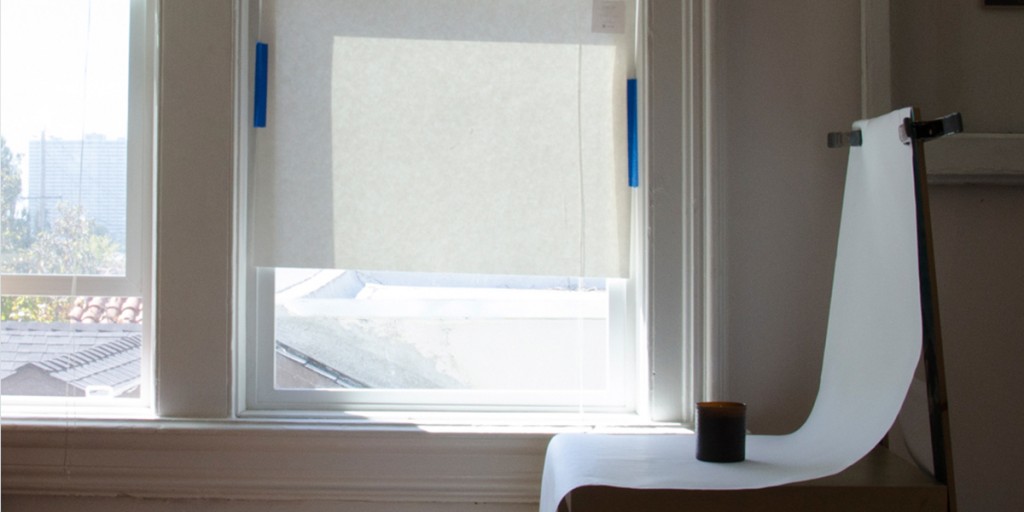
Foam boards are a better option when it comes to DIY product photography. Foam boards are much more versatile as they’re easier to mount using clamps or jaws. Not to mention, they’re much cheaper too.
On the other hand, a reflector is mostly for professional use. While they tend to cost more, the light they reflect is harsher and they add more contrast to the final images. They also have better longevity and are easier to stow when you’re shooting on-the-go.
Artificial lighting
If you’re using artificial light, the ideal basic setup has three lights. You will need two lights, one on each side of the studio, to light up the entire product. Place them closer to the front and lower to the ground to avoid getting harsh shadows near the bottom of the product.
You also want to place a third light above and slightly behind the product to give it some dimension — it’s good to have a balance between the light that shines directly on the product and the light that lights up the entire setup.
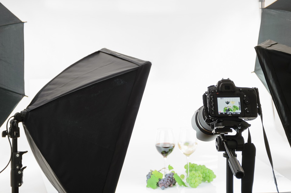
There are two important things to remember when using artificial lighting: You can’t mix light temperatures (it’ll throw off your camera’s white balance calibration) and you need to cover up all the windows.
Same with natural light, you’re also going to need some kind of method for diffusing or reflecting light, regardless of whether you’re using studio lights or a cheaper alternative. It is important to use indirect or soft light sources; direct lighting can create harsh shadows and light glares, and leave your products overexposed.
Reflecting the light involves shining the lights in the opposite direction from where you want the light to fall and having your reflectors cast the soft light onto the desired spot. The most efficient way of doing this is to use an umbrella-style reflector (a basic one will cost well under $50).
You can use anything translucent and white to diffuse light, but a thin white sheet or tissue paper works best. If you’re serious about product photography and already own studio lights, I highly recommend purchasing a softbox.
A softbox fits around your lamp; the outside walls are dark, the inside walls are reflective and the front wall is made of diffusion material. It’s really easy to attach and quick to set up and adjust. If you’re starting your DIY studio from scratch, buy a kit that comes with a reflector or diffuser.
Stabilizing your camera
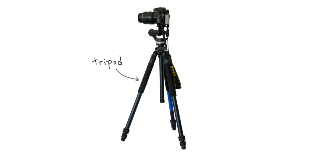
You need to stabilize your camera to ensure crisp in-focus product images. You can do this by placing it on any kind of hard and stable surface, like a pile of books, but a tripod or smartphone mount will make your life a lot easier if you plan on photographing products frequently.
Camera Settings
Though the settings on each device are different, all you need to remember is you should shoot the largest and highest-quality photos possible. You can always compress files and make them smaller later, but you can’t increase the size or improve the quality.
On a point-and-shoot or smartphone, the camera will capture the best-quality images it is capable of by default. On a DSLR, the size settings often range from large (L) to medium (M) to small (S) — always go with large. The quality settings usually range from superfine (S) to fine (F) to normal (N) — always go with superfine.
As for DSLR camera settings, we explain it in detail here, but here is a quick cheat sheet:
- Your ISO should be around 200 to 800 when working with natural light, and 800 and above in areas with low light conditions.
- Set your aperture setting between f/4.5 to f/7.1 if you have a plain, white background, and f/2.8 or lower if not.
- Your shutter speed should be set to 1/125 or higher to ensure clear and crisp shots.
- You should also set your white balance to ‘AWB’, or ‘Auto White Balance’. If you’re on a smartphone, make sure you’re shooting in a normal mode, and not in one with predefined filters.
Setting up your products
When arranging your products on the shooting table, make sure you set them up on a smooth and stable surface. Smaller products tend to move in the middle of shooting, so it’s best to glue or tape them in place before you start. You should also position the in the middle of your tabletop setup.
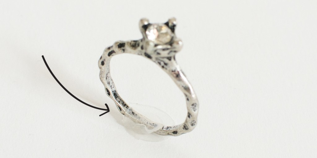
You also have to make sure that your lighting source is not directly hitting the products. Try to situate them in a way that they get just the right amount of lighting with little to no shadows.
Shoot and test
Before you go all out and embark on an hours-long photography session, you should take a couple of test shots first to ensure that you have the right lighting and camera settings. When you find that you’re happy with the test shots you’ve taken, you can go ahead and proceed with actual shoot.
Make sure you turn off your camera’s flash. Whether you’re using natural or artificial lighting, your product needs to be sufficiently lit without the camera flash.
When shooting, you want your product in the center of the frame and taking up the majority of the canvas. If you need to get closer to the product, move your tripod or use the optical zoom on your DSLR, which is adjusted by rotating the lens left and right.
Never use a digital zoom on any kind of camera (this is where you press the ‘+’ and ‘-’ signs on the device). A digital zoom lowers the quality of the image because it just crops the photo while you shoot.
Take several shots to evaluate your setup and settings. Take time to really look and evaluate your photos. Don’t be afraid to experiment. Once you’re happy with your test shots, set the camera on a two-second-timer mode. This will give your camera enough time to re-focus after you press the shutter button.
How to shoot Manual (M) if you’re using a DSLR
The benefit of using a DSLR is having the ability to adjust some of the more advanced settings. These settings might be overwhelming at first, but there are only a few key things you really need to know: aperture, shutter speed and ISO.
The perfect combination of the three will depend on your studio setup, but if you have a basic understanding of each one, you’re sure to find the best settings in no time.
The aperture is the hole within the lens that determines how much light travels into the camera. The size of this hole is measured in f-stops. By increasing the f-stop number, you make the aperture smaller and as a result, let in less light — this will make the image darker.
The aperture setting determines how much of the shot is in focus; the technical term for this is your depth of field. A large f-stop number (small aperture) clearly captures everything in the frame while a small f-stop number (large aperture) isolates the foreground from the background by making the foreground very clear while blurring the background.
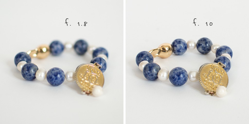
When it comes to product photography, you want to set the aperture setting that’s small enough to clearly capture the entire product, but large enough to give you a well-lit product. I like to shoot with an aperture of around f/8.
While your aperture refers to the amount of light the hole in the lens lets in, the shutter speed is the speed at which this hole opens and closes.
This is measured in fractions of a second. Using a small aperture setting means your camera is taking in less light, which means the shutter needs to be open longer to produce a well-lit photo. Experiment with different combinations for shutter speed, but here’s a tip: You’ll find that a small aperture combined with a slow shutter speed will produce the best images.
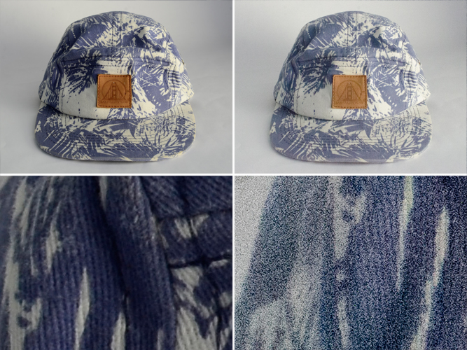
The ISO determines the camera’s sensitivity to light; the higher you go, the ‘granier’ your image will look. This is referred to as camera noise and will lower the quality of any photo, so keep your ISO as low as your lighting conditions will permit. Try not to exceed 400.
Get multiple shots
A post by Tictail suggests that the more product photos you publish, the more you’ll increase sales. This doesn’t mean quantity over quality; rather, providing enough photos to help people visualize your products will increase your sales.
Take photos from all angles and provide close-ups of any details, special features or textures you think visitors to your store should see.
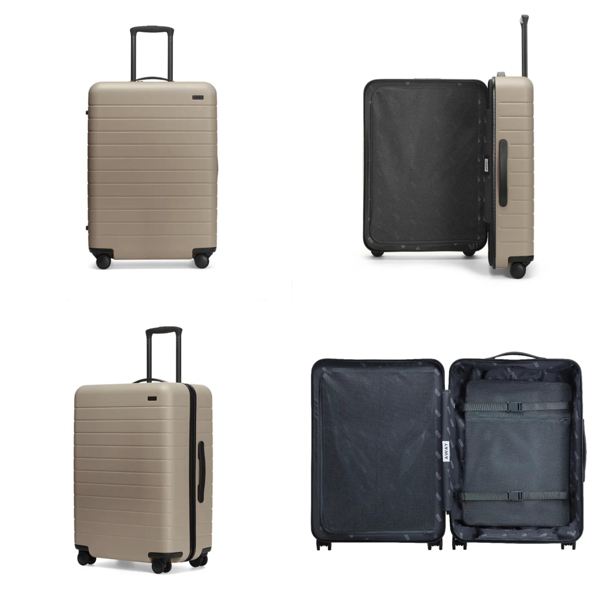
Luggage brand Away showcases its products from different angles.
Back to top
DIY Product Photography Retouching
How to remove the background from an image
So now that you have your awesome shots, it’s time to make them retail-ready for your eCommerce store. Removing the background from each photo can give your product images that extra professional touch.
It’s a fiddly process, but practice makes perfect and it’ll be worth it in the end. To remove the background from your product images, follow the steps below. I’ve used a photo of a shoe to help explain the process.
- Open your image in Adobe Photoshop.
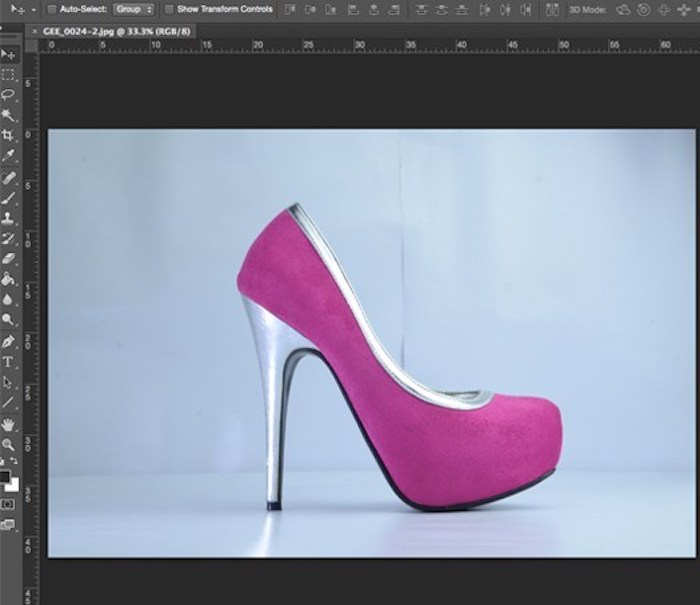
- Select the pen tool by either pressing ‘P’ on your keyboard or selecting it from the tools palette on the left side. The pen tool links together different line segments (‘anchor points’) to create a ‘path’. The anchor points are created whenever you click on the image with the pen tool.
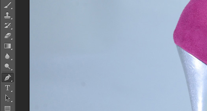
- Choose your starting point by left-clicking on the product where you want the path to begin. You’ll see your first anchor point show up.
- To start creating your path, left-click another point on the product’s edge. The most logical place to put your anchor points is when the product changes shape distinctly.
- Work your way around the product by creating new anchor points, starting with the easy straight edges of the product to get them out of the way. By default, the path created between anchor points is straight.
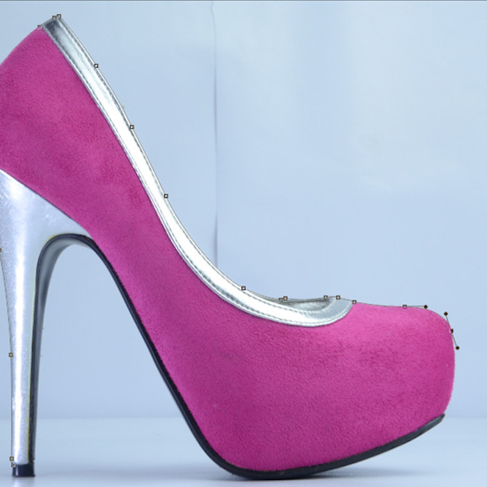
- When you get to an edge of the product that requires a curve, this is where it gets a little tricky. Hold down the mouse as you click and drag the path away from the anchor point. You’ll see two ‘bezier handles’, which allow you to manipulate the shape of the line. The handles will affect the line on either side of your anchor point, so if you want to adjust them individually, you need to hold down the ‘Alt’ key and drag a particular handle. It might take you a while to master this as it requires a steady hand, good coordination and a bit of time to get a feel for how the bezier handles work. If you get any of the points or curves slightly off, don’t worry! You can change them later. If you’re way off, undo an action by pressing ‘Command + Z’ on your keyboard and try again.
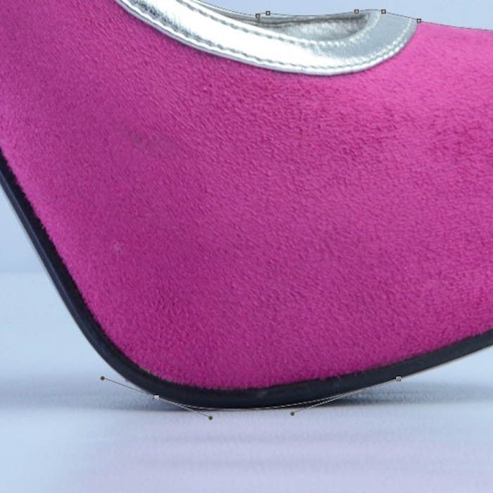
- Continue to work your way around the product until your last anchor point catches up to the first.
- To adjust any existing anchor points, you need to use the ‘Direct Selection Tool’. To do this, hold down the ‘Command’ key, click the anchor point and drag. Alternatively, you can select the tool by clicking on it in the tools palette or hitting ‘A’ on the keyboard.
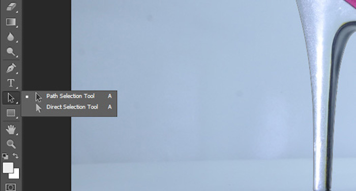
- Make sure the pen tool is selected again and save the current path by clicking ‘Selection…’ in the paths palette above the workspace. Press ‘OK’ and you’ll see a selection line (‘marching ants’) appear around the product exactly where your path was.
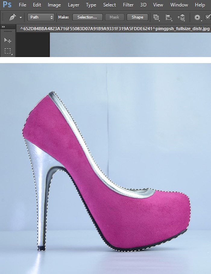
- At the top of your Photoshop window, click ‘Select’ > ‘Inverse’. This will invert the path so the background is selected instead of the product.
- Hit ‘Command + X’ on your keyboard, and voila! The background is white! If you want a transparent background, continue to the next step.
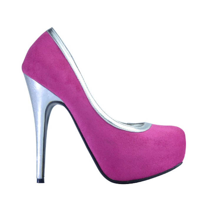
- At the top of your Photoshop window, click ‘Select’ > ‘Re-Select’. This will place the marching ants around the white space.
- Click ‘Select’ > ‘Invert’ to place the marching ants back around the product.
- Hit ‘Command + X’ to cut away the product. Don’t panic, it’s supposed to disappear! You’ve just placed it in your clipboard.
- At the top of your Photoshop window, click ‘File’ > ‘New…’. The dimensions will default to the size of the item in your clipboard, i.e., the product.
- Change the ‘Background Contents’ to ‘Transparent’ and hit ‘OK’. A blank canvas will appear before you with a white-and-gray checkered background. This represents transparency in Photoshop.
- Hit ‘Command + V’ on the keyboard to paste the file and you’ll see your clipped and clean product on the new canvas.
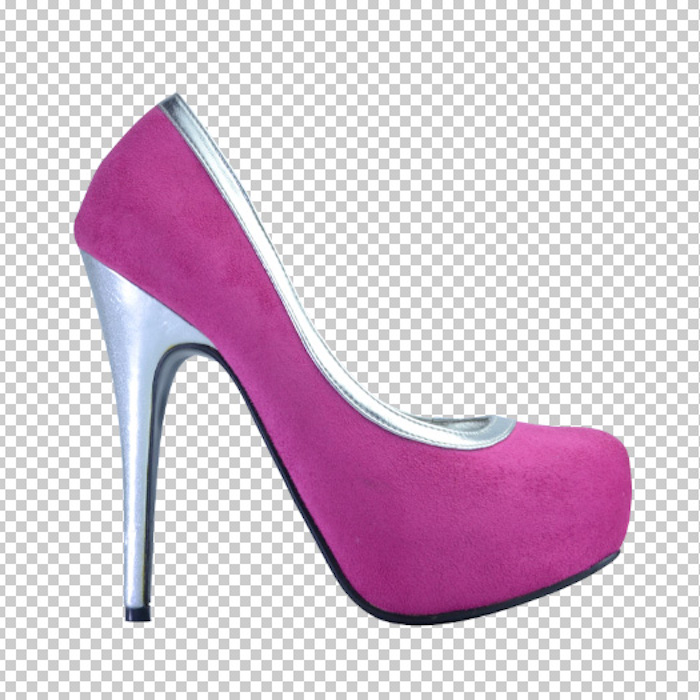
- When saving your image, do not overwrite the original file with a background as you may end up needing it again. Save the image as a PNG or JPEG; JPEG is the most compatible file format for websites but, unlike PNG, it doesn’t support transparency, and the transparent parts will automatically turn to white when saved.
| Try Pixc for Free |
How to create a product image template
What’s the point of having great product images when they don’t look great together? The last step is to create a template and apply it to your product images. This will ensure they look consistent are the perfect size for your website.
To create a template:
- Open Photoshop.
- Click ‘File’ > ‘New…’.
- Give your new file a name.
- Set the width and height values. I recommend anywhere between 1000px and 1600px on the longest side. This is sufficient for Amazon and eBay.
- Ignore ‘Resolution’. This only matters when you’re printing photos.
- Set the color mode to ‘RGB Color’, ‘8 bit’.
- Make sure the background contents are ‘White’.
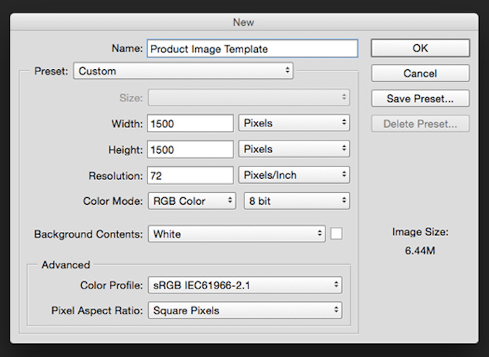
- Click ‘OK’ and you’ll see a blank canvas has been created.
- Create center guidelines to help you nicely position your product in the middle of the canvas. At the top of your Photoshop window, go to ‘View’ > ‘New Guide…’ and create a horizontal guideline at 50%. Repeat the process but this time create a vertical guideline at 50%. You should now have a ‘cross’ on your canvas.
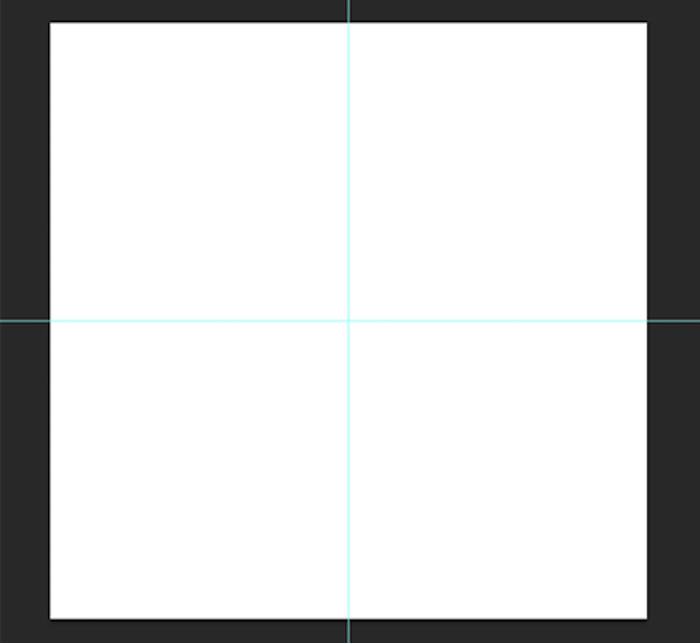
- Create guidelines around the edges of your canvas so all of your products take up the same amount of canvas space either vertically or horizontally. The general rule is the product should take up 80-90% of the frame. For a square canvas, just go to ‘View’ > ‘New Guide…’ and create both horizontal and vertical guidelines for 10% and 90%. For a rectangular canvas, you’ll need to do a bit of math; work out 10% and 90% of your width and height, then type in the exact pixel amount when you create the guidelines. Note that you need to put ‘px’ so Photoshop doesn’t default to another measurement. For example, a length of 1500px should have guidelines at ‘150px’ and ‘1350px’. Play around with different percentages — try 80% and 20% if you’re after more white space, and 5% and 95% if you want less.
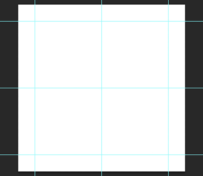
- Open your product image in Photoshop. Hit ‘Command + X’ on the keyboard and watch it disappear from its canvas (it’s now on your clipboard).
- Go back to your product image template and press ‘Command + V’. Your product image appears!
- Press ‘Command + T’ to enable ‘Free Transform’ mode, and resize your product by holding down the ‘Shift’ key, clicking one of the little corner squares, and moving your mouse in the direction you want to go. Move the product around and keep resizing it until it’s sitting in the center of the canvas and touching both horizontal or both vertical guidelines. Only ever shrink your product — enlarging it will pixelate it. If your product is too small for the template, make the template smaller.
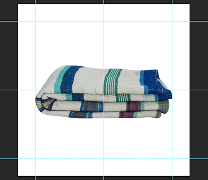
- Save your file as a JPG; this is the most compatible format for websites, and the product image you upload to your eCommerce store doesn’t need a transparent background.
- For a super-speedy site, compress your image to a web file. Go to ‘File’ > ‘Save for Web…’ and set your quality to 60. You won’t notice much of a quality difference and you’ll be able to reduce your image to under 500KB, which can make a huge difference to your website’s speed when you’ve got hundreds of product images.
Why so big?
You’ve probably realized your website’s product image template is much smaller than 1000px, so you might be wondering why I specified those values above as the perfect size. This is because the image you upload to your website becomes the ‘base image’, and it’s then resized to fit the differently sized templates you have on your eCommerce store (the product listing, the shop page, the thumbnail for alternative product images, etc.).
Having a base image larger than the templates will let you enable a zoom function, which is a great way to improve your customer’s online shopping experience. The secret behind the zoom function is it simply displays the image at its full size (the base image size), and for an effective zoom function you need a base image that’s larger than the product image templates.
If coded correctly, your site will resize your base image perfectly if the product image template and base image have the same width-to-height ratio. For example, 1000px by 1000px will resize perfectly to 500px by 500px.
Back to top
Optimizing your images for web
So now that you’ve taken all your product photos and turned them into retail-ready images, you must think that they are now ready to be uploaded on the web, right?
Well, not so fast!
The next step is to work on image optimization.
It’s important that you optimize the product images so a) they can load fast enough to allow for good user experience, and b) they show up in search engines and raise your store’s brand visibility.
Here’s what you should do:
Reduce the file size of your images
The bigger the file size is, the slower it is to load.
You don’t want your site to be bombarded with images with large file sizes because the customer might get too impatient to wait for them to load.
For eCommerce product images, try to keep the file size lower than 70 KB regardless of the dimensions in pixels. This ensures your product images don’t adversely affect the recommended loading speed by Google.
The great thing about this is that lower file size doesn’t necessarily mean lower quality of the image. Certain file types, such as JPEGs, can be downsized without affecting the quality of the photo.
If you’re exporting the image via Photoshop, you can take advantage of the “Save for the Web” option so the program will automatically compress the image for you.
If you don’t have access to Photoshop, there are free tools on the Internet that you can rely on to reduce file sizes. Sites like WeCompress, Pixlr, and Pic Monkey compress your images without putting a damper on the quality.
Choose the right file type
JPG, GIF, and PNG are the most commonly used file types on the web.
JPG or JPEG, which stands for Joint Photographic Experts Group is typically used for photos since they display colors vividly.
GIF or Graphic Interchange Format is used for smaller images like icons and logos, as well as animated imagery.
Meanwhile, PNG or Portable Network Graphics is similar to JPG but better in terms of quality. However, it tends to result in higher file sizes.
For eCommerce product images, it’s best to use JPG. It displays the best quality while still maintaining a small file size. You can also use PNG if you want to use an image that needs to have a transparent background.
Include alt text/alt tags on your photos
Adding alternative text (alt text/alt tags) to your images can positively impact their visibility on search engines.
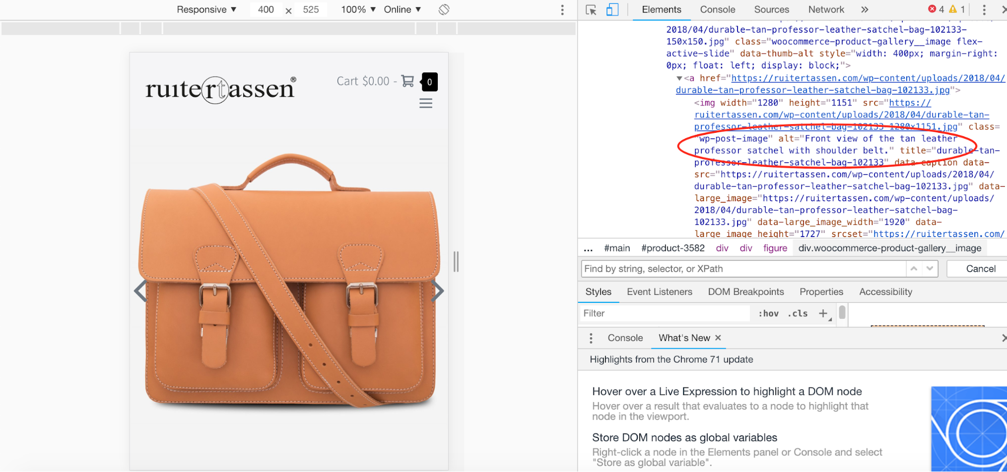
Example of an alt text from Ruier Tassen’s online store
The ‘crawlers’ that index web pages cannot see exactly what is in an image, so they rely on text instead to determine the content of the photos. They then use the alt text attached to images to determine the ranking. Since eCommerce stores depend on images to sell, writing alt text can help consumers who are searching for a certain product to discover your store.
When writing alt text, you must follow three simple rules:
1) keep it brief
2) make it descriptive
3) don’t stuff too many keywords.
We have previously written how to use alt text in detail, but here is a quick guide in using it:
First things first, keep your alt text short. A good rule of thumb is to limit it to 125 characters to accommodate screen reading tools. Describe the image as best as you can without going overboard with the characters.
Secondly, make it descriptive. Explain in detail the product type, color, size, shape, make, and model. It may be impossible to include everything considering you’re only limited to a few characters, so the best you can do is only write what you want the users to know about the product.
And third, don’t include too many keywords. Keyword stuffing is taboo in SEO and may result in your site being flagged by search engines. Only use the keyword/s once and allocate the rest of the characters to describing the product.
Use detailed file names
When saving product images on your computer, you’re probably accustomed to assigning generic file names like “Picture-1”. This is fine when you’re organizing files on your device, but you should do the opposite when you’re uploading them on the web.
Just like with alt text, you need to be descriptive with your file names for SEO purposes. It’s best to use a keyword, but you also have to keep it short. You also have to use dashes in between words, and avoid using articles like “a,” “an,” and “the.”
Say you’re selling a pair of yellow heels… when assigning a file name, think about what your potential customer would write in the search engine to find an item. Instead of naming the file as simply “yellow-heels.jpg,” it would be better if you name it as “yellow-chunky-open-toed-pumps.jpg”
Now it’s up to YOU!
Now is the time to get started and take your DIY product photography to the next level! After all, your product photos will have a lasting effect on both your business and your overall brand image.
Don’t be discouraged if your results aren’t perfect straight away – product photography is a skill that will take practice and patience. If you have any questions or need any help, feel free to reach out! We love helping eCommerce store owners with their product images.
| Try Pixc for Free |

