Imagine going to a store, and it takes an hour to find the product you are looking for. You would be frustrated, right?
Your customers feel the same when shopping online. Just as you’d expect a pleasant in-store shopping experience, online shoppers expect fast, convenient, and seamless experiences from ecommerce stores.
As an ecommerce business owner, next to having an amazing product, you need a website optimized for the best experience. This boils down to your ecommerce user experience.
What is UX, and why is it important for ecommerce?
User experience (or UX) refers to the overall feeling a visitor has when he/she navigates your ecommerce site. You achieve great UX when your user finds browsing easy, enjoyable, and helpful.
In most cases, it’s dependent on your design, speed, and functionality. More specifically, your use of video and imagery, colors, typography, and placement. In this article, we’ll discuss how you can optimize these factors to improve your ecommerce user experience and ultimately delight your visitor with each visit.
Find and Fix the Problems
How do you know if your website is user-friendly? Here are some simple tools to help you find out:
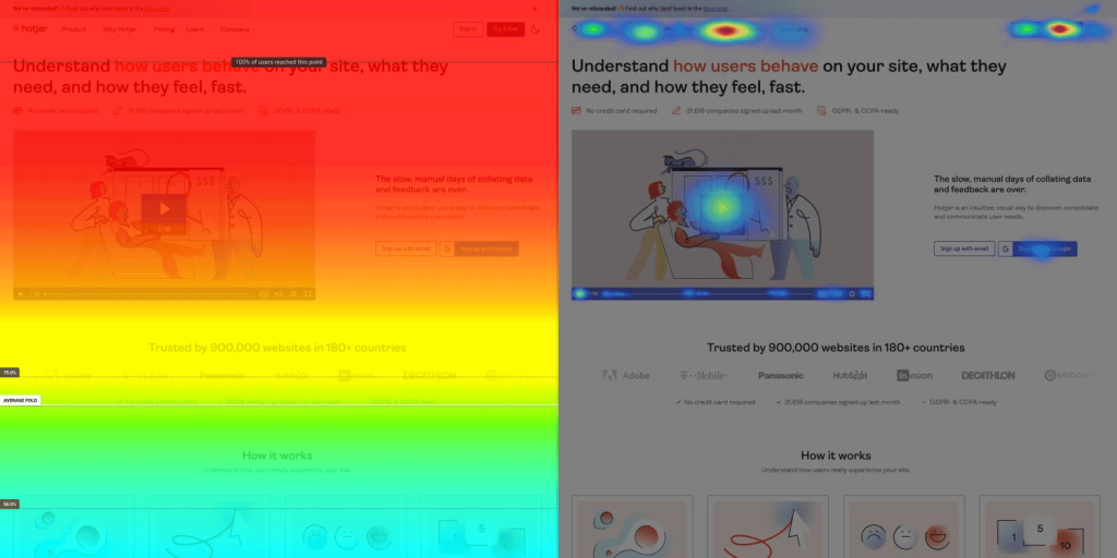
Scroll/Click Heatmaps
A website heatmap is a tool that helps you to see what people do on your website—what interests them and what they ignore.

The most popular spots on your website will appear in red. You can use this information to discover missing links. For example, are they clicking on a word to try to go to an information or payment page? Or is something catching their attention that you can replicate elsewhere?
Hotjar and Smartlook are heatmap software you could try.
Session Replay
You can take it a step further by replaying how a visitor used your website. No, it does not mean you’re secretly recording your customer’s screen — that would be illegal. Instead, a session replay simply logs their movement, then creates a video of the user’s experiences. This is a great way to learn how a real customer navigates your website, discover their pain points, and improve them.
You can learn more about session replays here and check out Hotjar if you want to try out the tool.
User Test
User testing is a method of evaluating ecommerce user experience. You ask subjects to test your website and identify its positive features or negative attributes if any, so you can improve it if necessary. You and your web developer think your website is great, but your customer doesn’t have the same technical experience and may find the website confusing.
In a user test session, you can test specific things on your website, like adding an item to the cart or registering a return and see your test subject’s reactions and attitudes in real-time. From there, you analyze your results and enhance the ecommerce user experience accordingly.
Ask Your Customers
This is a very simple way to find problems on your website! What do they like or not like? What improvements would they like to see? Your customers are the best source of information.
8 Tips to Improve Your UX for More Conversions
So, now you know the problems, how can you fix them? Here are 8 practical and actionable tips that you can use to help improve your user experience.
Improve Speed
Internet speeds vary – not just across the world but even within the UK, Australia, and the USA. That means heavy websites – those which host a lot of heavy videos or use lots of plug-ins – will take a long time to load, which will frustrate your customers.
In fact, a two-second delay in your page speed can result in a 103% increase in bounce rate!
There is a range of factors that can impact a page’s speed, including:
- Unoptimized images, videos, and other media files that are on the page; 80% of a website’s time to load is spent downloading things on the page, like images, stylesheets, and scripts)
- Themes and plugins
- Coding and server-side scripts
How can you improve your website’s speed?
- One simple way to improve your website speed is to minimize and simplify your web page design. You can do this by deleting unnecessary images and videos. Also, remove any plug-ins that you are not using.
- Compress and optimize all of your images and videos. SEO: Image Optimizer Page Speed and SEO, Speed & Image Optimizer are two great apps that can help optimize the images on your Shopify ecommerce store.
Improve Navigation
Good website navigation allows customers to quickly find the product or information they need and drive them through the conversion funnel. It also helps your search engine indexing and SEO!
Imagine the customer journey – from search, discovery, cart, to checkout – and how your website can make that as easy as possible.
How can you improve your website’s navigation?
- Replace the drop-down menus – Menus can overburden them with information, and usability research shows that consumers find them annoying. Instead, consider floating or collapsable menus.
- Focus on search. People who run a site search convert approximately two times more often than people who don’t. Make search easy to find and use.

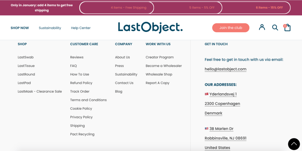
- Create a mega footer. It will provide navigation links to all the important pages on your site, meaning that customers can quickly jump to exactly what they’re looking for.
Make Your Webpage Easy to Use and Understand
User experience also refers to the text on your website – especially regarding products. Ask yourself: is the text informative and to the point, or does it confuse customers?
How can you make your webpage easy to use and understand?
- Keep it relevant. Focus on short, sharp, informative text and select images and videos that make sense for the product and page.
Ensure Your Website is Scaled for Mobile
58% of all online visits came from smartphones in 2021.
People shop at work, at home, on the go, and waiting for the bus – so your website needs to be user-friendly to ensure the best user experience.
How can you ensure that your website is scaled for mobile?
- Keep navigation in the same place as on desktop so that customers can switch between the two formats seamlessly.
- Ensure that your website design is responsive – i.e., when you change the screen size, does your website automatically move with it? Otherwise, your customers will miss half of the information and have to scroll across the screen to see the page’s full content, leading to a bad customer experience.
With that in mind, you should consider building your website as ‘mobile-first,’ meaning built for mobile and then can be scaled up. Mobile-first design requires UX designers to prioritize the most valuable content, leading to more efficient browsing for your customers and, therefore, greater customer experience.
Overall, UX is very important when designing and building your e-commerce website. Over time, it might become slower and more complicated. These tips will help you optimize your store’s UX for more conversions.


