The success of ecommerce sites depends highly on efficient design and page optimization.
It especially matters if the competition on the market is fierce and you’re competing with some other stores selling similar – or even the same – products. In that case, the look, intuitive interface, and checkout process of your website all create a strong competitive advantage.
Here are the ten most important UX and graphic design tricks on how to optimize your ecommerce store and push your sales to new limits.
1. Get The UX Basics Right
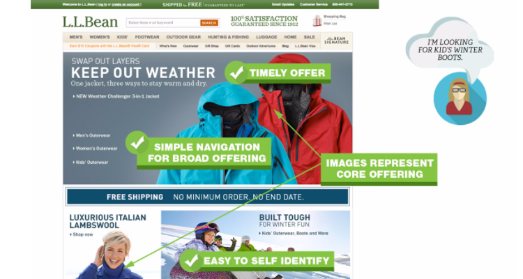
First of all, you should get the basics right. Your images must represent the core offerings on your website and be of high quality. Make sure you emphasize and showcase what it is that you’re selling.
Then work on the flow of your navigation. Make sure the navigation menus and bars are clear and visible and that the visitors aren’t overwhelmed by the amount of information on the starting page.
2. Remove the unnecessary
Strip down the images and information
Don’t use any confusing images around your pages or subpages. If the page is about swimming gear, don’t put any information about coffee there even if you have another ecommerce store selling it.
Remove unnecessary promotional info
Oftentimes, ecommerce stores are trying to push users onto products they completely don’t need via the promotions tab. Make sure that visitors are aware of them, but still let them focus on the particular items they’re searching for.

3. Expose The Right Stuff
When your store is selling a range of different items and products, make sure that you’re giving visitors an immediate overview of everything that’s available. It’s worth including the links to customer service or return policies both to be transparent and because they’re important information to visitors.
However, it’s a pretty bad practice to emphasize your promotions straight away – they’re distracting and make you look cheap.

4. Structure Your Product Pages Well
The organization of your product pages is a critical part of ensuring that your customers are drawn in by the information that is most appealing to them.
When opening the product page, make sure you immediately show if the product is available. Then work on structuring the information on the page logically and nicely. Include:
- Product photo,
- A neat description,
- Shipping information, and
- All the product specs.
Product images should always be the first element. Customers want to see exactly what they are getting for their money.
Make sure that the “Add To Cart” button is big and visible. But don’t make it too annoyingly huge – better to place it somewhere under the product info, located at the middle of the page.
Keep elements like customer reviews and links to similar products closer to the bottom of the page.

5. Make your product photos look awesome
That’s pretty basic advice, and yet 90% of ecommerce stores still have a lot more work to do on product photos. Make sure that the image is clear and not pixelated. A great practice is to use vector graphics software like Vectr to make sure that the graphics are clear even if you have to scale them.
From the technical perspective, most ecommerce platforms support plugins that allow you to easily include and locate your product photos. Give it a bit of research, spend some hours resizing and cropping, or let Pixc do the work for you – and the results will be tremendous!

6. Motivate customers to create an account
There’s a big difference between having a customer purchase something once and having that same customer purchase items monthly or even weekly. In order to make sure that visitors and customers are going to come back, it’s worth emphasizing the benefits of creating an account.
If there are no obvious benefits from the customer’s perspective – then create some!
- Give them a discount for completing their purchase if they sign up, or
- Promise to send a coupon code to the email they supply.
In other words: offer something of value in exchange for their email.
However, be sure to offer a guest checkout option so customers don’t have to create an account before purchasing unless they want to. Once the checkout process is complete, you can offer to create a new account using the information they have already provided and just ask the user to create a password. But you don’t want to force them to become a member.

7. Make the order confirmation process simple
It is estimated the average online store loses over 75% of sales, while studies show some industries are losing as much as 83.6% of potential sales due to cart abandonment.
Be sure to simplify the design of the confirmation process forms. That’s the most important part of the purchasing process, and everything must ultimately go well. Remove the navigation bar at that point – leave just the contact information in case the customer decides to call you.
As you may already know, the attention span of online customers is incredibly short. It is worth spending a bit of time looking more in-depth at whether a single or multi-page checkout might suit you best. The right checkout style could result in a significant boost to your sales and conversion rates.
Single-page Checkouts
Single-page checkout includes all the information a customer needs to finish their checkout processes – such as billing, shipping address, payment options, shipping options, and additional fields related.
Pros:
- Reduces cart abandonment.
- Time-saving with fewer steps.
- Higher conversion rates.
- Easy to understand.
Cons:
- Site speed – it can increase the amount of loading time.
- Can overwhelm customers – as billing, shipping, and payment methods appear at the same time on a single page.
- Limited analytics – harder to track and analyze at which step your customers stop their shopping and abandon their cart.
Multi-page Checkout
Multi-page checkout will divide the whole checkout steps into several web pages, usually from 3 to 5 pages. Therefore they tend to be slower compared to single-page checkouts. However, many users stated that they find it easier to follow with multi-page checkout because they have more time to carefully check and confirm details before placing an order.
Pros:
- Better analytics – easier to identify at what steps customers abandon their carts for future improvements.
- Higher security – the process is slower and customers are allowed to fill in their details step by step, making them feel more secure about buying on a website.
- Cleaner layout – reduced amount of content on each page makes it less overwhelming to customers and much cleaner also.
- Display progress – customers can have more motivation to finish their purchase if they can see how close they are to the final step.
Cons:
- Time-consuming – It may discourage customers if they are in a hurry or those who don’t have much patience.
- Cart abandonment – long checkout process is one of the main causes of cart abandonment on ecommerce sites.
- Harder to change or correct details

8. Display total price and quantity
Keep visitors focused on what’s already in their carts when they decide to go back and browse more. Display the number of items in the cart and the total price of the chosen items so they won’t forget about what’s already in there.

9. Design with SEO in mind
Remember SEO when designing your web pages. Keep SEO-friendly navigation links, and make sure that you include the right keywords in the product description. Your design also impacts SEO through 2 indicators: the bounce rate and the average time on the page. The lower the bounce rate and the more time visitors spend, the higher your chances are to rank high for your target keywords.
The importance of a search box
For ecommerce websites, a search box is a vital feature for the visitor’s ability to find products they want. Over 30% of online visitors prefer the direct use of a search box rather than following category paths for navigation.
The use of an ‘autocomplete’ function within the search box allows visitors to directly link to the matching products without the need of loading the search results page.
A good search bar on your site can improve conversion rates, so make sure to enhance your site search function.
10. Keep it original
The last piece of advice – keep it original. Even if you try to copy someone, you should still make it special. Your ecommerce store is unique and must immediately stand out to visitors so try to:
- focus on its authenticity,
- highlight your uniqueness and mission, and
- use some unique personal branding like logos or watermarks on your images.
Remember that your ecommerce store design and structure greatly influence your customers’ experience. So don’t perceive design as an expense – but rather as an investment that usually has a very high and rapid return.
BONUS TIP: Make your site mobile-friendly
The total ecommerce sales from mobile ecommerce have increased from its 52.4 percent market share in 2016 to the current 72.9 percent market share, and are projected to reach $3.56 trillion in 2021!
With the increase of smartphone usage to purchase online, making your online store mobile-friendly is not only beneficial to your business, but also to your potential customers.
So, when creating your website, make sure to optimize your online store for mobile. Consider how your store’s desktop layout will translate into small screens. Ensure the most important elements are highlighted on a page and check how navigation works on mobile.
What are your best design tricks? Share them with us in the comments below.
This blog was written by Vlad. Vlad Shvets is Head of Growth at Vectr, a revolutionary free graphic design software program. Vectr knows that design connects people and believes everyone should experience the almost indescribable feeling that comes from expressing your creative freedom through art and design.