Fashion retail giant Zara is on a quest to become a truly global brand — both online and offline. Late last year, Zara’s parent company Inditex announced its massive online expansion, introducing online sales to an additional 106 countries.
In this product page teardown, we’re going to examine the current state of Zara’s product pages and determine if they’re comprehensive enough to serve a global market.
Hopefully, this helps you if you are looking to expand your target market internationally to design your respective eCommerce websites.
Let’s take a look.
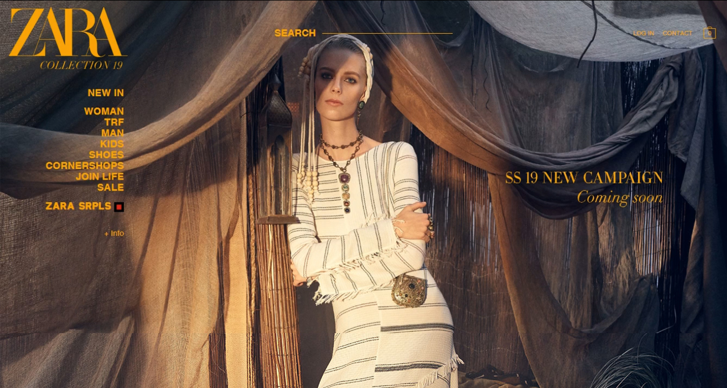
The homepage depicts the brand’s personality
Zara’s homepage encapsulates the experience one would get when you enter their physical store. There’s tons of white space, and you’re not immediately bombarded with products and promotions. In fact, there’s no sign of actual products on the page.
There’s a navigation bar on the left that includes links to different pages, a noticeable search bar on the center top for users to punch in whatever they’re looking for, and newsletter opt-in at the bottom of the page to key in your email address should you want to receive news on new arrivals and sales.
At the center of the homepage is an image carousel that shows different photos every few seconds. Multiple images alert the user of an upcoming image that announces the new collection.
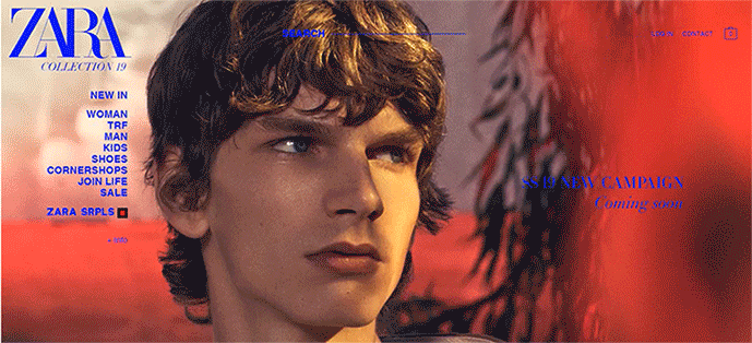
Image carousels are usually deemed a no-no by usability experts, but Zara has used it correctly in this case. Since the content of the homepage is minimal, it doesn’t distract the user from the other elements on the page.
The only thing that could improve the slider is if it’s timed a bit slower to give the user some time to read the entire text. As a bonus, it would also be better if there are slider arrows or radio buttons so visitors can pause the carousel and read the specific image that caught their eye.
The navigation bar is well-categorized
When you click on a category on the navigation bar, subcategories appear right away. This helps the user go to the page of their choosing with absolute ease, rather than having to click dozens of links before they even land on the page they initially set out to visit.
Every category is included in the navigation bar. They also include a sales section and new collections — if there are any.
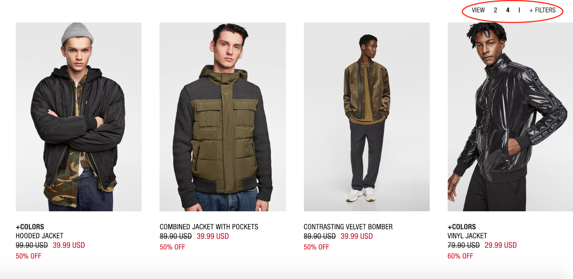
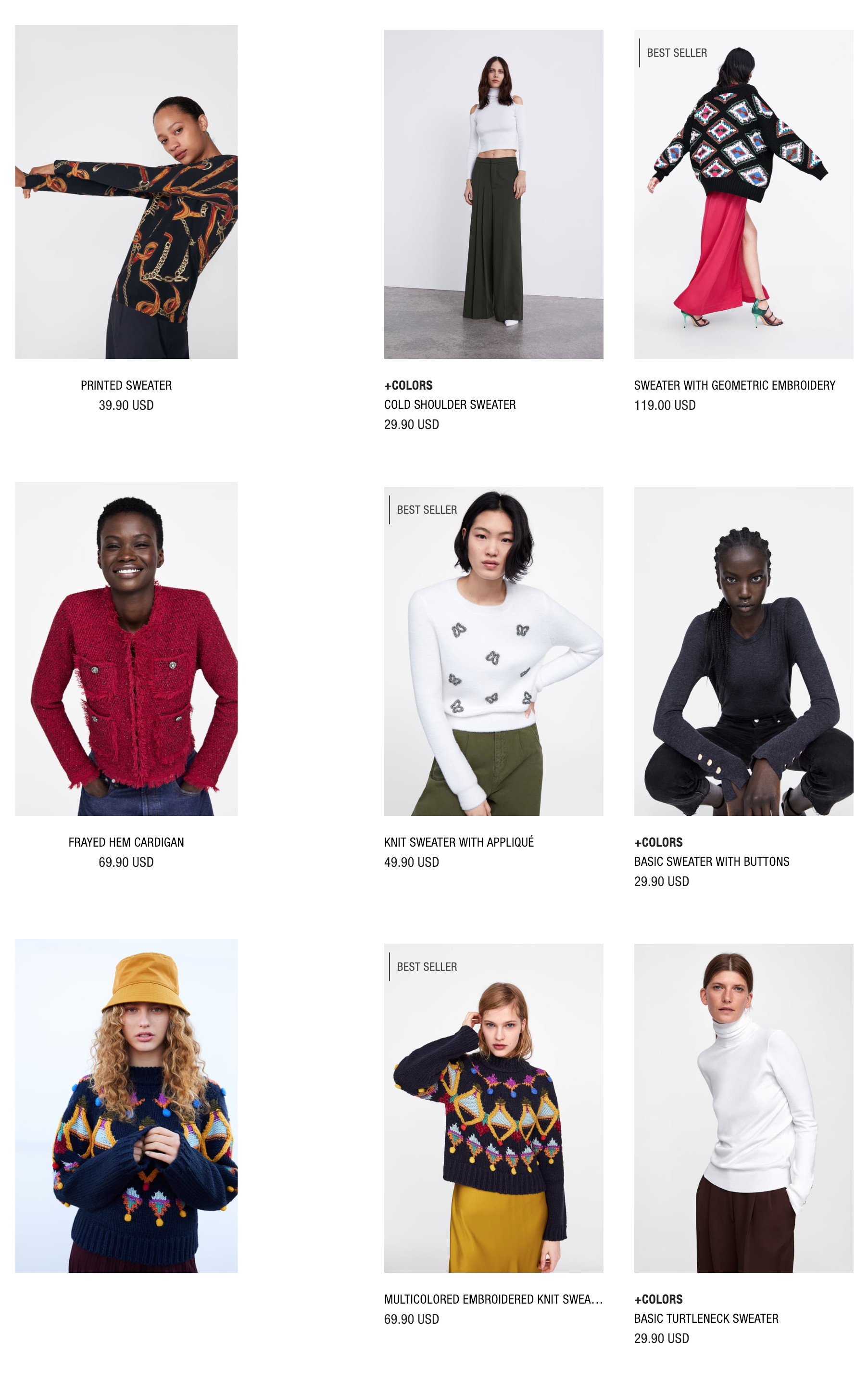
Provide different viewing options
The collection page allows the shopper to filter by 2 or 4 items. The 2-item view option gives them the opportunity to assess the items individually without going to the individual product page. Meanwhile, the 4-item filter makes the collection more skimmable. It then allows the user to view the collection as a whole, and they can easily pick the products they want in a single glance.
Contextual product shots help give your products personality
Zara prioritizes contextual shots instead of product only shots.
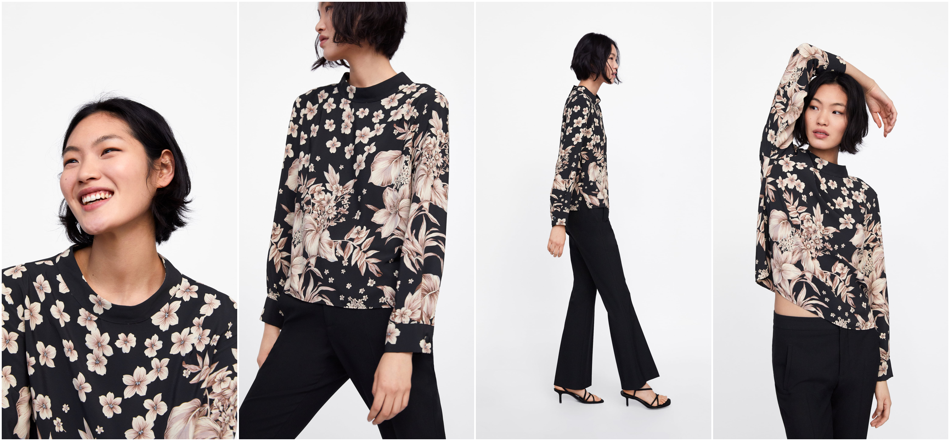
On the product pages, multiple photos of the model wearing the item are shown. Numerous angles are involved, too. There are close-up shots, angled shots, back shots, creative shots, and more.
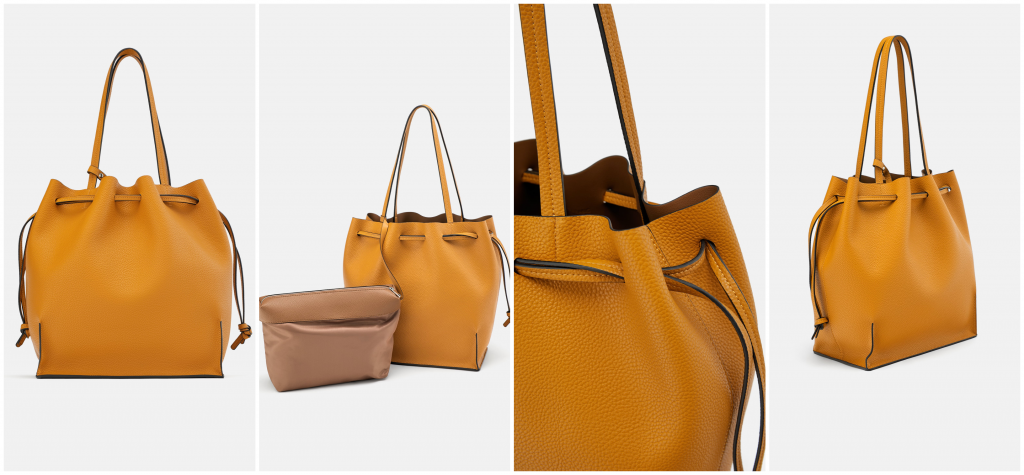
This isn’t to say that their product shots are anything to scoff at. Zara also offers multiple product-only images that show the item in multiple angles and close-ups.
When it comes to clothing photography, eye-catching visuals are key. It also helps to hire a model to demonstrate scale. When users see an actual person wearing the item, it helps customers envision the fit of the product in real life. Plus, the context shots visually explain the features of the item, which would then help them in purchasing decision. You know what they say, a picture is worth a thousand words.
Aim to champion diversity
If you’re catering to a global audience like Zara, it’s important that you strive to champion diversity and inclusivity. You can start by hiring models that are culturally diverse.
Remember: your shoppers come all over the world. They come from different cultures and different walks of life. To appeal to them, you must also show that you support diversity so they could feel well-represented. Hiring only models of a certain color may alienate the rest of your potential customers.
Plus, it’s also a way of showing that there is no concept ideal beauty. Beauty is in diversity. It comes from people of different shapes, sizes, and color.
This isn’t to say that Zara has already perfected this. There is always room for change. They could also start featuring models of different body shapes to cater to shoppers that do not have the same body types of their current models.
Get creative with the layout
If you scroll through Zara’s collection pages, you’ll immediately notice that their images are different sizes. Instead of having a consistent layout and shots that look similar, they are trying to make the page more like a story or a Pinterest board. It’s one way of showing that they are not conventional — that they are not afraid to defy the norm.
In terms of usability, this type of layout may not always be the easiest for the customer. Given that Zara is a multi-billion dollar brand, it can be safe to assume that they have done a lot of prior testing before pushing this out.
If you’re going to introduce something new and different to your audience, it’s in your best interest to do an A/B test first. You can push out two different versions of the same thing to determine which one resonates more with your target market.
Sell more by including styling suggestions
In eCommerce, there’s a practice called cross-selling that involves identifying products that are similar or complementary to the specified item. The suggested items are typically shown on the same page to catch the attention of the user, and therefore increasing the chances of closing a sale.
Zara’s product pages include a “wear with” section that recommends pieces that pair well with a certain item. This kind of visual prompt alerts the shopper of other items that may be of interested to them — items that they otherwise might not come across with if it weren’t directly presented to them.
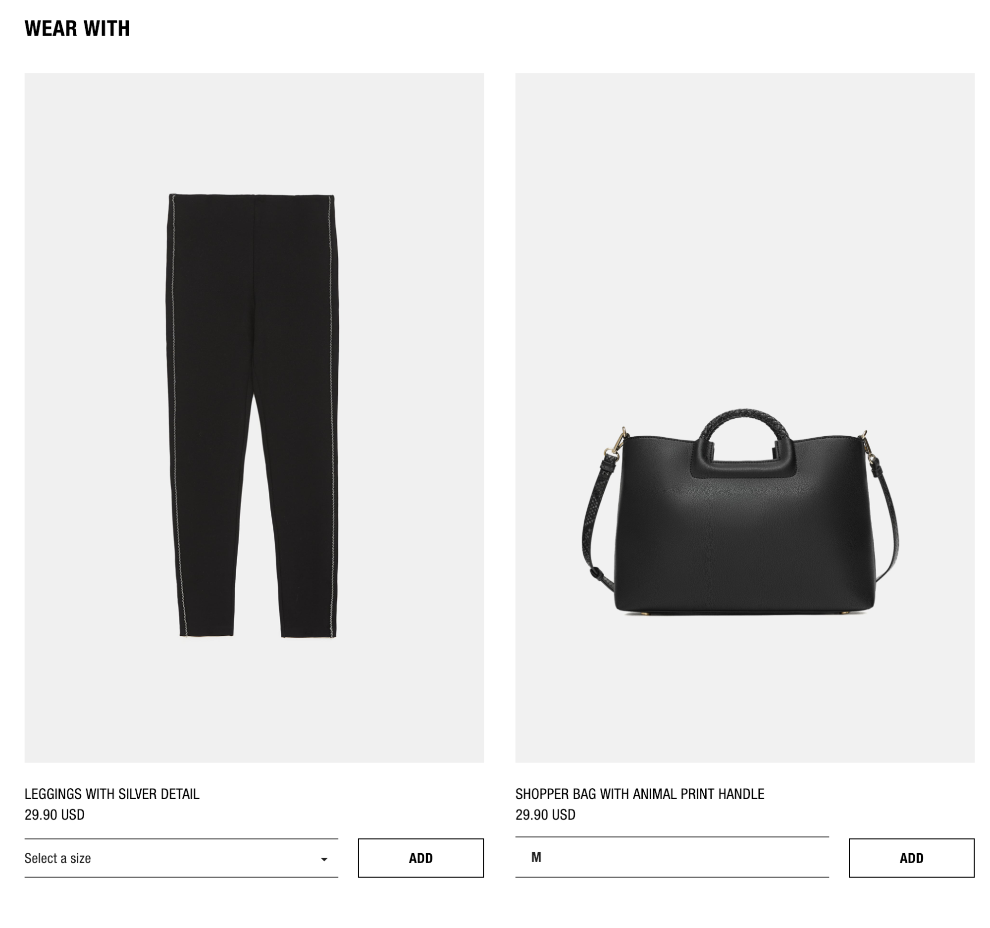
The suggested products already have an add to cart button at the bottom so shoppers can easily place it in their carts without clicking through to another page.
Other noteworthy product page inclusions:
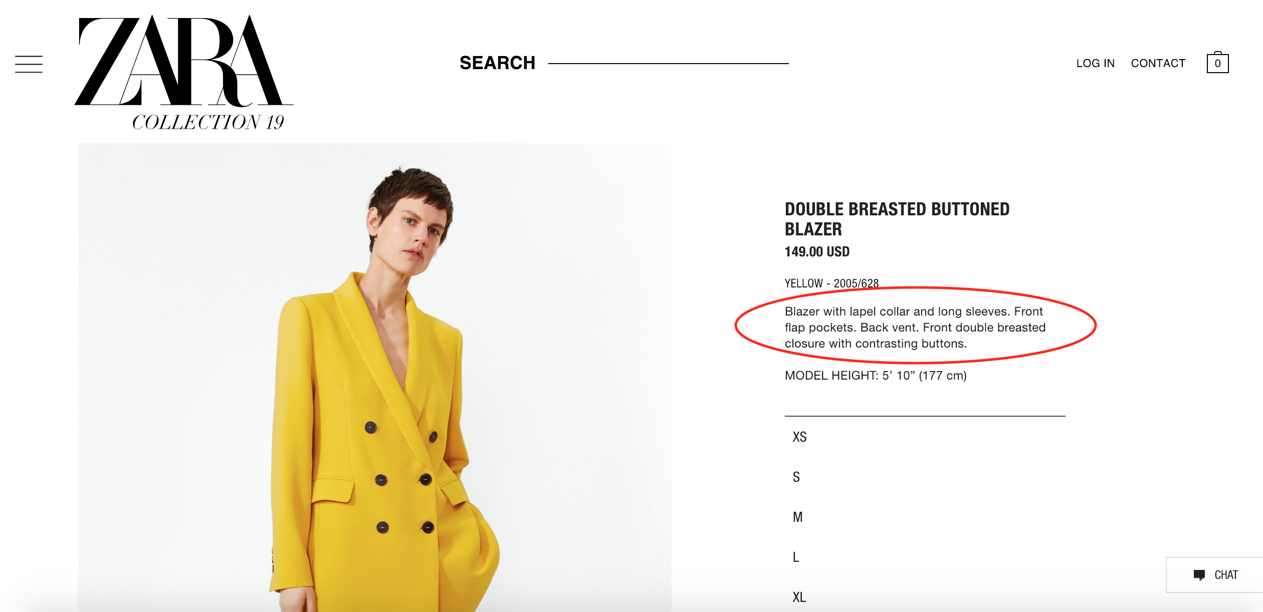
Straight to the point product copy
Product copy doesn’t always have to contain fluff or flowery words. Sure, it helps in some cases, especially when your brand capitalizes on a fun, carefree image. In Zara’s case, though, where elegance and sophistication are key, straight-to-the-point product copy is enough.
Recommend related products
Another great way of upselling is including a “similar items” section that features products with the same style. This would help customers find what exactly they’re looking for and also discover other things they may want to buy.
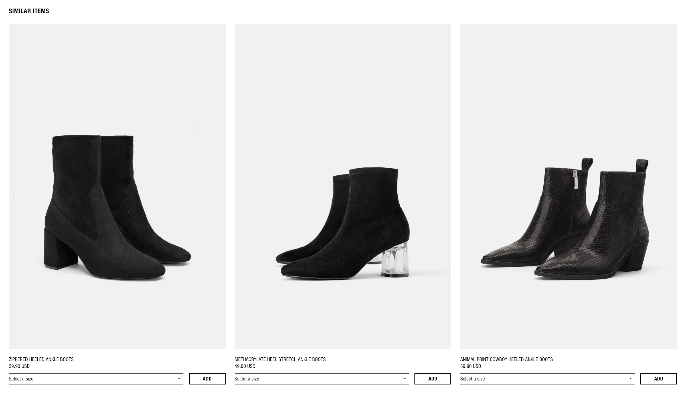
For example, say you’re selling a pair of boots. You can include a list of other stilettos and heels of different color and size on the page to catch the user’s attention. You never know, one of the suggested items may be the product that they have been on the lookout for all along. Even better, they can also opt to buy more than one pair!
Size matching tool
While you can always include a chart of standard clothing sizes, Zara’s sizing tool helps the customer because it allows them to key in their sizes and fit preference.
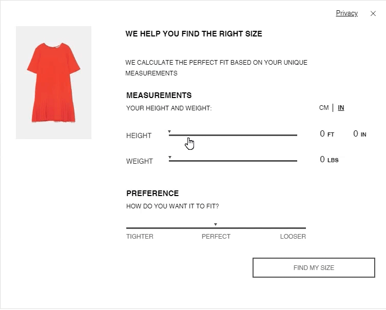
By showing matching them with their specific size and preferred fit, you also lessen the chances of a return.
In-store availability
A lot of businesses nowadays don’t have their online and offline operations in sync. This creates a problem for the customer who may want different options for purchasing, returning or exchanging an item.
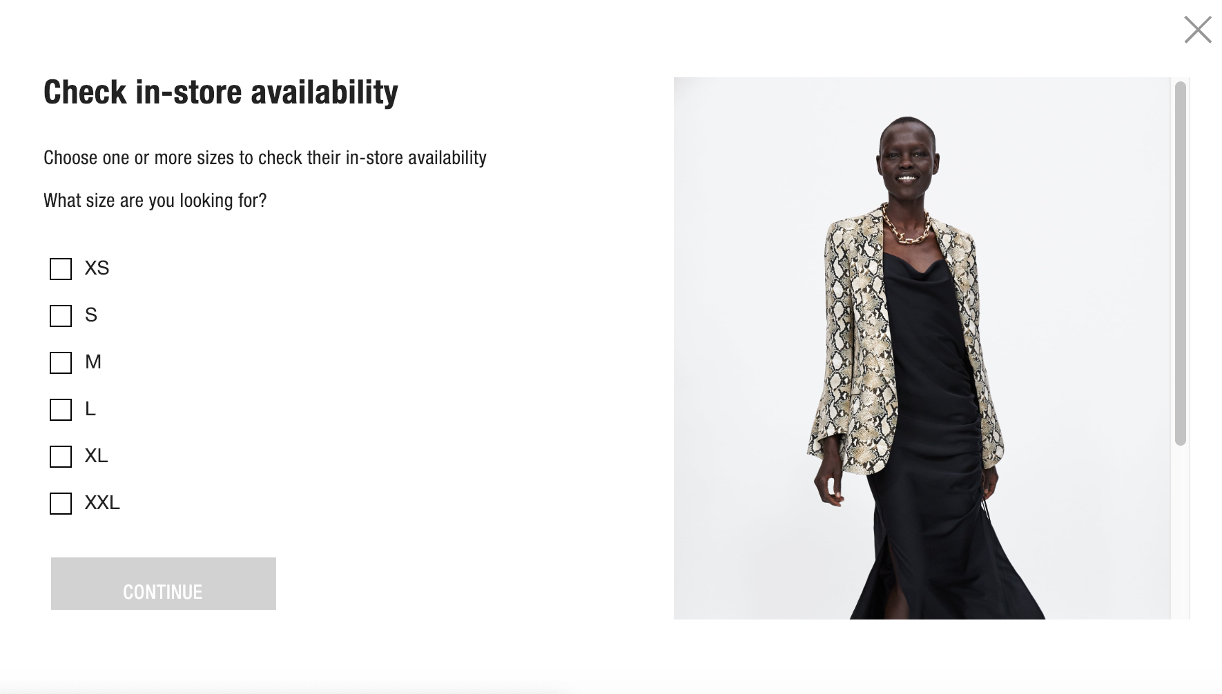
In Zara’s case, they have an online tool that allows customers to check whether an item is available in one of their physical stores. This may help shoppers who have trouble deciding on the spot, as it gives them the chance to see, feel, and fit the item in real life prior to purchasing.
Final Verdict
Zara is a global clothing company and their website directly translates that. It’s quite obvious that they prioritize eye-catching visuals and creative product photography to make their products more enticing to consumers. Like their brand, the site is elegant and the images they use are all sophisticated and unique. Their overall website really captures the fact that Zara is part of the high-end fashion real.
Product Page Design Best Practices To Take Away
Tip 1: Product descriptions don’t always have to contain fluff.
Tip 2: Get creative with your product photography. Don’t just stick to a set of bland poses.
Tip 3: Always aim to champion diversity. Your customers come in all shapes, sizes, and color — your models should be, too.
Share on social: