Anyone who knows me, knows that I love travelling!
I love going to a new place, seeing a different culture, and trying all the new and delicious food. But packing your favorite swimwear or day-to-night outfit into an old, tired and battered suitcase can make the experience feel a little less luxurious.
Away suitcases aim to change that: the simple, elegant and luxurious design can be seen in airports around the world and are a firm favourite of celebrities like Karlie Kloss.
On my recent trip to Austin, I was surprised at how many Away suitcases I actually saw at the airport.
View this post on Instagram
Despite being in a very crowded market, the company is now valued at $1.4billion – only three years after they launched.
Since launching in 2016, the suitcase company has gained global fame thanks to a host of creative collaborations with celebrities and brands including NBA Champion Dwyane Wade, the Despicable Me minions, and the Flour Shop, a New York bakery best known for colourful rainbow cake creations.
Our community has come to associate Away with better travel, not just better luggage […] they view their luggage and bags as part of a travel uniform and naturally, as an extension of their style, co-founder Jen Rubio told Conde Nast Traveler.
And that starts with the brand identity. In an interview with Skift, Rubio said that the company put a lot of effort into developing their product pages with this in mind – so, let’s take a look!
Homepage: Stylish and straight-to-the point
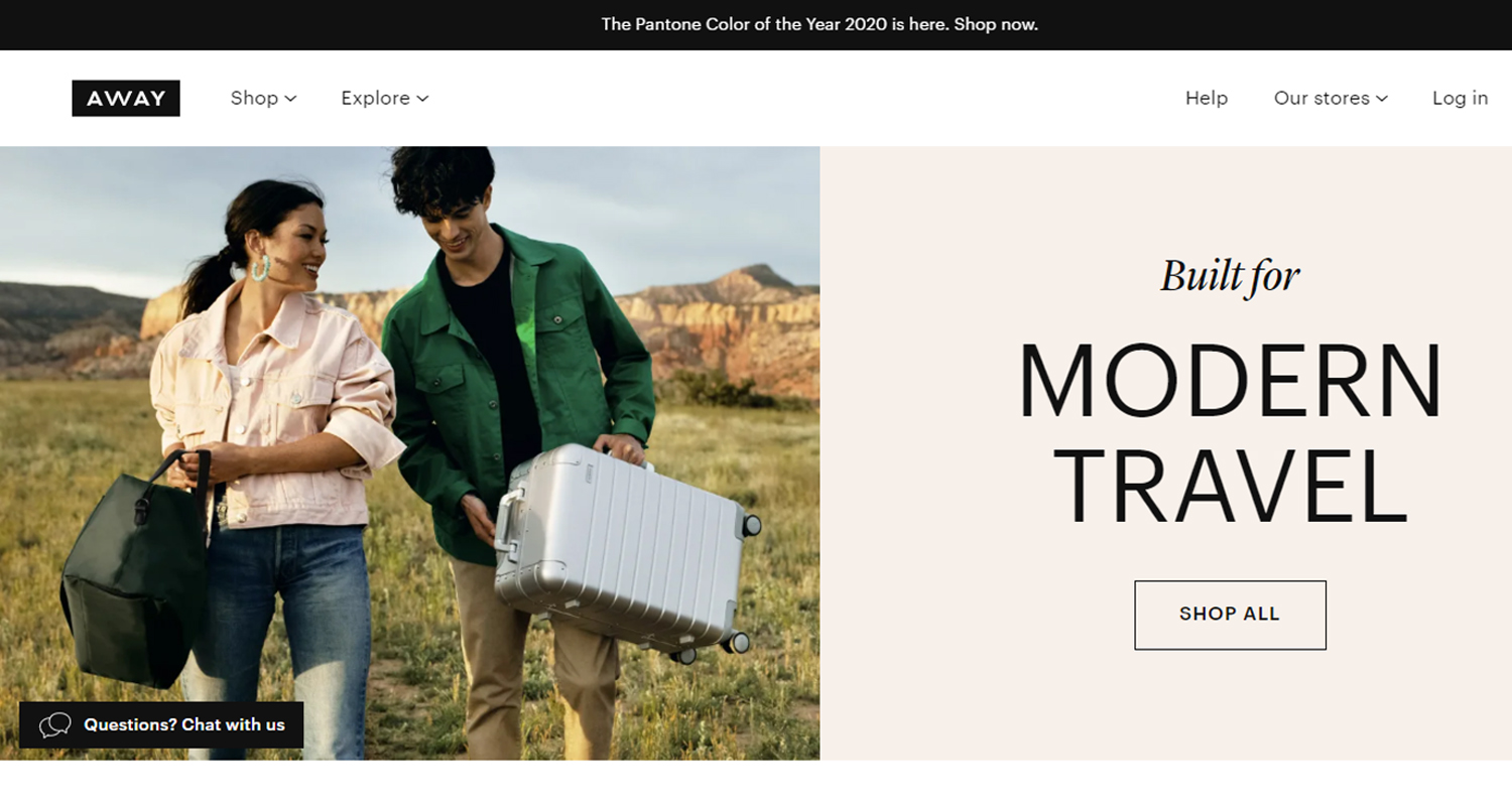
The homepage immediately sets a stylish tone. It is the definition of minimalism, just like Away’s line of luggage!
The homepage has an asymmetrical design, with photos alternating from left to right, which creates a lot of movement as shoppers scroll down the page. The pictures are bold and aspirational: you want to be as cool and stylish as the models in the photo.
There is very little text on the homepage. In fact, there are just headlines – the longest being seven words. Below that, there is a call to action – a small clickable box indicating shoppers to buy the product. There is no paragraph of text that provides further detail or describe the product, the material or why you should buy it. This makes both the image and call to action pop off the page.
The product page
The page layout has four separate sections.
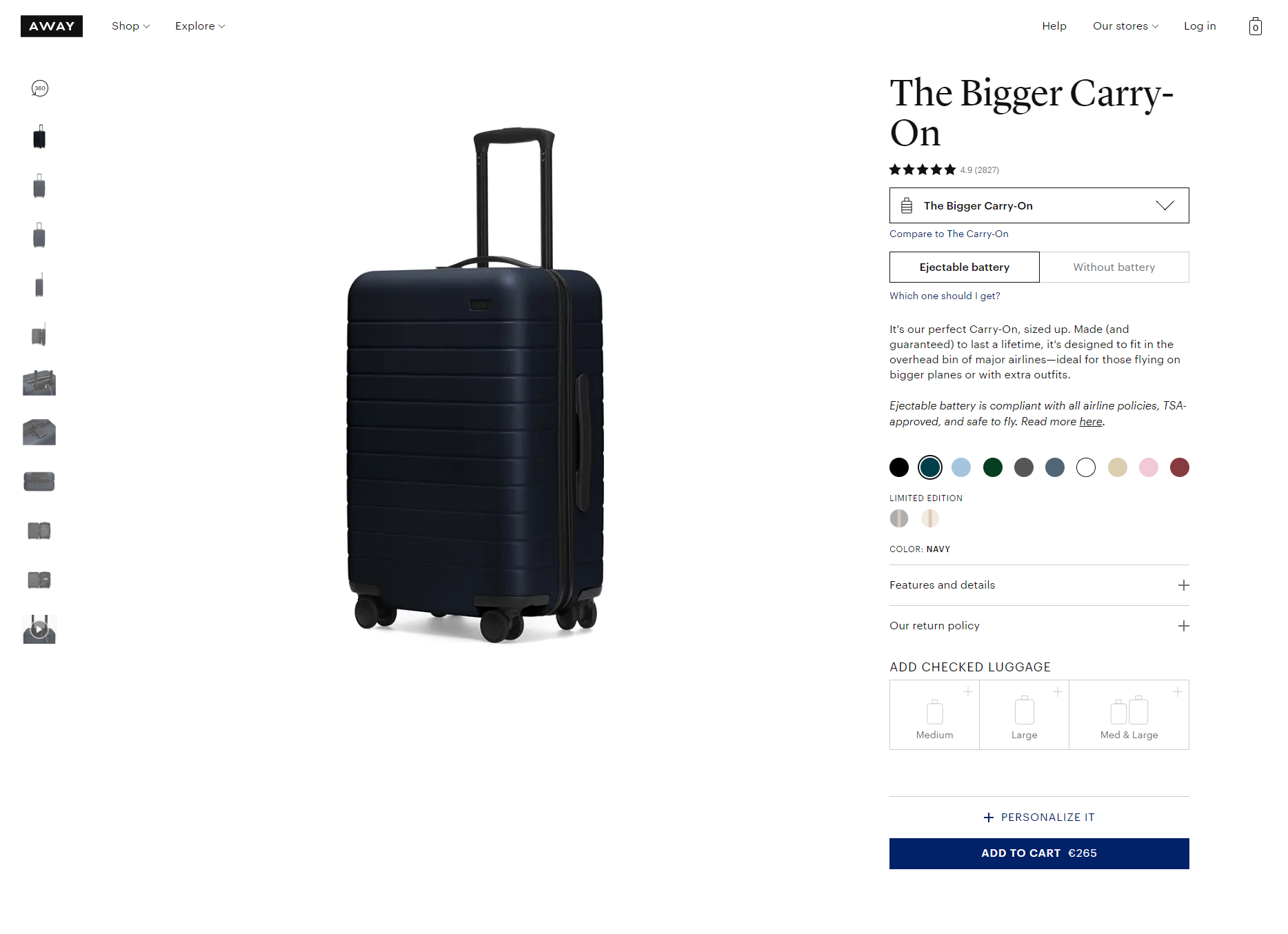
First, the product, with images on the left and a description on the right. Second, the upsell showing customers what other Away products would enhance their purchase. Third, a video feature about how to use your bag. And fourth, customer reviews.
It is a stylish and innovative layout that keeps shoppers engaged from the top to the bottom of the page.
Overall, it is a nice browsing experience but there are few small details missing which lets the design down.
Product photos
The product images are very eye-catching. They are shot in high-quality on a white background surrounded by a lot of white space, so they pop off the page and immediately draw the shopper’s attention.
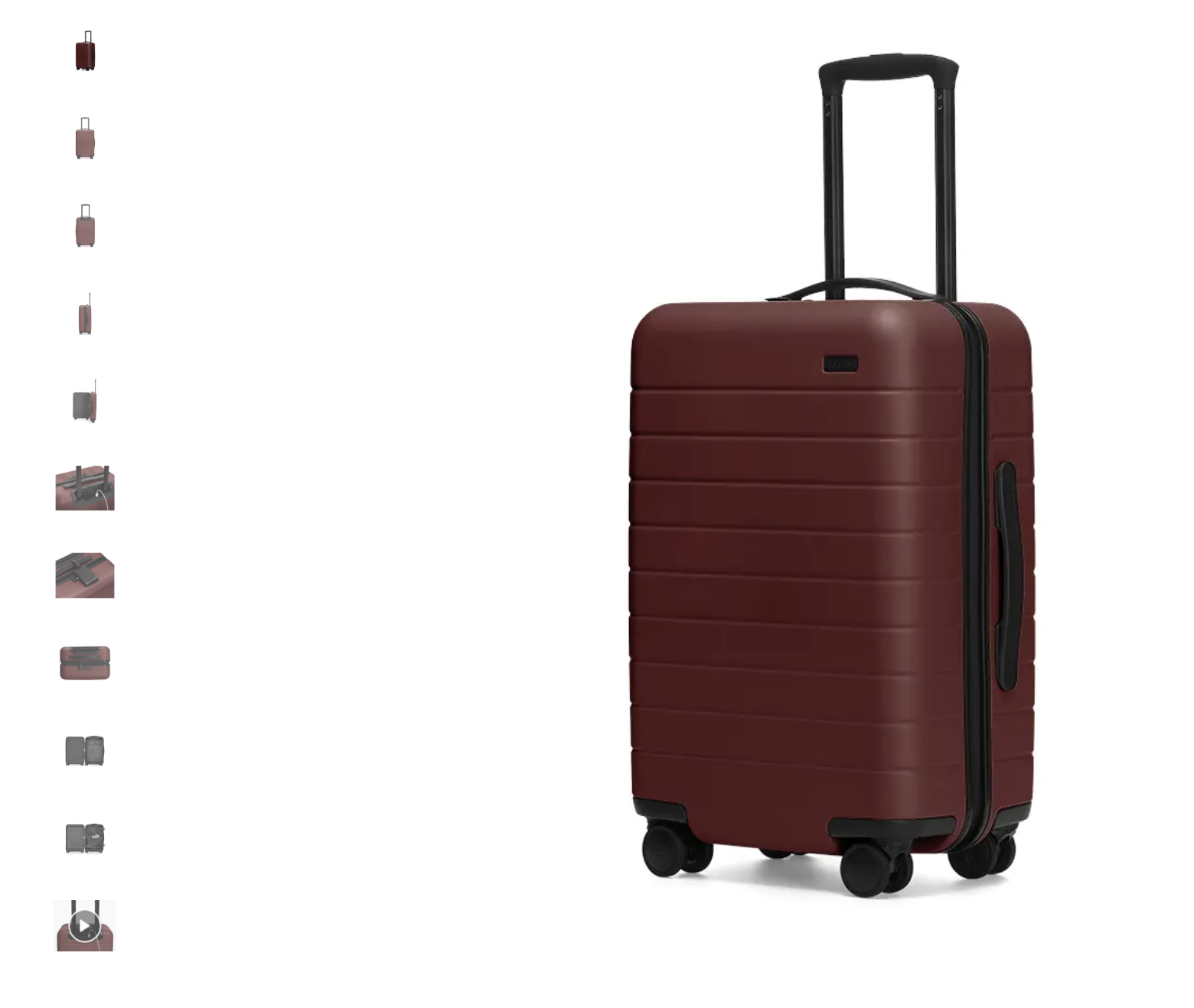
There is also a quick video among the carousel of images – but it only shows how to remove the power pack so it is short, specific and relevant.
Another great feature is that these images are consistent along each of the colours that the bag is available in, so you don’t have to click around to get a full picture of the product. (We saw this in Serena Williams’ Product Page Teardown.)
The pictures convey a sense of luxury in their simplicity. However, there are three small details that let the images down:
- The product is captured from every angle – top, sides and inside – except the wheels. This is one of their “stand out” features, claiming that they are easy, glide really well. In fact, this is the whole reason that the company got started! So why don’t they have a picture of them?
- There are no ‘in situ’ pictures on the product page, so shoppers can’t easily gauge the size of the product. (How many people actually know what 57.7 cm x 37.3 cm x 24.3 cm looks like?)
- The pictures are high-quality, but there is no obvious zoom function so shoppers can’t get a good, up close visual detail of the product.
Product description
Next to the images is an expandable information box which provides useful features and details about the bag’s size, weight and material.
There is also a simple description of the bag – but it is almost too simple. There is no detail about what you can fit in it or why this bag is the right choice for you, like “perfect for a spontaneous weekend getaway with friends or a short-haul business trip to help you land that big client”. Basically, it does not provide the customer with an emotional connection to it.
And probably some of the most useful customer information is fairly well hidden!
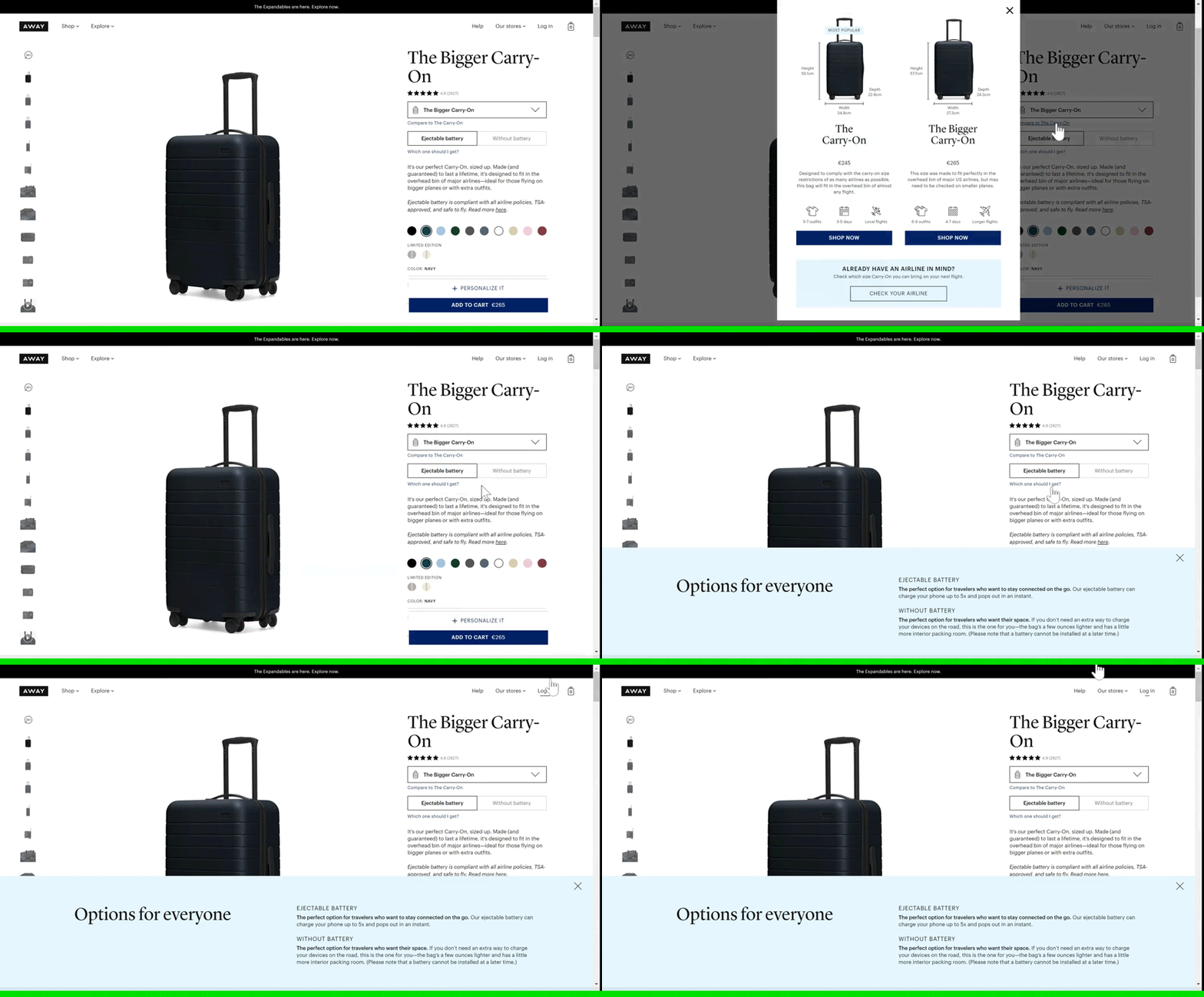
There are helpful guides to help customers choose which size of suitcase is right for them – including useful information about how many outfits will fit, how many days travel it is recommended for and which flights the suitcase would fit into the overhead locker – but it is easy to overlook. The text is small and the same colour as the rest of the text and has been placed under a big click-able button.
One very clever addition to the information box is the subtle upsell. By anchoring it to the description box, it is always visible and customers will likely begin clicking out of curiosity – just like I did!
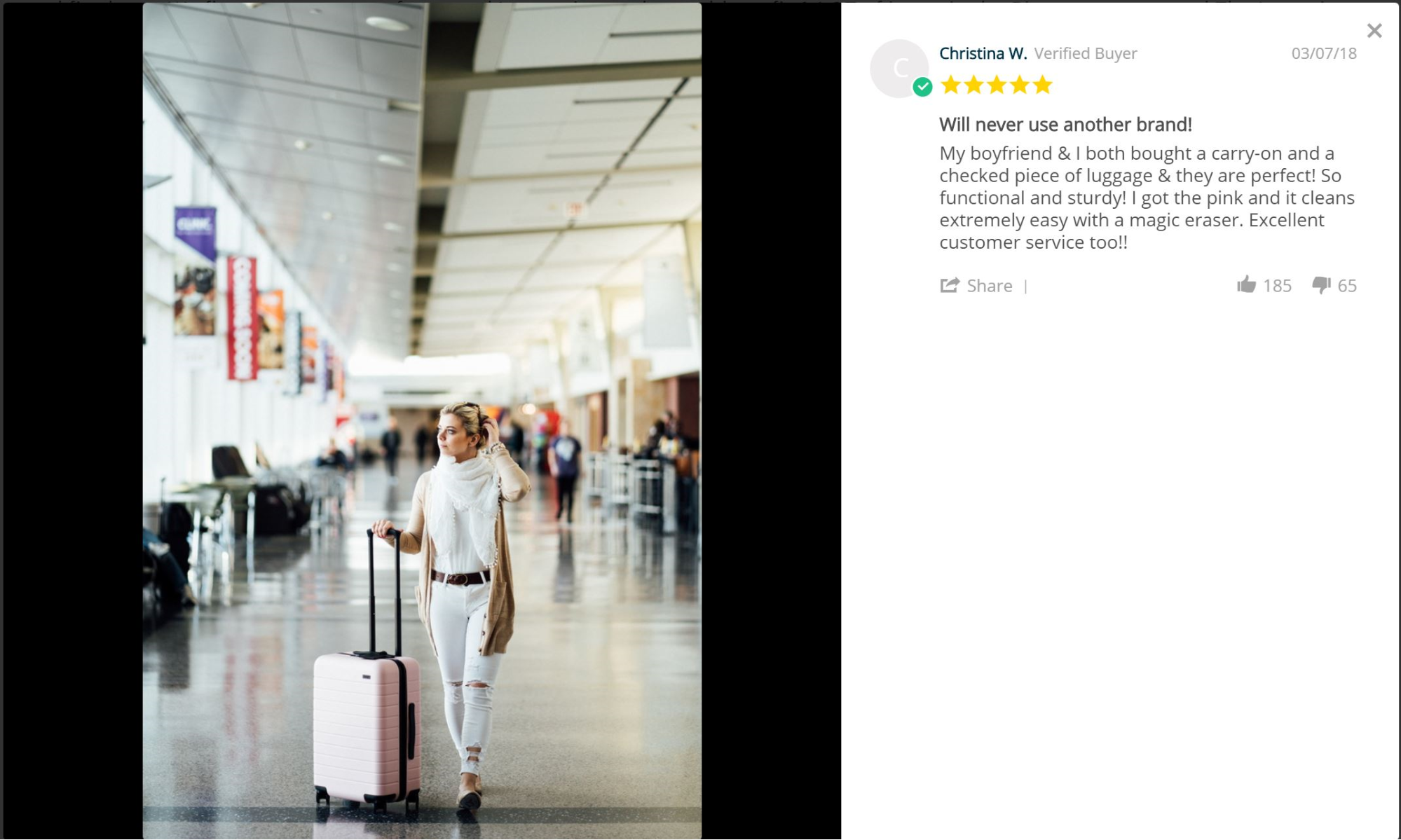
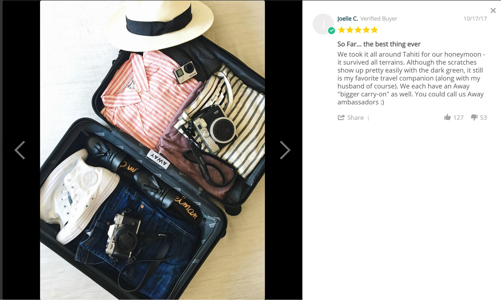
At the bottom of the page, customers can leave a review of the product and most of them include a picture of them using the bag. Showing that there is a global community of happy customers is a great way of building a good reputation and trust with the potential customer.
Video clips
The third section of the product page is a series of creative video clips; a reel of photos stitched together to make it look like the clothes are packing themselves. They are artsy and eye-catching, and each video rolls seamlessly into one another as you scroll down the page.
Each video has a short text attached to it, giving a little description of how the bag will work and fit into your life. This is a really nice feature, but it is a little lost being so far down the page.
Marketing
Away Travel is a little bit different to the other brands that we have profiled in a Product Page Teardown because a big part of their ecommerce experience is the brand ecosystem that they have built.
It all began with their almost failed launch. After an issue with production, the co-founders realized that they would not make distribution in time for Christmas. Instead, they decided to switch gears and put the suitcases on pre-order while offering their customers a book called The Places We Return To which was full of curated travel stories from respected people in the creative community – such as writers and photographers, as well as people in the fashion and food space.
It wasn’t simply, let’s make a book because we don’t have any luggage ready. It was a way to assemble a bunch of people to talk about our luggage when it was available, Rubio told Inc.
Thanks to this innovative ‘pre-order’, they raised $12 million in sales in the first year – without having shipped a single product!
Storytelling is a huge part of their product marketing. They launched a 10-episode podcast, Airplane Mode, which ran from May to September 2017, looking at why we travel and where we go. Most recently, they launched a magazine, Here Magazine, currently on it’s 10th edition. According to the website: “Here Magazine tells compelling, thoughtful, and unique travel stories through the lens of local, creative, and influential people.”
Both the podcast and magazine are a creative outlet to share the joys of travel with past and potential customers – more importantly, they keep within Away’s stylish and aspirational character. It is a clever way of engaging potential customers; if they like the marketing material, they will feel connected to the brand and will be more likely to make a purchase.
Key takeaways for you to consider when designing your store
Away Travel have swept the market thanks to a great product and marketing strategy that sets an aspirational tone.
Overall, the website is stylish and luxurious – with minimalist and engaging details – but there are some small details that lets it down.
Here is what you can take away from the experience:
- Keeping your homepage free from clutter – not only does it look more sleek and stylish, but it makes the content pop.
- Make sure you give your shoppers as much context as possible – this includes providing them with at least one ‘in situ’ photo – so they have a better sense of the product’s size and dimensions.
- Include all relevant information that a potential customer might want or need should be easy to find.

