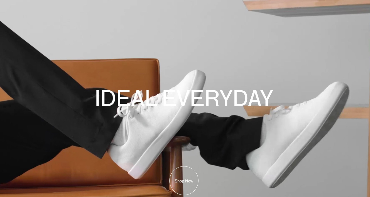
Online shopping is a convenience, something that people fit in between meetings or to pass the time on the train ride home from work.
But, Atoms – a relatively new shoe brand and ecommerce store – makes online shopping feel luxurious.
The brand embraces the motto ‘keep it simple’ to maximum effect.
That is, in part, thanks to the fact that they only sell one product: a comfortable and versatile pair of trainers, in three color variations.
Atoms also brings an interesting concept for shoe shopping. If you order one pair of shoes, they send you three – the size you ordered, a size above and a size below that.
You then keep the individual shoes that fit, meaning the left and right could be different sizes if that is what fits your feet best.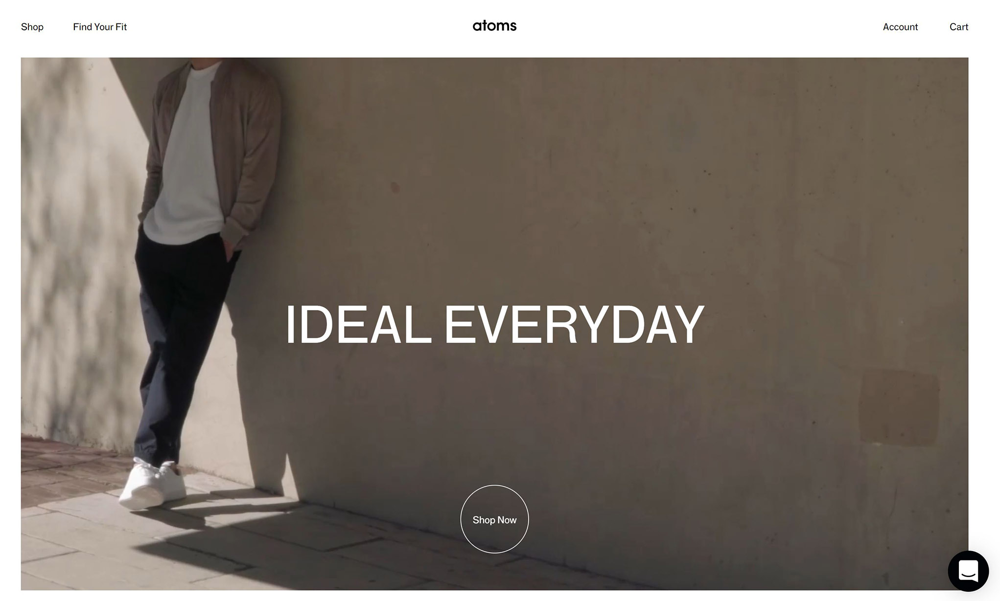
Atoms’ tagline, “ideal everyday,” emphasizes the idea of quality over quantity in order to achieve everyday luxury. And they have managed to translate this care to detail through the online shopping experience too.
But by predominantly focusing on aesthetic, some of the website’s primary function misses the mark.
Simply, a beautiful web experience
As an ecommerce retailer, you have to ask yourself: what message are you trying to send to your customers through your website?
Atoms have created a clean, fresh and high-end website that elevates the status of the trainers. They feel more exclusive because the website looks exclusive.
This is a luxury brand – but they never tell you this on the website. Instead, this is achieved through minimalism.
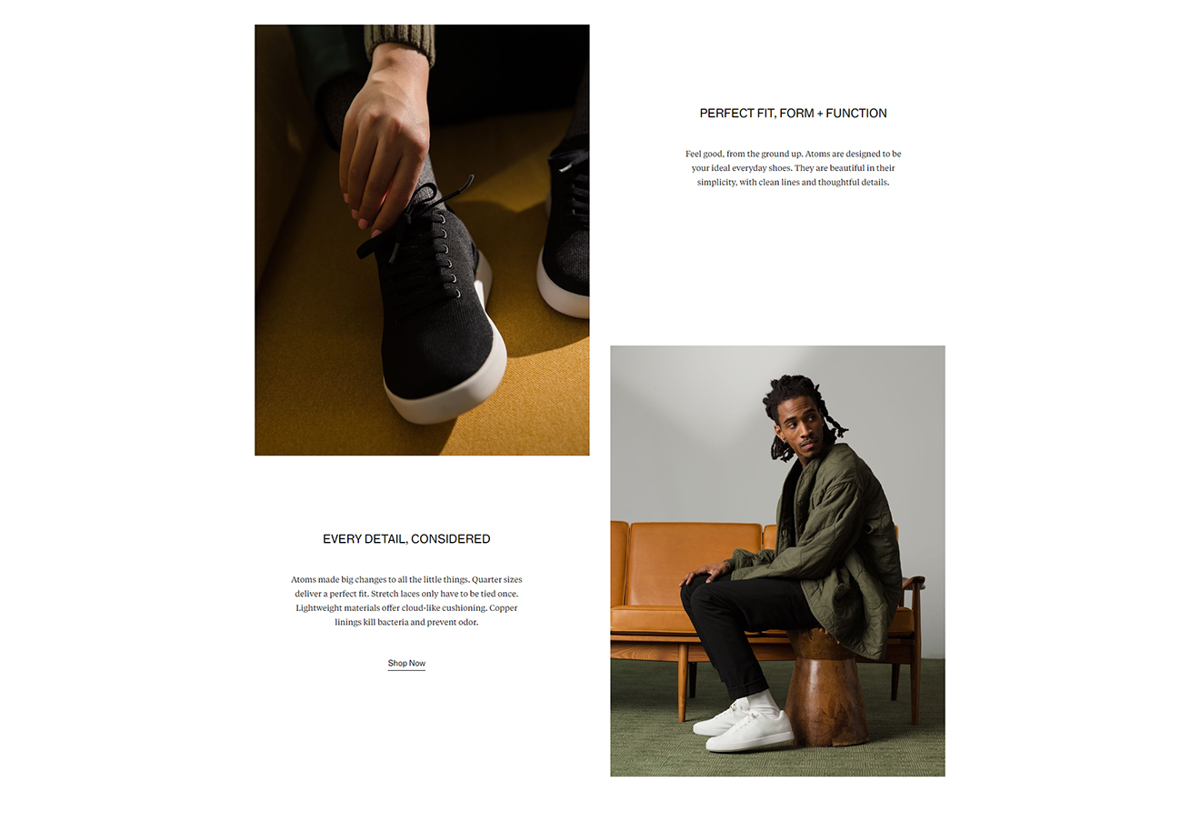
The website has short powerful text, visually engaging and high-end photography, and a good understanding of white space.
The homepage does this very well.
On the desktop website, a video takes up the whole screen which immediately makes shopping an immersive experience.
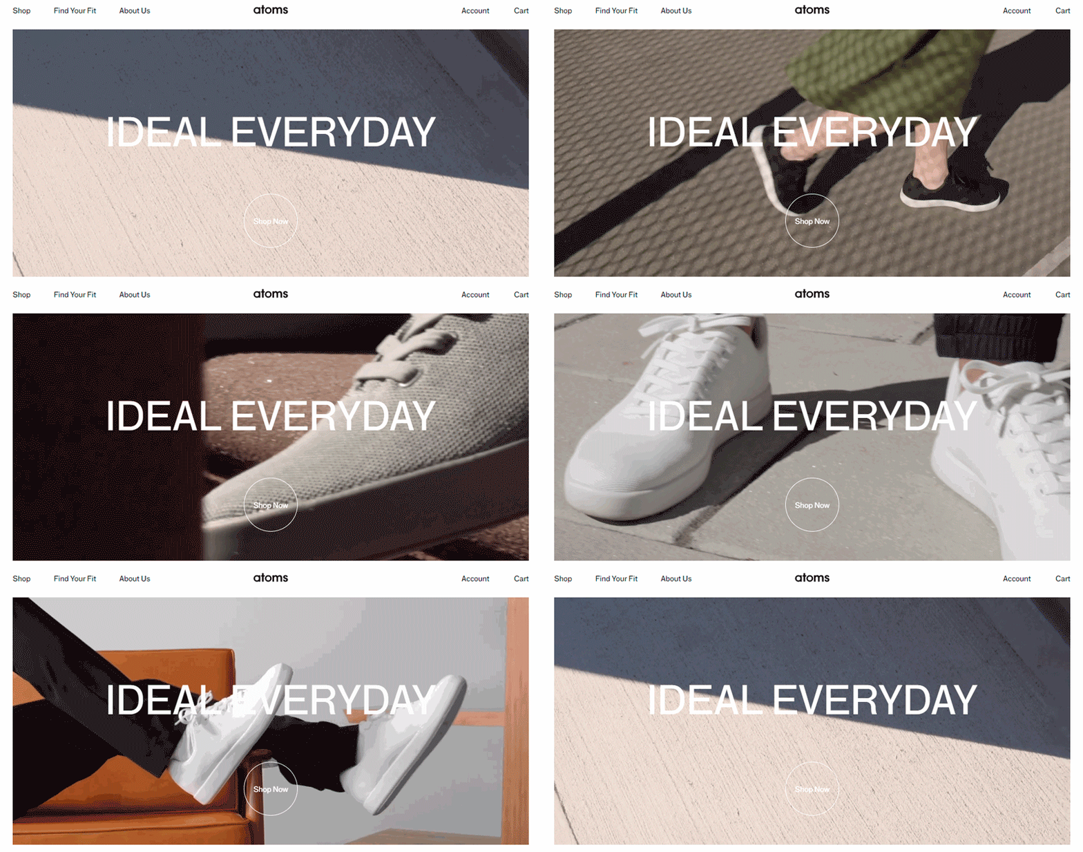
Though it is a simple video – nine shots lasting just 12 seconds before looping again – the high-quality production value of the video enhances this experience immeasurably. (Interestingly, the shoes are only visible in six of the nine shots.)
The result is that the shopper’s eyes are instinctively drawn to the “Shop Now” button at the bottom of the video.
The only issue is that because the video is wide, it might not be immediately obvious that there is more content below it.
This means customers might miss out on some of the other great design elements – such as the asymmetrical images or thoughtful text – further down the page.
But how does all of this translate onto mobile?
Scrolling through the website on mobile feels more like perusing a glossy, high-end magazine than an ecommerce site. It effortlessly retains the clean style as the desktop website.
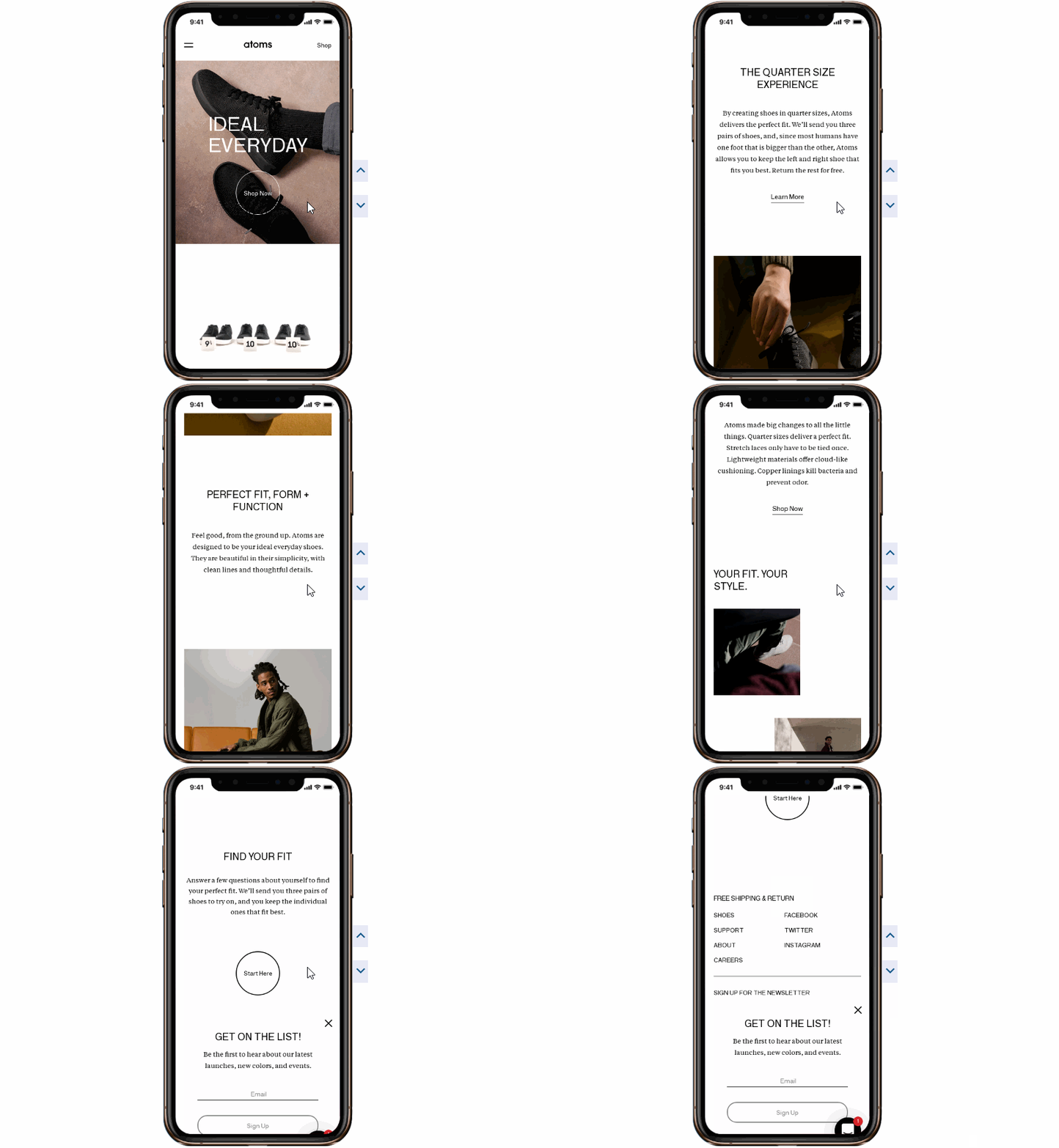
The short video retains the high-quality of the desktop website and renders perfectly to mobile, but there is enough space given to the next image to allow customers to know that there is more content below.
On the first screen of the homepage, there are only four words that shoppers can see:
- ‘ideal everyday’ – This tells you why you should buy the product.
- ‘Shop now’ – This is the call to action (CTA) – and it is the only clickable link.
By stripping away the noise and fuss, this is a great way to get your customers exactly where you want them to be: on the product page.
However, there is one oddity on the homepage. When you add items to the cart, numbers do not appear next to the word located in the top right-hand corner. This can be a little disorienting.
While it is good to try new shopping methods in ecommerce, the design should never come before function. Customers have an expectation that the cart will tally and track their order. This expectation should be met.
Product page
When you first launch the product page, it is clear that a lot of thought has gone into the design of the product page.
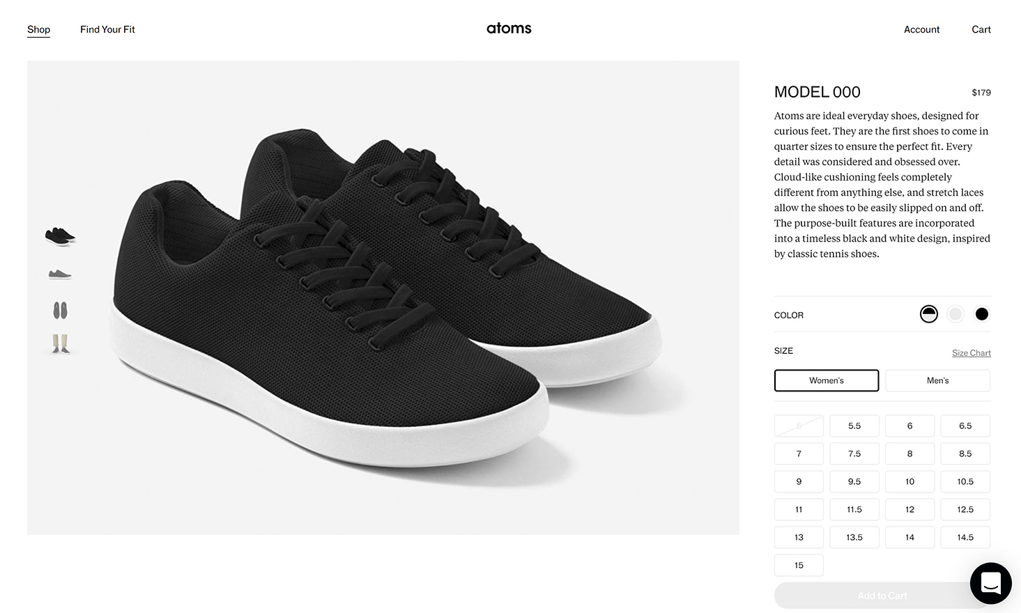
Though the page design is minimal, they create an impact where it matters.
For example, the interplay of white and off-white is very artistic, again conveying a strong sense of luxury.
The product images are taken from a variety of angles, which gives the prospective customer a lot of visual information about the product.
The last image is a video of someone walking slowly in the shoes so you can assess how they move, which is a very simple film to make but is a nice touch – and very simple for you to film!
The text, though short, is written in a way that makes it feel like the shoes were made just for you and with your comfort specifically in mind.
But a few small details let the page down a little.
- The zoom function on images is very limited which has a minor impact on the shopping experience. This is frustrating because the images are of very high quality.
- Important details like the material and the shoe’s odor-reducing properties are quite far down the page – and thanks to the design of the page, many people may not know they can scroll down. These are important selling points that they will miss.
- The font size is also quite small, especially in proportion to the size of the images which makes the text difficult to read. While it is good to have a strong visual identity, online shoppers need as much information as possible to make a purchase decision.
- The sizing chart offers a “talk to an expert” option, but nothing happens when you click the button. Instead, the function is hidden behind the pop out! Why does this not link to the “Find Your Fit” page instead?
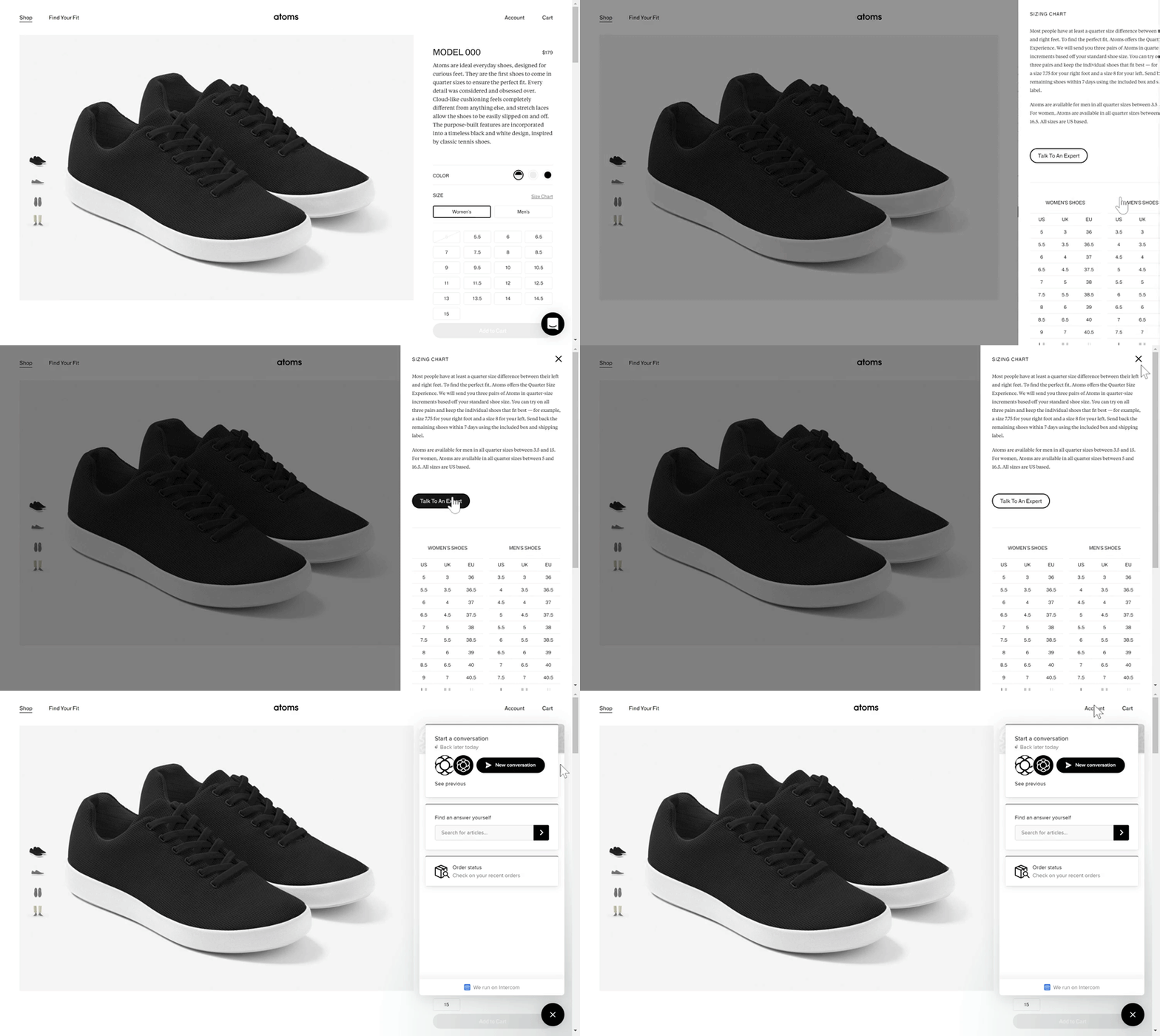
- A problem for both desktop and mobile is the font size of the price. It gets lost next to the other information. This is an important detail: people need to know how much your products cost and it should be as effortless as possible to find.
Find Your Fit
Knowing what size shoes or clothing to buy is an important question that online shoppers face – especially if the brand does not have a physical in-store presence.
Atoms’ Find My Fit page is a nice remedy to this problem.
The page is very simple, comprising of a short survey to help you find the perfect Atoms shoe size.
It asks three basic questions – what is your shoe size; do you always wear this shoe size; and how do you spend your time on your feet? It is a good length.
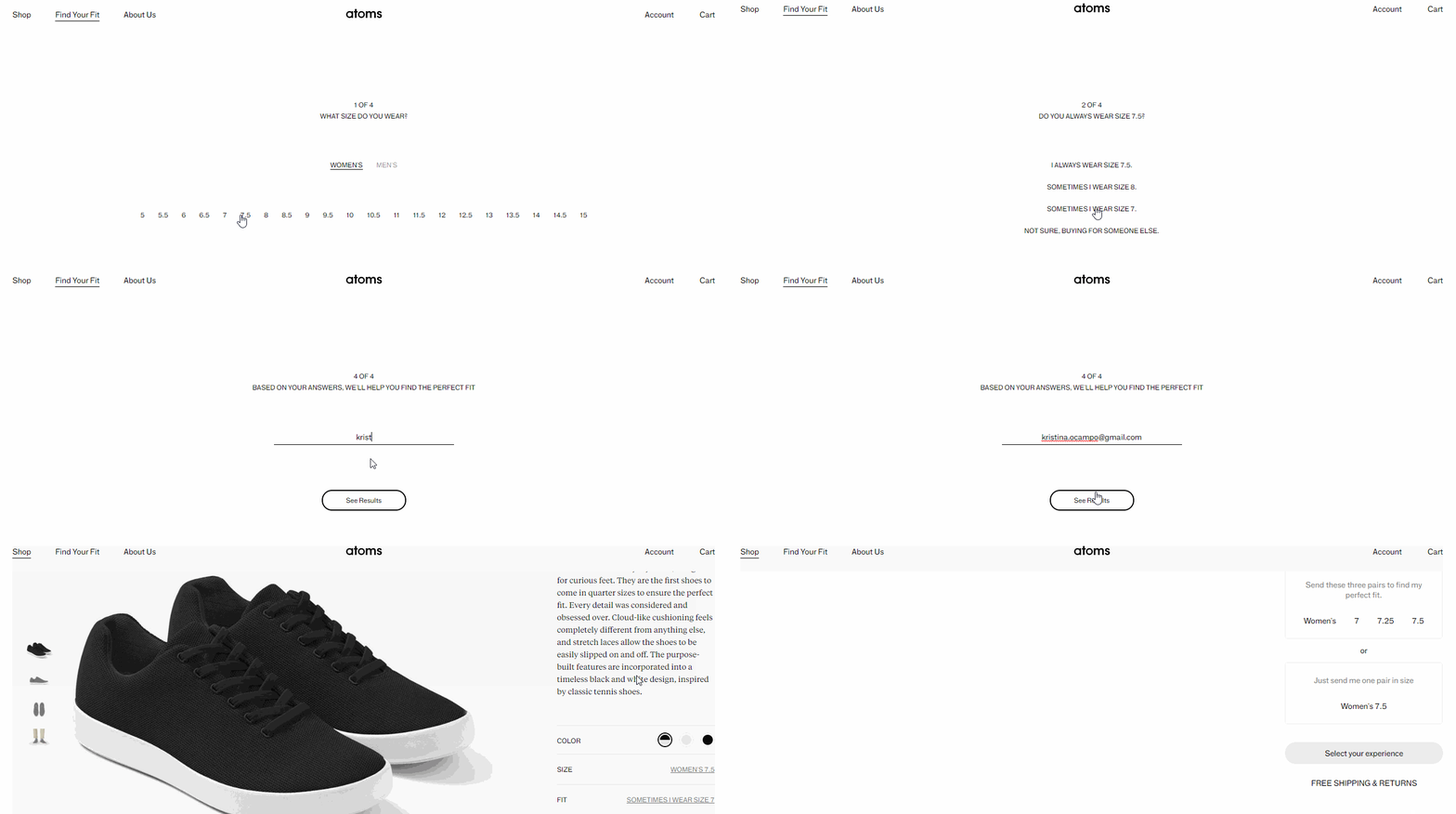
A survey is a nice personalized touch – and shows customers that they know shoes so well, they can determine the perfect size for you with just three questions!
Unusually for the website, the page is just text. Because the other pages are very visual, it is almost disorientating.
And the text is incredibly small – I had to check that my screen zoom was set correctly to 100%. Customers should never have to question their webpage settings.
Unfortunately, the text is also very small on the mobile webpage. Text of any kind should be easy to read on mobile, especially as the screen is already so small!
Strangely, on mobile, the page is called “Find Perfect Fit”. The difference is confusing. Instead, all page names should be aligned across desktop and mobile.
Luxury through minimalism
Though this minimalist website style is not for everyone – most ecommerce sites will have more than three products for sale – there are still lessons that you can take away.
It is obvious that the website was designed with mobile in mind – also known as “mobile-first” design.
And there is a good reason for this design strategy: in 2018, mobile phones were used in some part of the buying process in over a third of all retail sales in the USA, accounting for over $1 trillion.
In fact, the design has been thought of the whole way through the website. Your eyes are always drawn to images. This allows the product to “speak for itself” and gives the customer the opportunity to imagine how the trainers would fit into their “ideal everyday”.
However, because the website is very video-heavy, it is sometimes slow to load. You should consider customers in areas with low data rates when designing video-based ecommerce websites.
Last thoughts…
As an ecommerce retailer, the way your website looks and functions on desktop and mobile should be at the front of your mind. Here are some key takeaways from Atoms’ online store:
- Although Atoms has created a visually stunning website, their focus on aesthetic leaves room for improvement on the site’s functionality.
- Important information like material and design properties should be easy to find and easy to read.
- Images should zoom to show detail – especially high-quality images like Atoms has!
- Atoms’ leveled up their buyer’s experience with a very simple, yet useful ‘Find Your Fit’ section to help shoppers choose the right size shoes.
You should not forget the primary focus of your ecommerce website: to make a sale.
At the end of the day, your website should provide your customers with as much detail about the product as they can get in-store. And to make that process as painless as possible.

