It doesn’t matter what webpage layout you are going for or what product you sell, creating the perfect product page isn’t always easy – even the big guys miss the mark sometimes.
From giant online marketplaces to nationally recognized brands, here are some companies that we think could do a slightly better job and ended up having poor product pages.
Kogan: Picture quality matters
Kogan is an online store based out of Australia that sells a lot of different brands across a wide range of departments, from homewares to books and power tools – it is a bit like a department store.
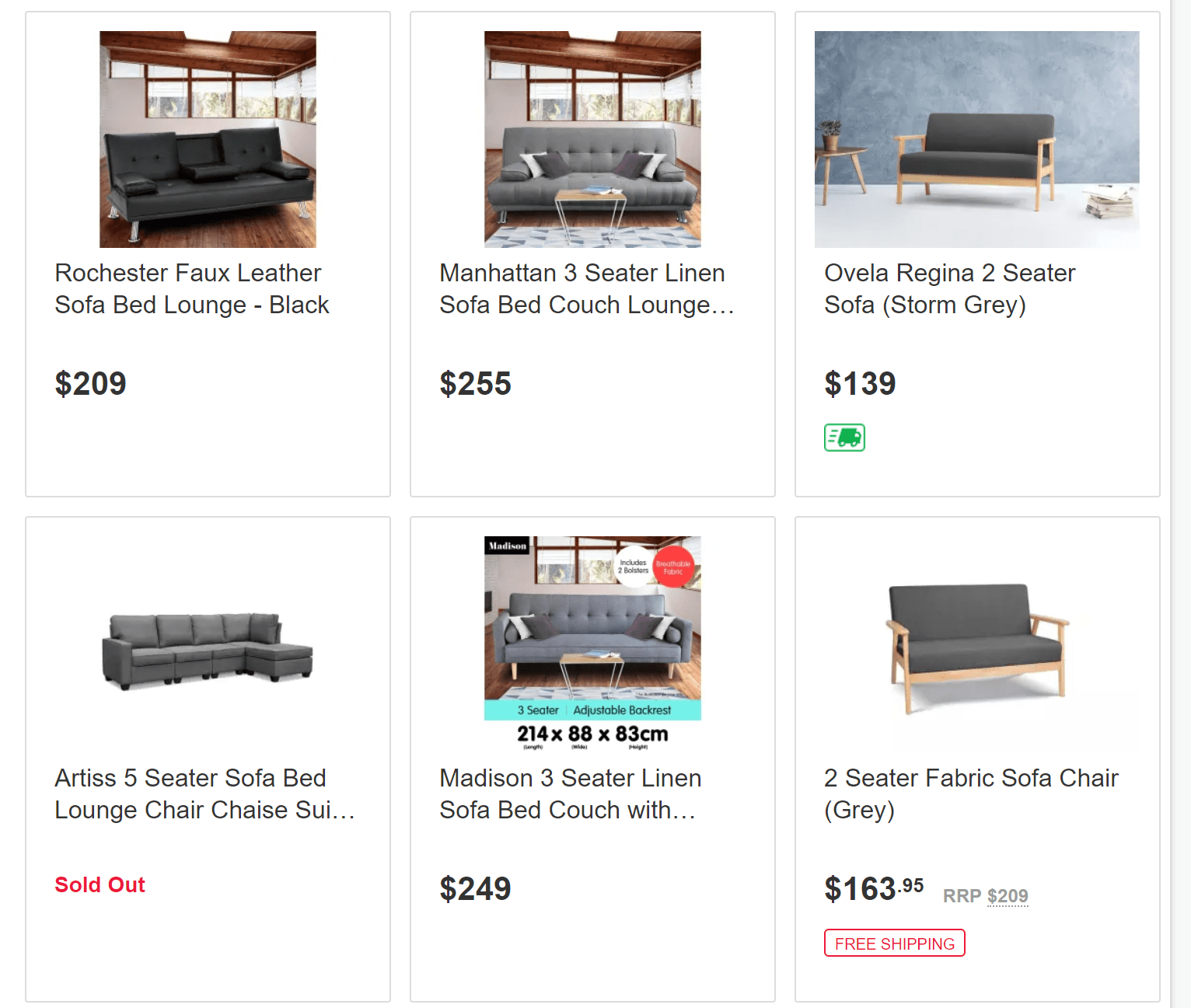
Sofa images via Kogan
In an online marketplace with different suppliers, like Kogan, product pages are set-up and managed by individual retailers, which is why it’s understandable that there is no uniformity in the photography style.
But there should still be some rules.
While it would be difficult to set and enforce a codified image rulebook, you should set minimum quality requirements.
For some customers, this might be the first time that they have seen the product, so clear and sharp images can help them make the decision whether to buy or not.
The Artiss 3 seater fabric sofa bed listing is a good example of why you should set out the minimum acceptable photography requirements for images on your website.
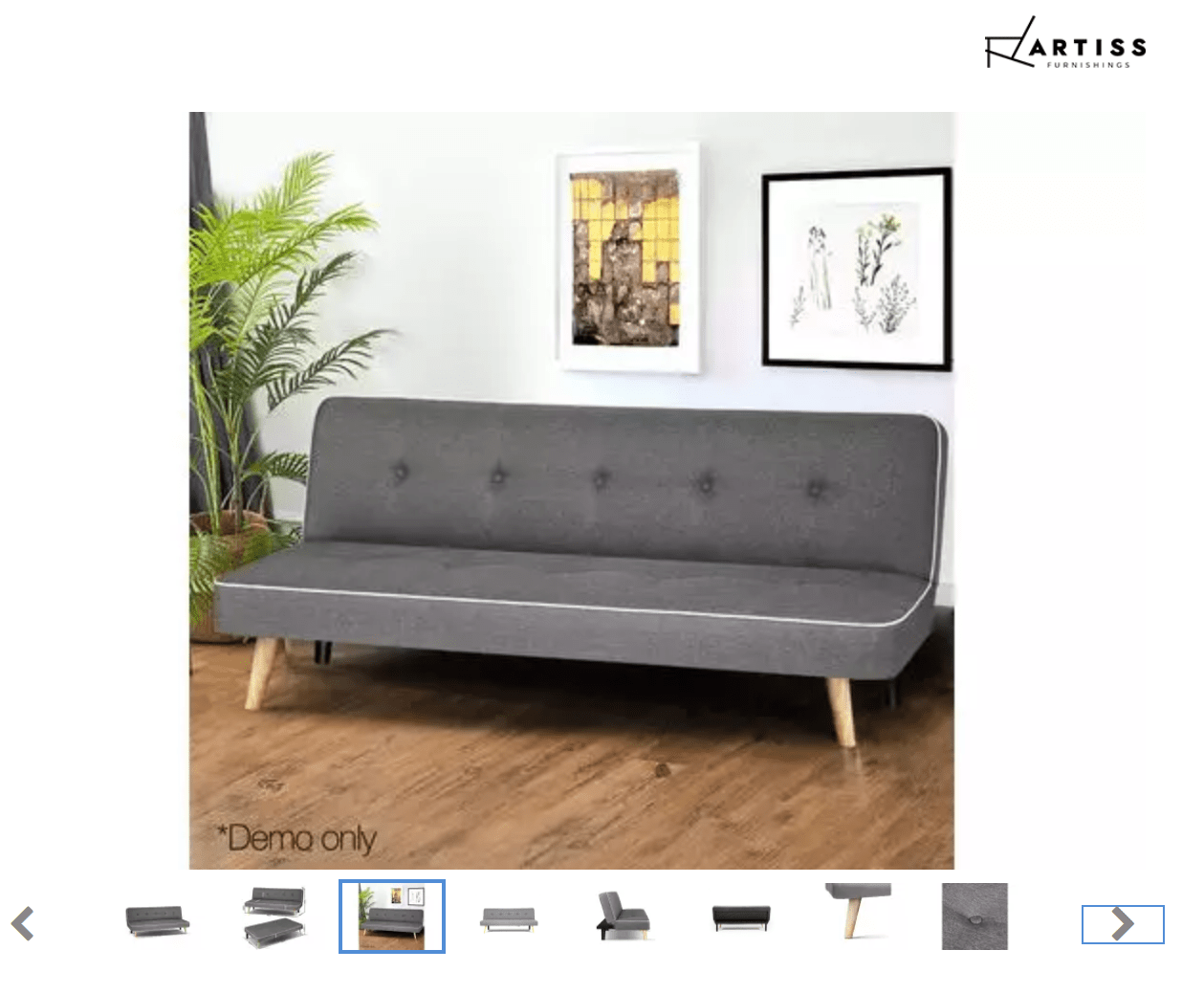
Artiss 3 seater from Kogan
There is a great range of product pictures on that page – from wide shots to close-ups – which allows the customer to see the product from every angle imaginable.
But the product photos are low resolution meaning customers can’t get the level of detail that they want when they click to zoom on the image.
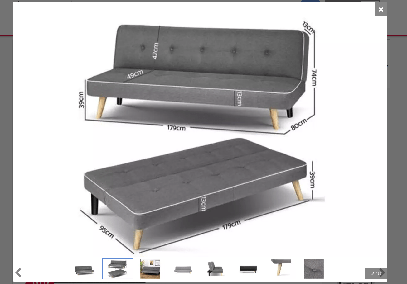
Artiss 3 seater close-up photos
And you know what happens with blurry images. If the image is blurred, customers can get frustrated and choose to buy from another store.
Also, the thumbnails under the photo slideshow are incredibly small.
If a customer wants to scroll through the image carousel at their own pace, finding a picture that they want to see takes a little more concentration.
You need to make it as easy as possible for customers to find answers to their questions such as:
- What is the texture of the fabric?
- Will this fabric breathe well in the summer?
- How easy is it to remove any stains?
High-quality product photos will help them find the answers.
Target: Inconsistent and poor product pages
Target is known for selling affordable clothes and homewares.
But Target’s online store does not reflect this economical attitude.
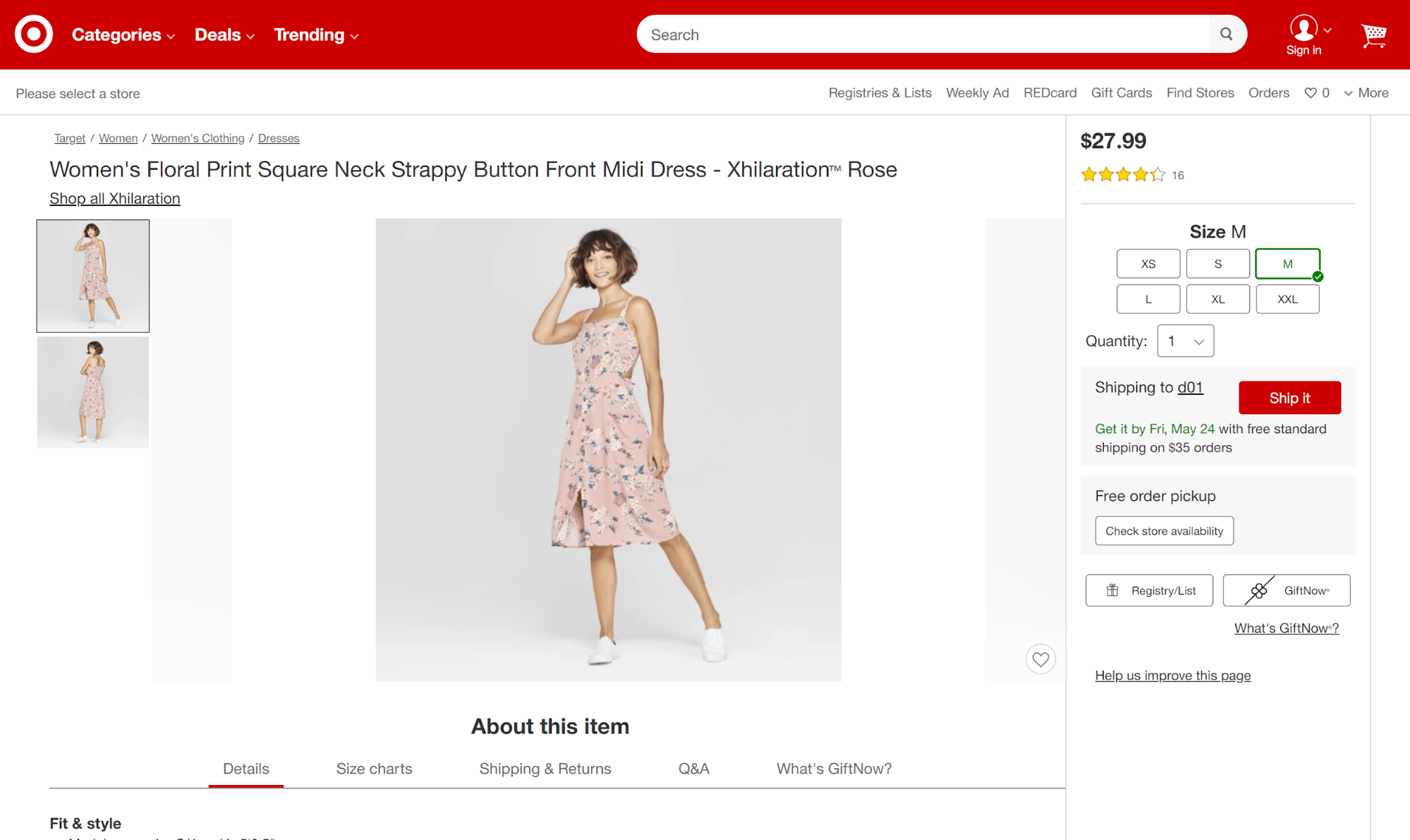
Target’s product page
In fact, there are a lot of great things to say about Target’s product page:
Shop the look: This gives customers easy access to the model’s complete look in the photos. It is an easy way to upsell to the customer who wants to shop for a fashionable and coordinated look.
#TargetStyle: This is a great way to engage with customers who engage with the brand on social media.
Customers also bought: This is an easy way to introduce the customer to a wider range of products that they might be interested in.
However, there is a limited number of pictures and the zoom functionality is limited meaning the customers cannot see the product in detail or get a real visual sense of the product.
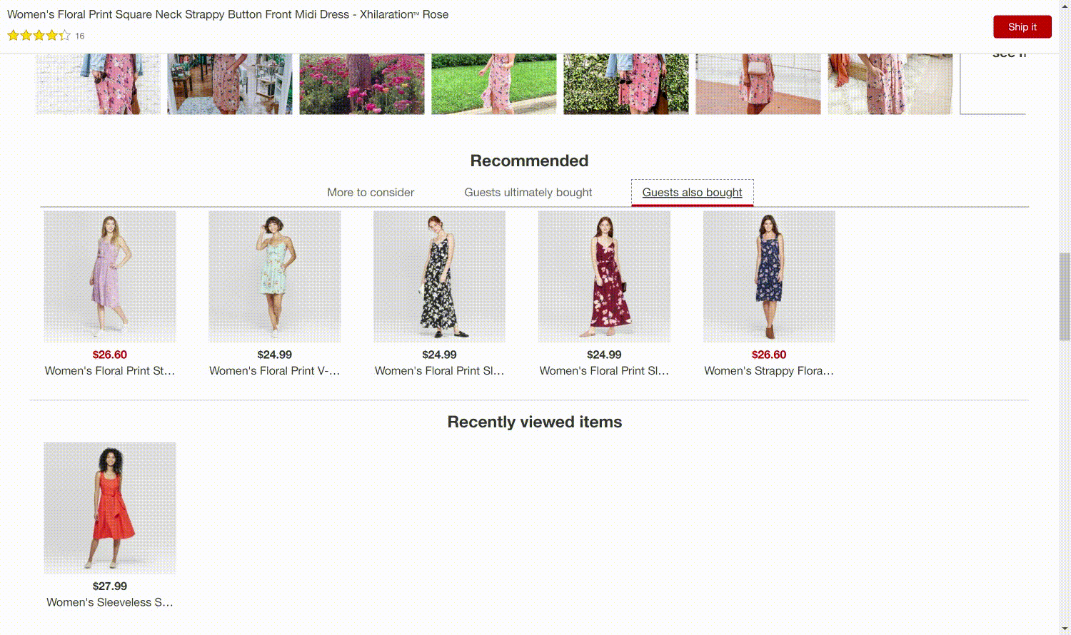
But the product page design is quite inconsistent, like in the image above
Fortunately, the page has a very detailed product description – including fit and style, special features, and primary occasion worn for.
Sadly, there is a lot of wasted space on the page and where did the price or shipping and returns information on the left-hand side go?
Again, the number of product images and zoom functionality is limited, but, this time, the product information is not as detailed.
That means the customer is missing key information.
Why is the look inconsistent on different pages?
Not only will this confuse the customer, who will expect information and toggles to be in the same place, but in my opinion, the first page is definitely the better and more user-friendly of the two.
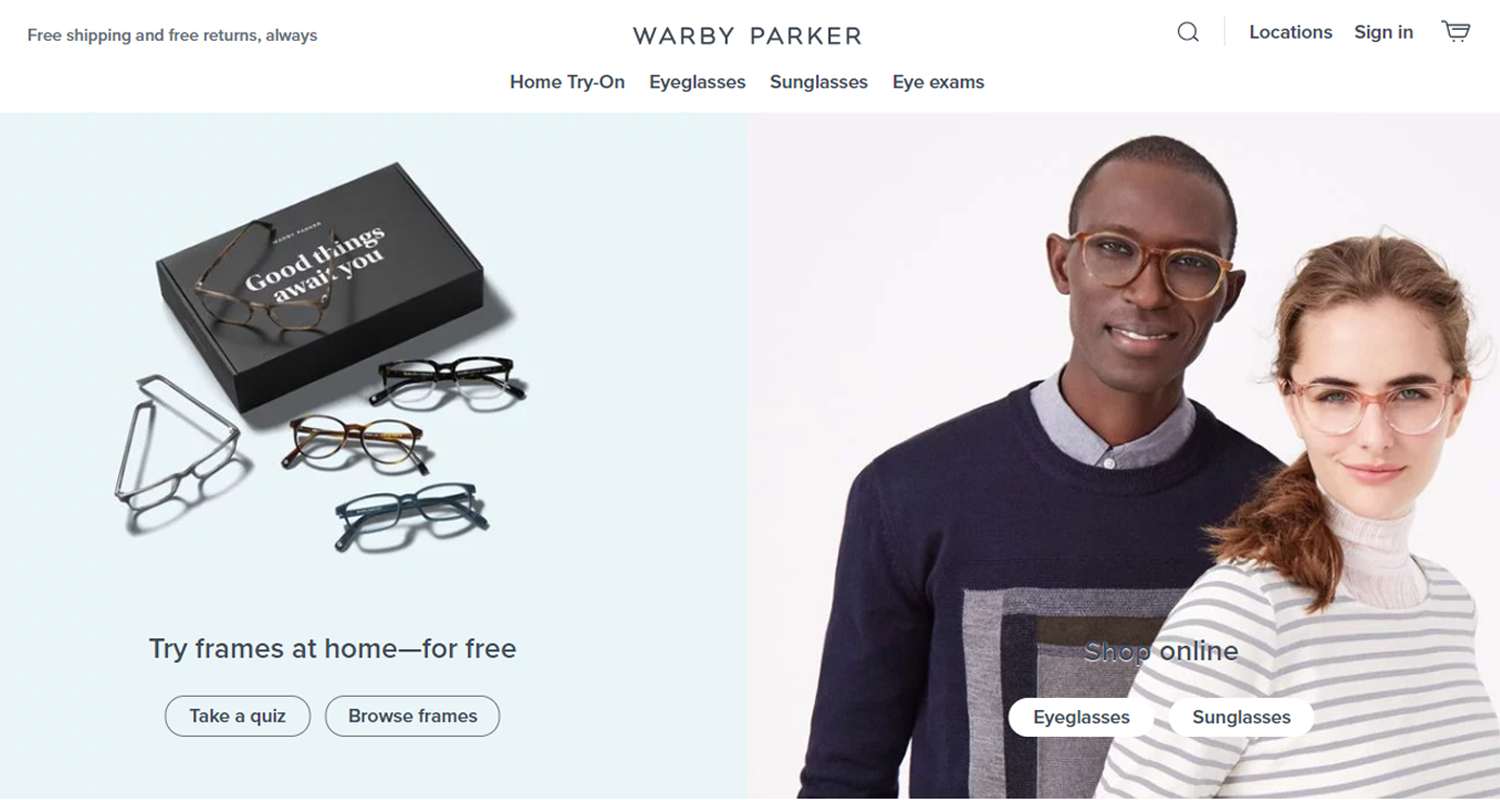
Warby Parker: The details matter
On the face of it, Warby Parker’s page is amazing.
Shopping for glasses can be a pain, but Warby Parker’s website makes the arduous process of choosing your next pair a luxurious and high-end experience – in fact, the website has the same fresh look-and-feel of Apple’s online store.
The landing page is clutter-free and simple, but incredibly effective.
Warby Parker’s layout makes you want to scroll through the wide choice of frames all the way to the bottom.
But one minor adjustment would take the product landing page from a 9 to a 10.
And that minor detail is the price.
This is a necessary detail for making purchasing decisions, so why is it not on the product page?
Anyone who has ever been shopping for glasses knows what a nightmare it can be to find a style and color that suits your face, so any and all additional help to ease that pain goes a long way.
You might think that the price isn’t listed because each frame costs the same – but they don’t.
An important consumer detail like the price should never be kept off the page in favor of web page layout.
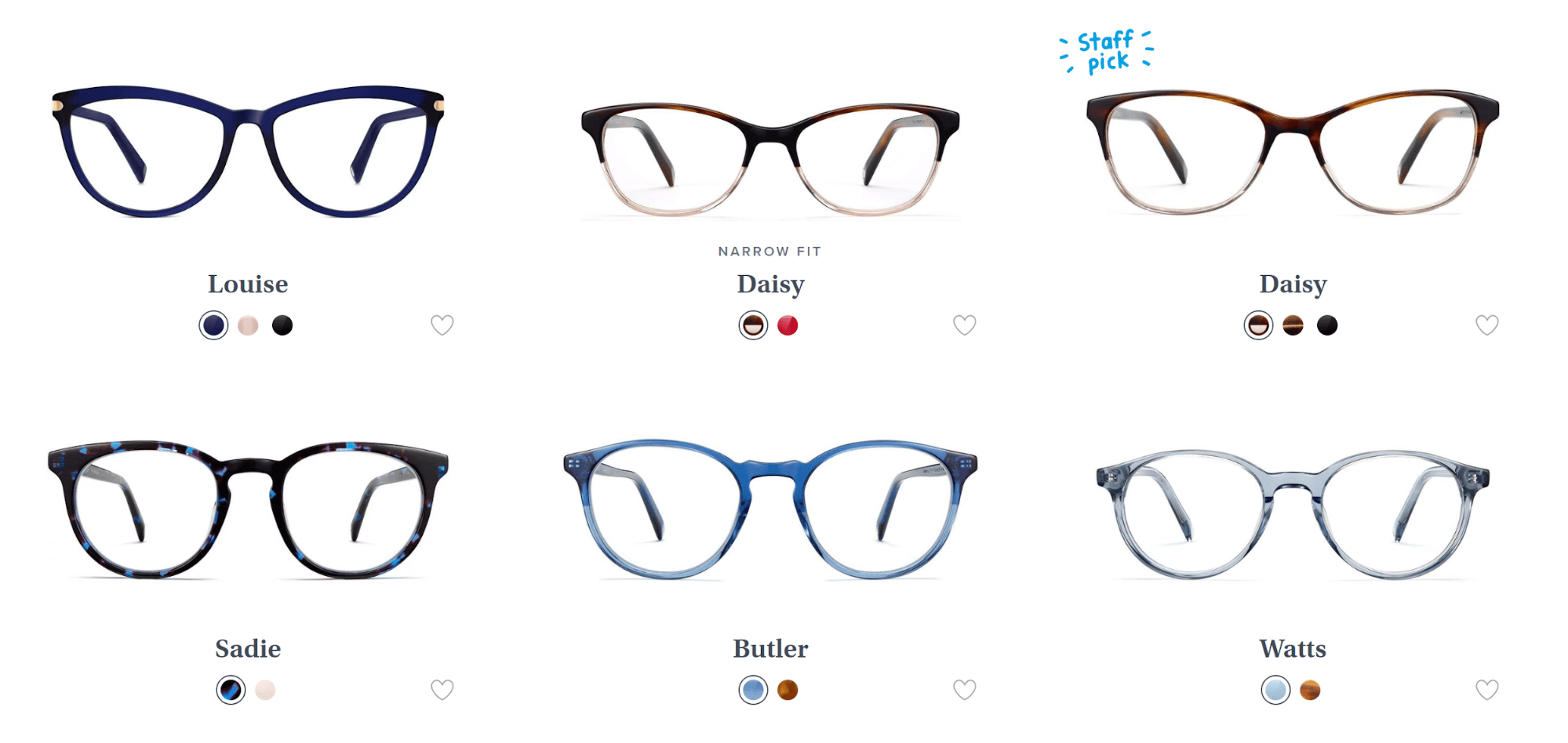
Warby Parker product page
The product page is just as visually appealing as the landing page. It draws your eye thanks to its simplicity.
But it doesn’t forget to provide the necessary information – it tells you everything you want to know about the size and shape of the frames, as well as the lens and prescription options available for the glasses.
The pictures are also stunning. They take up space and show a full range of angles.
But they just don’t say how much the glasses cost and that surely costs them conversions.
It would allow customers to get a sense of what the product looks like on them and would also let friends and family get involved in the process, making the whole thing a lot of fun!
What can you learn?
We have a lot of advice on this blog on what ecommerce stores can do to make their product pages stand out from the crowd.
But let’s look at the three big lessons from these three giants so you don’t end up having poor product pages:
- Keep the product listings consistent across your website
- Have sharp, high-quality images that zoom well
- Make sure to include any appropriate details
Share on social: