If you’re trying to use one image and just a couple of words to sell your product, I’ve got two words for you: try harder.
During the 2016 year-end holiday season, Americans spent roughly $63.1 billion when shopping on PCs. That was a 12% increase compared to 2015, and some projections say we’ll see an even larger increase this year.
So, you’re going to have to step up your digital photo game if you want to invite customers with your year-end holiday articles, blogs, social media ads, and social posts. There’s no single product photo or brief description that’ll work across all those elements, and if you try it, your customers are going to be bored of seeing it before they shop.
The good news is that you’ve found this guide that’ll provide some actionable steps you can take right now and give you a few marketing ideas to entice holiday shoppers. And, there’s still plenty of time to get things right for the 2017 shopping season.
Let’s get started by adding some new photos to your mix.
Improve your product photos with these tips and tricks
There’s a lot of professional photography advice specific to your industry and product types, and we recommend starting there. Look for things like this specific furniture guide for eCommerce as well as tools that are designed to give you an eCommerce look that’s proven successful.
Professional photographers are willing to write tips and tricks because they want to help their industry and come off as a leader in their field. It gives them credibility with their audience (that’s you) and makes it more likely you’ll turn to them if photography is too difficult or time-consuming on your own.
As for us, we’ll keep this section brief and provide just a few additional thoughts to diversify your photo offerings and up your overall product game:
- Shoot your product from multiple angles and mix these into your campaigns. You can even keep all the ad copy the same but switching out images will ensure that your audience won’t get bored.
- Ditch wide-angle lenses and wide apertures that can distort products or make elements out of focus.
- Take photos in as high a quality as possible and keep the quality by looking for image optimization tools instead of resizing the photos
- Diversify your backgrounds: use both solid-color backgrounds and in-context shots with backgrounds of where products will be used
- Leave space around your subject, which can be used for cutting and editing as well as places to add text
- Mix in any user-generated content you have from older campaigns for a fresh feel.
- Make use of models: If your product is hard to convey, introduce a model making the facial expression your customers desire.
And, if you’re struggling with the right equipment to buy, check out this guide that’ll walk you through what to get, explain how to set it up, and give some additional shooting tips.
Beef up your branding with filters and edits
While we’re about to dive into what exactly you can do with images to give them an extra pop on your social channels, you don’t want to start there.
The place to start after you’ve snapped a great shot is to create a copy and start playing around with editing and filter tools. Processing gives you a chance to make your images really shine and test out different filter options.
You don’t have to rely on the latest trends — they can be good, but also be time-consuming to adhere to and keep up with — but using consistent images, filters, or color schemes makes it easier to brand your company and help users recognize you when you show up in their feed.

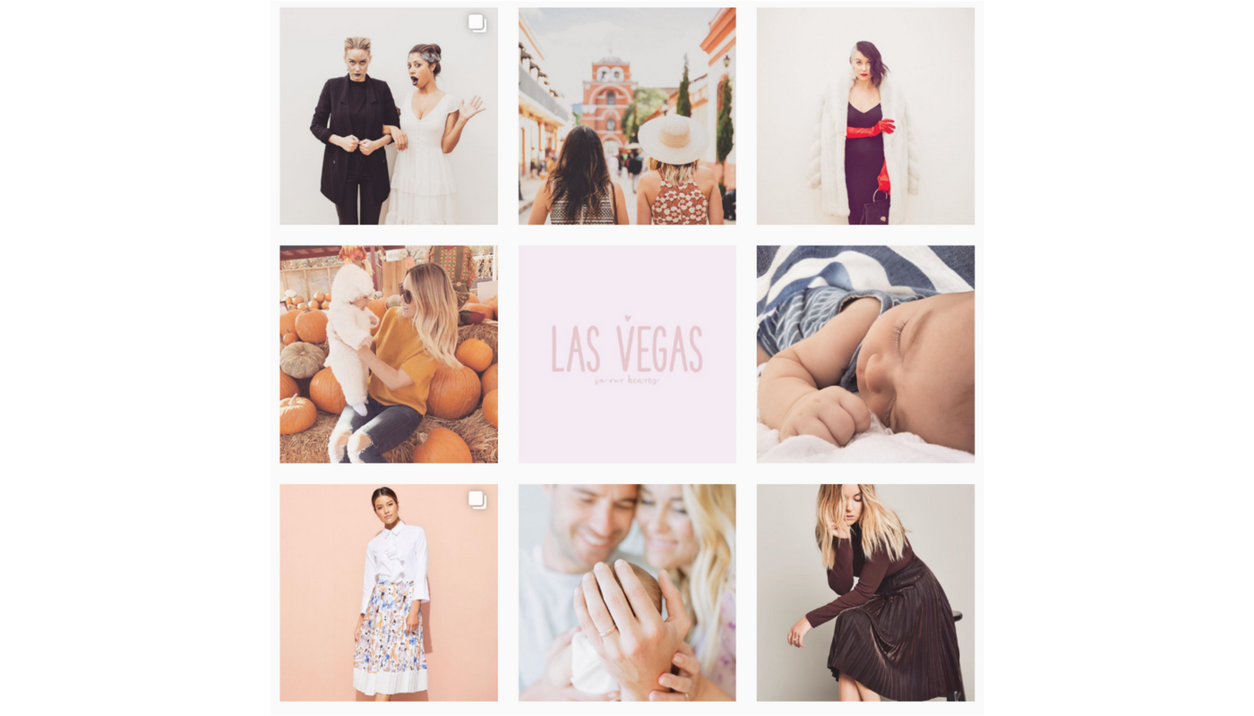
Check out the mood Lauren Conrad creates with a consistent filter style on her Instagram.
And remember, different colors evoke different emotions, so choose a filter or a consistent background color that highlights what you want to evoke:
- Black: Bold, strong, dangerous
- Blue: Trustworthy, calming, inviting, warm
- Brown: Sturdy, strong, earthy
- Green: Natural, rich, firm
- Grey: Neutral, distant, formal, dismal
- Orange: Animated, playful, thrifty
- Pink: Innocent, childlike, feminine
- Purple: Romantic, mysterious, expensive
- Red: Power, passion, importance
- White: Honest/sincere, clean, sharp
- Yellow: Happy, friendly, antiquity
Touchups, filters, and backgrounds that focus on these colors will give your brand an underlying impression that customers may not even realize, but they will feel.
Mix in movement
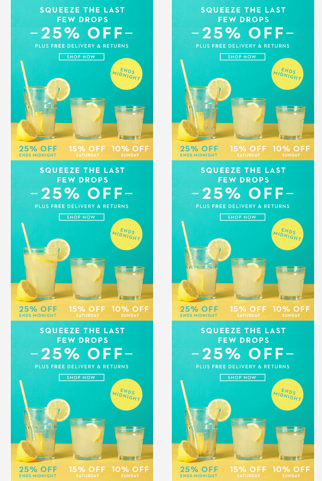
There’s no need for everything to be over the top to catch the eye. Here is our favorite GIF that can inspire a straightforward way for you to highlight your holiday offers:

Source: Boden
The movement of water draining from the glass on the left grabs the eye, but there’s nothing to distract from the offer that Boden is promoting. And, the British style brand doesn’t have to pitch its apparel to work. They avoid the “too much of a good thing” issue by having subtle movement in a small section of the overall image.
If you’re old enough to remember the days of GeoCities websites and the billion flashing, rotating images, you already know what to avoid.
Another bit of good news here is that you don’t have to make multiple graphics or edits for different shopping seasons or holidays. If you want to use 25% off as your go-to, then branding with something like “Ends Midnight” in this example makes the item evergreen and you’re free to use it at any time.
Add video to the mix
More brands are investing in video for their social content than ever before because the market is there for it. A roundup of the latest studies shows that 82% of active Twitter users watch video on the platform and 100 million hours of video are watched on Facebook every day. It’s now a must.
That can sound a little daunting, but there’s good news in there too. You don’t have to do a lot, and it doesn’t have to be perfect… it just needs to feel honest.
Facebook videos, for example, should be about 90 seconds long to maximize engagement in someone’s feed. The two most important aspects of them are the visuals and storyline because not everyone will turn on the sound. So, overlay text in your product video and ensure that you’ve got a nice shot of your product in action.
The big takeaway for social video: show people using your product and achieving the result you promise, whether that’s relaxation, an easier time completing a task, or doing something for someone else.
If you’re struggling with what text to add, consider reviews from Amazon or your website that are short and sweet. Or, repurpose your most successful tweets to highlight your offer.
But what about Christmas and the other holidays?
Now that you’ve got some idea of what to do in general, here are some thoughts and options for customizing your ads and imagery around upcoming holidays. Social feeds are going to be slammed with content around the holiday, so how do you stand out?
We’ve taken a look at some of the most and least successful campaigns in recent years and determined that two approaches tend to work best for brands of any size:
- Immediately showcase your value
- Create a mystery that invites an immediate action
Yes, those are a bit on opposite ends of the spectrum, but they reach two important desires of today’s shoppers:
- knowing that they’re saving on what they want or
- the feeling that they’re part of something exclusive, respectively.
Here’s how you can do this:
1. Repurpose general content
Let your product do the heavy lifting with a photo or video of it added to content, even content you’ve already made. All you need to do is add a few frames at the end of the video or slightly crop your image to add room for text that includes the words “Christmas Sale” or “Holiday Sale” and your website or an offer code.
Aim for something simple and effective that will only take a few minutes of your time — and could potentially be used next year too!
There’s a hidden gem in this work too: scarcity. You can’t offer holiday sales forever, so people know that they need to buy soon. You can increase that risk of scarcity (or urgency) with quick little layers that say things like: “There’re 12 days left until Christmas, but only 10 in our big 50% off deal!”
2. Create a sweepstakes and hashtag
Give something away, even if it’s to just one person, by creating a sweepstake with whatever is your hottest product of the season. Set a short timeframe, and have people enter by sharing or retweeting your ad image with a specific hashtag.
It’s a smart and effective way to grow your reach while limiting the ad spending you’ll need to do.
3. Have an event, even if you don’t really have an event
Here’s a nice-looking idea that works whether you have retail stores or just an eCommerce platform: create an invitation to your sale. Check out this Amaro ad from 2011:

Source: Amaro
With the holiday, you instantly know there’s a sale or discount, and the “RSVP” nature of it invites you to click through and learn more. Tie an image like this to a sale landing page or a sign-up form for your rewards program and people will join to feel like they’re part of the exclusive group to get your Black Friday deals.
It works well for Black Friday because the event is extremely limited and time sensitive. There aren’t too many other predefined shopping days afterward but that doesn’t mean this tactic won’t work. It just means you have to be a bit more creative and really carve out a space of your own.
You can create your own special day of savings based on your metrics and shopper data, especially on hot dates like December 21st, 22nd, and 23rd — the last Thursday, Friday, and Saturday before Christmas.
4. Make it your own
Those’re our thoughts on what you can do this holiday season, but we’ve left out the finishing touch:
There’s no guide you can follow that will tell you what to do 100% of the time, or if there is, you shouldn’t follow it because many other brands will be doing just that. They’ll start to look the same and lose the importance of quality imagery.
So, tell the story that’s important to your customers and you. In the end, it’ll come off as more authentic and honest, which is what social media needs right now.
Need help editing your photos for your social media ads?
Pixc can remove the background and more and have it back to you in 24 hours.
This blog was written by Jake Rheude. He is the Director of Business Development for Red Stag Fulfillment, an eCommerce fulfillment warehouse. He has years of experience in eCommerce and business development. In his free time, Jake enjoys reading about business and sharing his own experience with others.


