The role of photography in eCommerce branding is becoming increasingly important – especially for those eCommerce websites that rely upon photography in their customer journey and sales process. But surprisingly, despite investing heavily in the development of their logo and brand, some eCommerce sellers overlook and undervalue photography.
In today’s digital world, organisations and eCommerce sellers have a wealth of digital platforms from which to sell their goods and present their brand – whether it be their own website, blog, Instagram feed or secondary sellers. Whilst having lots of choices is a good thing, it also creates a number of challenges for brand management and consistency.
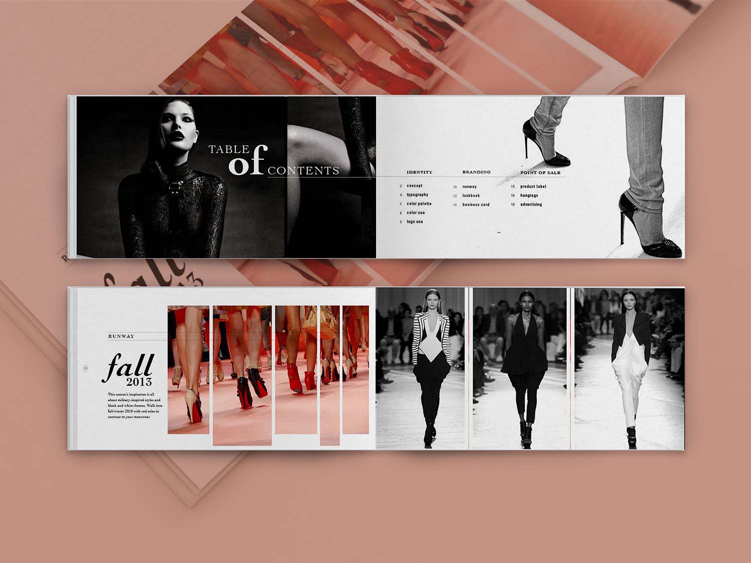
Big businesses invest heavily in branding and for good reason. Maintaining a strong eCommerce brand is important. It can have a huge impact on sales, customer loyalty and, ultimately a company’s bottom line. If you want proof, take a look at this case study about Etihad Airways’ rebrand.

Source: The Branding Journal
So why is branding important?
1) Branding communicates the unique personality of an organization
An organization’s brand is the window to its soul. A colorful and playful product design alongside imagery of bright, natural ingredients (such as those featured by Roar Cordials) communicates that the company is a fun, modern brand that sells healthy products.

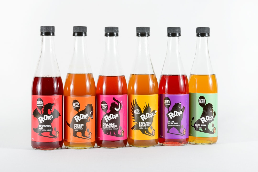
Source: Roar Living
2) A brand adds value to the consumer experience
By adding value to the consumer’s experience of that brand, great branding adds value to the product itself. For example, people spend thousands on Louis Vuitton bags not just because they are a high-quality product, but also because of the prestige that comes with owning a designer bag.
3) Branding supports the sales process by generating visual appeal and clarity
A product with a well-organized and attractive brand behind it is likely to be far more desirable to a customer than a product with a messy, ugly or inconsistent one. Good branding aids the sales process by increasing appeal.
Which website below would you rather buy a bike from?
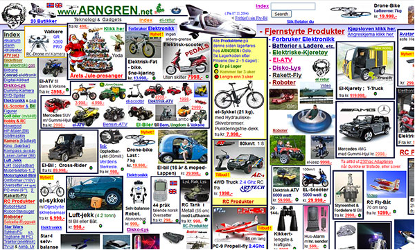
Source: Instant Shift
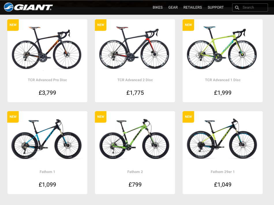
Source: Giant Bicycles
4) Good branding generates customer loyalty and emotional connection
A great brand designed specifically for its target can help create a strong emotional connection between it and the consumer, thus increasing the consumer’s loyalty. For example, aside from the impressive array of groundbreaking products that Apple offers, their development of a great brand – which represents leading edge tech, design, and great customer service – has generated an army of followers. Here’s an interesting take on Apple and what drives their customer loyalty
Even the smallest of companies have some semblance of a brand identity, whether it be their logo, color palette or staff uniform. However, it’s common for brand guidelines to miss a crucial element: the photography style guide.
A photography style guide can help support and build your eCommerce brand
We live in an increasingly visual world. Short attention spans and the need for instant feedback mean that companies rely heavily on photography.
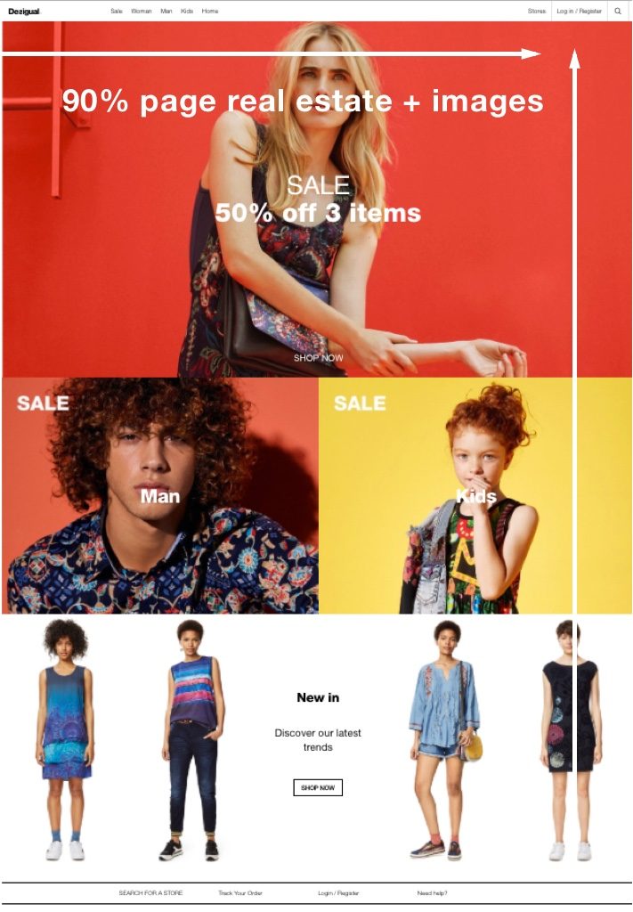
Look at any modern website or Facebook page and you’ll see 75% of site real estate is taken up by photos and images.
Source: Desigual
For eCommerce sites, this percentage can be even greater. So it should be a no-brainer that photography should support your brand identity, enhancing the overall look and ensuring consistency just as color palettes and logos do. Take a look at these examples of eCommerce stores with great photography
The best way to support your eCommerce brand with great photography is by developing a photography style guide alongside your brand identity document. Include your company’s preferences for your:
Color palette
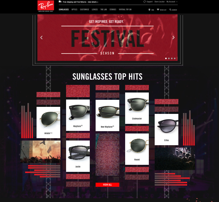
Color is key to brand identity. The colors in your photography should match or complement your brand’s color palette. Ray-Ban is a great example. They use lots of red imagery to reflect their red brand palette.
Source: Ray-Ban
However, using only images that match the palette would be pretty limiting. A color palette is not meant to be binding and exclusive. Instead, try sticking to complementary colors and/or similar hues. For example, if your brand incorporates neon, try including photographs that feature accented neon colors If your brand’s palette is made up of muted colors such as creams and whites, then softer photography using similarly muted colors would be recommended.
Saturation
As with your color palette, you should outline how saturated you’d like your colors to be. Bulmers’ current campaign is all about fun, so their color palette is made up of highly saturated colors

Source: Bulmers
Focal length
People who are less photography-savvy tend to overlook focal length. It’s not really at the forefront of anyone’s mind, but it’s still important. l Specifying the general focus length ensures that all images follow a similar style.Do you want everything in your product images to be crystal clear? Or do you want to focus on the foreground and have everything in the background blurred?
Shadows
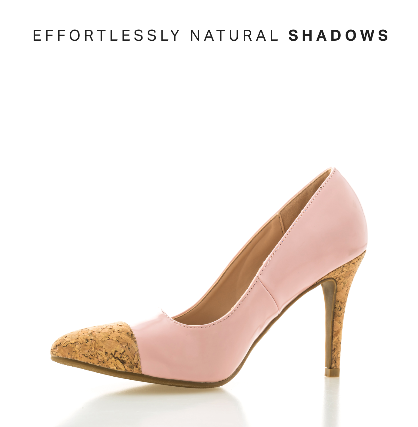
One of the most common requests from Pixc clients is removing or adding a shadow to a product image. Luckily, there’s no right way to have a shadow; it really depends on your own preference. Shadows can add an element of reality and depth to an image, whereas removing the shadow can make it appear flatter.
Composition
The general composition of an image is a big one. Do you want the object or person to be left- or right-aligned? Or would you prefer them to be centered in the middle?
Another element of composition is the volume (or amount) of content within a photograph. Do you want your images to be minimal with lots of negative space? Or are the brand values busy and lively? If the latter, you might want the frame to be full of products and objects.
Location or context
The context of your images can make a huge impact in terms of communicating your product or brand as well as the look and feel of the image.
Do you want all your images to be shot in a controlled studio environment? Or would you like to include some outdoor or in-context shots? This company sells socks, so pretty much all their photography features legs and feet.
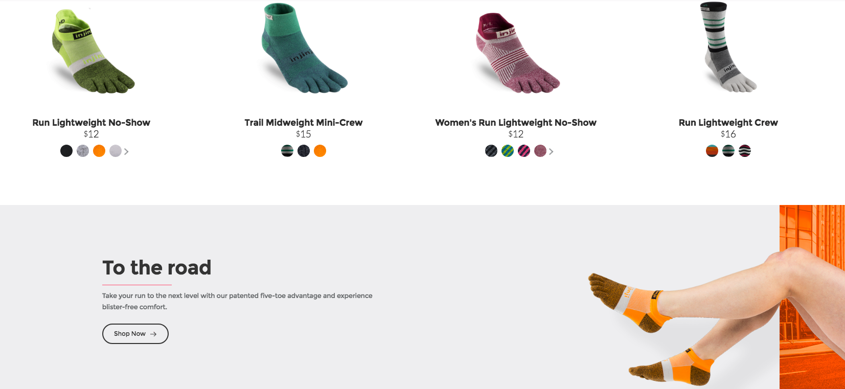
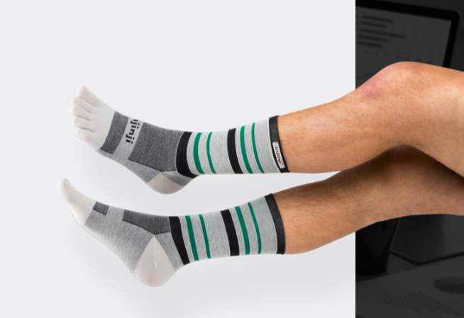
Source: Injinji
Combination of photography (i.e. close-ups alongside long shots)
How would you like your images to be placed within your marketing channels? For example, if you’re an outdoor clothing company, it might be important to include a combination of shots – Some product images on white backgrounds alongside pictures of outdoorsy types climbing mountains.
Content
Although it sounds simple – your photography content should appeal to your target audience. If you’re a clothing brand for young, hipster twenty-somethings, you should most likely place young, hipster twenty-somethings in your image. Can you imagine Topshop using fifty-year-olds to model their clothes?
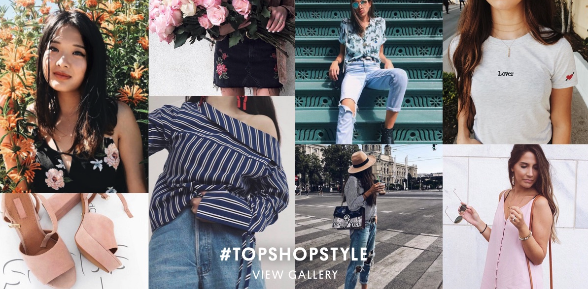
Source: Topshop
Style and filter
Consistency in editing, whether that be contrast and brightness or filter, is very important. Make sure to give clear instructions to your re-toucher and post-production team. Whether it be a retro, analogue look or a sharp, professional gloss, a consistent style is essential!
Ideally, your photography style guide will evolve over time as your product lines and trends change. The concepts above are not only a great starting point, you can also come back to them time and time again to make sure you are developing a strong photographic vision for your eCommerce store.
How does your business incorporate photography branding?

