A quick glance at most eCommerce websites and you’ll see lines of shimmering products floating against a white blanket of apparent nothingness.
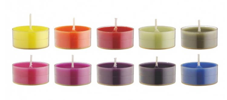
What does this tell us? That white backgrounds rule the roost when it comes to eCommerce product photography.
Our clients at Pixc understand the importance of having high-quality images on their sites and the impact those images can have on their conversion rate. So why do over 90% of them choose to have their photographs edited to remove the background and replace it with white?
Although white backgrounds are the eCommerce industry standard, shooting products in context can and should be considered as an alternative or additional option by eCommerce store owners.
The case for white backgrounds
White backgrounds are popular amongst eCommerce and product sites for good reason. It’s the go-to approach for most sellers whether they be jewellery stores, fashion stores or furniture stores. A white background:
Promotes consistency
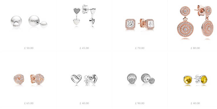
Using white backdrops across all products ensures consistency, contributing to a uniform look and feel throughout the site. Just as it is important to ensure the brand identity of a seller is consistent, the same goes for photography. Imagine a site where each product was presented against a different background, with a variety of lighting and angles. It would get confusing and distracting for the buyer.
Source: Pandora
Emphasizes the product
White backgrounds mean no distractions. You can focus on presenting the product – the quality of its finish and the detail – without having distracting backdrops or focus points.
Saves you money
By using a white backdrop, you simplify the shooting process. The cost of searching out locations, hiring a model, a pro photographer and an art director can push a shoot budget into four figures. White backgrounds eliminate the need for all of this. They require a relatively simple process, and even less technical expertise. And with services like Pixc available, you don’t even need to shoot on a white background. We’ll do the editing for you.
Speeds up the editing process
When shooting and editing a product in the context of a scene, differences in lighting, color and focus can lead to complications. Editing images of products against a simple backdrop, however, is a lot less time-consuming.
The case for photographing products in context
There are many arguments for white backgrounds and thousands of eCommerce entrepreneurs are white background evangelists. So, the white background route is the way to go, right?
Wrong!
Shooting and selling products in context or in a lifestyle format can be extremely beneficial and have a big impact on your conversion rate. It:
Conveys richer messaging and storytelling
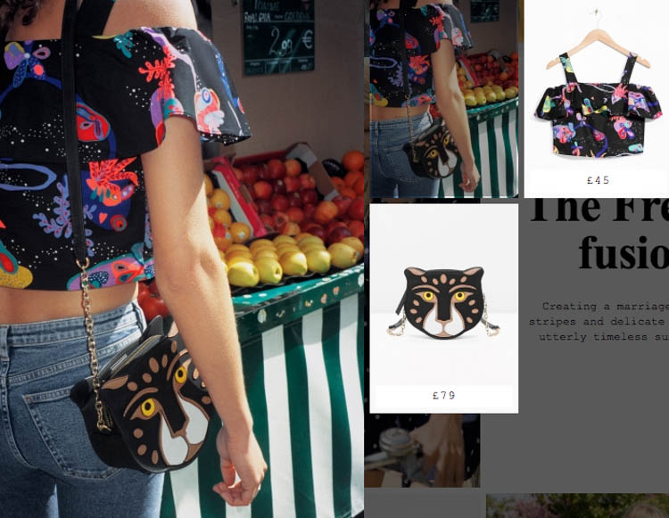
Photographing products in context is a great way to tell the story behind the product and bring it to life. For example, an online fashion store could enrich their range by using look-book style images of the models living the clothes.
Source: & Other Stories
Speaks to your demographic
It’s easier for customers to infer who the product was designed for if they are given context. Subtle inclusions in an image such as a shirt cuff or a laptop could insinuate that the product is designed for the busy high-flyer.
Source: Motorola
Encourages aspiration and inspiration
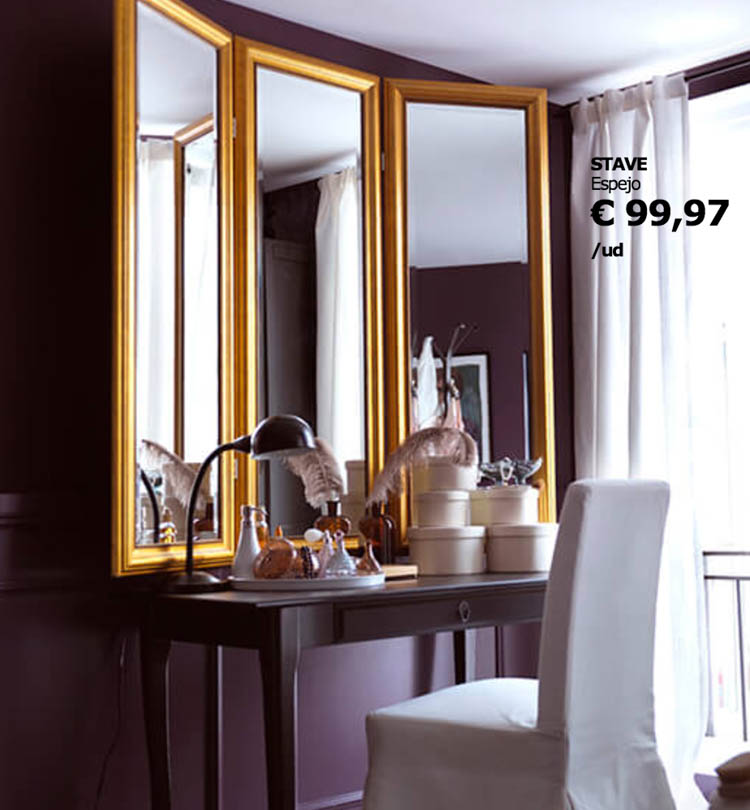
Presenting a product within an aspirational setting can enhance its desirability. The customer doesn’t need to imagine what the mirror would look like on their wall, they can see it in full color as part of a beautifully designed interior which can make them want it more.
Source: Ikea
Upsells and promotes complementary products
Selling a multitude of products within one lifestyle image is becoming increasingly popular. It’s a great way of not only selling a lifestyle concept but also of tempting customers to buy the complementary products that sit alongside each other.
Source: Currys
Different products need different approaches
With a strong case made for both styles of product photography, you may be confused as to which route to go. Ultimately, the answer depends entirely on your brand and the type of product you’re selling.
For example, if you are selling wearable tech, showing the product in the context of the wearer would be a good way of communicating its purpose. The same goes for design-related products such as furniture or home decor objects, which are likely to benefit from being shown in context.

Source: Fitbit
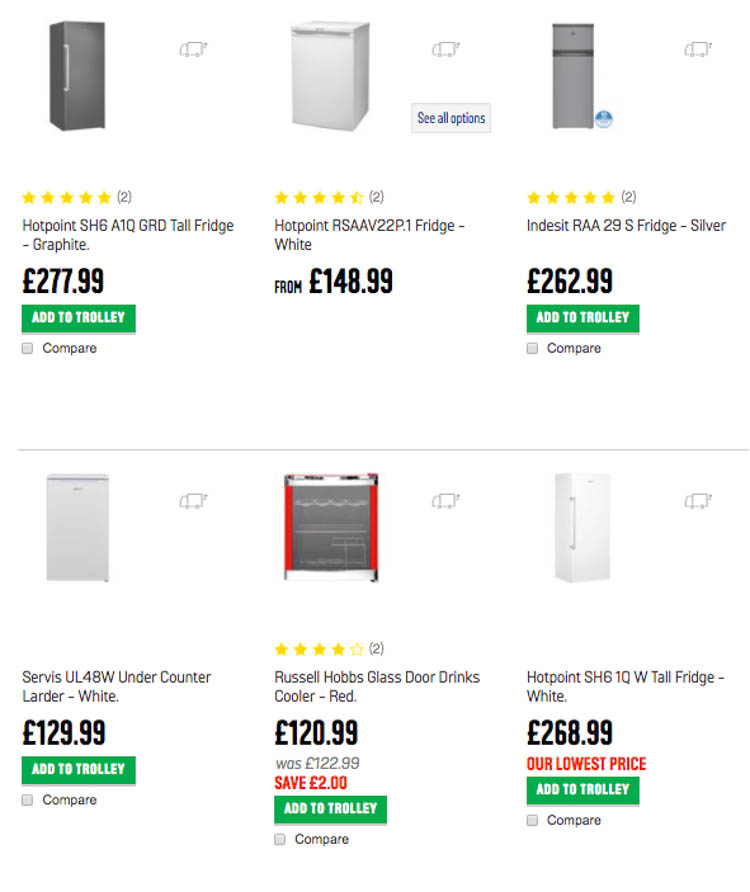
On the flip side, small or highly detailed objects are likely to require close up shots with good lighting and would benefit from a white background. The same goes for electronic goods and generic objects where specifications are more important than the context, especially where it can be inferred e.g. a fridge.
Source: Argos
Why not do both?
But wait! There’s actually no need to choose between one or the other. Lots of eCommerce stores are mixing it up and telling the story with lifestyle photography, whilst doing the hard sell with white backdrop shots. Here are a few examples of how this can be done:
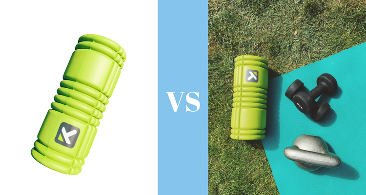
- Collages – Make a collage for each product featuring white background product photography next to in-context shots.
- Rollover images – Where the user can view both types of images just by resting their cursor over the product.
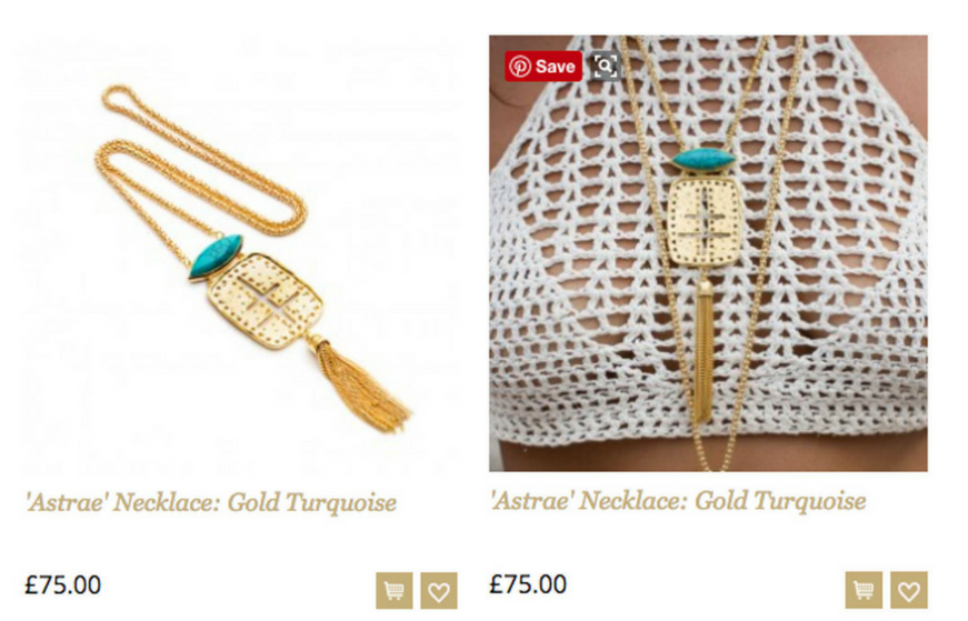
Source: Anuzi
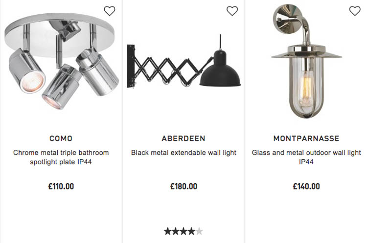
- Interspersing product shots with context shots.
Source: John Lewis
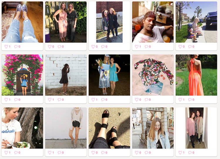
- Use of additional media such as Instagram to tell the story.
Source: Instagram
And if none of those options appeal to you, there are a number of alternative image options that could work for your site:
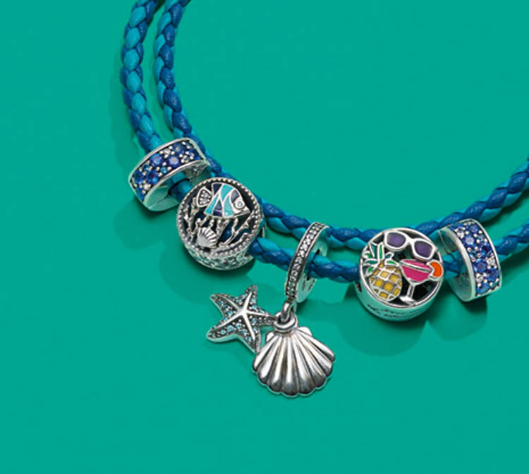
- Shooting against different colors – Is more interesting than a white backdrop but offers all the benefits of the simple backdrop.
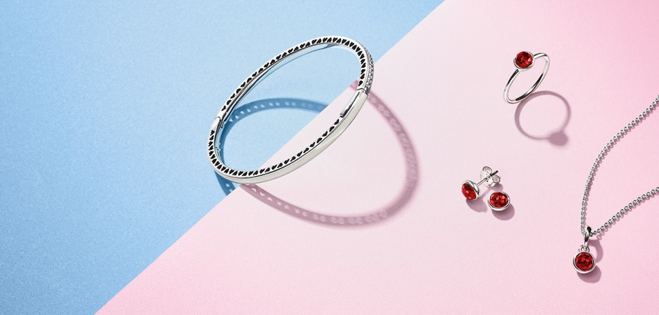
Source: Pandora
- Still life layouts – Can be great for illustrating how to use products and add a bit of context in a graphic way. e.g. What fits in your bag?
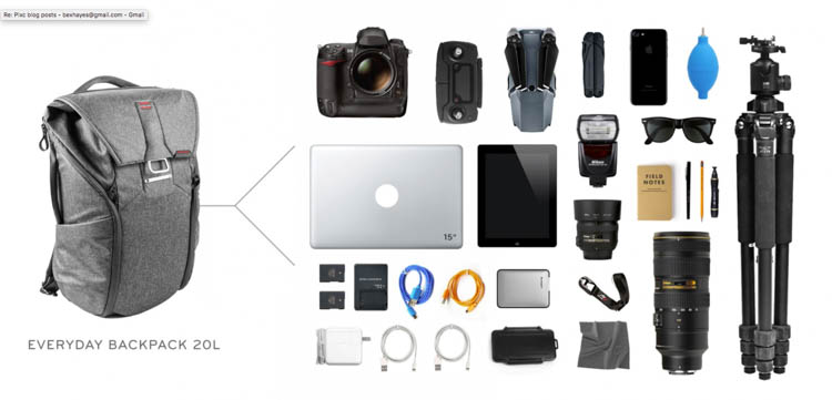 Source: Peak Design
- Video – Something that is set to be a trend in the future is the use of video to sell products.

