Getting your product photography right can have a huge impact on your store’s conversions. Knowing when to use different types of photography and how to showcase different products is crucial.
That’s why I have gathered this list of 19 eCommerce stores – across the fields of fashion, tech, health & beauty and gifts – with great examples of product photography. These stores use photography in a number of ways to sell the product, provide extra information to the customer or accentuate their brand.
Fashion
Fashion product photography is all about giving the customer images that
- let them imagine wearing your product and
- convey the craftsmanship behind your product.
Here are four stores that do this exceptionally well:
1. Injinji
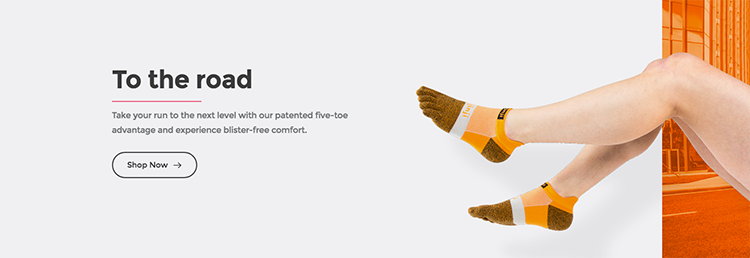
Injinji uses clear, bright product photography to focus on their products. By editing out the background of their photos, they can reuse their product photography in banner images and marketing without having to take new photos.
Source: Injinji
They also photograph the products in the same shape as they would have on the customer’s foot, as opposed to in a package or box. This gives the customer a better sense of the product they are buying.
2. Mansur Gavriel
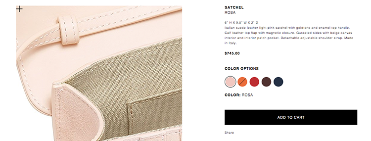
This luxury fashion brand uses a white background throughout the website to accentuate the simple, bold colors of their products.
Source: Mansur Gavriel, Rosa Satchel
In addition, on their product pages, they use a variety of different angles to showcase the different features of the product. Their 1750 x 1750px photos on a white background allow you to mouse over each image to view the quality of craftsmanship.
3. Bulbul Watches
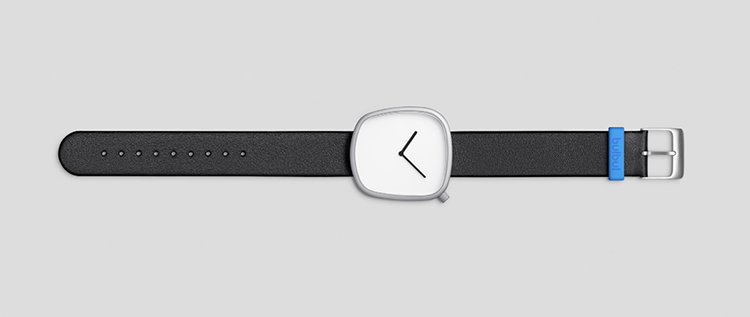
Through the use of lighting and a light grey background, Bulbul makes their watches instantly pop. Immediately, their photography choices make their simple products seem modern and fresh and reflect the minimalism of the product.
Source: Bulbul Watches, Pebble 02
On the product page itself, Bulbul showcases different angles of the product on the same light-grey, industrialist background. It uses shots with models sparingly – only on the homepage and their Instagram – so as not to take away from the watches themselves.
4. Boxfresh
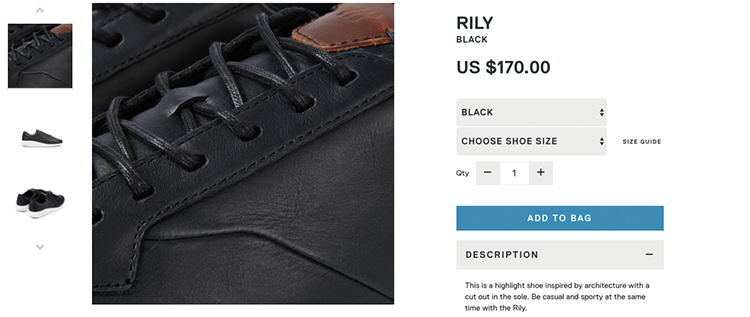
This shoe-obsessed company uses product photography to demonstrate how their product differs from their competitors in both style and quality. They display each angle of the shoe and include closeups that illustrate the quality of its stitching.
Source: BoxFresh, Rily Black
Outside of the product page, Boxfresh uses photography in other ways to tell the story of their brand and the process behind making their products.
Tech
Features, build quality and use case are the most important components to cover in your technology product photography.
- Can the user see themselves using this product?
- Will it solve a problem they have?
- Is it going to last?
These tech stores use product photography to answer these questions.
5. Native Union
To sell their range of mobile accessories, Native Union first uses photos of their product in a real-life situation. For example, an iPhone on a desk using one of their docks or their speakers nestled amongst some indoor plants. Such context helps customers envision how the products might fit into their lives and promotes the image of the brand.
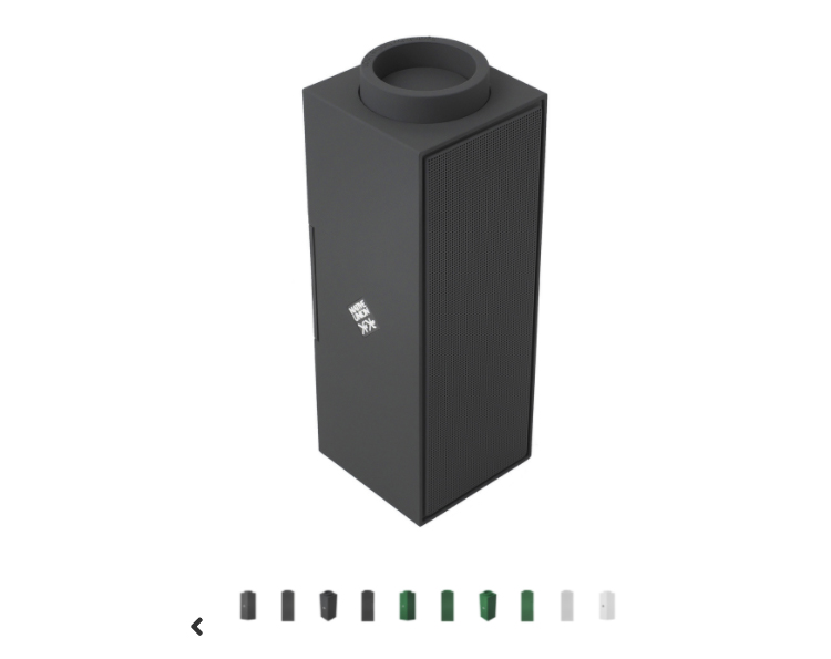
Source: NativeUnion, Switch
The product page itself, however, is a different story. Native Union uses a large gallery of images all on white backgrounds. The images provide a full 3D overview of the product so the user can see it from all angles as well as in different colours.
6. Tile
Tile is a square Bluetooth tracker you can attach to objects to help you locate them. While the physical product is quite unassuming, its use cases are what really inspire potential customers.
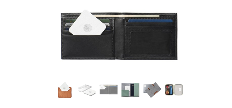
Source: Tile, Slim
As opposed to just sticking the product by itself on the product page, Tile utilises photos of everyday situations to show you how it could be used in your life. Tiles are pictured next to wallets, lunchboxes, credit cards, and more. These juxtapositions not only inspire you to find more uses for the product, they also help provide a better sense of scale for the product.
7. Inventables
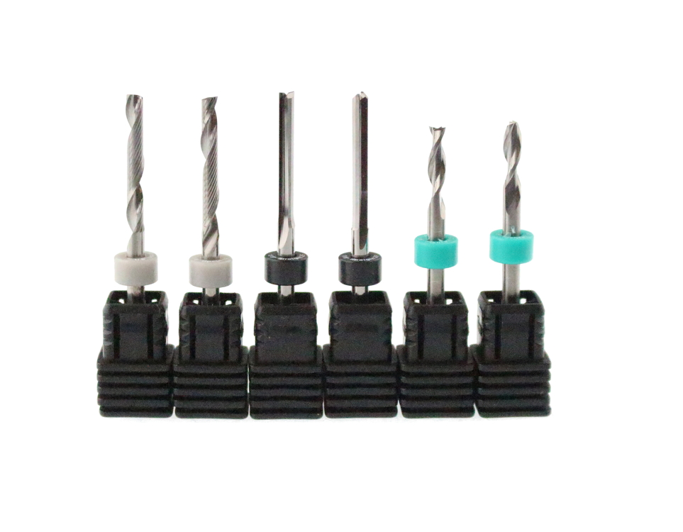
When you’re selling parts for 3D carving that include twelve different types of bearings, you need to make sure people can be confident that they are buying the right product. Inventables does this in part with descriptive product titles, but also with close-up photographs of their products on white backgrounds.
Source: Inventables
They also sell projects that customers can download and make themselves using materials from their site. Product photography is crucial here to give the makers a point of reference for what they are building and to show the build quality of the project.
8. Square
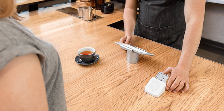
Square has some fantastic examples of a well-designed product page. At the very top of each product page are full-width photographs of their product. They use clear grey backgrounds to feature their all-white products, which makes the few colors that are used feel very distinct and purposeful.
Source: Square
Square’s simplistic product photography helps convey that their payment terminal will work and not get in the way. Throughout the site, you do see images of the products in use, but the focus remains on the minimalist design of the products themselves.
9. Fugoo
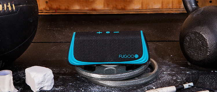
Fugoo uses a mix of different product photography to sell their range of speakers. Depending on which product you are thinking of buying, you might see photos of the speaker being used at a beach party, on the front of an ATV or strapped to a basketball pole during a pickup game.
Source: FUGOO, Sport
However, each product also features a gallery of close-up images on a white background that highlights the angles, features and points of differentiation in detail.
Health and Beauty
With health and beauty products, imagery can be an incredibly powerful motivator. But when your product is a powder or gel, how do you photograph this in a way that is both appealing and convincing? These health and beauty stores show how you can use product photography to sell less-photo-friendly products.
10. 100% Pure
100% Pure uses a mixed approach to their product photography. With most of their products coming in mineral form, it can be difficult to convey the benefits or unique value. They are able to illustrate their product’s worth by using a variety of different photos and videos.
For example, their Gemmed Luminizer product page gallery features:
- Two photos of the product as it arrives in its container
- A video of how to apply the product
- A video of the results
- A ‘smear’ of the minerals to promote the product quality
- A comparison of the product against various skin tones
- Photographs of models who have used the product and
- A marketing shot of the product against a luxurious background
Source: 100% Pure, Rose Gem
11. Naturebox
To sell their range of healthy, high-quality snacks, Naturebox uses product photography to showcase their food in a more natural setting. Instead of photographing the packaging, they opt to lay their food out in a setting that looks similar to how you would have it in your own home. The end result is a product that looks both appetizing and aesthetically pleasing.
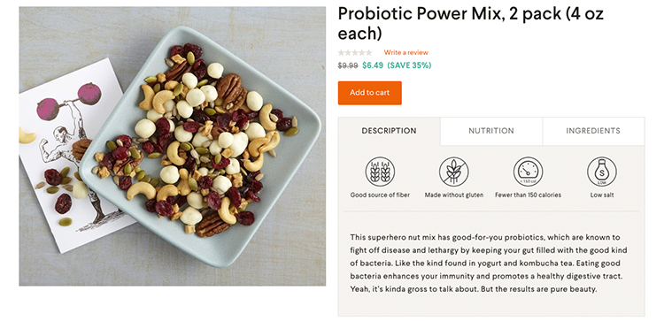
Source: Naturebox, Probiotic Power Mix
12. Frank Body
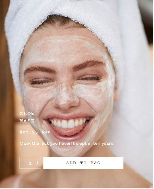
Frank Body has a fantastic website design and their product photography compliments it well. To illustrate the benefits of their products, Frank Body uses model shots with the scrub product applied. In addition to immediately showing the product and its use, these model photos add a sense of humor, making Frank Body’s brand seem relatable and relaxed.
Source: Frankie, Glow Mask
For their ‘kits’ which contain multiple products, they use a simple grey backdrop to keep the focus on the products themselves.
Source: Frankie, Original Coffee Scrub
13. Purgo
To sell their range of teas designed to help you detox, Purgo uses a mix of product photography to showcase the product at every stage. They begin with photos of the product packaging to show what you are getting with your order.
Source: Purgo, 14 Day Teatox
Then, they provide images of the tea itself to show you the ingredients within the package. Photos of the tea, ready-made, round this out by giving you an idea of what the tea will look and even taste like. Model photos also feature their target market using the product.
14. Faucet Face
Glass water bottles would certainly be a tricky product to make interesting through product photography, but Faucet Face has done a great job.
Through their photography, they promote not only the unique design of their product but also the tangible benefits for the customer and the environment.
Source: Faucet Face, Hose Water Bottle
Cutaways show the quality of the product, while added text highlights particularly notable points such as the BPA-free cap.
Gifts
If you are selling products for people to buy for others, product photography is particularly important, especially if they are sending it directly to the recipient sight unseen. These eCommerce stores have photography that makes you feel confident when purchasing their product as a gift for someone else.
15. Beardbrand
Beardbrand has a fantastic range of photography that all culminates around a certain lifestyle and aesthetic (namely beards). Regardless of whether the product is a brush or jar of balm, Beardbrand uses a large gallery of product photos with the background removed to showcase every aspect of the product.
For balms and ointments, this means the customer can read the ingredients and get a sense of the product as if they were actually holding it their hands.
Source: Beardbrand, Tree Ranger Styling Balm
16. Stonewall Kitchen
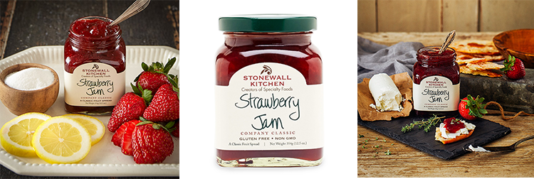
Stonewall Kitchen’s use of product photography is made to get you hungry. The gourmet products are expertly set up with a variety of foods to inspire you with recipe ideas.
Moreover, they provide photos of the product without a background to give you an idea of the product you are buying. On some products, they even feature photos from their customers who have used the product in their own recipe. Customer photos are particularly appealing to consumers because they confirm that what you’re seeing is really what you get.
Source: Stonewall Kitchen, Strawberry Jam
17. Papier
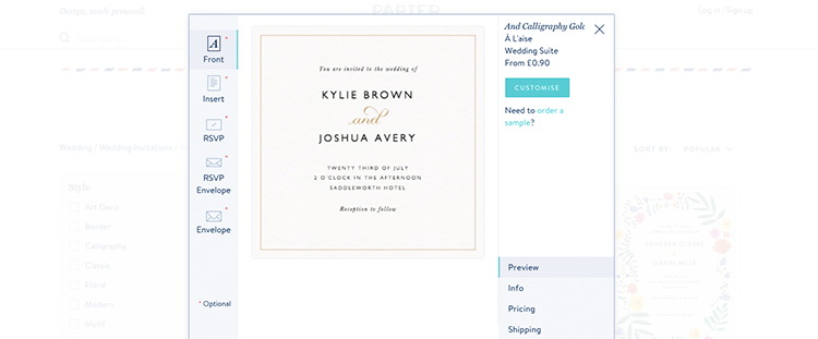
Rather than provide a gallery of images, Papier has customer navigation on their product pages to let you view each section of the card or invitation that you are purchasing to go with your gift. For example, on a wedding invitation, you want to ensure the front, insert, RSVP section and envelope are all exactly what you want. Papier’s approach lets you view each of these sections in detail rather than scrolling through an overwhelming gallery.
Source: Papier, Invitations
18. Lostmy.name
To display their personalized books, Lostmy.name uses video and images that suit the theme of each story. Being an illustrated book, images are obviously very important and the store uses the colorful designs to their advantage.
Source: Lostmy.name, Kingdom of You
19. Mancrates
Mancrates does a fantastic job of showcasing products across their range of crates for men. Each crate is photographed in a place or with objects appropriate to its theme – the Beard Wrangler Crate next to a mirror and the Auto Care Crate on top of a car. The products within each crate are then also individually promoted using photography that follows the same theme.
Source: Mancrates
Each of these eCommerce stores is an excellent example of product photography used effectively in an online store. While they vary in approach, there are some similarities they share. For example, while many use photography to tell a certain story on their homepage, when it comes to the product page, they use photography that focuses on the product itself, often with a transparent or white background.

