Now that Black Friday has kicked off the holiday shopping spree, eStores will be competing on keeping the momentum going all the way up to Christmas. So don’t even think about dropping the ball; dress your site in Christmas cheer and gift suggestions instead.
Most small online retailers can be tempted to skip the site tuning for the holidays and try to get away with just a notification bar or a popup. But if you are to take full advantage of the holiday emotional spenders, you need to do more.
This is the time to learn from the big guys and give your store a dash of red, build a gift guide, or keep the discounts rolling.
You can do that by following at least two or three of these simple rules for your holiday page designs:
- Bring on the holiday cheer
- Put your best-selling items upfront
- Create a Holiday Gift Guide
- Offer free shipping
- Advertise seamless returns and exchanges
Most brands do the first three or four. You get extra points for doing all five. So without further ado, let’s look at 10 great holiday page examples.
Source: Bloomingdale’s
1. Bloomingdale’s
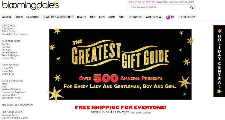
The fabled New York City department store scores pretty high in holiday mood setting on their website. They have a fixed slide-in bar called Holiday Central that is very hard to miss. And once you click on it, a message appears at the top that shipping is free for everyone until December 20th. Pretty sweet deal already!
Next is a link to their Holiday Gift Guide that takes you to a page that offers gift categories for everyone you can think of. And let’s face it, we all need help picking gifts even for the people we know better than ourselves.
Their Holiday Central bar also includes a Wish List creator and an opportunity to purchase Gift Cards, for when you want to play it safe.
Source: Macy’s
2. Macy’s
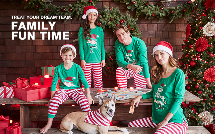
Macy’s leads the pack of festive department stores around the holidays with sprawling window designs that make the news each year. The same goes for its website that is overflowing with red color, Santa hats, and gift boxes. Macy’s is all about family and spreading the holiday cheer, and they do a great job at making shoppers feel cozy and generous.
While they only offer free shipping on orders over $99, since they sell just about everything under the sun, they are the one-stop-shop for many holiday shoppers. Furthermore, its descriptive Gift Guide doesn’t simply list items, it tells stories that sell their products through emotions and associations. For example, their Gifts for the Home section boasts an image of a home bar with all the bells and whistles (and a few delicious looking cocktails).
Source: Sephora
3. Sephora
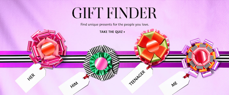
Sephora’s homepage banner is hard not to click on with vibrant pink ribbons an engaging Gift Finder quiz, and inescapable mood of luxury and quality. The site boasts a highlighted gift menu that spans all categories you can think of and gives you an opportunity to pick by price range.
Sephora’s site is naturally geared towards gifts for women, with pink boxes, gift wrappers, and ribbons all around creating a feminine, festive atmosphere.
Like most leading brands, the site also has a Guide that lets you select who the gift is for, the category, and the price range, and lands you on a page full of gift suggestions. It’s the perfect tool for lazy shoppers out there – one that most men will be thankful for. This is a perfect example of smoothing over and shortening the buyer journey and piloting them towards a quick purchase.
Source: Tiffany’s
4. Tiffany’s
The luxury jewelry and homewares seller takes a more sophisticated and artistic approach suited to its coveted offerings. Highly stylized art photos are nested on its front page, featuring its signature blue gift packages, suggesting its products are a must-have in the holiday season.
Tiffany’s site is also quick to mention that it offers free, seamless returns and exchanges over the holidays; it displays this offering prominently on its top notification bar. Over, their webpage is elegant and conveys the holiday spirit in a subtle way, suited to its upscale clientele.
Source: Baublebar
5. Baublebar
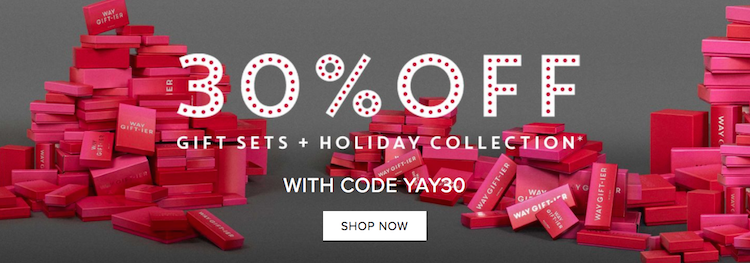
Jumping right in with their best offer, Baublebar greets you with a 30% off coupon for all its Holiday Collections, which feature some of its most popular tassel earrings. A notification bar at the top informs shoppers that they get free shipping and returns, a fact that puts their customers’ minds at ease, making them more inclined to keep browsing.
The site further boosts the season’s mood with plenty of red and pink to go about. Here, the Holiday Collections take a central place. Themed holiday selections can be a good tool to help busy shoppers find what they need and guide them to make a purchase.
Source: Zappos
6. Zappos
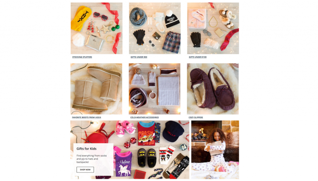
The shoes and apparel retailer welcomes shoppers with a pine branch, Christmas tree ornaments, and an invite to give our loved ones the gift of warm shoes. Most popular items and brands are right on the first page, and nested among them is the Holiday Gift Guide.
The Guide takes you to a page full of well-placed categories and suggestions littered with Christmas tree decorations and the warmed of fireplaces. The page is also topped with a fun, uptempo look into their customer’s typical Christmas-prepping day.
Zappos’ Gift Guide focuses on powerful mood-setting images that are hard to look away from. Christmas lights are everywhere, engulfing the visitor in coziness and relaxation. Each image marks a category that narrows the shoppers search and helps them save time. Every eStore out there should have a page like that!
Source: Swarovski
7. Swarovski
The jewelry maker’s home page is all about the holidays, showcasing glittering Christmas tree ornaments and jewelry with plenty of white and red. It features holiday collections, newly designed decorative pieces, and cheery crowds bearing gifts, boasting a truly luxurious holiday mood. Ready for a party, anyone?
It also advertises free shipping over $75 with a top page bar, which is a generous offer considering it sells mostly high-ticket items.
Source: Uniqlo
8. Uniqlo
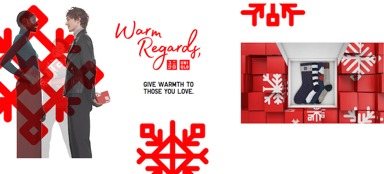
In their top notification bar, Uniqlo is quick to mention that shipping is only $5 or free on orders over $125. The site is geared towards the winter season and gently eases the casual browser into shopping, using images that gently appear as the user scrolls down the Gift Guide. The Guide is also beautifully interactive with gifs, giant red snowflakes, and happy models bearing gifts.
This super upbeat webpage is created for younger holiday shoppers and guides them through categories that lead to collection pages. Shoppers can also navigate by price range, which is a must-have feature in order to provide a smooth purchasing path for budget-minded gift seekers.
Source: Harney & Sons
9. Harney & Sons
Harney & Sons teas always do a great job bringing the holiday cheer to their website, with special products, images, and a good story. They visually take you right to their Santa-like factory with a video, where “elves” put all the gifts together and send them out to happy customers.
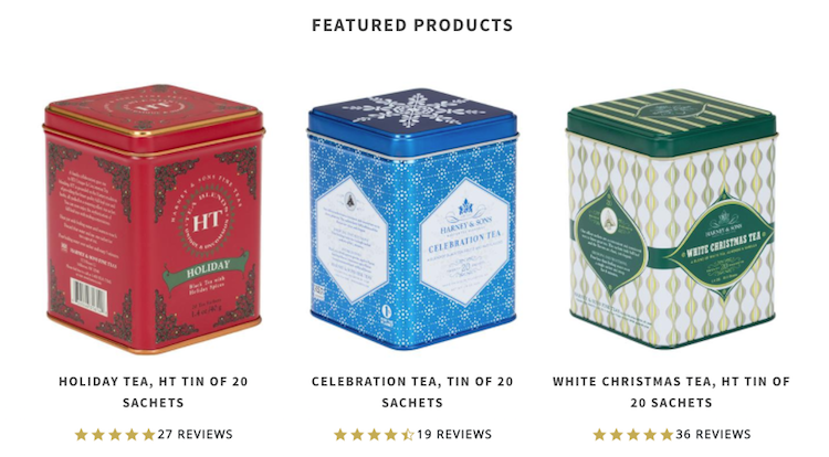
Their homepage features three special holiday offers: Holiday Tea, Celebration Tea, and White Christmas Tea. The tea makers also advertise their free shipping-for-all offer with a top page bar. They even go a step further and offer a free mug for orders over $75.
Source: Things Remembered
10. Things Remembered
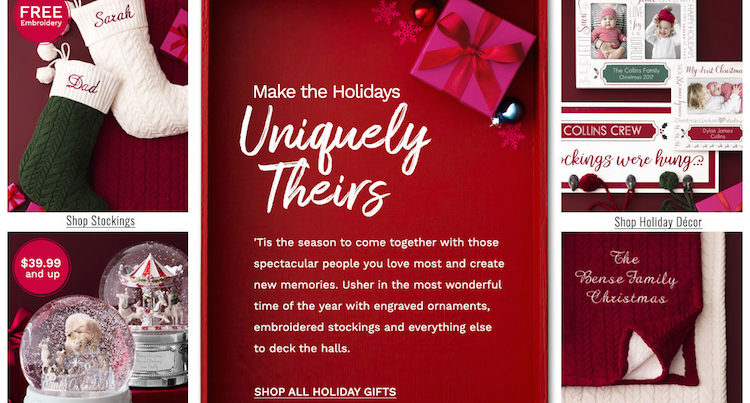
This is an eStore whose business model is founded on gifts, and now as the holidays are here, their homepage is aglow with Christmas themes and colors. The most popular categories take center stage along with a gift guide that navigates visitors to high-ticket items.
The store also emphasizes its free shipping at both the top and bottom of the page.
Conclusion
Don’t underestimate the boost in conversion that holiday cheer can bring to your store. Dress up your home page, and create an island of holiday delight for your visitors. Putting a Guide together or creating gift collections pays off.
Most platforms out there will have an easy, intuitive way to add a new page, and if yours doesn’t, you can get a freelance developer to put one together using a platform like Upwork.
So jump on the holiday train, and happy selling!


