For every online retailer, your eCommerce product page should be the most critical part of your website. Despite the fact that online shoppers can add products to their cart directly from autocomplete, search results, or even from the home page on many websites, most conversions still come from dedicated product pages.
But many online retailers today are starting to worry about other metrics, rather than basic conversion metrics. A low AOV (Average Order Value), for example, may be caused by design choices, hurting the overall performance of your eCommerce product page.
Keep in mind; the shopper has landed on your product intentionally. Regardless of how they got here, they’re telling you that this is a product they want to learn more about. They are going to have a few questions you should address immediately.
Here are the four most essential eCommerce product page elements you should focus on:
- Price
- Product Options
- Images & Media
- Ratings & Reviews
1) Price
Price is the primary determining factor in whether or not a conversion happens. If the product is priced too high, or even too low, there’s just no chance that the purchase will happen. Regardless of how well you address their other concerns.
On a site-wide scale, this isn’t something you can address in your page design, but you can certainly look at your data and find the product anomalies that have lower conversion rates. It’s very likely that the price is an issue. If your site sells very few products and you have low conversion rates, it’s something you need to re-examine
In addition to being set appropriately, the price should also be easy to see and understand at a glance. You should make it clear when an item is discounted, and what the original price is.
Studies have shown that including tax and shipping estimates is also very helpful. If you offer free shipping, make that evident by saying “free shipping” right next to the price. If tax and shipping are included in the price, say “tax and shipping included.” If you charge for these things and don’t say so, even if a visitor does choose to add the item to their cart, they may back out later. This example of cart abandonment is directly due to the failure of your eCommerce product page.
2) Product Options

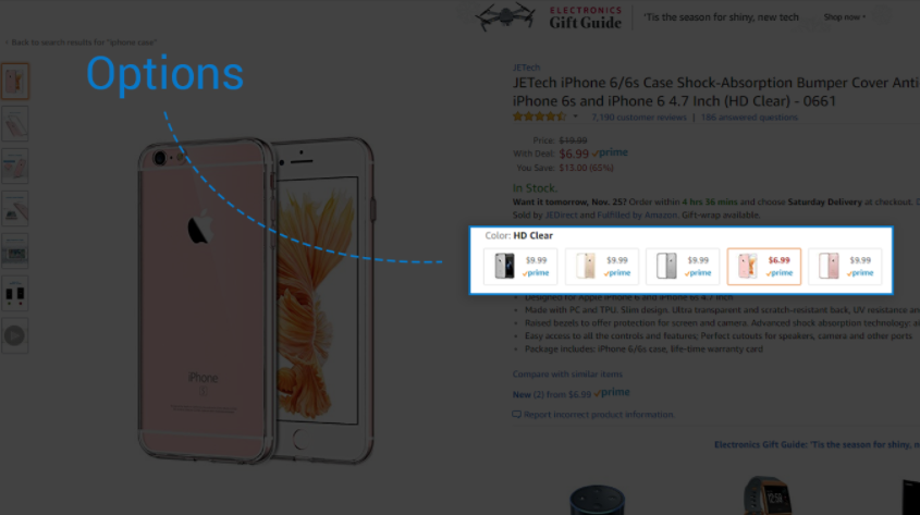
Many products come in different sizes and configurations and have optional add-ons. This can sometimes affect the price of the product, which is part of the reason why it’s so important.
Drop-down selectors or images displaying various prices for the size, color, and other configuration options are essential. When a user makes a selection, pricing and availability should immediately update.
Making a significant change here (switching from a 15” laptop to a 13”, for example) should also update the user reviews. The review switch is something even a mega-retailer like Amazon struggles to handle for some reason. However, for low volume products, it’s better to show a few reviews rather than just one, two or none at all.
For store struggling to get more reviews, tying user reviews to a specific make, model or color might be detrimental. Ironically, it could result in reviews not showing at all for many products. In this case, it’s best to show all reviews for all products, no matter what features are selected by the online shopper.
3) Images & Media

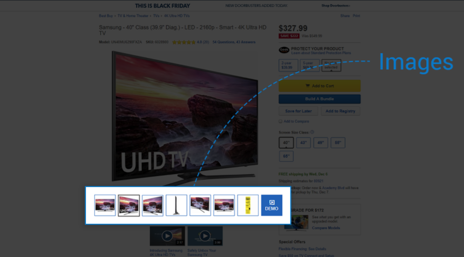
Many smaller retailers make mistakes with their product photos, but getting these images right is extremely important. For one thing, they help the shopper confirm that they’re on the right product page. At least three large images should be available for each product. More is always better!
And don’t be afraid to experiment with newer trends. 360-degree images, for example, are beneficial to users who are interested in understanding the shape, size, dimension, and proportion of a potential purchase.
One area that we expect to see more activity is video. While it’s somewhat rare at the moment, product videos are much more effective at selling than images alone. Even a silent video that shows a product from multiple angles is more effective at demonstrating it’s size, shape, and color when compared to a handful of images.
Integrating user-generated content from buyers is also incredibly powerful. Embedding user videos from Twitter, Instagram, or YouTube not only helps the shopper understand the product, but it also provides them with social proof and trustworthy opinions from other buyers. This article isn’t the place to discuss the power of influencers, but they can certainly do a lot to help your eCommerce product page come to life.
4) Ratings and Reviews

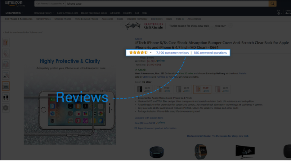
Ratings and reviews are a must. As mentioned above, having more is always better since it increases the social proof of the product itself. Generally speaking, shoppers trust reviews, especially if there are multiple reviews all praising the product. Seeing only one or two reviews might be viewed as being fake.
Using a trusted reviews network, like Yotpo, is a good option for stores of all sizes. For smaller stores, it can help the reviews appear more trustworthy, and can make it easier to acquire those reviews. For more substantial stores, it saves time from a management and marketing standpoint.
Shoppers should have the option of sorting and filtering reviews to find ones that are helpful to them. Some shoppers prefer to see high ratings, and others want to see a balance of opinions.
Only after you address these top four eCommerce product page elements should you start thinking about adding product recommendations, bundles, ads, or other forms of upselling to your product pages. While they can work, these things are really distractions from the main information your customers need.
Get your product page images right: try Pixc today for FREE
 Author Bio
Lane Fries is the digital marketing strategist at SearchSpring, an ecommerce site search provider. Specializing in ecommerce marketing techniques, Lane creates content to help etailers improve their site’s shopping experience.


