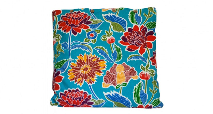
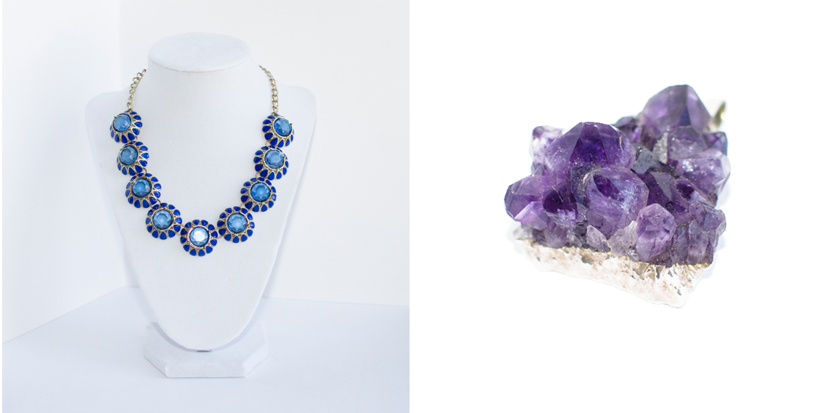
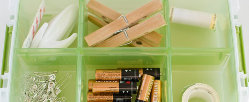
What’s the point of having awesome product images if they don’t look great on your eCommerce store?
For consistent product images, you need to create a template. Applying all your product images to this template will ensure they’re all the same size and that the product takes up the same amount of canvas space either vertically or horizontally.
Follow these five steps to create and apply an eCommerce product image template in Adobe Photoshop:
Step 1: Create a new file in Photoshop
Create a new file by going to File > New at the top of the Photoshop window.
A dialogue box will appear that will let you set up your canvas. Set the width and height dimensions. If you’re not sure what size you need, we’ve written a blog post to help you.
To summarise, the ideal size for a product image is anywhere between 1000px to 1600px on the longest side, and a square product image is always the safest because it will look great with products that are either vertically or horizontally longer.
Ignore resolution! This is only needed if you’re printing images, and not if you’re uploading them to an eCommerce store.
Set the color mode to ‘RGB Color, 8 bit’ and the background contents to white. Press ‘OK’ and your new canvas will appear!
Step 2: Create centre guidelines
These guidelines will create a ‘cross’ in the middle of your canvas to identify the centre point and create a four-square grid. This will help you centre your product later.
Go to View > New Guide at the top of your Photoshop window.

Create a vertical centre guide by selecting the ‘Vertical’ radio button and typing ‘50%’ into the field. A thin aqua line will appear on the canvas — these guides are only visible in Photoshop, so don’t worry, they won’t be visible on your eCommerce store.

Create a horizontal centre guide by selecting the ‘Horizontal’ radio button and typing ‘50%’ into the field. Another line will appear.
Step 3: Create outer guidelines
Unless you only sell the same product in multiple styles or colours, your product images are likely to all be a different shape. To make them look consistent, you want to align them so they meet the same guidelines either horizontally or vertically.
If your product image is a square, create guidelines by repeating Step 2, but this time use the values 10% and 90% and create both horizontal and vertical guidelines for these specifications. If you want more white space, use 15% and 85%. If you want less white space, use 5% and 95%. You should start by testing the image on your eCommerce store as it will look completely different when viewed on your site.
If your product is rectangular, you’ll need to do a bit of maths. Simply work out what 10% and 90% (or whichever percentages you choose to go with) of your width and height are in pixels. You then need to type these values into the field. Note that you must type ‘px’ after the number value as Photoshop does not default to this measurement.
When you’ve created four guidelines, you should have a nice, even border like in the screenshot below.

You should save a Photoshop version (PSD) of your product image template so you don’t have to remake it each time.
Step 4: Apply your product image to the template
Note: The following step involves keyboard shortcuts as written for a Mac. If you’re using Windows, substitute ‘Command’ with ‘Ctrl’.
Open your product image in Photoshop and hit Command + A on your keyboard. A dotted line (marching ants) will appear around the product image.

Hit Command + X on your keyboard and it’ll disappear. Don’t freak out — it’s only been placed in your clipboard.
Go back to the template file and hit Command + V and the product image will appear in the template. The product image should be larger than the template; if you’ve pasted it and it’s smaller than the guidelines, your template is too big. You need to either create a smaller template or take better-quality product images.

Hit Command + T on your keyboard and resize your product image by holding down shift and dragging the the corners inwards. As mentioned above, never enlarge your product images. They will become pixelated and blurry.
Resize until no part of the product is outside the outer guides, and the longest/widest points are just touching the guides. Unless your product is perfectly square, only two points on opposite sides of the product should meet the outer guidelines. Use the centre point to help you get the product in the middle.

Step 5: Save your product image for your eCommerce store
When your product image is retail-ready, go to File > Save As at the top of the Photoshop window.
Save the image as a JPEG — this is the most compatible format for websites. Do not overwrite the original image as you have decreased the resolution and it’s a good idea to have the high-res version on hand in case you ever make your template larger. You should also name the image according to the product, e.g., ‘Floral Pillow’. This will make it easier to find later on.

For a super-speedy site, you can create a web image. Go to File > Save for Web at the top of the Photoshop window. I’ve found that saving the image at quality levels above 60 will compress the image to below 1KB without much quality loss. If you’re uploading loads of images, I highly recommend you do this because eager online shoppers won’t bother with your store if it takes five years to load!

I hope this helped you create an image template!
If you have any questions, feel free to leave a comment below and we’ll get you an answer straight away. Also, check out our photo editing tips section of the blog if you’d like to see more Adobe Photoshop tutorials!

