First popularized by Jane Fonda in the 80’s and then brought back to life by Sporty Spice (Mel C) from the Spice Girls, gym fashion is back in a big way – It’s now called activewear!
The Australian label, PE Nation, is the go-to brand for fashion-activewear – sports clothing that follows seasonal trends so it doesn’t look out of place in the gym or on the streets.
Not only is PE Nation stocked in nearly 270 stores around the world, but it is also a favorite of celebrities like the entire Kardashian clan, including Kylie Jenner. And it has only been around for three-and-a-half years!
It is safe to say that the Australian street-meets-sportswear label is taking over the world. But is the brand’s website just as strong?
A distinct and recognizable brand
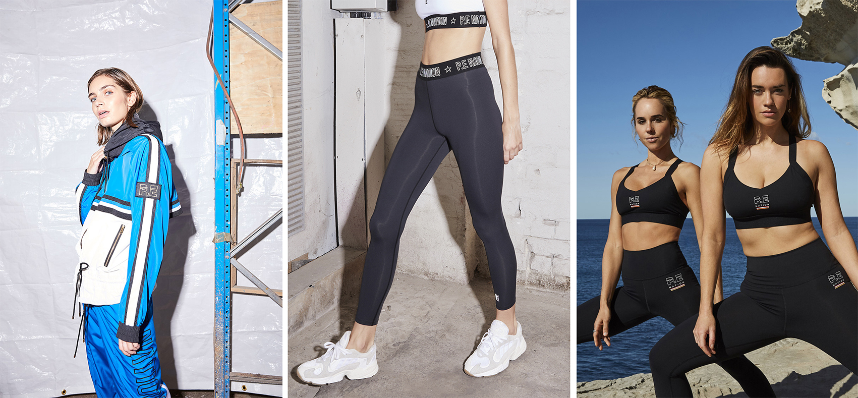
PE Nation makes gym gear that you can comfortably wear out on the streets. The clothes are versatile and have a clear and distinct brand aesthetic.
The brand is highly recognizable. Each item has the logo front-and-center as part of the design; whether that is the leggings that have PE Nation written across the elastic waistband or a bomber jacket with the ‘PE’ logo on the arm. Wearing PE Nation is a statement: you are part of the community.
And the name is really clever because ‘PE’ has a double meaning. It is the initials of one of the company’s co-founders, Pip Edwards, and PE is what us Aussies call ‘gym class’!
But branding goes beyond the clothes themselves – there is an ecosystem around it.
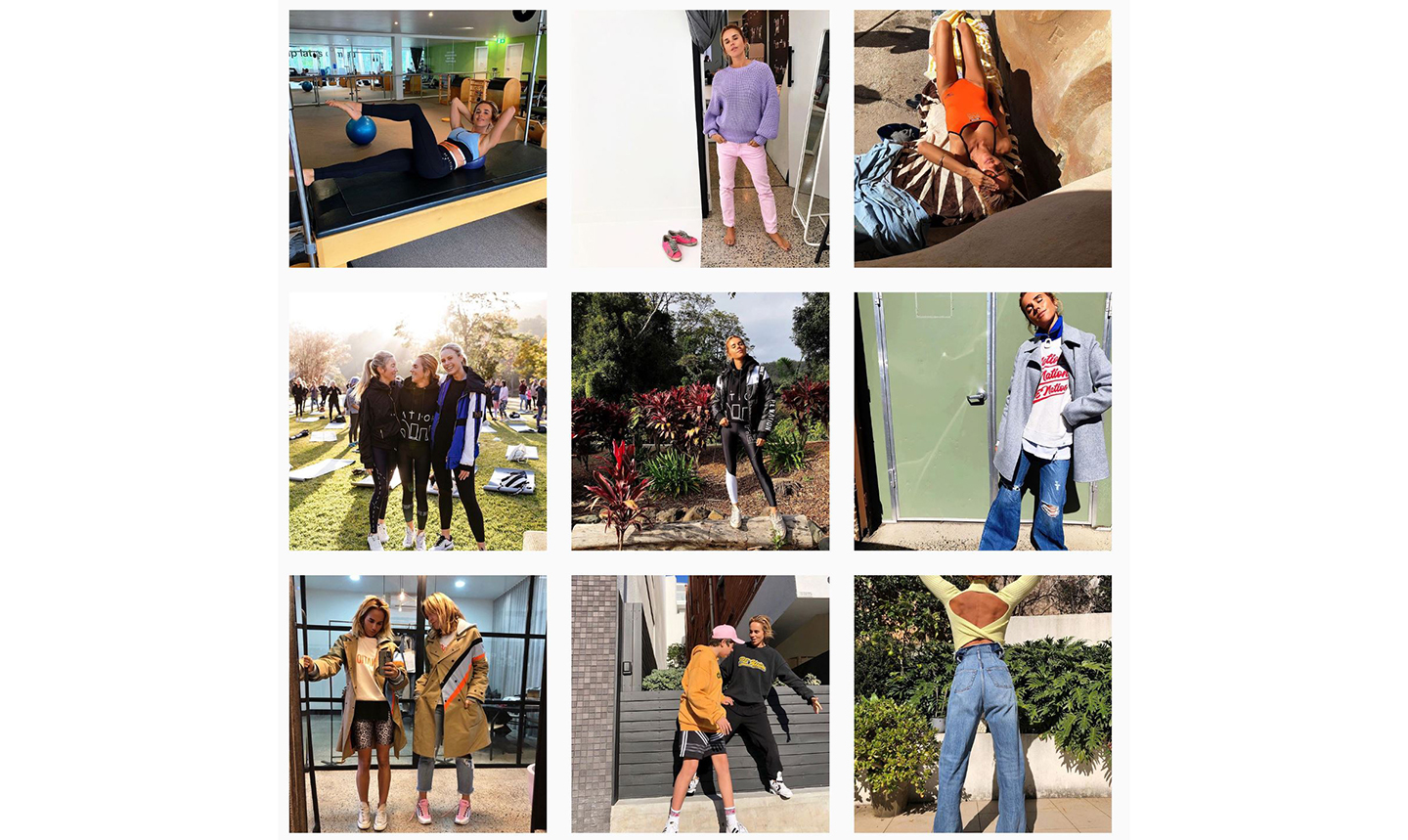
You only need to take a look at Pip Edwards’ Instagram (@pipedwards) to understand the brand vision. She lives, eats and breathes PE Nation on her Instagram; she is on the beach in the morning, does pilates, eats healthy food.
Pip Edwards posts at least three times a day. It feels real and authentic. You see her messy living room in the background, she doesn’t pose in her pictures: she posts pictures like a friend does. And there is something to be admired in that.
Although the branding is brilliantly thought-out, we think the shopping experience isn’t as logical or effective.
Messy website experience
The website, just like the PE Nation products, has a funky off-beat feel. But it comes at a cost: it is difficult to use.
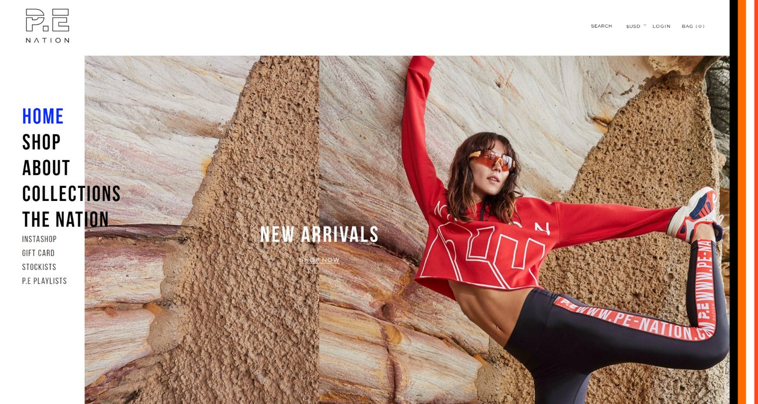
The homepage is a little messy.
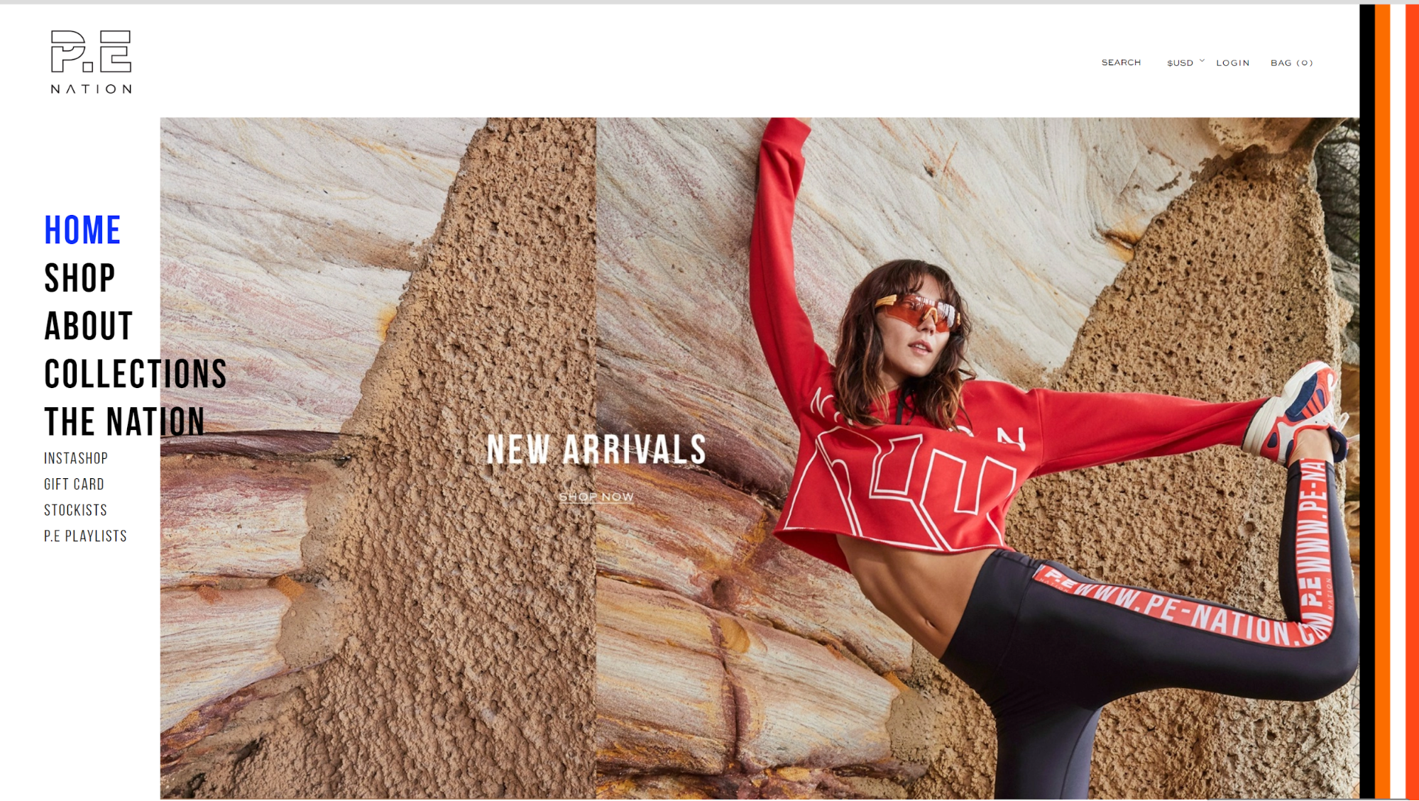
There is a large image with a photo of a model wearing the items while stretching. It makes the homepage dynamic and immediately tells you a lot about the brand: we are about healthy and active living.
But the text on the photo advertising ‘new arrivals’ gets lost: it is the same size as the writing on the leggings. In fact, the ‘shop now’ button is even smaller! It does not grab the shoppers’ attention – I am sure that they have lost sales because of it.
The navigation bar is on the left-hand side of the page. Rather than acting like the spine of a glossy magazine, it covers some of the photo and makes the page look disorganized.
If you want to be different and innovative, make the content different not the structure of the page. It is better to stick to the norm for a better user experience.
Inconsistent photography
PE Nation’s ecommerce store is full of beautifully staged photos. They have contextual movement and are engaging – and they correspond to PE Nations’ brand identity.
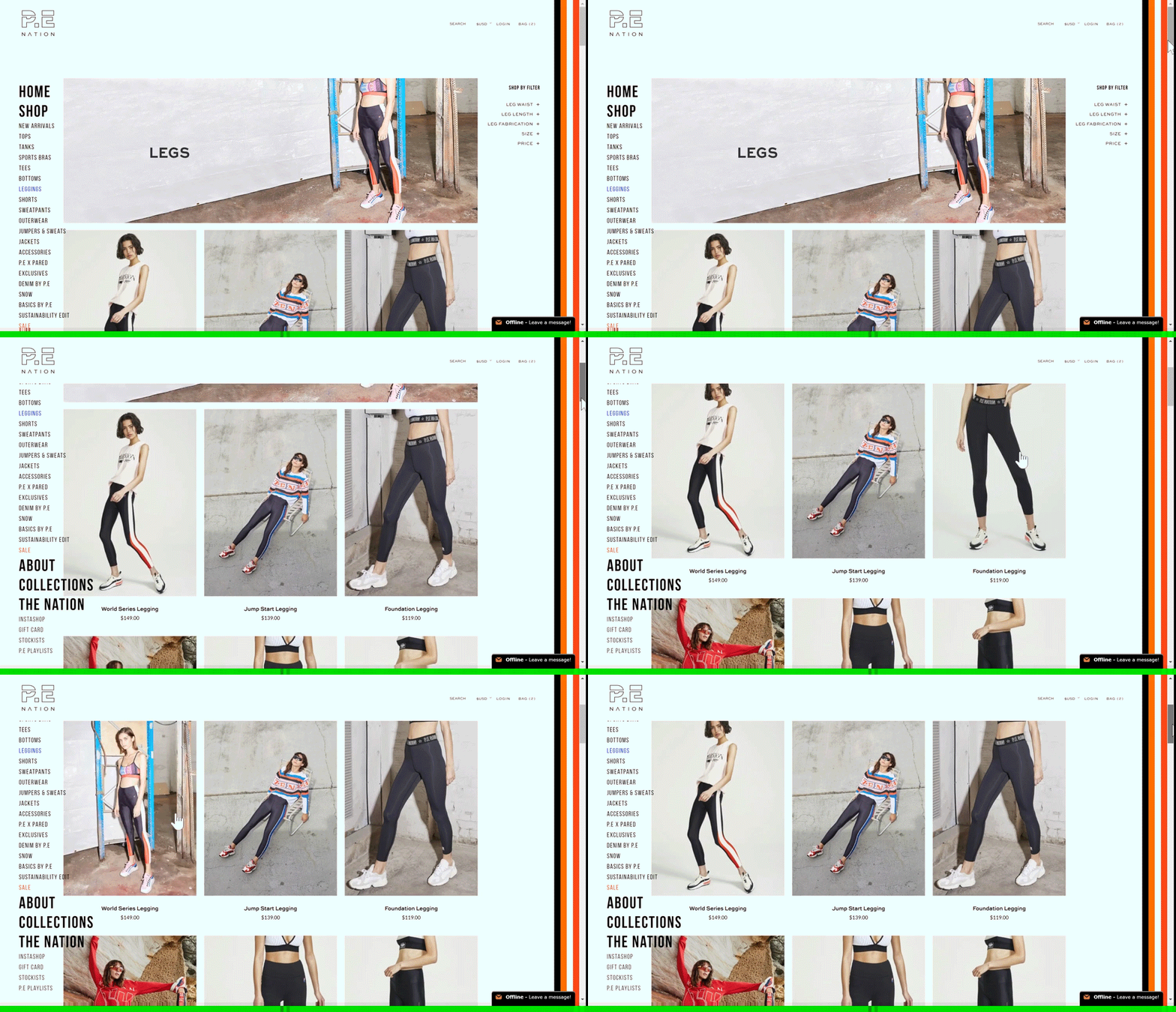
But there is no uniformity: some are up close, some are from a location photoshoot, some are in the studio, some are overexposed. While that does work to make the user watch every photo in detail, it makes it harder to browse quickly.
All of the products have a second image when you hover over them. This gives the shopper more detail about the product before they click through to the product page. But again, there is no uniformity – some are close-up, some are a location shoot, etc.
Another odd thing is that the models do not smile. It is a lifestyle brand – exercise gives you endorphins, so why do they all look so serious?
Finally, the location shoot photos are great because a shopper can visualize themselves wearing the product out and about.
An informed shopping experience
The shopping experience is mired by the website design: there are too many features that could cause shoppers to lose focus.
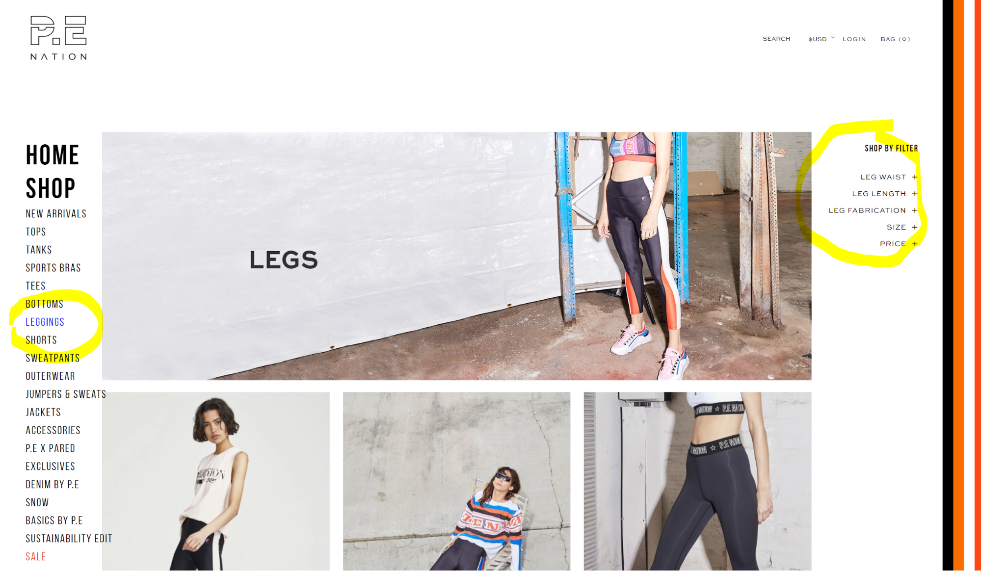
On the product landing page, the product filters on the right-hand side and not directly underneath the subheading on the navigation bar on the left-hand side. This is a little disorientating and it gets lost among the product photos – what most shoppers will be focusing on – especially because the text is so small!
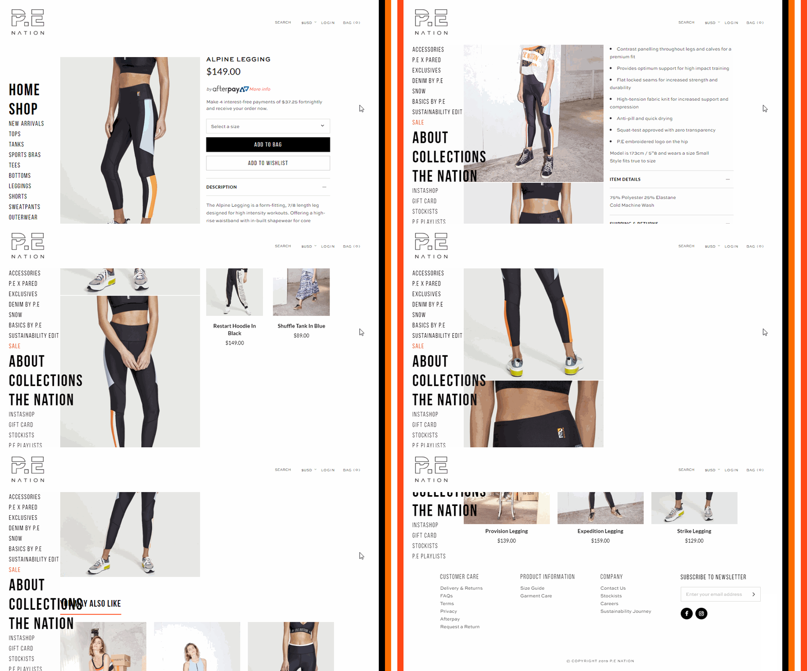
The product page, on the other hand, is great for online shoppers. It is full of important and necessary information, including a short product description, detailed size and fit information, model height information, material and washing instructions, and shipping and returns. It also lists the products that the models wear in the other images.
The photos are also very informative. There are images from every angle: the front of the product, side and back helping the customer to have a better understanding of the product.
You can enlarge the image to some extent, but the images are not sharp. Looking at the ‘en-garde legging’ for example, the PE Nation banner running along the legs is blurry which doesn’t let the customer see the quality of the product.
Clunky cart experience
Adding an item to the cart is slow. And they don’t let you know how much stock is left for a product.
I tried to add two small ‘en-garde leggings’ to my cart and a box popped up saying, “we don’t have as many “en-garde legging” as you requested” – but there was no warning in the size drop-down menu.
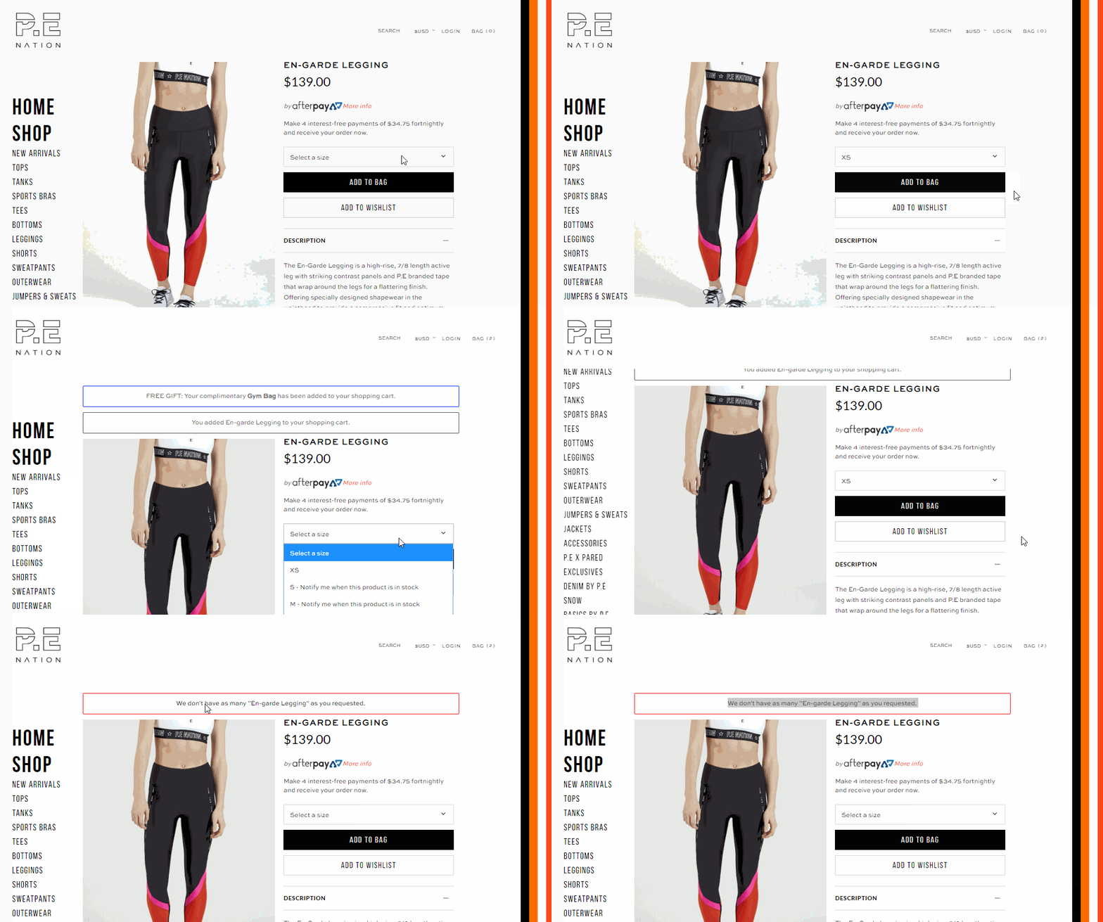
Keeping users informed, especially with stock levels, is really important and can also help you to improve your conversions because if you are about to run out of a product, a shopper may feel a sense of urgency to make the purchase rather than missing out.
An awesome brand with limitations
PE Nation is an amazing brand – it is modern but nostalgic, activewear yet fashionable. They just need to think a little more about the overall user experience of their online store.
The product images are engaging and represent the tone of the brand well, but the website is difficult to use – meaning, if a customer wants to buy a product, they might go to one of the 270 stockists which has a better web browser user experience.

