Getting your Shopify image sizes right shouldn’t be this frustrating. But if you’ve ever opened your store on your phone and found your hero banner cropped, your product photos stretched, or your collection page looking blurry, you know it can be. The good news: once you have the right numbers in front of you, it really is straightforward.
The tricky part is that Shopify uses images in a lot of different places, and each has its own ideal size. Your store’s hero banner requires a different dimension than your product photos. Using the wrong size might affect your loading speed or make your store layout look a little off.
That matters more than you might think. Google’s own research shows that when load time goes from one to three seconds, bounce rates jump by about 32%. And according to the HTTP Archive’s Web Almanac, images now make up over half of a typical webpage’s total weight. For image-heavy Shopify stores, they’re usually the first thing worth optimizing.
We put this guide together as a single reference you can bookmark and come back to whenever you need it. It covers the exact pixel dimensions for every image type, the file formats that actually make a difference, and the image optimization basics that keep your pages fast. If you’re looking for more on how images connect to sales, we’ve also written about how to boost sales with product images.
What are the best Shopify image sizes?
The best Shopify image sizes depend on the type of image and where it shows up in your store. Shopify recommends that product images should be 2048 x 2048 px in a 1:1 square ratio. Banners and hero images work best at 1920 x 1080 px (16:9). Collection images should be 1024 x 1024 px (1:1). All images need to stay under the platform maximum of 5000 x 5000 px and 20 MB file size.
Here’s the complete quick-reference.
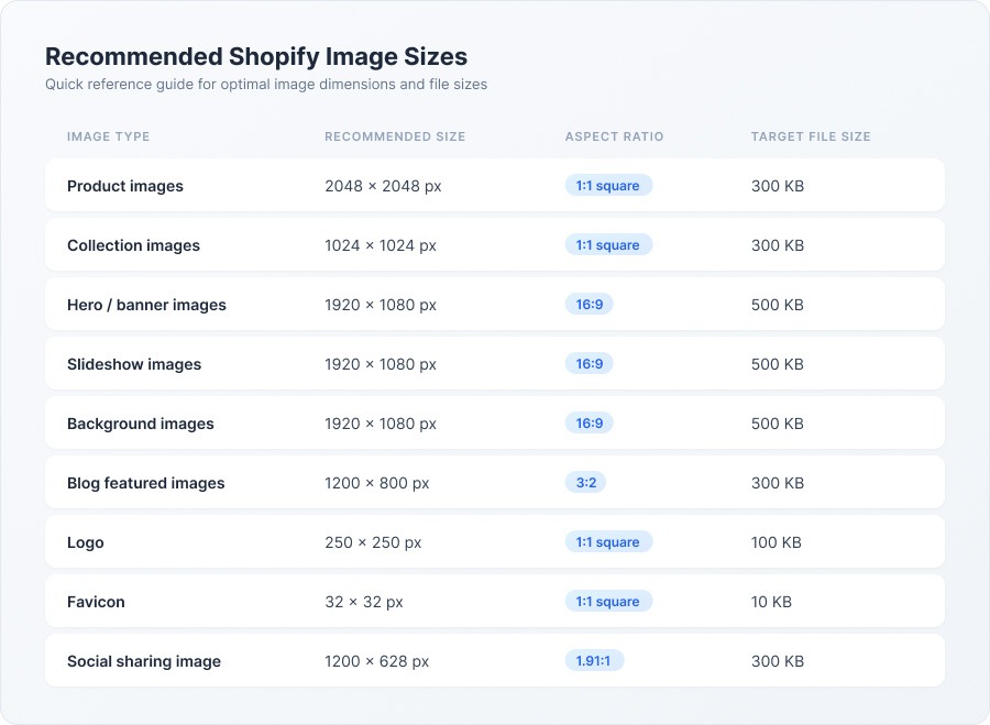
One thing to note: the “Target File Size” column is what you should aim for after compression. This is not Shopify’s hard limit. Technically, Shopify lets you upload files up to 20 MB (file size) and 5000 x 5000 px (dimension). But you really don’t want to go closer to those limits. Any large photos will slow down your pages, and anything bigger than 5000 x 5000 is automatically downsized by Shopify.
These dimensions work well across most Shopify 2.0 themes, including Dawn theme, Sense, and Refresh. That said, some premium themes have their own specific recommendations, so it’s worth checking your theme’s documentation before you go on a resizing spree.
What size should Shopify product images be for zoom?
When a shopper clicks to zoom in on one of your products, that’s a buying signal. They’re interested enough to look closer. The last thing you want at that moment is a blurry, pixelated mess where the detail should be.
Shopify product images need to be at least 800 x 800 px for the built-in zoom feature to kick in. But the sweet spot is 2048 x 2048 px. That size gives you a crisp, detailed zoom on product pages, holds up well on retina displays, and won’t balloon your file size if you compress your product photos properly.
This matters because your product photos essentially serve as the in-store experience. Research from Power Reviews found that 60% of consumers always look for visual content before deciding to buy. If someone’s trying to check the stitching on a bag or read the label on a bottle and the zoom turns to mush, you’ve probably lost them.
Shopify’s own Help Center backs this up: 2048 x 2048 px is what they recommend for square product images. You can technically go up to 5000 x 5000 px, but in my experience, the extra file weight isn’t worth it. Most products simply don’t need that level of detail, and the larger files will slow things down.
Why 1:1 square is usually your best bet
Square images stack cleanly in mobile grids. They look consistent across collection pages, and they avoid the messy layouts that happen when you’ve got a mix of portrait and landscape product photos. If your products genuinely look better in a portrait orientation (dresses, tall bottles, that kind of thing), a 4:3 or 3:2 aspect ratio works fine. The key is to pick one ratio and stick with it for every product.
Consistency really is the whole game here. Mixed aspect ratios on a collection page make your store look unfinished, even if each individual photo is great. If you’ve got hundreds of products and need to get them all into the same shape, our Photo Resize app can handle the whole catalog at once. We’ve also written a more detailed breakdown of how image resizing for Shopify works under the hood.
What about Banner, Hero, and Slideshow images?
Your hero banner sets the first impression for your entire store, so it’s worth getting right. The challenge is that the same image has to work on a 27-inch desktop monitor and a 6-inch phone screen, and those are very different canvases.
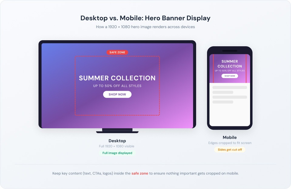
Banner and hero images should be 1920 x 1080 px with a 16:9 aspect ratio for desktop. Slideshow images work best at 1200-2000 px wide and 400-600 px tall. And here’s the one rule that applies to all of them: keep your essential content (text, key product, call-to-action) centered. Mobile devices crop the edges, and there’s no warning before they do it.
Here’s how I’d approach each placement:
- Homepage hero banner (desktop): 1920 x 1080 px is the standard. It fills most screens cleanly without being overwhelmingly tall. If you’d rather have a slimmer banner so shoppers can see products below the fold without scrolling, 1920 x 600 px works well too.
- Homepage hero banner (mobile): If your theme lets you upload a separate mobile image (many do), use an 800 x 800 px or 800 x 1200 px image designed for portrait orientation. If it uses the same image for both, make sure your subject is dead center.
- Slideshow images: Keep all slides at exactly the same dimensions, somewhere between 1200 and 2000 px wide and 400 to 600 px tall. Mismatched sizes cause visible layout shifts when slides transition, and it looks janky.
- Dawn theme specifics: If you’re on Shopify’s Dawn theme (the most popular free option), the image banner section looks best at 1600 x 1050 px for desktop. Dawn auto-crops on mobile more aggressively than some other themes, so the center-your-content rule matters even more here.
Collection, Blog, and Logo image sizes
Not everything in your store is a product photo or a hero banner. Collections, blog posts, and your logo each have their own sizing considerations, and they’re easy to overlook.
- Collection images (1024 x 1024 px, 1:1 square). These show up on your category pages, usually in a collection grid layout. Because they sit side by side, consistency is everything. If one collection image is landscape and the next is portrait, the grid immediately looks off. The recommended Shopify collection image size is 1024 x 1024 px, which gives you plenty of detail without unnecessary weight. Just make sure they all match.
- Blog featured images (1200 x 800 px, 3:2 ratio). Your blog featured image appears at the top of each post and in your blog listing page. A 1200 x 800 px image is a good Shopify blog featured image size for most themes. It’s large enough to look sharp without dominating the page. Some themes handle images up to 1800 x 1000 px, but I’d check how yours renders them before going bigger. You still want the reader’s eye to land on your content, not just a massive photo.
- Logo (250 x 250 px or smaller). Your logo loads on every single page, so keep it lightweight. Shopify recommends a max of 250 x 250 px. Many stores do well with even smaller logos, around 100 to 200 px. Use a transparent PNG so it works across different header backgrounds, and try to keep the file size under 100 KB.
- Background images (1920 x 1080 px, 16:9). These fill the wider layout sections of your store. 1920 x 1080 px works for most setups, though some merchants go up to 2560 x 1400 px for ultra-wide screens. Keep file sizes under 500 KB, and remember: a background image should support your content, not compete with it.
What image format is best for Shopify?
File sizes and dimensions are not the only things you need to think about when it comes to Shopify image sizes. The file types you use matter, too. As much as I want to say just use one file type, there are some use cases you might need a different one.
One thing you should know is that Shopify automatically serves WebP to browsers that support it, so you don’t need to worry about converting. And GIFs? Don’t use them for product images. Just don’t. Here’s the practical breakdown you can follow:
- JPEG (JPG): This should be your default for product photos, lifestyle images, and banners. JPEG uses lossy image compression, which basically means it trims data you won’t notice to shrink the file size. The sweet spot is saving at 80 to 85% quality. At that level, the difference from 100% is virtually invisible, but the file size drops significantly.
- PNG: Use it for logos, icons, badges, and anything that needs a transparent background. PNG uses lossless compression, so nothing gets removed, but the file sizes are noticeably bigger. A product photo saved as PNG can easily be three to five times larger than the same shot as a JPEG, with no quality difference your customers would ever spot.
- WebP: This newer format gives you smaller file sizes than both JPEG and PNG at comparable quality, often reducing file size by up to 30%. The nice thing is you don’t need to do anything special. Shopify CDN automatically detects browser support and serves WebP when it can. Just upload as JPEG or PNG and Shopify handles the conversion.
- AVIF: Even newer, even better image compression than WebP. Browser support is still growing, and Shopify’s starting to support it. Worth knowing about, but not something you need to act on right now. Stick with JPEG and let Shopify’s automatic conversion do the rest.
- GIF: Fine for a small animation here and there. Terrible for product images. GIFs are limited to 256 colors and produce massive file sizes. Your product photos will look washed out and your pages will crawl.
For more on this, we’ve written a full guide to Shopify image optimization that goes deeper on format selection and compression workflows.
How do you make Shopify images load faster?
Here’s something I think a lot of merchants underestimate: images typically make up 50 to 75% of a Shopify page’s total weight, according to Firstpier’s analysis of hundreds of stores. That means your images aren’t just a visual issue. They’re a speed issue. And sites that load in under two seconds see about 2.5 times higher conversion rates than slower ones.
The good news is you don’t need to become a performance engineer to fix this. Here are the moves that make the biggest difference:
- Focus on file size, not just pixel dimensions. You can have a perfectly sized 2048 x 2048 px image that’s either 50 KB or 5 MB, depending on image compression. For product images, aim for 100 to 300 KB. For hero banners, try to stay under 500 KB. That’s the range where your pages stay fast even on slower mobile connections.
- Compress before you upload. Shopify applies some automatic image compression, but it’s fairly gentle. A dedicated compression tool can usually squeeze out another 30 to 50% in file size savings. TinyPNG works great for one-off jobs. If you need to do your whole catalog, a Shopify app will save you a lot of time.
- Turn on lazy loading. Lazy loading tells the browser to load images only as the shopper scrolls to them, rather than downloading everything at once. It makes a real difference in how fast your page feels on first load. Most Shopify 2.0 themes support it natively, but double-check your theme settings to make sure it’s actually enabled.
- Let Shopify CDN work for you. Shopify hosts all your images on a global content delivery network (CDN) that serves cached copies from servers near your shoppers. It also handles format conversion (serving WebP where supported) and generates multiple sizes for different devices automatically. You don’t need to upload separate mobile and desktop images for your products; just upload the recommended size and Shopify sorts out the rest.
- Keep an eye on Core Web Vitals. Google uses three performance metrics as ranking factors: Largest Contentful Paint (LCP), Interaction to Next Paint (INP), and Cumulative Layout Shift (CLS). Oversized images are the most common culprit behind poor LCP scores. Running your store through Google PageSpeed Insights takes about 30 seconds and will tell you exactly which images need attention.
If you want a step-by-step walkthrough, our guide on how to optimize images for the web covers the full process.
5 common Shopify image mistakes (and how to fix them)
We’ve seen these come up over and over across thousands of Shopify stores. Even experienced merchants trip on a few of them. Here are five common mistakes merchants make and what you can do about them.
Mixing aspect ratios on collection pages.
This is far and away the most common one. You’ve got one product shot in landscape, another in portrait, a third in square, and your collection grid looks like a jigsaw puzzle. The fix is simple: pick one aspect ratio (1:1 square is the safest bet) and apply it across every product image. If you’ve got hundreds of SKUs, a bulk resizing tool makes this manageable instead of miserable.
Uploading raw camera files.
Modern DSLRs and even newer smartphones can produce files at 4000 x 6000 px and 8 MB or more. Uploading those straight to Shopify means the platform has to compress them on the fly, and the results can be unpredictable. The better approach: resize to 2048 x 2048 px and compress to under 300 KB before you upload.
Forgetting about mobile cropping.
Over 70% of ecommerce traffic now comes from mobile. A banner that’s gorgeous on desktop can cut off your headline or chop your product in half on a phone. The fix: keep all key content centered in your banners. If your theme supports separate responsive images for mobile, take advantage of that.
Skipping alt text.
I know, alt text feels like an afterthought. But it’s doing double duty: it makes your store accessible to screen readers, and it helps search engines understand what’s in your images. About 28% of Google searches include image results, so missing alt text means missing traffic. Write a short, descriptive alt text for every image. “Red leather crossbody bag with adjustable strap” beats “IMG_4532” in every way.
Using the same image size for every placement.
A 2048 x 2048 px square product photo doesn’t work as a hero banner. A 1920 x 1080 px banner doesn’t work as a collection thumbnail. Each spot in your store has its own Shopify image dimensions requirements. The fix: use the reference table at the top of this guide and size each image for where it’s actually going.
We’ve got more on this topic in our guide to great ecommerce product images, which covers the photography side of things too.
Get your Shopify images right (without the hassle)
If you take one thing from this guide, let it be this: consistent, properly sized images are one of the highest-return improvements you can make to your store. They make your collection pages look polished, your product pages load faster, and your whole brand feels more trustworthy. That kind of visual consistency builds the confidence shoppers need to hit “Add to Cart.”
The quick recap: 2048 x 2048 px for Shopify product image dimensions, 1:1 square aspect ratio, file sizes under 300 KB, and pixel dimensions matched to each placement.
If you’re running a store with more than a handful of products, doing all of this by hand gets old fast. That’s exactly why we built Photo Resize by Pixc. It takes your product images, makes them all a consistent square, compresses them for speed, and swaps them into your store automatically. You can try it free with 50 image resizes and see the difference on your collection pages right away.
Frequently Asked Questions
What is the maximum image size Shopify allows?
Shopify accepts images up to 5000 x 5000 pixels (25 megapixels) with a max file size of 20 MB. Anything larger gets automatically resized, and aspect ratios are preserved. That said, just because the platform allows it doesn’t mean you should use it. The recommended Shopify image sizes in this guide will give you much better performance than uploading at maximum dimensions.
Does Shopify automatically resize images?
Sort of. Shopify CDN creates multiple versions of every image you upload, serving smaller sizes to mobile devices and larger ones to desktops. It also compresses images and converts them to WebP when the browser supports it. But this automatic processing is fairly conservative. If you upload a 5 MB raw photo, Shopify still has to deal with that large file. You’ll get noticeably better results by resizing and compressing before you upload.
What aspect ratio should I use for Shopify product images?
For most stores, 1:1 square is the way to go. Square images display consistently across collection grids, product pages, and mobile screens, and they avoid the cropping headaches that come with mixing aspect ratios. If your products genuinely look better in a portrait format (clothing, tall bottles), a 4:3 or 3:2 ratio works, but pick one and use it for everything.
Can I use different image sizes for different products?
Technically yes, but I’d strongly recommend against it. When your Shopify product image dimensions vary from one product to the next, your collection pages look uneven. Shoppers pick up on that kind of inconsistency, even if they can’t articulate why. Choose one standard Shopify product image size and aspect ratio and apply it everywhere.
How many images should I upload per Shopify product?
Four to six per product is a good target. Include a hero shot on a clean background, two or three angles, a close-up of key details or textures, and a lifestyle image showing the product in use. Shopify lets you upload up to 250 per product, but more isn’t always better. Every image should earn its spot by helping the shopper understand what they’re buying.