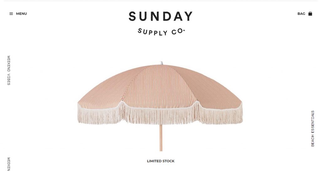
Sometimes you stumble across a product page on an ecommerce store that is so visually beautiful that it immediately makes you say: “I want one. Now.”
Sunday Supply Co.’s Black Sands Beach Umbrella is one of those pages.
The brand sells “An exclusive selection of boutique beach essentials designed for an endless summer” – and their mission is ingrained in the product page.
Don’t you want to be under the sun too?
It is sophisticated, aesthetically clean, and visually captivating.
From the effective use of white space, the style and layout of product images, the simple but effective content and text font; everything about the page has been designed with a purpose.
And the message is simple: you can’t not buy this product.
They want you to think that Sunday Supply’s umbrellas are the one thing that is missing in your garden, or the talking piece of the summer that will make you stand out at the beach.
How do they achieve this?
Start by keeping it simple
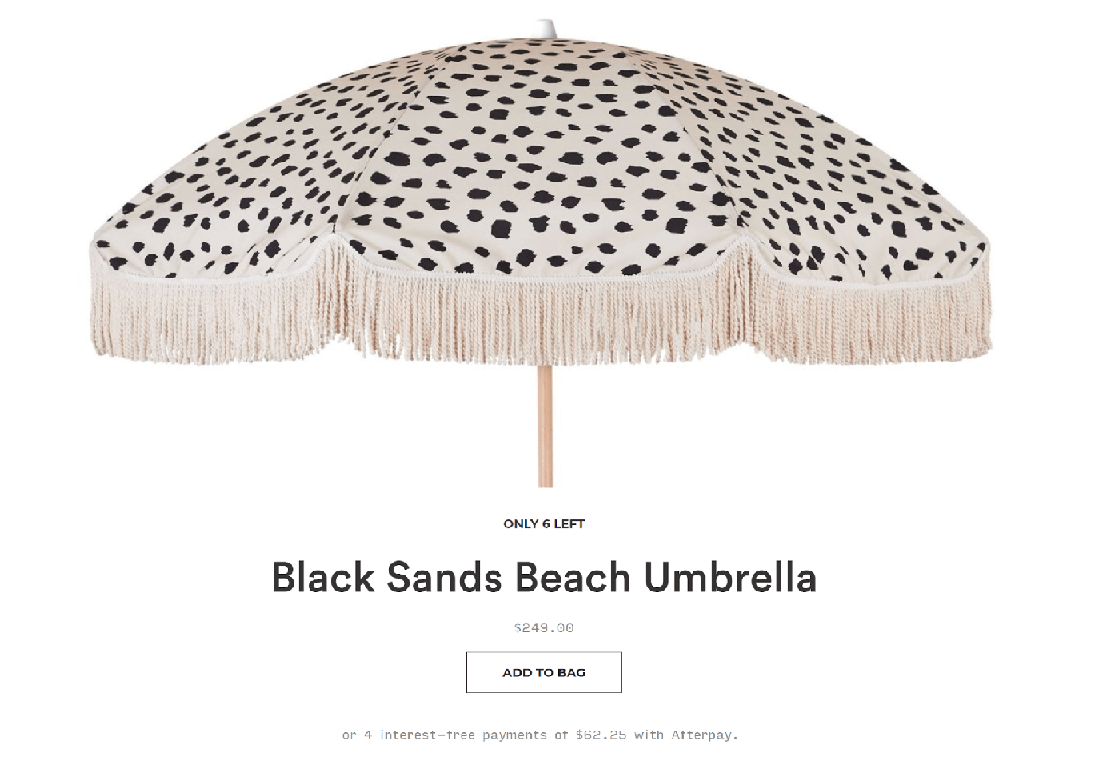
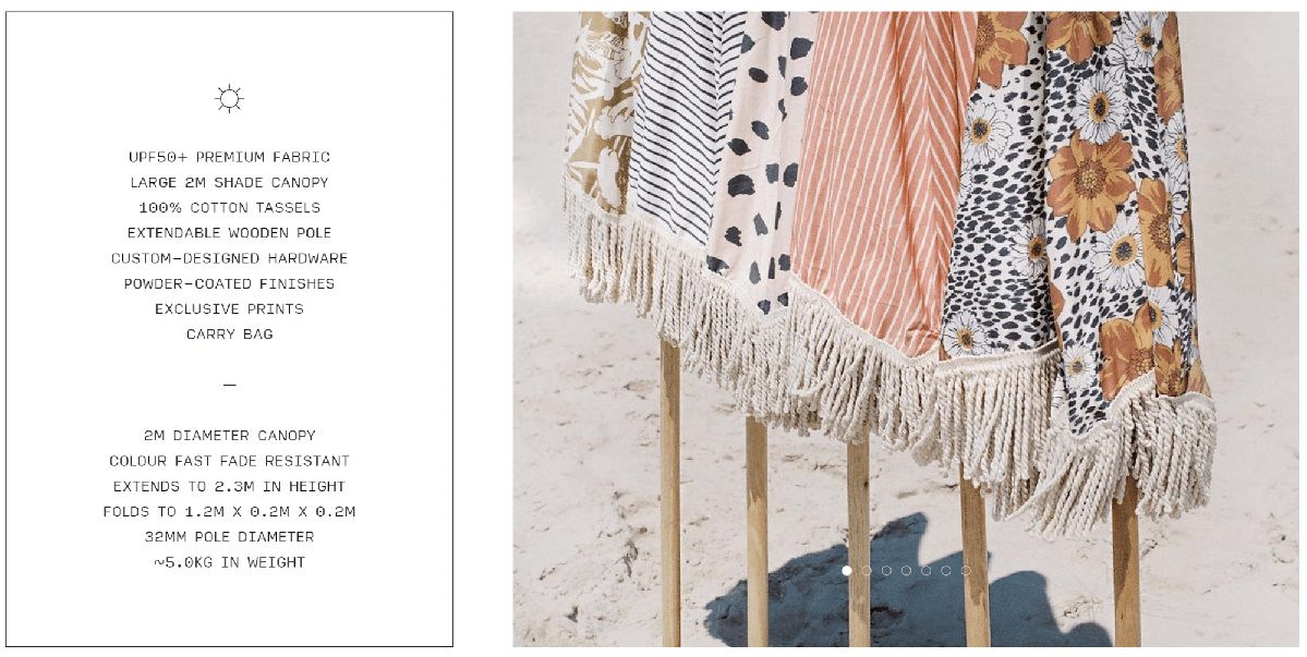
Sunday Supply Co Product Page
The first thing that you see on the page, under the canopy of the umbrella, is very basic product information: the product name, the price, the call to action (“add to bag”) and the quantity left in stock.
These four key pieces of information catch your eye while also being visually appealing: none of them have the same font or size – the price isn’t even in the same even color.
The name of the product is in an overly eye-catching size, whereas the price is greyed out and much smaller.
The reason that it works is that it takes up the whole page – it respects the use of whitespace and is not besieged by clutter or needless information in the offset.
It is very simple and very effective.
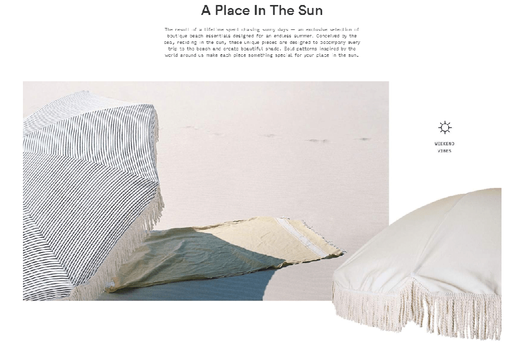
Let the details speak for itself
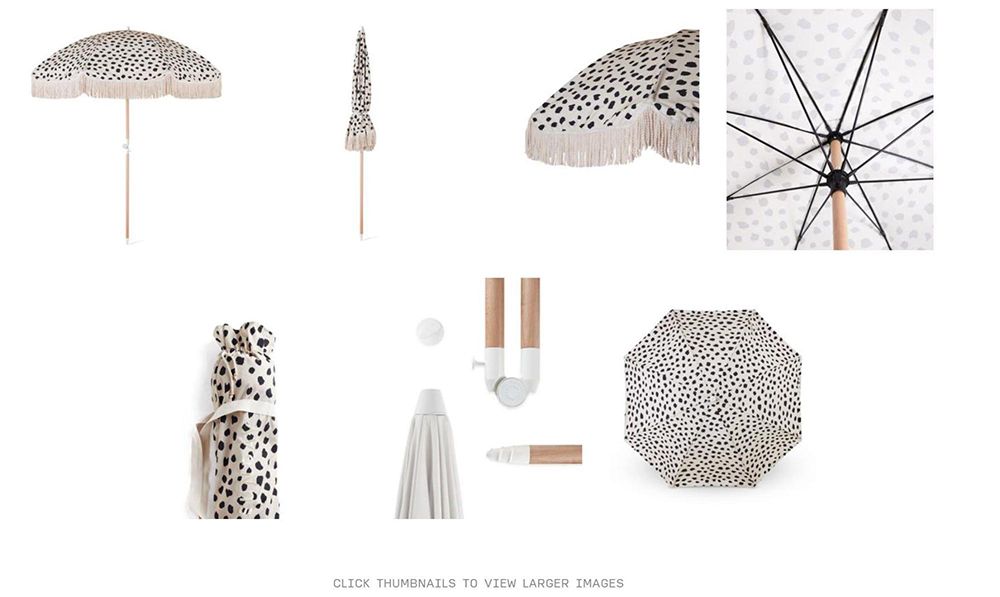
The product pictures are very self-explanatory
The page is very image heavy, which is great for online-only shoppers!
There are two sets of product photos:
- “The what” or information image, with a stylish and dynamic tone that gives the customer more detail on the product;
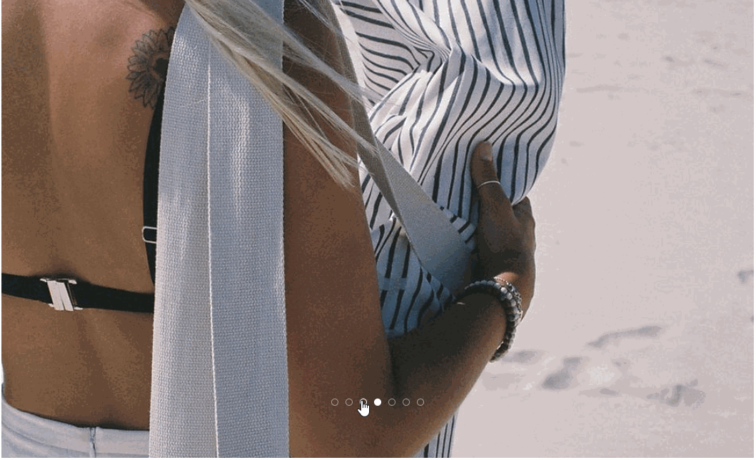
- “The why” or aspirational/contextual image with a dreamy hue in which the model’s face is obscured, so you can imagine you’re putting the umbrella up on the warm sandy beach.
Even though many ecommerce stores would naturally put these two picture sets together – keep similar content together – Sunday Supply Co. has divided the images by tone and purpose, allowing the page to tell the customer a story.
Both sets of product images are a great – and necessary – addition to the page.
When you click on “the what” images it zooms to fit the whole screen, but they manage to keep the high-quality detail so that customers can almost feel the fabric of the product.
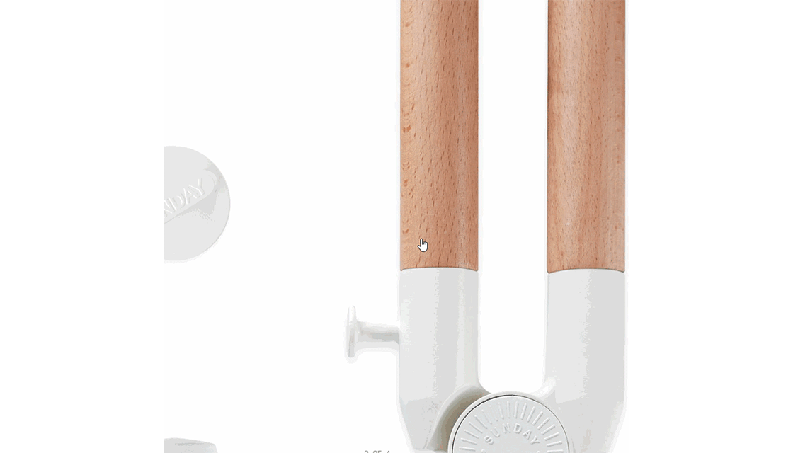
However, it would be good to have some close-up images of the product details, like the tassels, for example.
You can super zoom on the images a little more, but the shopper needs to know how to do this with keyboard or mouse commands because there is no option to zoom further on the page.
Doing this, the image does lose some quality.
Those pesky dots were hard to find
“The why” pictures further down the page are beautiful and aspirational, but a little difficult to navigate.
The tracker bubbles on the bottom of the image get lost in the background.
It would be good to make this slide of images more pronounced, with arrow icons to the left and right, for example.
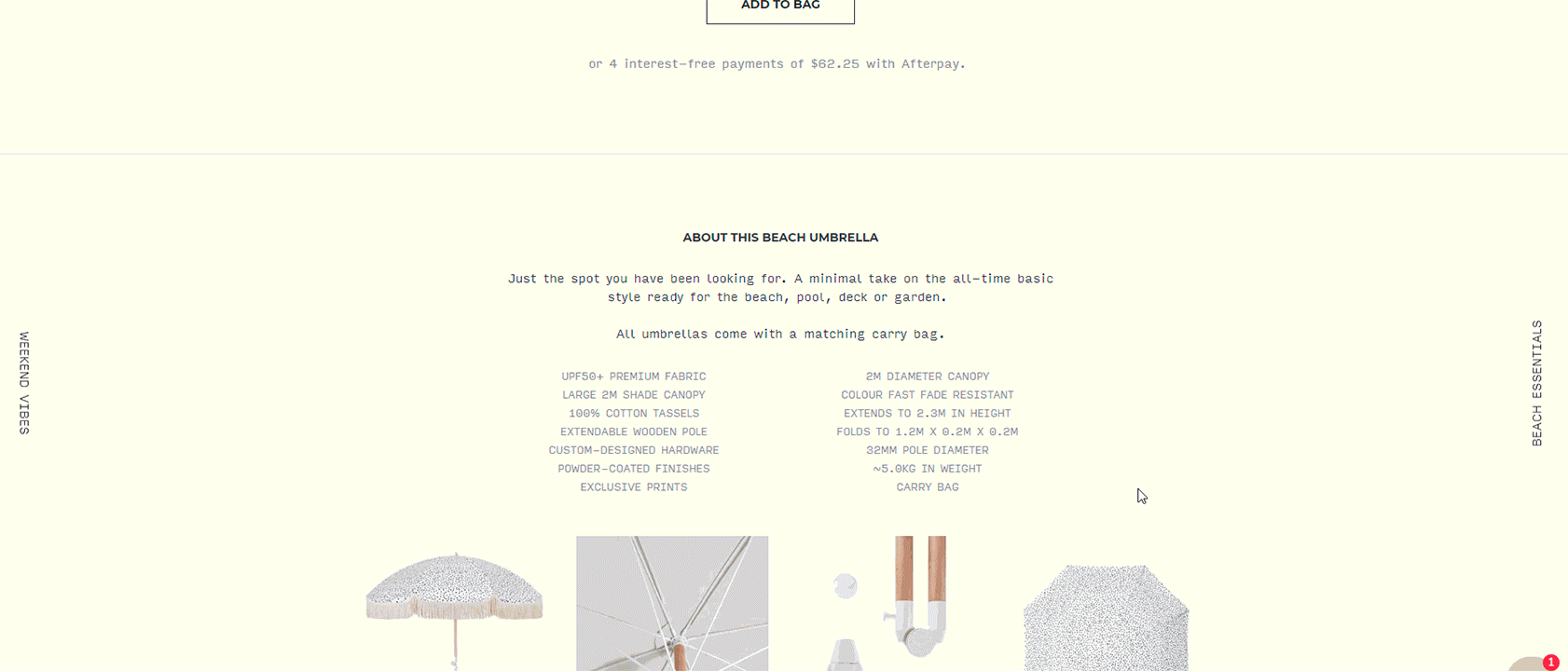
The detail is not in the text
The text is creative and wistful; it is carefully and deliberately selling an idea, a lifestyle – one that you can attain by buying the beach umbrella.
Some examples include:
- “designed to age gracefully and naturally” – The inference? It will age just like you;
- “an essential part of your sun-drenched days and endless summers” – This fuels a ‘fear of missing out’ (FOMO);
- “just enough scale to create a unique texture and talk to your inner animal” – This text changes to suit each individual umbrella. It speaks to why you would choose this specific pattern: it comments on your individual style and personality.
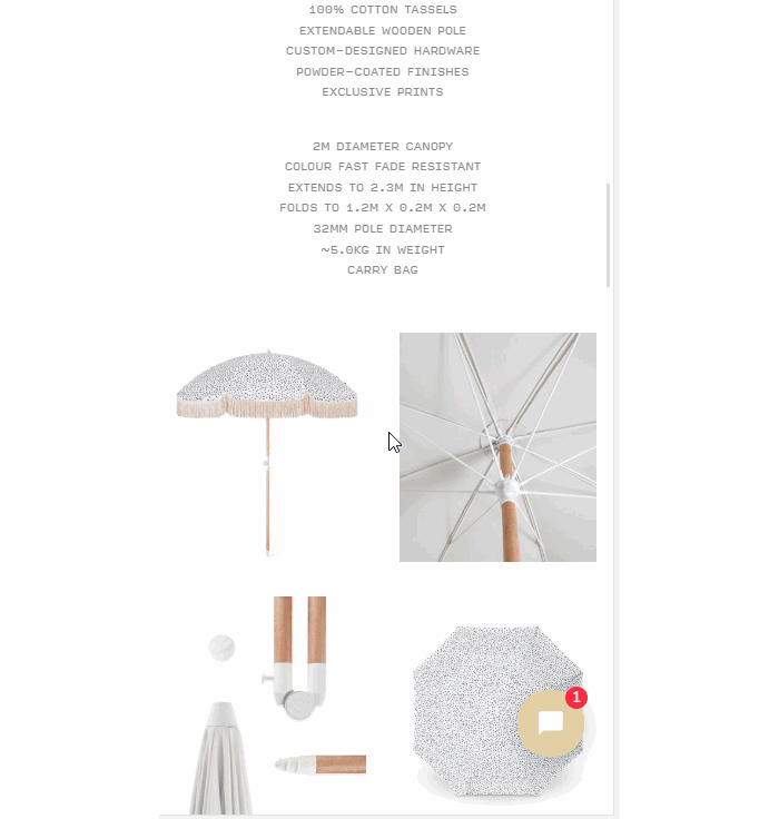
But there are also some details about the product further down the page in a condensed bullet point summary of the umbrella’s specifications.
This includes height, weight, length, material, finish, and UPF protection.
It is so good that they included it twice:
Version One
Version Two
Although the second iteration is more visible and eye-catching, if the information was visible enough the first time, why include it twice?
A piece of advice: delete the first instance; it is unnecessary repetition.
What is their mobile shopping experience like?
Sadly, on mobile, the product page does lose some of that magic appeal.
For one simple reason: the dimensions of a mobile screen don’t allow for a lot of whitespace.
Instead, the content is stacked. But that is not always a bad thing.
This is how Sunday Supply Co Mobile looks like
The web page design is almost perfectly designed to create a magic appeal specifically for mobile.
It is compact, but the images can still zoom in just like on the webpage and keep the same level of quality.
The text is short, so doesn’t take up more than one whole screen at the most. And when it does take up the screen, you want to continue scrolling through the webpage because you want to get to the next set of photos.
This store is a good example of why you should really think through your mobile shopping experience from a customer’s point of view.
Last thoughts
Even though the web page is visually appealing and leans into an assumed customer’s desire to live the life shown in the product photos, there are some things to consider:
- Because it is quite an image heavy website, it is quite long.
They could include more “buy now” buttons throughout the page to drive customers to the cart! There is no point having a strong image-led purchase funnel if you neglect to add the final ‘call to action.’
- Care and maintenance options aren’t properly displayed
Care and cleaning is an important thing to consider when buying something so big that will hopefully be part of your essential summer kit for years to come, so why is it hidden in the footer of the webpage?
If it is important to keep the aesthetic look and flow off the page clean and simple, consider including a small “Curious about cleaning? Click here” link somewhere on the page.
- They lack product videos
Now that every ecommerce store is doing product videos, it would be good to see a video showing customers how to open the umbrella somewhere on the page – if nothing else, to show how easy it is.
- You need to sign up for their mailing list to know when designs go live
On the homepage, a lot of the umbrella designs are “coming soon.”
If you want to know when they are available, you need to sign up to their mailing list.
Some people (including myself) just want the information, without their email inbox being flooded with spam.
Instead, give the customer an indication of when the product will be available: July 2019, August 2019? Next week, next month?
These are minor details that show you value the customer’s time and loyalty to your brand.