“I dreamed all my life of the perfect store for women. Then I saw Neiman Marcus, and my dream came true.” — Edna Woolman Chase, former editor of Vogue (1914-1951)
When you enter a Neiman Marcus store, you know exactly what they are all about: elegant glamour. Based in the USA, they sell apparel, shoes, accessories, cosmetics, and decorative homeware to wealthy, well-traveled and sophisticated customers. They fill their stores with fresh flowers, beautiful artwork and high-end merchandise, to create a luxurious in-store shopping experience.
But, how do they establish this luxury experience online?
It comes down to creating a smooth user experience through their simple product page design. The customer is not overloaded with flashy or confusing content – rather, information and detail are embedded in a clean and easy-to-navigate interface. The luxury comes from the sites’ simplicity, letting the products speak for themselves.
As co-founder Herbert Marcus says, “It’s never a good sale for Neiman Marcus unless it’s a good buy for the customer.”
Considering their online platform accounts for over a third of their sales, the tactic must be working. But, there is still room for improvement.
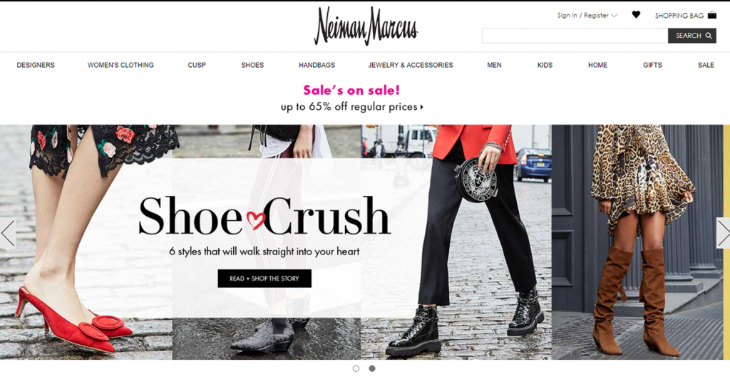
An uncluttered welcome
The sense of luxury starts with a simple, easy-to-navigate homepage: there is a two image slider at the top of the page and a single row with three columns below. It feels uncluttered and clean. This modest design immediately draws the customer’s eye – and a limited amount of text lets the bold and colourful images do the talking!
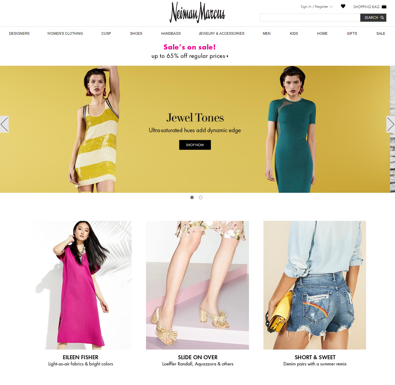
But, this uncluttered visual identity comes with a compromise: the banner text size is tiny. How will your customers find the beautiful products on offer if the navigation tool is overpowered?
When you hover on the banner, the lists are very full. Neiman Marcus gives the shopper multiple ways to shop for their dream item – by designer, trend, type of clothing and occasion – but it this can be very distracting, and it takes a moment to find what you want.
Simple product page design provides a great user experience
The clean and uncluttered look continues for the product listings. They use a traditional eCommerce layout – the menu on the left, products in a grid on the right – a style that many regular online shoppers will be familiar with.
Everything is designed to make the shopping experience smooth and easy for the customer.
Scrolling through, it is easy to get a good idea of the products on sale: the images show the single item, photographed on a model with a plain white background. (Click here to learn how Pixc can help you create the same look!) Hovering over the image gives a second angle of the product which allows the customer to have a quick glance before they click to learn more or easily continue scrolling.
The format of the listing is also easy to understand. Information follows a standardized format: brand – product – price.
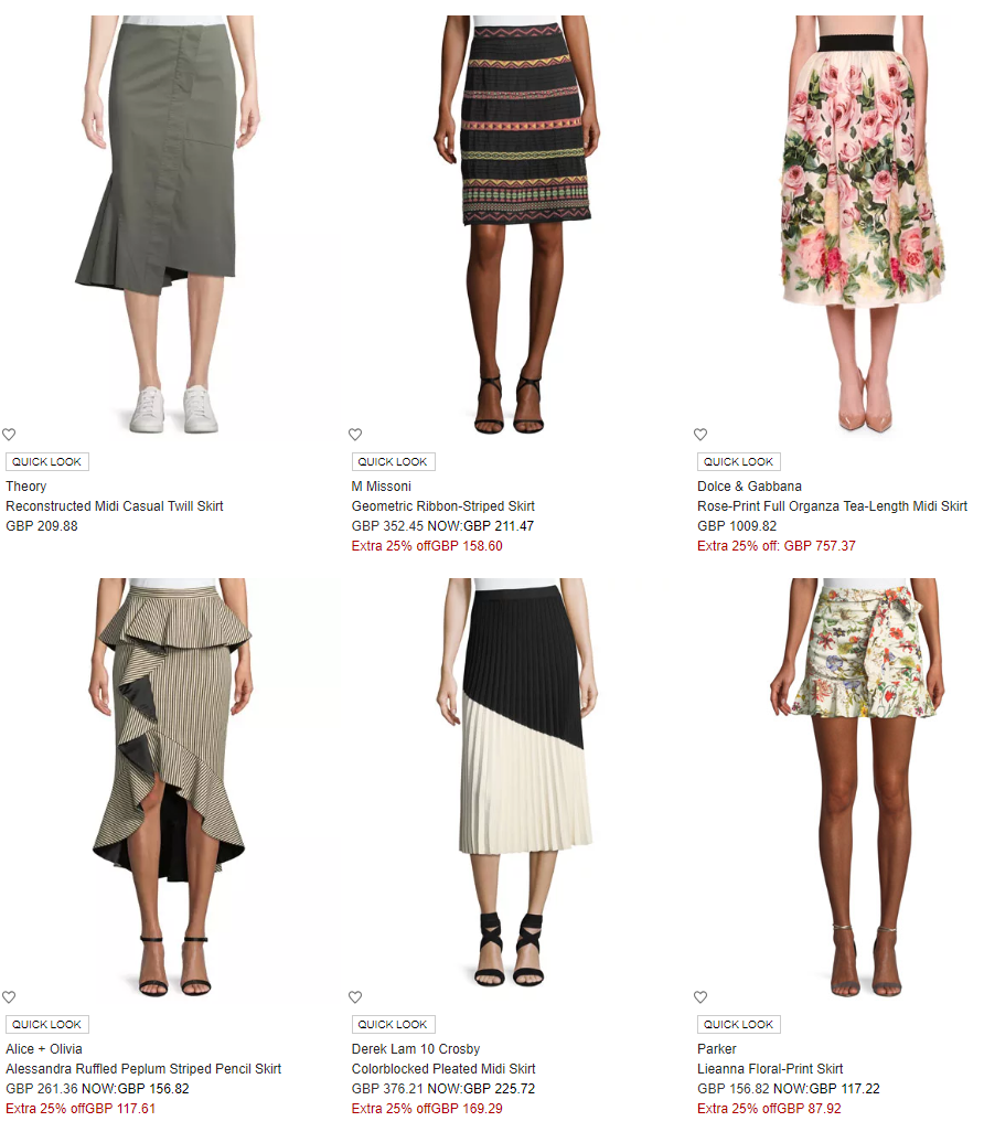
The sidebar is very detailed, meaning customers can find what they want very easily. Looking at the dropdown options for ‘pants and shorts’, you can choose cropped, wide-leg, straight, skinny, leggings and shorts.
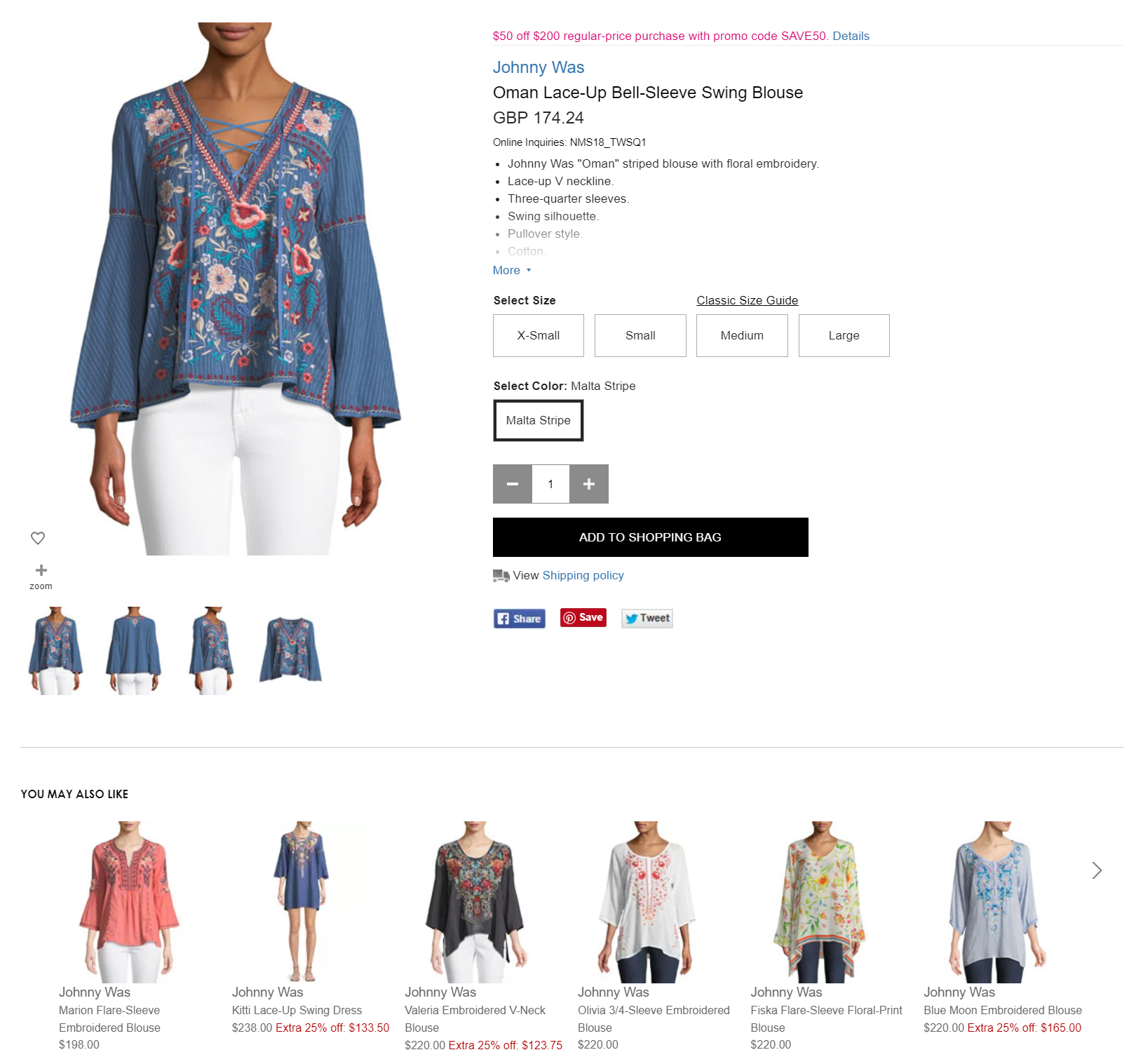
Additional information helps reduce returns
The product listings are very detailed, helping the customer make a highly informed decision – bullet points describe the material, the shape and washing instructions. Uniquely, the description also includes the model’s dimensions; it is an excellent way to help customers decide how the item will fit their body.
The listing also only shows sizes available to avoid confusion: think how messy and distracting those sizing options are when they are greyed out or crossed out with a red line!
Neiman Marcus also includes additional information about the designer, which makes the shopping experience more personal and intimate.
The images are standard studio shots: one full image shot from the back and one from the back, with a third photo showing the product alone. Occasionally, there is also a close-up.
Some products come with additional images where you can see the products out of the studio. This gives the item situational context, helping customers see how to wear the product. Understandably, this is not available for all of the listings – but, it would be nice if a video was made available so the customer could really see how the product moves.
All of the listings have a ‘you may also like’ bar at the bottom. For example, if the customer chooses a mid-length skirt, they will see suggestions for other mid-length skirts of a similar style. This is great if the product isn’t exactly what they want because they can click until they find the perfect item. But, it would be nice to mix in ‘wear with’ suggestions to help the customer choose a full outfit, thereby potentially increasing the revenue from each customer.
Final verdict
Neiman Marcus’ product page design has a clean and fresh look, with easy to navigate functionality. The images are eye-catching and there is a lot of detail in the product description. But, by focusing heavily on beautiful images, the all-important navigation text often feels lost and overpowered or cluttered.
What you should take from this
Everything that you do should make the online shopping experience as simple as possible for the customer. This is something that Neiman Marcus does very well, and is easy to replicate on your eCommerce site.
Tip 1: Keep the listings clean and simple. It is a great way to draw the customer’s eyes around the page.
Tip 2: Make sure that product information is as detailed as possible, so that they can make an informed decision.
Tip 3: Keep images bright and uncluttered. When listing an item, try to take a picture of the product, not an outfit so that the customer knows exactly what they are buying!