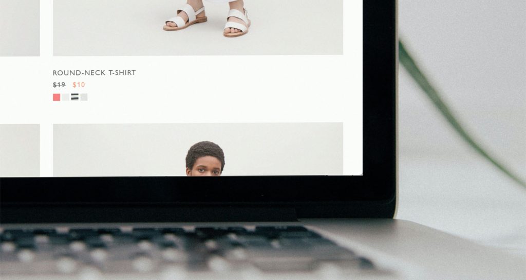
You uploaded your product photos last week. They looked sharp on your laptop. Then you open your store on your phone, and something is off.
The colors feel flat. The edges are soft. The text on your product label is hard to read. Welcome to the most common (and most overlooked) problem in ecommerce: product photos on mobile look nothing like the files you uploaded.
Here’s the kicker. More than 79% of ecommerce traffic now comes from mobile devices. So the version of your photos that most of your customers see is the worst version. It’s not the version you signed off on. It’s the version your phone decided to show.
This post isn’t about cameras or lighting. We’ve already written plenty of guides for that. This is about what happens to your images between your upload screen and a shopper’s iPhone — and how to optimize your images for mobile, so they hold up. If you’ve ever wondered why your mobile product photos look fuzzy, washed out, or just slightly “wrong,” this is for you.
The mobile mismatch nobody warned you about
Most Shopify sellers do everything from a desktop. You upload images to a big monitor. You preview the product page in a browser window at 90% zoom. Everything looks great.
But your customer is squinting at a six-inch screen. They’re on cellular data. They’re standing in line at a coffee shop. The image they see goes through a completely different rendering path than the one you approved. Browsers resize on the fly. Networks compress files. Shopify auto-generates new versions for each device.
The result: images blurry on mobile, even when the original file was tack sharp. It’s not a phone problem. It’s an upload problem. And once you understand the upload side, every product photo you publish from this point on will look better.
Here are the six reasons your photos break on mobile — and the simple fix for each.
Reason 1: You uploaded a giant file
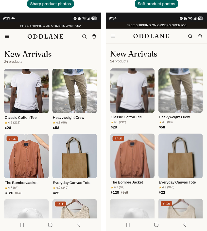
Bigger files aren’t better files. When you upload a 4000×4000 px image, Shopify and your theme automatically generate smaller versions to serve on mobile. That conversion is lossy. The detail gets thrown away. Edges go ‘soft’.
If your file size is over 1MB, Shopify often compresses it harder. Those compression artifacts show up as soft edges and color banding. They’re most obvious on photos with smooth gradients — skin, sky, plain white backgrounds.
The fix: Resize your master file to around 2048×2048 px. Keep the file size under 300KB. Save a high-res master in your archive if you need to reprint or relicense. But upload the optimized version to your store.
Reason 2: Your aspect ratio fights small screens
Desktop product grids are forgiving. They handle weird aspect ratios without complaint. Mobile grids are brutal.
A 16:9 horizontal product photo gets letterboxed on a phone. A tall 9:16 portrait gets cropped or shrunk to fit. The product ends up tiny and floating with empty space around it. That space screams “amateur” before your customer reads a single word of copy.
The fix: Standardize your images to 1:1 (square) or 4:5 (portrait). These two ratios cover Shopify, Instagram, and TikTok Shop without surprises. Pick one for each page type. Apply it across your whole product catalog. Consistency is what makes a store look professional.
Reason 3: Cellular networks cut your image quality
When a shopper opens your store on 4G in a tunnel, their browser may downgrade your images to save bandwidth. Some carriers compress images at the network level too. You’ll never see this happen on your office wifi. Your customer will see a noticeably softer version of every photo.
This is the single biggest reason your Shopify product images look worse on mobile than you expected. The file you uploaded was fine. The pipe it traveled through wasn’t.
The fix: Save your images in WebP format where possible. WebP is around 25–35% smaller than JPEG at the same visual quality. When the network does its compression dance, more detail survives. Most modern Shopify themes support WebP delivery automatically, so you don’t need to change your workflow much.
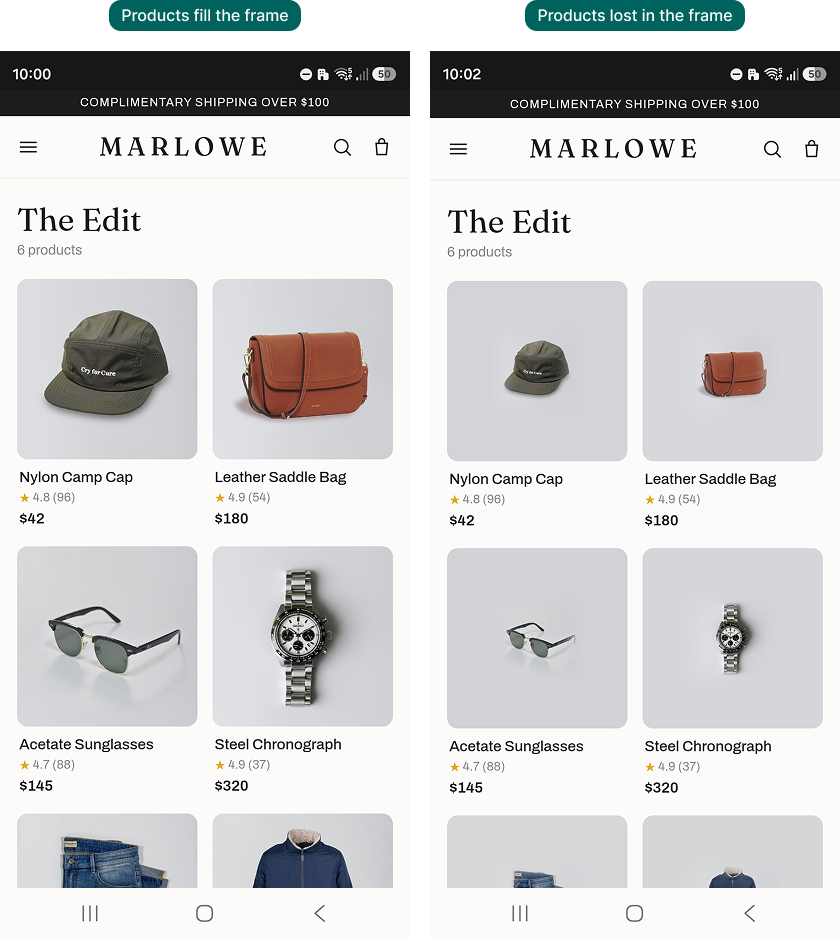
Reason 4: Critical detail disappears at thumbnail size
Your collection page shows each product at maybe 150×150 px on a phone. At that size, fine details turn into mush. Stitching disappears. Product text becomes a smear. Subtle patterns flatten out.
If a shopper can’t tell what your product is from the thumbnail, they don’t click through. They scroll past.
The fix: Photograph for the thumbnail. Get closer to your product than feels natural. Crop tighter. Fill 80–90% of the frame with the product itself. Save the wide, in-context lifestyle shots for the second or third image in the carousel. By then, the shopper has committed to looking at your product page.
Reason 5: Slow load creates a permanent “blurry” first impression
Modern mobile pages use a trick called Low Quality Image Placeholders (LQIP). A tiny, blurry preview loads first. The full image swaps in once it downloads.
If your photo is too heavy, the customer scrolls past before the full version finishes loading. All they ever see is the blur. Then they bounce.
This is why blurry product photos on mobile devices are among the top customer complaints. The image isn’t actually low quality. The shopper just never stuck around long enough to see the real one.
The fix: Get every image under 300KB. Faster load means the full image renders before the customer scrolls past. Don’t try to do this by hand. Bulk compression tools exist for a reason.
Reason 6: You never previewed your store on your own phone
This is the most embarrassing reason. It’s also the most common one. You uploaded your photos, glanced at the product page on your laptop, and moved on.
You never opened your own store on your own phone, on cellular data, the way a real customer would. So you never saw what your customer sees.
The fix: Make this a hard rule. Every time you publish a new product (or page or blog), open your store on your phone. Turn wifi off. Scroll to your collection page. Tap into the product detail page. Pinch to zoom. If anything looks wrong — too small, too cropped, too soft — fix it before you spend a dollar on ads. This 60-second habit will save you more sales than almost any other marketing tweak.
How to optimize your images for mobile: a simple workflow
If you take one thing away from this article, take this. Here’s the workflow that keeps your product photos mobile-ready, every single time:
- Shoot tight, so the product fills the frame even at thumbnail size.
- Crop to 1:1 for collection pages and 4:5 for product detail pages.
- Resize the master file to 2048×2048 px.
- Compress every image under 300KB. Save as WebP where supported.
- Use a bulk tool, not Photoshop one-by-one. You don’t have that kind of time.
- Preview every new product on your own phone, on cellular, before you call it done.
Six steps. Done consistently, this workflow change will lift your mobile conversion more than any button-color A/B test you’ll run this quarter.
The bulk-resize problem (and how to solve it without losing a weekend)
Most Shopify stores have hundreds, sometimes thousands, of product images. Resizing and compressing them one at a time is a non-starter. And the second you start eyeballing file sizes, you’re right back where you started.
This is exactly the problem we built Photo Resize to solve. It runs in your Shopify admin and scans your entire product catalog. It resizes and compresses every product image for Shopify, at the correct mobile dimensions and file size. You don’t download anything. You don’t open Photoshop or Canva. New product uploads get processed automatically going forward.
It’s the simplest way to make sure your mobile product photos display as well as the originals you shot. No new habits to learn. No extra software to manage.
Before you upload another photo
Most of the “my photos look blurry” problem isn’t a photography problem. It’s a delivery problem. It happens between upload and display, in the part of the pipeline most sellers never look at.
Once you fix the upload side — file size, aspect ratio, format, and a 60-second mobile preview habit — the photos you’ve already shot will start performing the way you wanted them to. No reshoot required.
For more on getting your store ready for mobile shoppers, read our guide to mobile optimization for Shopify stores. And for a full breakdown of every image dimension Shopify expects, here’s our Shopify image sizes reference.
Your customers are shopping on their phones. It’s time your product photos matched.