Serena Williams is known as a global tennis icon: she has won the second-most women’s Grand Slam singles titles of all time and is the eight-time tennis World number one. Now, she is rapidly becoming known as a fashion icon, too.
The tennis pro launched Serena, her “Strong Sexy Sophisticated Clothing” line in Summer last year. From comfortable sportswear to chic dresses, Serena wants women to feel confident in her clothing.
“My goal is for women to feel confident and sexy when they’re wearing it. It’s practical and wearable, yet it makes you feel good and walk taller—everyone should have that feeling,” she told BAZAAR.com.
But does her website reflect that empowering message for their customers?
First impressions of the SerenaWilliams.com homepage
The one word that best sums up the homepage is fresh. It embraces simplicity which is an effective and eye-catching technique.
The design is clean: by keeping text to a minimum, it lets the images – and therefore the clothes – speak for themselves.
The simplicity works well. It invites the customer to click through and see more of the clothing range.
This is a crucial achievement as a relatively new brand because even though Serena Williams has name recognition, her clothing line does not.
More importantly, Serena doesn’t have a physical store, so the first impression that a customer gets of the brand is entirely from the homepage.
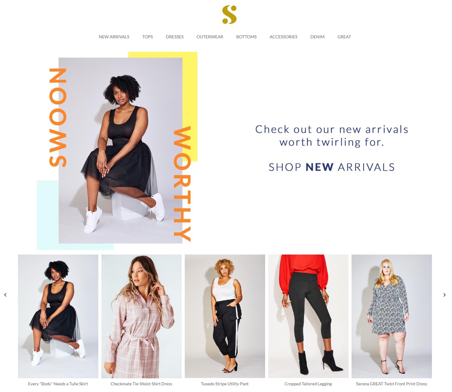
The main image grabs your attention thanks to a playful pop of color with Instagram-inspired text, alongside a simple call to action for customers to check out the new collection on the left.
The five images in the stack below show a good variety of the clothing line, with a hearty mix of full body and close up images of the clothes, which draws the customer to know more about the item.
But the left and right arrows to scroll through the carousel are too small and get lost in the design, so a lot of the impact of the carousel goes completely unnoticed.
Instead, it could be best serviced by a slow-moving carousel which customers can take control of – i.e. pause and move forward – should they wish.
All in all, it feels like the brand is hoping to reach a 25-40-year-old audience, one that likes easy to navigate design without clunky, non-essential movement.
It certainly is practical, though perhaps not empowering.
Inconsistency is confusing
The fresh look-and-feel of the website is carried through to the product pages.
It is great that the website uses a variety of models, all with different body shapes and skin tones, in their imagery.
It lets customers see what the products look like on people who look like themselves, and shows how the products fit different body sizes.
However, the page suffers from inconsistent layout and design.
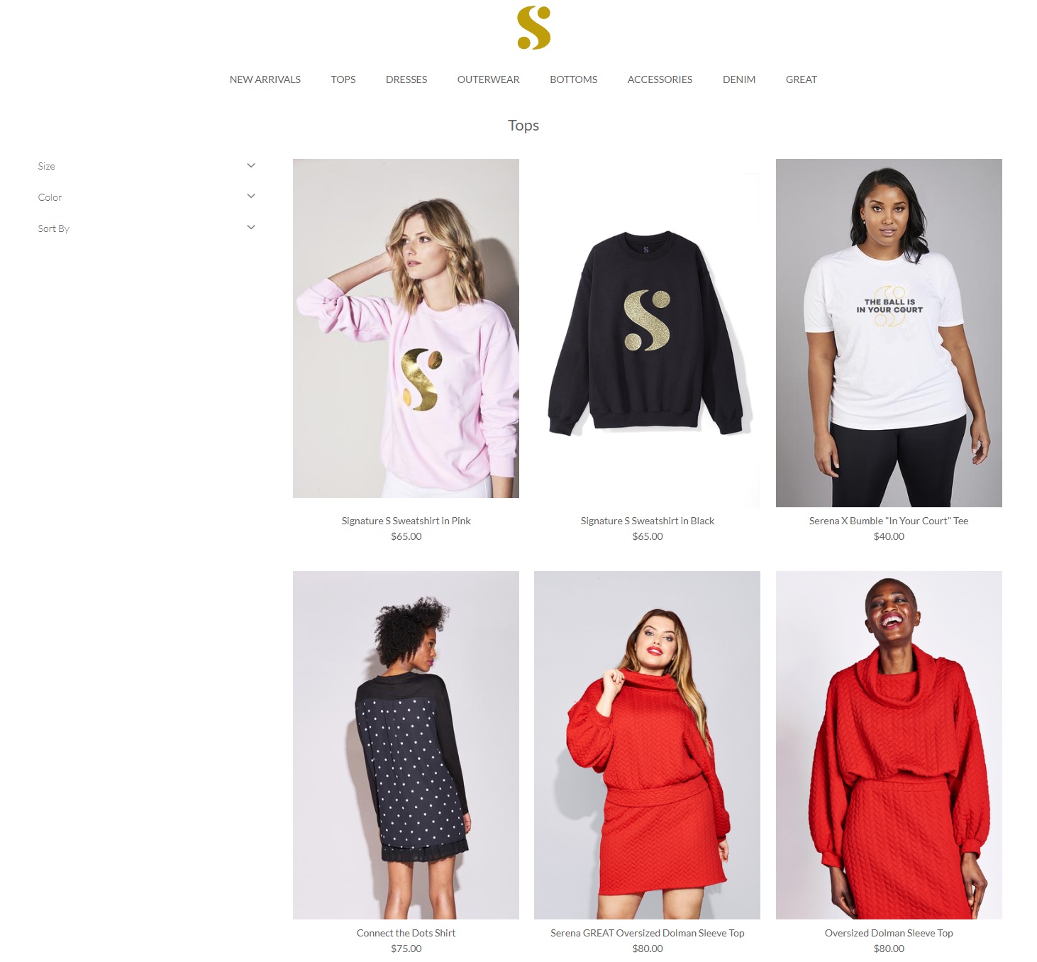
There are odd instances of repetition – for example, why are two models wearing the same red sweater right next to each other, and why is there an image of a jumper with a clean background right next to a model wearing the same jumper?
It creates the idea that the website is trying to sell the product more aggressively – or they just have a badly designed website.
When you hover over the images to learn more about the product, it flips to show you a different angle.
But the angle of the second image shown is inconsistent, so you never know what you will see.
Sometimes it is a close up of the material, other times it is an image of the back or a picture of the product on a white background.
Keeping it consistent allows the customer to easily compare different products, which helps them easily choose between different options.
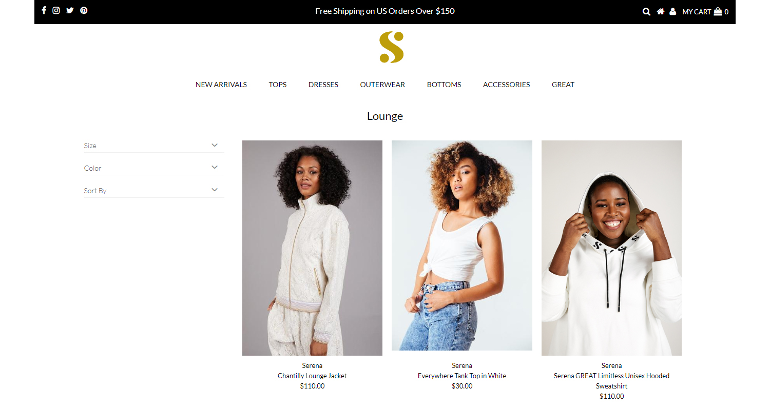
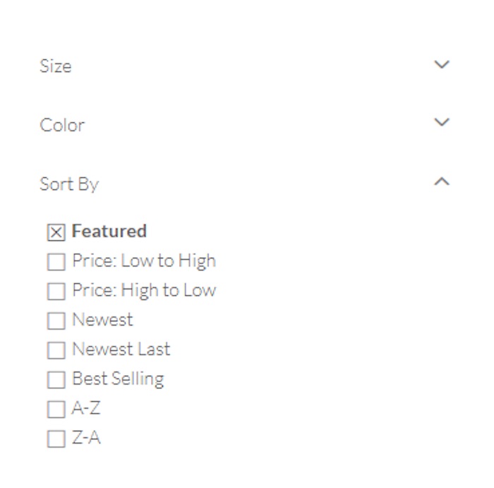
Another oddity is the sidebar.
As you would expect, it lets you filter the products by size, color, price, and best selling – however, it is a little strange it also categorizes the clothes by “A to Z”. It is a feature best left on Amazon or other e-commerce stores that sell a lot of different brands.
Product page
The clean look-and-feel is kept throughout the product pages – but it is almost too clean.
There are only two images on the page which gives the customer an extremely limited view of the product.
This will invariably leave them with more questions, i.e. “what does the back look like,” or “what about the movement of the product”?
Pictures are the only way that a customer can get a good sense of the product.
That is why there should be a minimum of four images which show the product in various states: from the front, from the back, how it moves, and what the fabric looks like up close.
A good way to achieve this while keeping a “fresh” and modern look to your website is with a video. It will let the customer see how the item of clothing sits on the model as she makes simple movements.
When customers scroll over the images to zoom in and get more detail on the Serena website, the pop-up box is small and the image becomes pixelated.
High-quality images are important because they let the customer get the detail that they need – which can often be a deciding factor in whether they make a purchase or not.
The product description follows Serena’s minimalist trend – it includes the product materials, but not much else.
Don’t forget to tell the customer what the washing instructions are, and what size the model is wearing alongside her measurements, to help them make an informed decision.
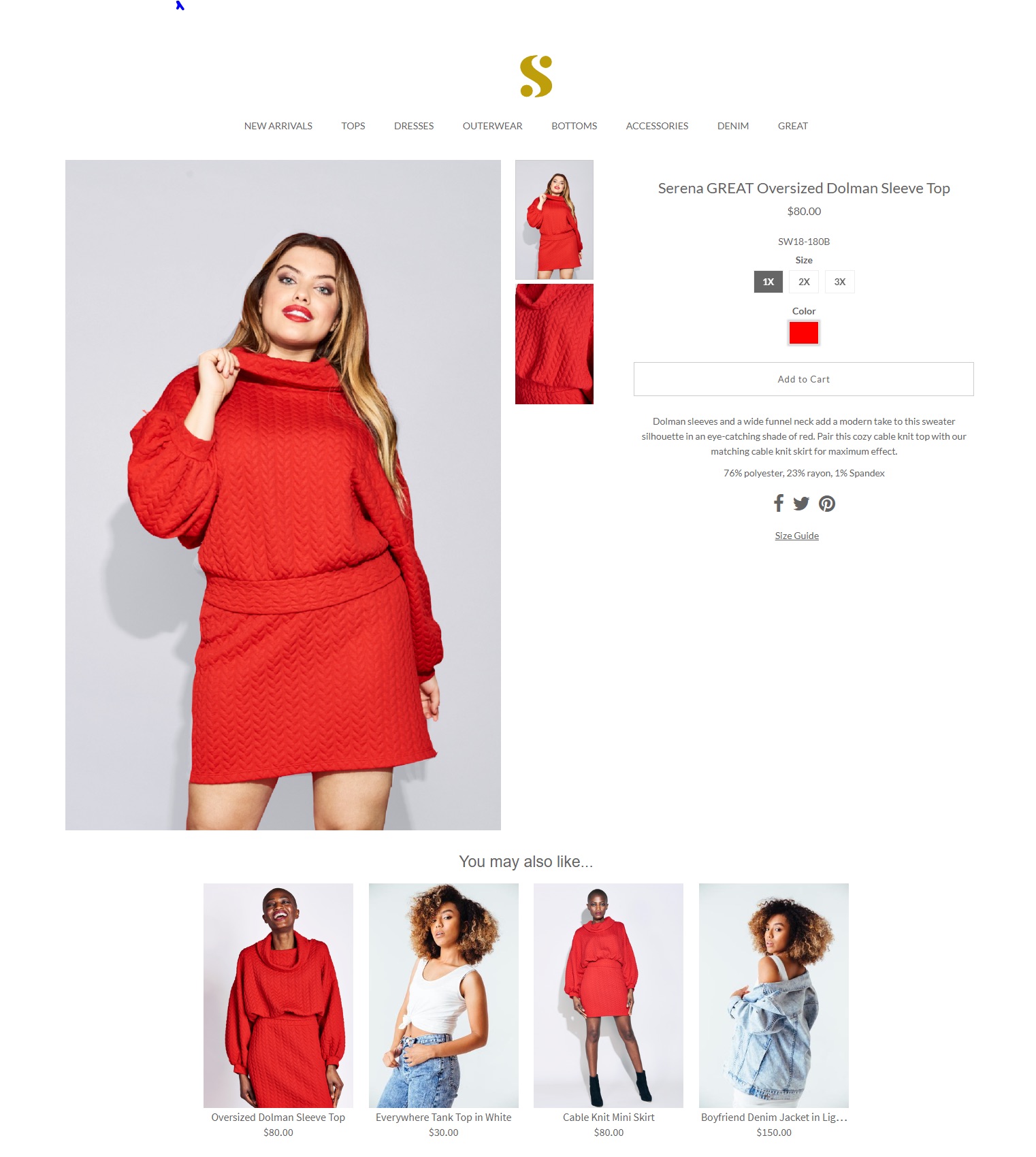
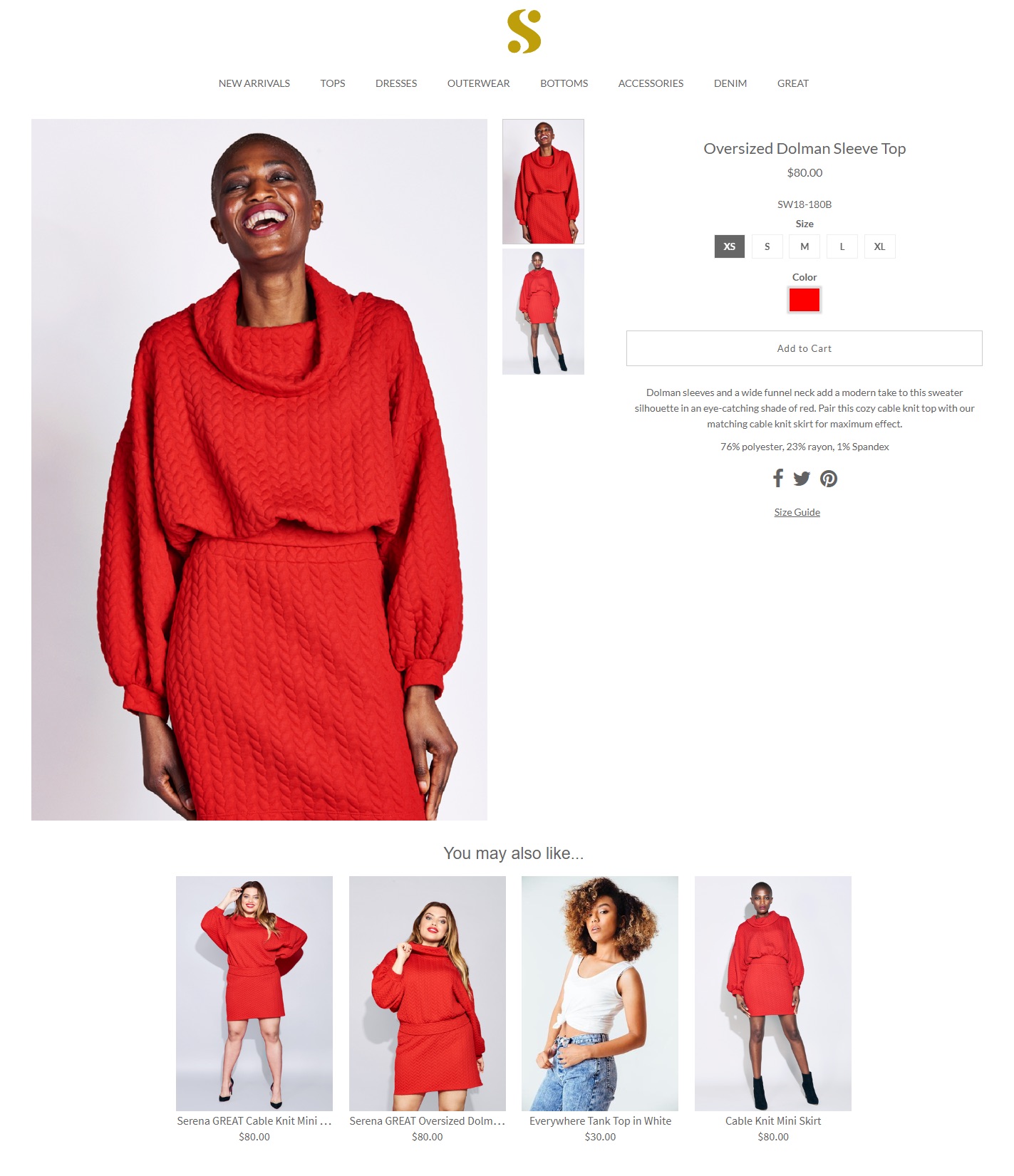
Somewhat strangely, this product has a separate product page for sizes XS-XL and 1X-3X (also termed “GREAT”), both of which have the same design issues as the other.
But it begs the question, why does each sizing range have a separate page in the first place?
Your customers should never be made to feel “other”, and it certainly doesn’t match the empowering message that Williams is trying to send through the brand: why not show the plus size model alongside the other model on the same page instead?
And yet, some product pages on the Serena website meet the missing expectations experienced from the Oversized Dolman Sleeve Top.
The Plaid Colorblock Maxi Coat, for example, product page achieves most of the missing or lackluster features from the top’s page: it features all of the product sizes on one page and has several different images that show the coat’s movement and dynamism – even though both the coat and the top are from the same SW18 collection.
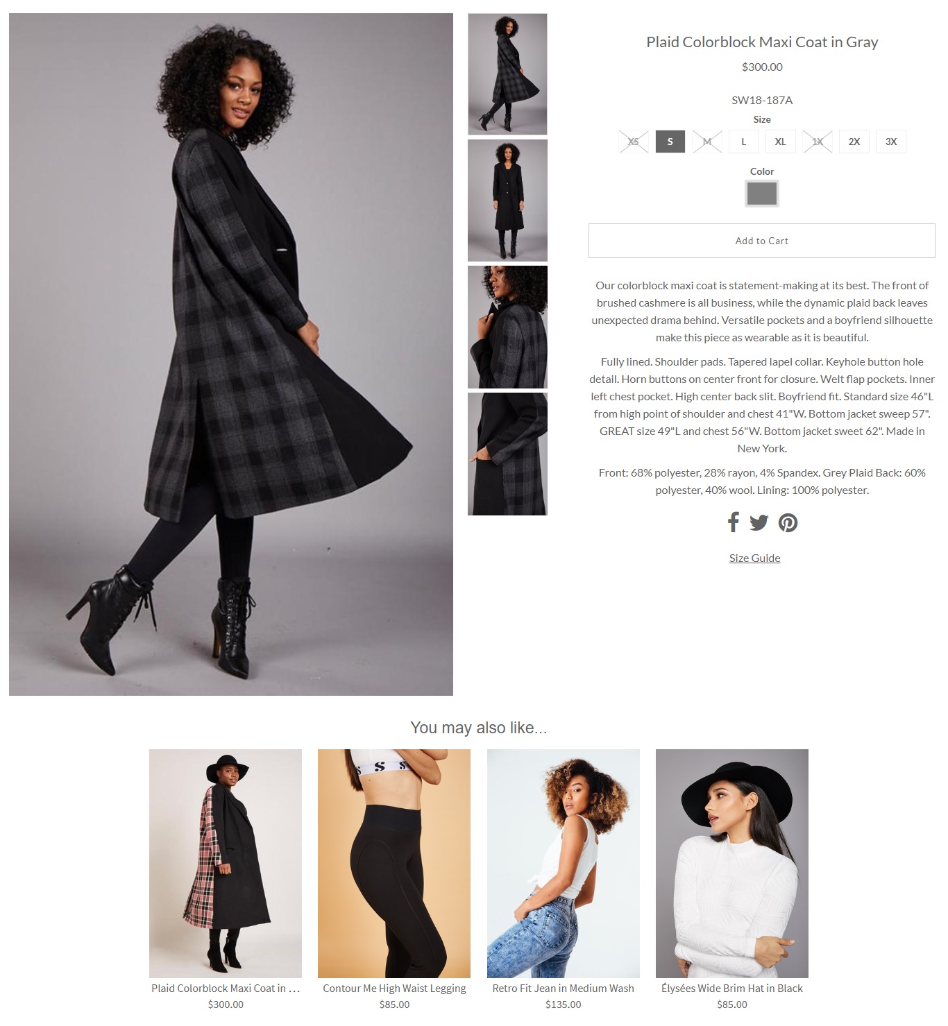
I cannot explain why there is a difference, but this inconsistency is certainly to Serena’s detriment.
There are still some teething issues
All in all, the website tries to be fresh and inviting, and though it sometimes achieves that, it suffers from an inconsistent product page design where some customers will be craving more.
Product page design best practices to take away
- Make sure you don’t sacrifice functionality for design.
- Keep products of a different size in the same listing – otherwise, you run the risk of making your customers feel “other”.
- Use models of different skin tones and body types – it will let customers see what the products look like on people who look like themselves.
Share on social: