What Carrie Bradshaw does, others follow.
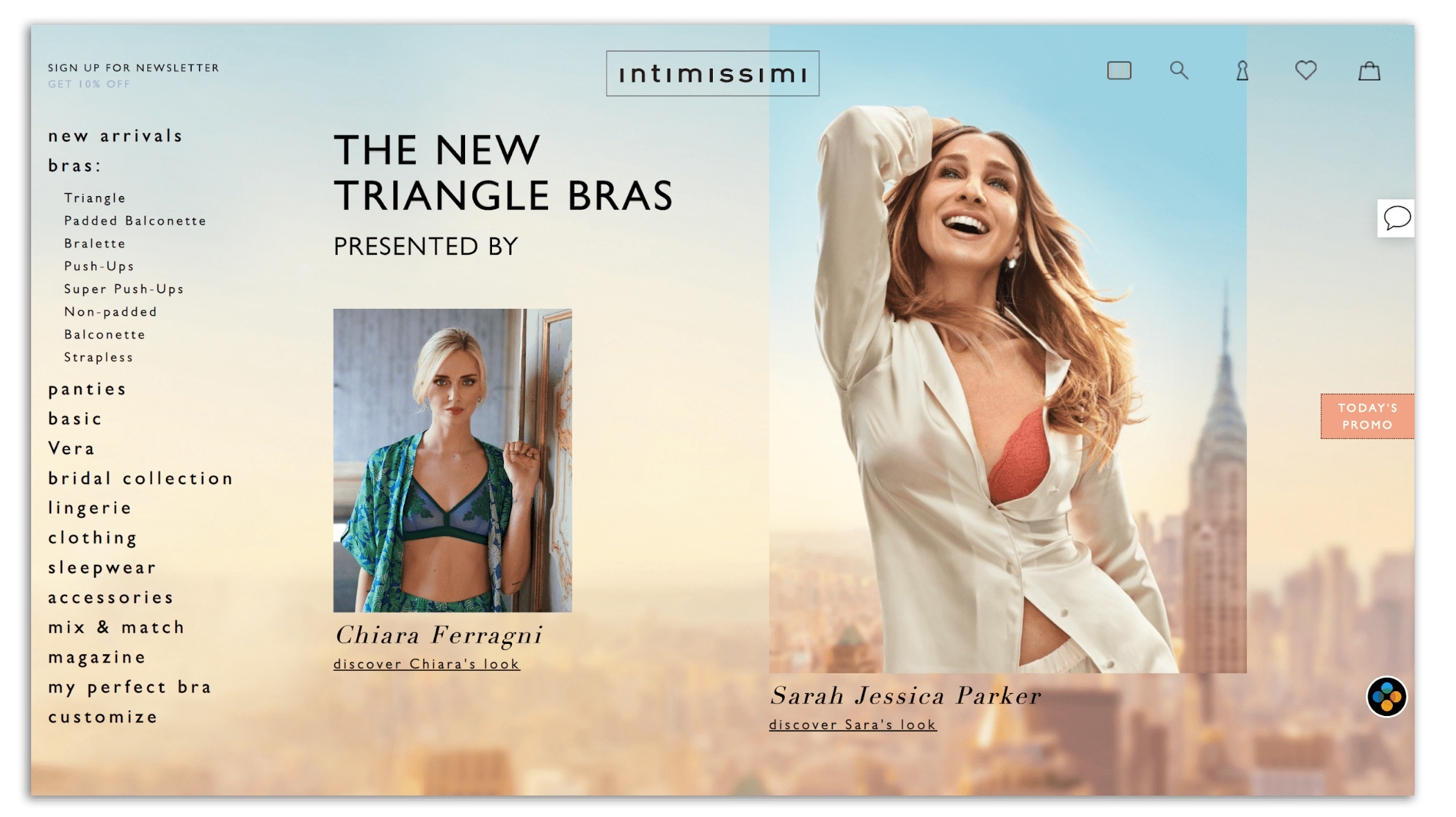
The iconic Sex and the City character was known for her daring yet sophisticated fashion sense – just like Sarah Jessica Parker, the actress who played her, who recently became the face of a global underwear campaign for Intimissimi.
But does the international giant’s website reflect Carrie’s discerning taste?
Underwear is an intimate item of clothing: it is a functional product that should make you feel comfortable and supported, but it should make you feel good at the same time.
Meeting all of these needs on an eCommerce site is a fine balancing act. Hopefully, this product page teardown will help you find the right tone and style for selling your product online.
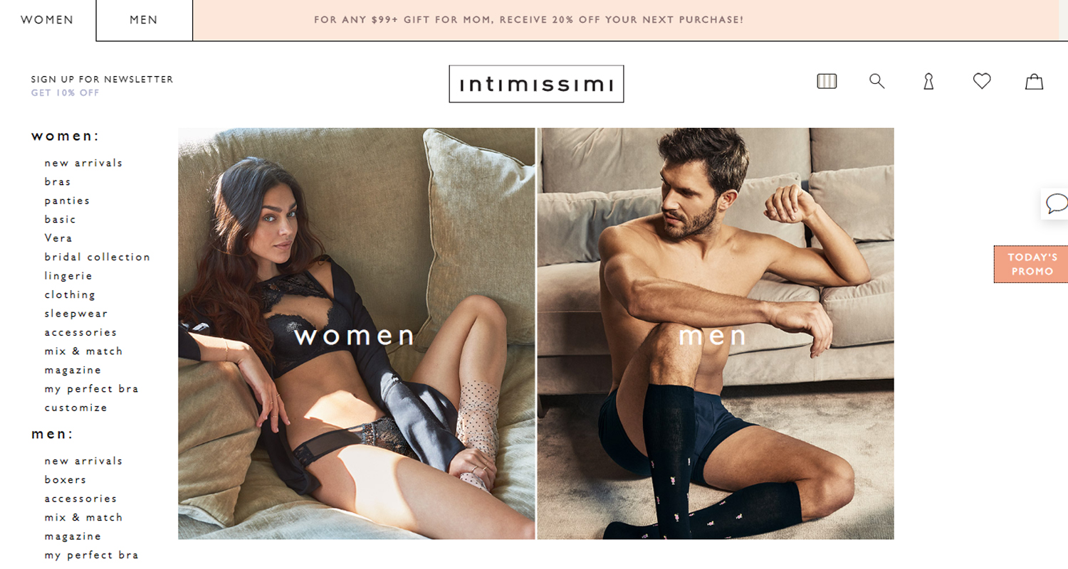
The homepage – Where should I look?
A product website should reflect who you are as a business and what you hope to achieve for your customer.
Intimissimi, a global underwear brand, prides itself on being a forward-thinking brand that focuses on “a simple but refined style” that is “receptive to modern needs.”
Unfortunately, for me, the homepage seems to miss that mark.
At first, the homepage is intriguing: the asymmetrical images – both in terms of size and style – feels unique and engaging.
However, scrolling down the homepage, the page instead seems to suffer from a lack of design continuity.
It is a messy blend of different design ideas. Without explanation or reason, the page jumps from having two asymmetrical images on a pastel hue background to a block of six images with a white background.
This can have a serious impact on trustworthiness as research shows that 94% of people say web design is a reason they don’t trust some websites.
That’s why it is important to pick a theme before you launch or redesign your website.
Dropdown menu – Options are hidden
The dropdown menu on the left-hand side gives customers an endless selection of products and some services to choose from.
But, clicking on an option will automatically redirect you to that product page, rather than giving you the option to open the sub-list of options from the homepage.
That means you cannot just jump to a specific page if you already know what you want, or see all of the various options available to you without having to load multiple pages.
This small but important customer experience oversight highlights the importance of customer journey mapping; the more trouble a customer has reached their intended destination, the more likely it is that they will become someone else’s customer.
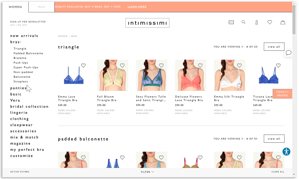
Product landing page – Lingering on the lingerie
In Initimissimi’s physical shops, the underwear is displayed like art on the walls rather than clothes on a rack.
You want to look at every product, so you move slowly through the store as you imagine which shirt you can wear with each bra and how it will make you feel, making sure to appraise each piece in individually.
There has been some effort to recreate this on the website: the product landing page is divided into rows, with different styles of bra stacked on top of one another. The panties, sleepwear and clothing pages are all laid out in the same way.
Customers are instinctively drawn to scroll down the page to see all of the styles and cuts. But users cannot scroll across the row to see more designs than the six on the page, forcing them to click on “see more”.
Unlike the homepage, the design is consistent. The images show the front of the bra, and then pivot to show the back of the bra when the mouse hovers over the image.
You shouldn’t tightly pack your website or forget about the ‘white space’ – i.e. the space between the elements on the webpage, such as text, images, and columns. The effective use of ‘white space’ gives your content space to breathe, draws focus to the products and importantly, gives the impression of luxury.
Product page – Give me all the information
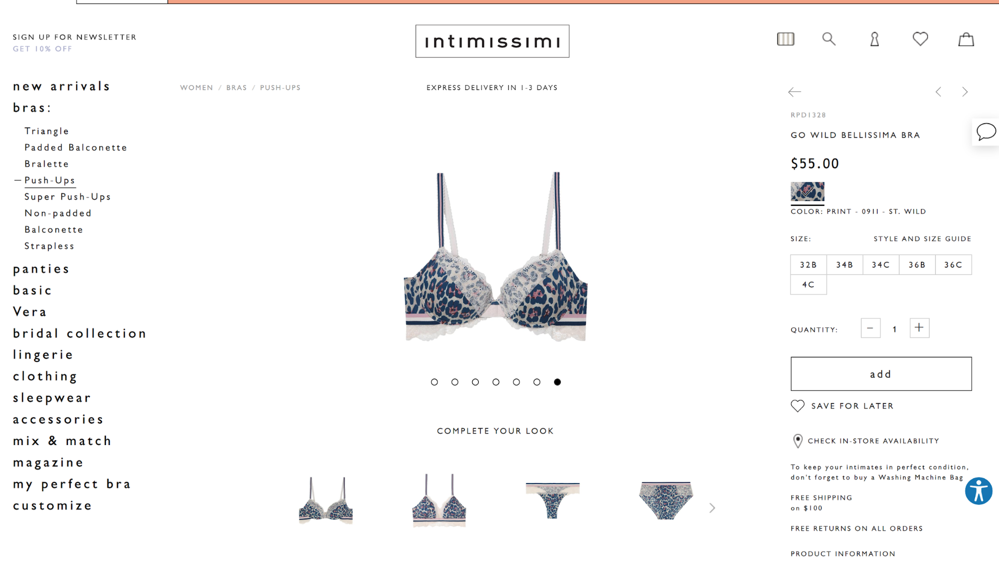
The product page is a veritable feast of information – it provides everything that the customer could wish to know:
- There is a wide variety of high-quality images showing the product at all angles, giving a great overview of the product.
- The zoom functionality is easy to navigate.
- It only lists the bra sizes available, rather than striking through the ones that are sold out which gives a cleaner and more legible look.
- There is a good selection of options available to “complete my look”.
Boring product descriptions
You can almost see more detail in the images that are provided in the small amount of text in the product description.
Instead of writing basic (and obvious) information, why not tell your customers where to wear the clothing?
- Perfect for work and drinks with the girls.
- Perfect for holiday dinner with the family.
- Perfect for dates or a lazy Sunday on the couch.
- Perfect for your first vacation with your new partner.
It is an opportunity to get creative which wouldn’t take much effort. It would be more interesting and engaging for the customer, too.
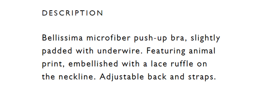
It will help the customer imagine wearing the product, making the experience more personal – and make them more likely to click “add to cart”.
Check in-store availability not operational
The “check in-store availability” option is a good way to engage with customers who might want to try the product or collect it while running other errands. However, you should always check the function is working!
I checked if the product was available in three different cities across the USA but was told there was no store in 60km of my search. Having a fail-safe, like listing out the cities that it is available in could easily prevent consumer frustration.
Too much information
At the end of each product landing page, there is a paragraph of text that gives an explanation about their products and services, and how Intimissimi aims to provide good customer service. But important information – like washing and care instruction – gets lost in the stream of consciousness.
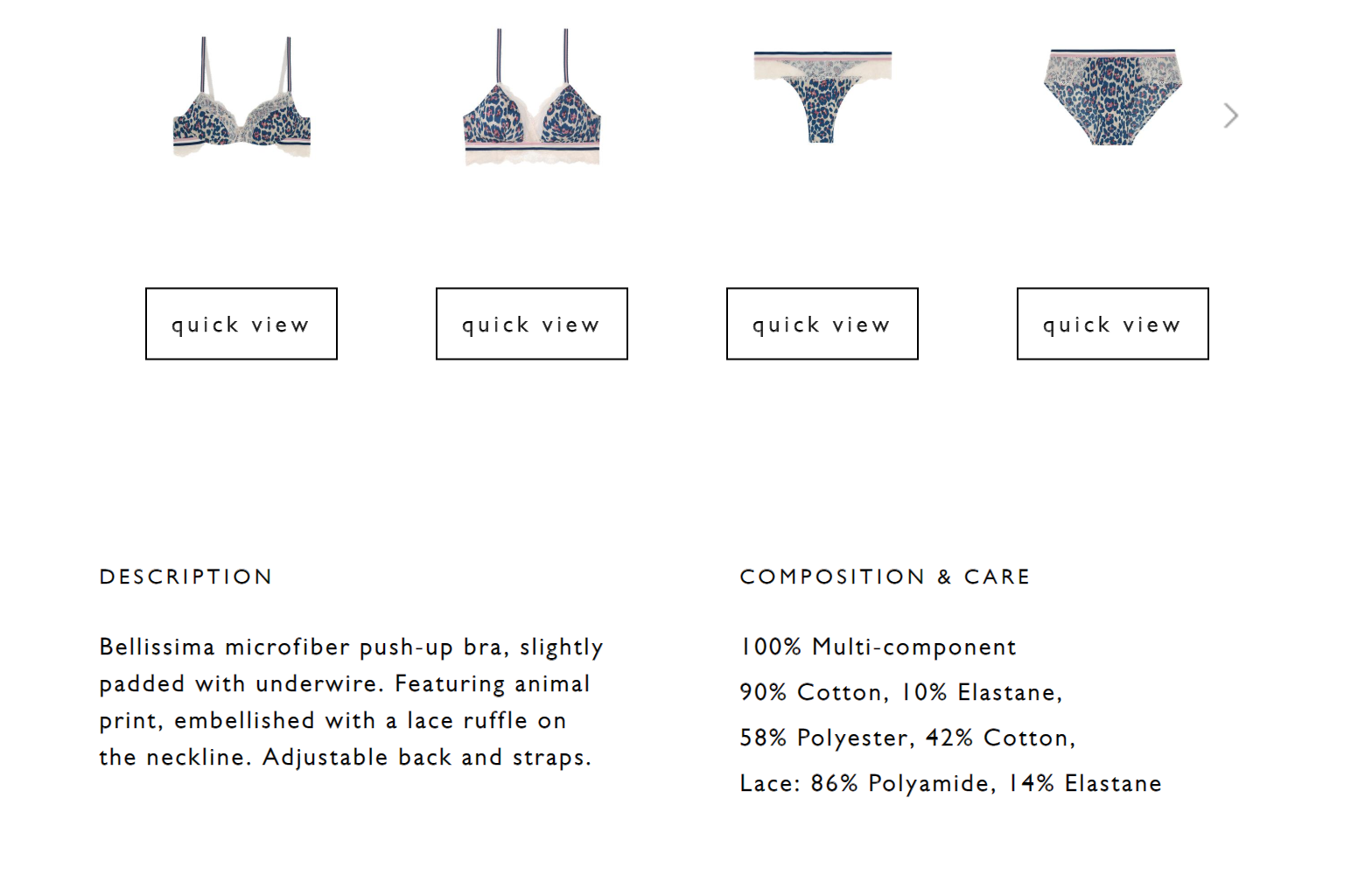
Instead, you should make this information easy to find and put it in a place where customers need it the most: on the product pages. (Intimissimi already has the perfect place for it in “composition & care”, for example!)
In conclusion
Though the product pages are detailed and informative, there are several ways that Intimissi can improve their online customer journey across the website.
For instance, the brand could improve their use of the ‘white space’ to showcase the lingerie and enhance the sense of luxury. Engaging product descriptions telling customers the perfect occasion to wear the garments would also elevate the shopping experience and make it more personal.
Product page design best practices to take away
- Play with the design of your homepage, but make sure that it is consistent, otherwise, it will look messy and rushed.
- Listing sizes available rather than striking through ones that have sold out creates a cleaner look on your product page.
- You should not overlook the importance of customer journey mapping.
Share on social: