Buying a beauty product online can be difficult, especially if you’ve never seen the product in real life; you can’t smell the product, rub it between your fingers to feel the texture or test its reaction on your skin.
That is why having a visually appealing and detailed product page design is so important for online beauty retailers.
Cosmetics is a huge industry – and growing! The global industry is expected to reach US$805.61 billion by 2023. And it’s an industry with a high rate of return and loyal buyers: people will stick to a product they know and love.
So, cosmetic retailers need to find a way to build trust between the buyer and the product when selling online.
Alpha-H does a great job of this, thanks to a strong visual identity. Using detailed descriptions, innovative and clear product photography, and engaging product page layout, consumers get a clear understanding of the product which in turn makes them confident in their purchase.
But some important bits of information get lost in the detail of the design.
Despite this, Alpha-H provides a lesson in why executing a visual identity is important for ecommerce retailers.
A homepage that looks like a glossy magazine
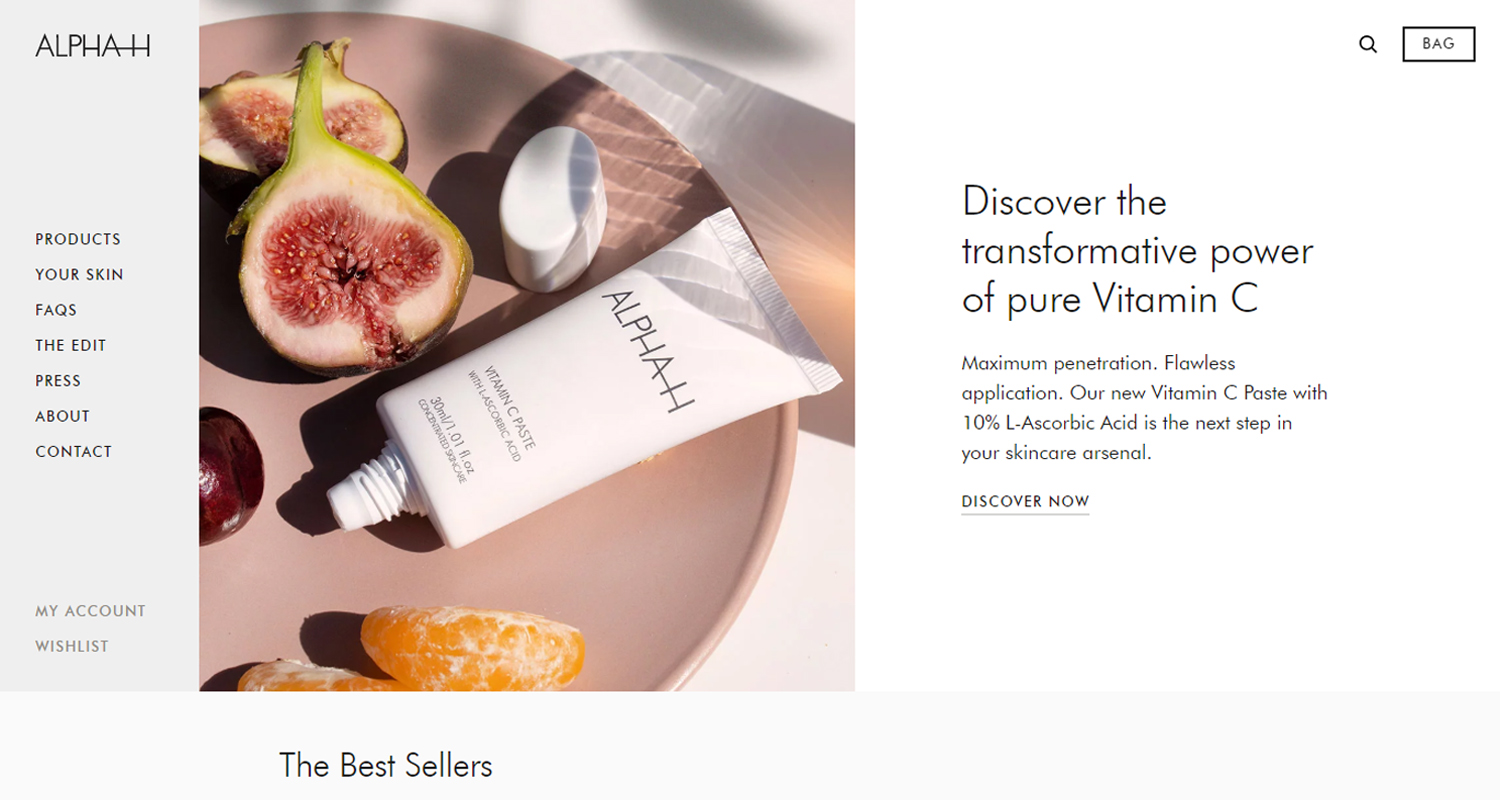
Alpha-H immediately projects a sense of luxury from the moment the shopper opens the website.
The first image is almost aspirational: it presents itself as the customer’s dream skincare kit. This is emphasized by the simple color pallet – white, black and bronze – which looks sophisticated and professional.
This is achieved with just a few simple design tricks:
- The navigation bar is anchored to the left hand which immediately draws the shopper’s eye.
- White space is used to maximum effect throughout the page, making each element pop. This is further emphasized by the minimalism greyscale and pastel-palette photographs, alongside short but inspirational text. (Who doesn’t want “softer, smoother and younger-looking skin with an unmistakable glow”?)
- The asymmetrical layout of the page – with images and text switching between left and right – is simple but engaging, meaning that customers pay attention to the whole page.
Alpha-H uses the layout to successfully sell the idea that they are a luxury brand: their products are designed to make your skin glow and iron out imperfections, so the website needs to reflect this idea.
Top tip: Your homepage layout should reflect your brand. If your product is selling a big, bold idea, you should have a big, bold webpage! It lets your customers know who you are.
Subtly highlight popular products
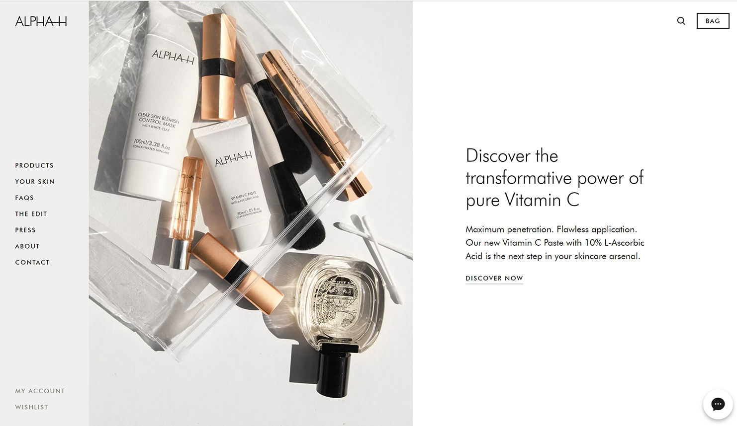
‘The Best Sellers’ stand out prominently on the page because of the homepage’s asymmetrical layout.
The whole webpage is split into two columns, except the new products section, which is split into four. So they stand out to the customer because they do not conform to the pattern.

These popular products are also the only items available to purchase straight from the homepage. This not only makes the whole page neat and uncluttered by product options, but it stops people from clicking around the homepage and getting lost or bored.
Top tip: By limiting the number of places to click on the webpage helps you lead your customers to where you want them to go: the shopping cart.
Clever photography anchors the product page
The product page continues the Alpha-H brand of luxury through the use of effective imagery and concise storytelling.
Effective imagery
Photographing cosmetics can be tough – detailed images of a bottle are not particularly interesting. Instead, Alpha-H has three very high-resolution single images of the bottle, the cream/ointment, and a stylized shot.
In this case, just having one standalone image of the product works well, thanks to effective staging.
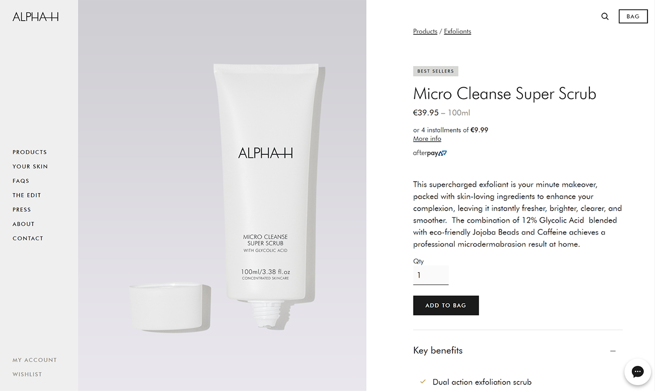
The bottle
By exposing the unscrewed top, customers can see the details of the bottle’s nozzle, thereby showing the customer everything that they need to see. The greyscale background lets the white Alpha-H bottle pop off the screen while also conveying a sense of sophistication.
The cream
The cream stands out against a white background, giving details on the color and texture of the product.
Stylized shot
Though this image doesn’t give any details about the product, it is staged to present an air of luxury. It is more about the emotional sale of the product to the customer.
Top tip: Though it is good practice for online retailers to follow the guideline ‘more images the better’, clever staging and high-quality images can be just as – if not more – effective. Really, how many angles of a bottle does your customer want or need?
Storytelling through text
A panel next to the header image gives the customer four pieces of relevant information:
- Key benefits – a short checklist that gives buyers a snapshot of how the product works, what results they can expect. Essentially it is a shortlist telling customers why you should buy this product.
- Pair this with – a complementary product that will expand the benefits of the product that you are looking at. Upselling in a prominent spot.
- Key ingredients – a no-nonsense list of (or some of) the product’s ingredients.
- Additional information – a checklist of what makes this an ethical and environmentally conscious product. Essentially telling the buyer why they can feel good about buying this product.
Although this is relevant and easy to read, some useful information gets lost in the design. If the accordion menu is collapsed, for example, a customer might miss some of the information.
Other key bits of text get lost further down the page, too.
For example, the ‘How-to’ text is buried at the bottom. This could be very useful information for both new and returning customers who have never used that specific product before.
Top tip: Useful information should not come second to page layout and design.
Alpha-H has gone the extra mile for customers and included a ‘how to’ tutorial video on the product page.
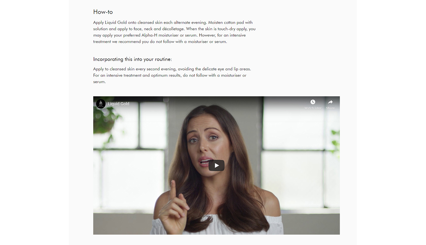
It is a fun way to engage first-time buyers and customers who are thinking about switching brands, while also showing their expertise as a beauty product retailer.
Top tip: Video is a good way to switch up your website content – and it can be a great tool to publish on your social media channels and YouTube, too!
How does the website perform on mobile?
By keeping the design fairly simple, focusing on single, high-quality images and concise text, the website performs very well on mobile and easily maintains its sense of luxury.
This brand design is executed consistently throughout the website – which is a good lesson for other online retailers.
Share on social: