We don’t need to tell you that your product pages are one of the most critical parts of your online store.
Time and time again, we see poor ecommerce pages pages full of low quality photos, minimal product descriptions, small text, and little to no information about their shipping and returns policy.
Poor product pages can cause you to lose sales.
You may not realize how important your product page really is, and you may think that as long as it looks good for you, it’s good enough for your customers.
Are you getting traffic to your store but little conversions? If so, there’s a great chance it has something to do with your product page.
Read this article about the common issues we see on product pages and apply some of our tips to improve your conversions.
Poor quality product images
Your product photos are the first thing your customers notice when they land on your product pages.
In fact, most buyer decisions are based on what they see as soon as they land.
With that in mind, if your product images don’t show the product in a compelling way, you’re going to have a hard time convincing them to spend.
How to spot this common issue?
For starters, you should ask yourself the following:
- Are your images pixelated or blurry?
- Are our customers able to zoom in on your products?
- Do your product photos depict the actual colors of your products?
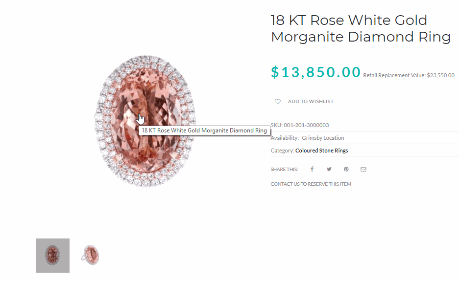
Take for example this ring. If you’re buying a 13 thousand ring online, you’d like to make sure it’s worth your money. You’ll want to see the details of the gems and the metal.
The same applies to any type of product. Buyers will always want to look into the fine details of the product they’re buying.
Unfortunately, this product listing failed to show this.
This ring could definitely use better product photos. Aside from the images being blurry, it’s also difficult to check the details of the stones because there’s no zoom functionality available.
How to fix it?
First thing you need to do is take high-quality photos. If you’re not sure how, here’s a guide you can use.
You should also make sure that you have zoom functionality enabled in your store.
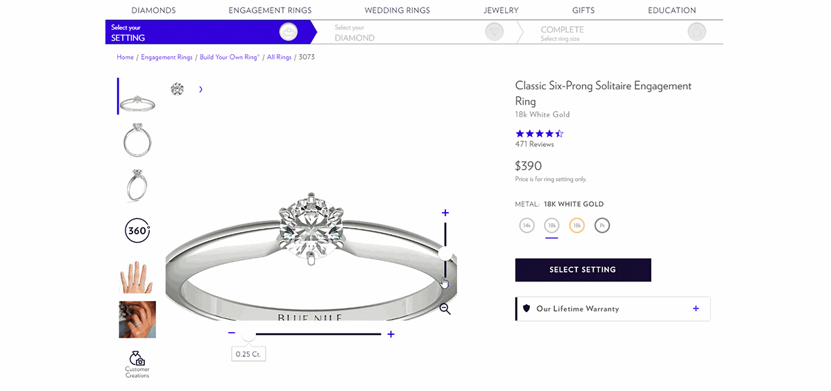
Blue Nile Product Page with good image zoom functionality
Blue Nile did a fine job with this. Aside from using high-quality photos, their customers can also zoom in and out and see the fine details of the products.
Also, you should consider taking multiple photos from different angles to show as much information about the product as possible.
We recommend having at least four product images to showcase your product properly, especially if the stitching or other details reinforce the value proposition.
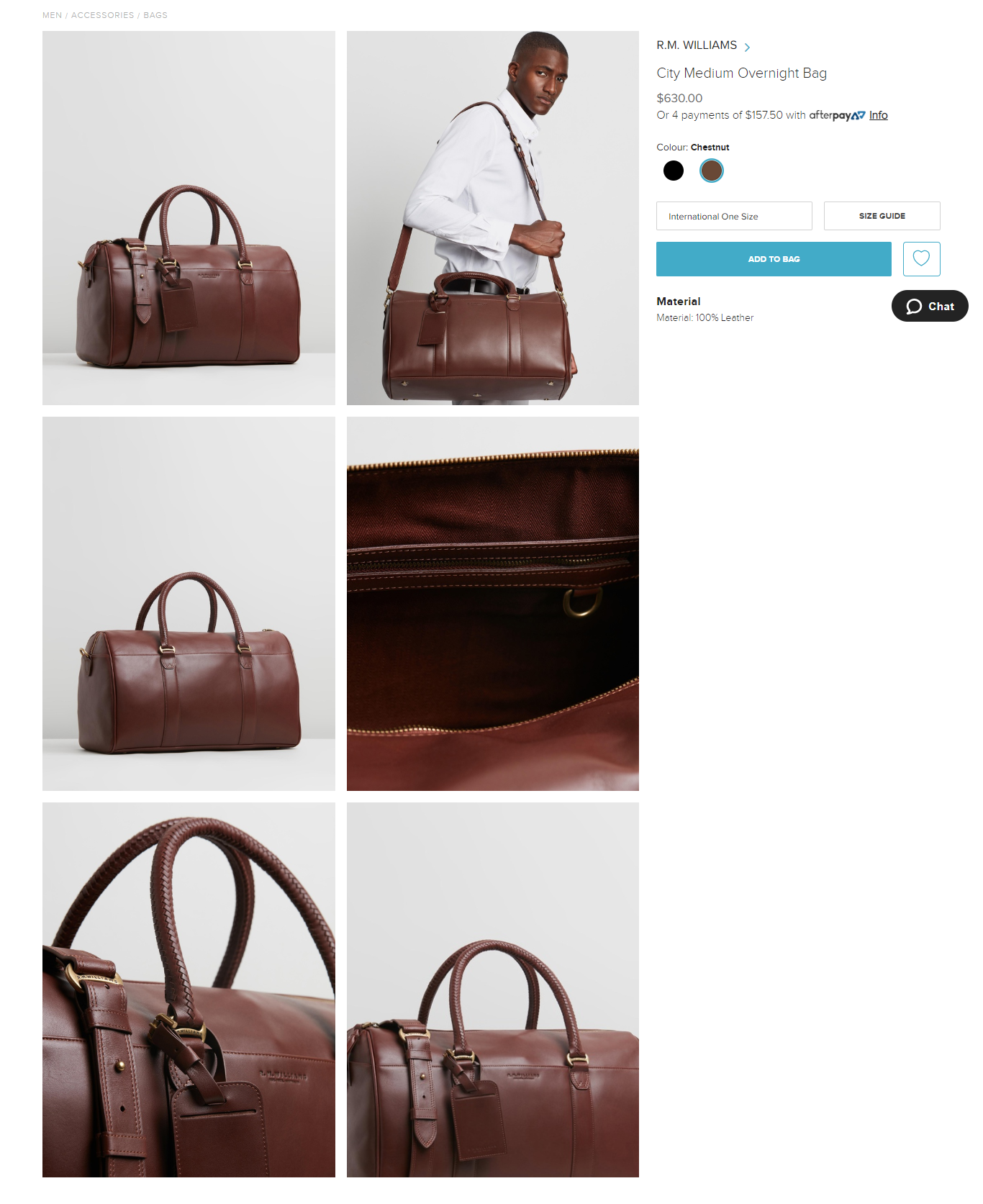
Product images of an overnight bag via The Iconic
Keep in mind that your product photography should elicit a tactile response that lets shoppers picture exactly what your product would feel like, just like this overnight bag from The Iconic.
Your photos don’t tell a story
Sometimes, when you visit a truly engaging ecommerce product page, it’s like something grabs hold of you.
If you look closely, that’s because the images tell a story, like this example from Sunnies Face.
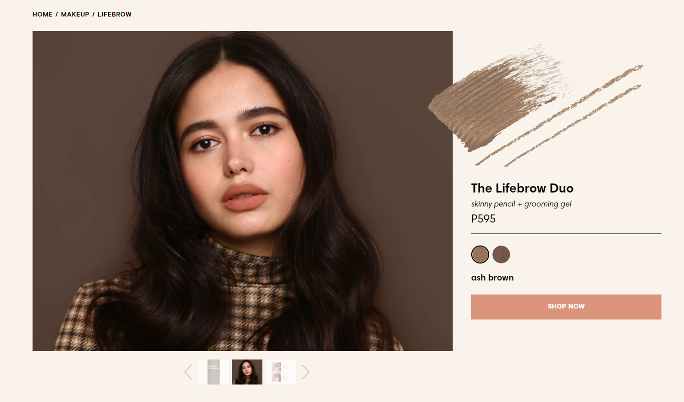
Sunnies Face eyebrow product page
Telling a story through images for Makeup products can be tricky. With other products, it’s easy to show through images how your customers will use your products.
With Makeups, your buyer would want to consider their skin tone, shape of their face, etc… So using one photo to tell a story can be difficult.
Sunnies Face did a great job capturing their buyers attention. If you think about it, the model shot was very simplistic. One-shot photo of the model wearing makeup.
But, the moment you land to their product page, the first thing you’ll notice is the model’s eyebrow, which is exactly what they’re selling.
How to spot it?
If you only have a set of images on a background, it’s likely that you’re not leveraging the power of image storytelling.
You may have plenty of product images on your product listings; however, if you’re not weaving in photos with a story and a brand image, you will compete purely on price and your shipping times.
Product images that tell a story can be powerful and help to improve conversions as consumers want to buy into a brand.
How can you fix it?
Start by creating contextual product photos and compositions that buyers can easily relate to.
You can take contextual photos that showcase the unwritten benefits of using your products. Or, in the case of Sunnies Face, take photos that can easily make your buyers say, “Hey, this will look good in me”.
If you sell women’s clothing, you could create a story on your product page that displays happy, friendly looking women having a good time wearing your clothing, just like Bon Bon Bon does on their website.
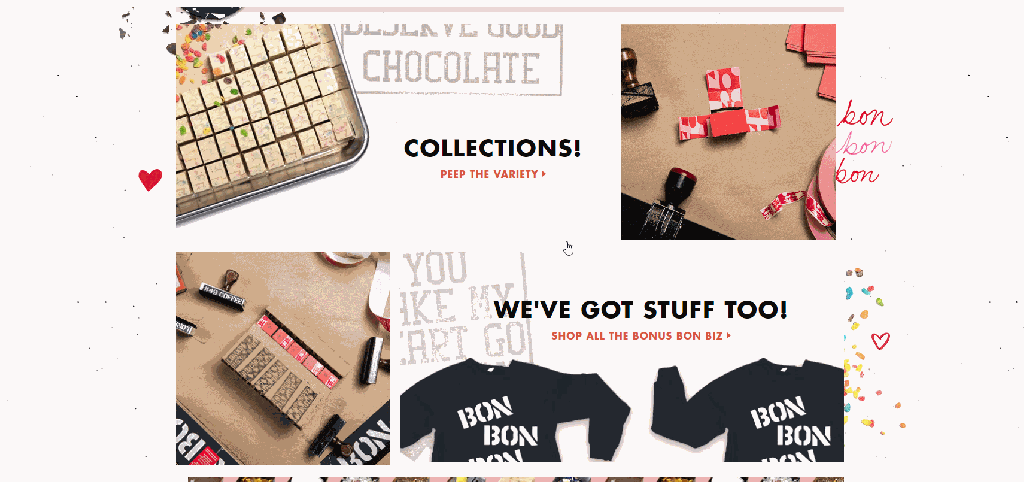
Product images on the Bon Bon Bon store
If you haven’t done yet, you should also consider creating on-brand photos. Having consistent on-brand and contextual photos on your store helps build an emotional connection with your customers.
You have too many product options
This is a common, but absurdly frustrating issue in ecommerce product pages.
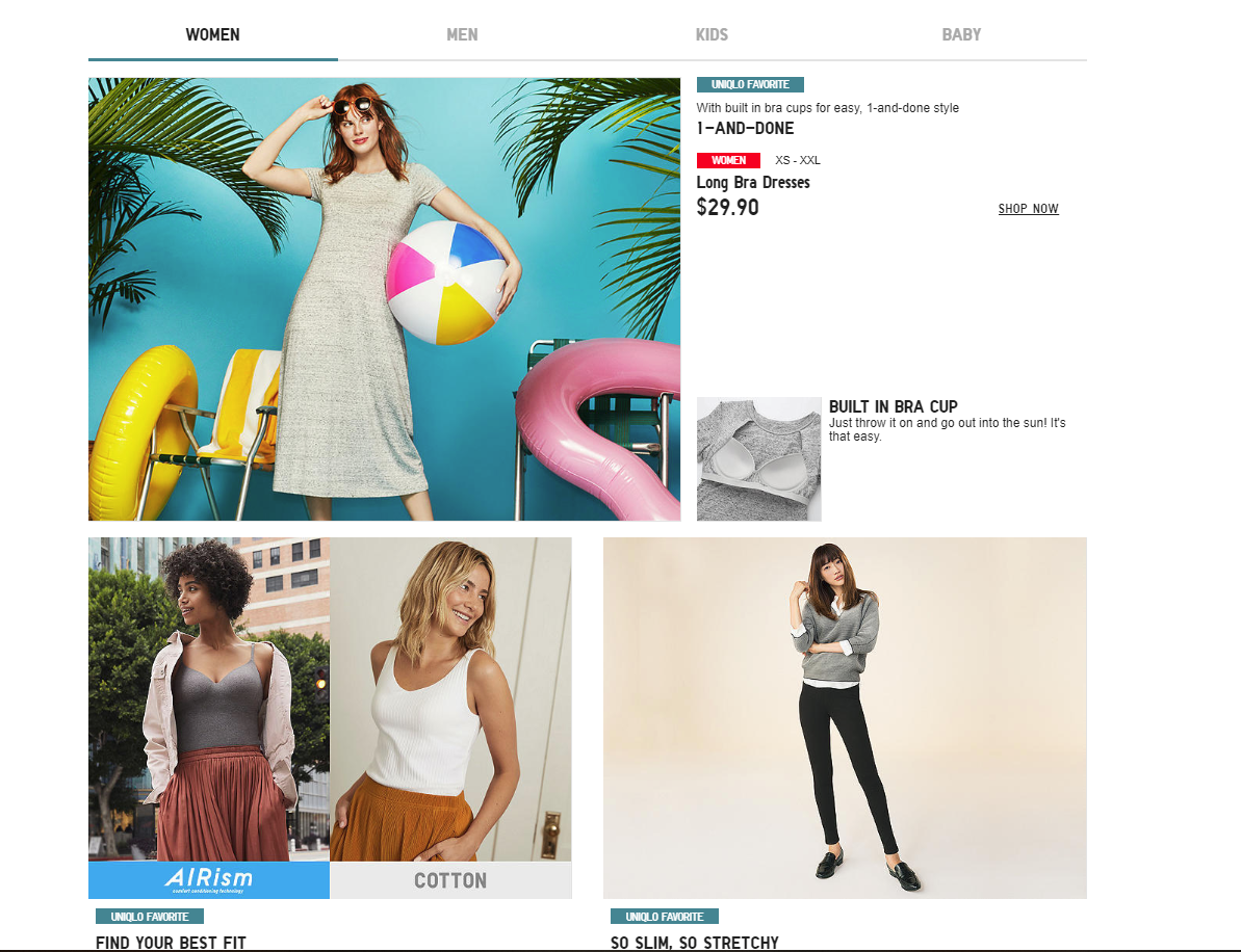
Uniqlo’s product page
Imagine that you’ve spent hours looking for the right product and that once you find it, the product page is cluttered with other products and unhelpful product descriptions like Uniqlo’s product page, where you end up feeling confused.
As a buyer, you end up feeling confused.
How to spot it?
One of the reasons most ecommerce store owners fall into the trap of cluttering their ecommerce product pages is that they want to show all their products.
This isn’t wrong in itself, but it could hinder your chances of making a sale.
The easiest way to spot a cluttered product page is to see how much white space you’re leaving.
If you’re cramming text and images, leaving little to no white space, you probably have too many options and it’s always better to show fewer items at a time.
How can you fix it?
Make sure that when your customers need to make a decision, they have a clear indication of what each decision means.
Everything, from size charts to colors, to other products or models need to be clearly labeled to avoid confusion and abandoned shopping carts.
Try to restrict the number of products on specific product pages on your store. You can add a slider or a similar method to display your products one at a time.
H&M is a great example for this. If you land on their homepage, their product categories are organized properly.
Look at how H&M organize their product categories
When you go to a specific product page, you’ll see “Style With” and “Others Also Bought” sections at the bottom. Basically, offering other products without making it look cluttered.
They make it feel like they’re shopping WITH you, instead of just bombarding visitors with a variety of product.
Your shipping and returns policies are not visible
As an ecommerce store, you’re not only providing products, you’re also providing services such as delivery, returns, and customer support.
And while this might not be the number one priority of your shoppers, they are assuming that these services are included with the purchase.
You need to make sure you got these things covered.
How to spot it?
Simple – Are you hiding your shipping and returns information and policies?
If you are, you’d better not because no customer wants to see that the item they covet doesn’t ship to its country or that shipping costs twice than they thought.
Or worse, that you don’t offer returns, or that it might cost them to return an item.
How can you fix it?
Make sure you always show your shipping and returns policy.
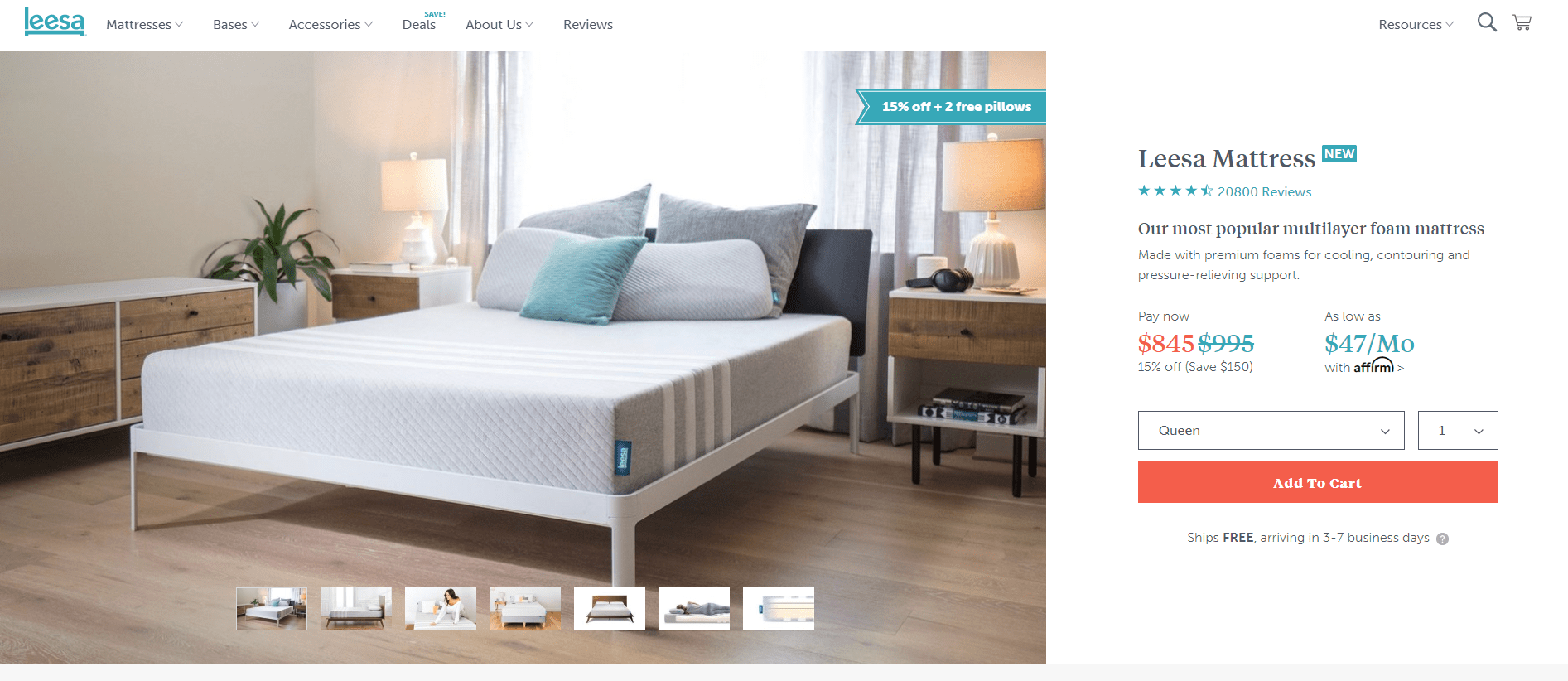
Leesa’s product page providing information about returns and shipping
Leesa, the mattress ecommerce store, offers free returns within the first 100 nights and free shipping.
Both information is clearly visible from the moment you land on the website. And, because they know that the store is not trying to sneak hidden fees, it also helps establish trust making shoppers decide faster.
Your web pages are too slow to load
You’ve been there. You want to buy something and the page simply takes ages to load.
That is enough of a turn off for most shoppers. In fact, it will only take 3 seconds for your potential buyers to decide whether to leave your site or not.
And it should, because we’re living in an era where fast loading speed is one of the most important pieces of a successful ecommerce product page.
If your shop isn’t loading fast enough, you might be losing customers without even knowing you’re doing something wrong.
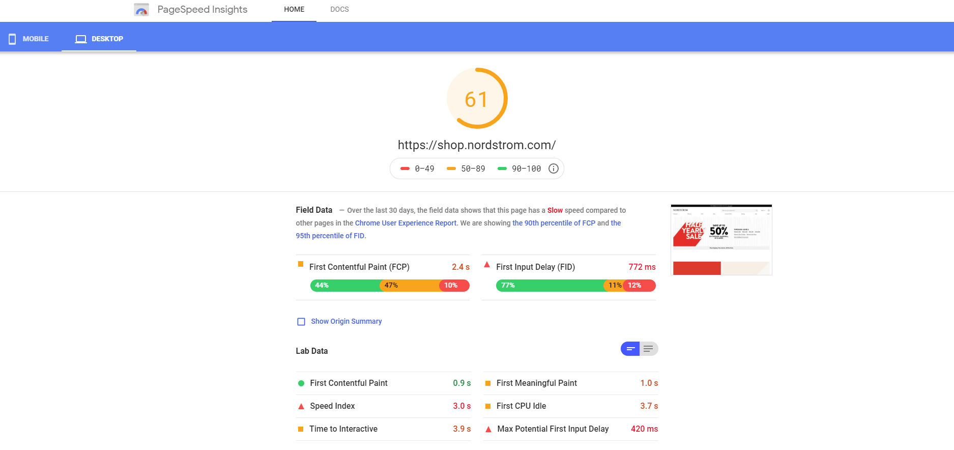
Sample report from PageSpeed Insights for Nordstrom
For instance, take a look at this audit we did to Nordstrom using PageSpeed Insights to see what we’re talking about. In this case, for instance, it seems they need to reduce the time it takes for their ecommerce product page to load.
How to spot it?
At a glance, a good idea to see how your ecommerce store fares against the competition would be to simply load your store and then load the ones from your competitors side by side.
You can also use Google’s PageSpeed Insights or this tool if you want to add several websites at the time and benchmark your results against your competitors’
How can you fix it?
Once you’ve run the page speed tool of your choice, you’ll see several options. We advise you to optimize the first render and make content visible as soon as possible so your shoppers don’t see a blank website as soon as they land.
Similarly, since most ecommerce product pages are image-heavy, it’s highly important to optimize your images and make them lighter.
Most ecommerce platforms like Shopify, Woocommerce, and Prestashop have plugins you could use to reduce the size of your images.
Your cart and checkout processes are cumbersome
Convenience is one of the reasons why people opt to buy online. Hence, ease of use of your website is one crucial factor affecting your conversions.
Do your clients need to register before making a purchase?
If that’s the case, you probably need to rethink your checkout strategy.
Every time you force a client to make a decision, they might not want, you face an abandoned shopping cart.
Besides, you should aim at making the shopping process less complicated, which calls for a streamlined checkout process.
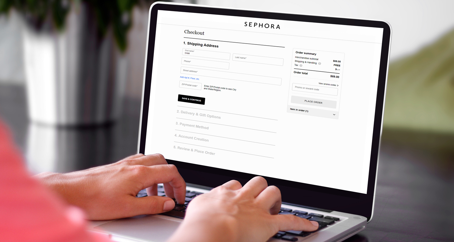
See, for instance, Sephora’s checkout experience. It took us literally two clicks to buy one of their products.
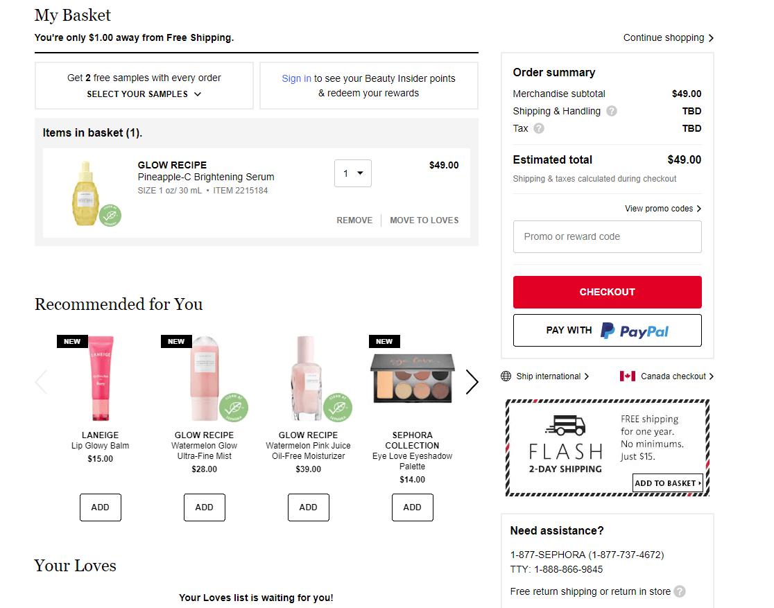
Sephora offers good shopper experience with its easy checkout process
How to spot it?
Go to your ecommerce product page and interact with your store as a shopper would.
How easy it is for you to choose and pay for a product?
This should tell you how easy it is for your customers to buy from your store.
Don’t ask for unnecessary data, and offer the payment options your clients will most likely use.
How can you fix it?
Start by retracing the steps it takes for you to get a product. Too many steps and you might lose a sale; few steps and you might look fishy.
Only ask for the information you need and don’t force your shoppers to give you information they might not feel comfortable sharing. Instead, use design elements to help guide your customers.
After all, you’re an ecommerce, not the FBI. You’re a guide, not a hassle.
In conclusion…
The truth is that your ecommerce product page design can be the difference between a sale and a bounce from your site.
Your ecommerce product page is one of the most important decision points for your customers. It’s only upon looking at your product page that they decide to stay and buy or leave.
In a nutshell, this means that an optimized ecommerce product page is critical to ensure your customers find what they’re looking for and come back for more because if your product page isn’t optimized, chances are you’re simply pouring water into a leaky bucket.
Share on social: